 Dev Design Library
Follow Button Components
Dev Design Library indexes 8 follow button components from 7 open-source UI libraries, with the most coming from FLX UI, Spectrum UI, OpenSourceUI, Amicro Micro Transitions and ReUI. Each one links to its page with the source code, a live preview where available, the library license and the install command. Follow button components belong to the Actions group.
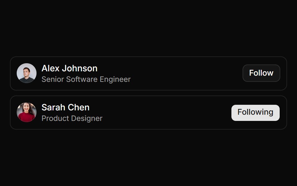 User item with avatar, info, and follow buttonReUI · ReactUser item with avatar, info, and follow button
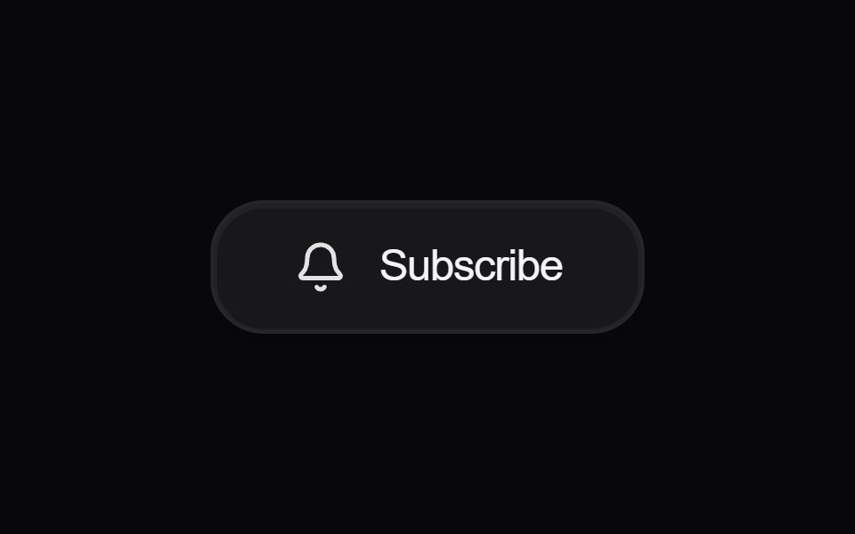 Button SubscribeAmicro Micro Transitions · React
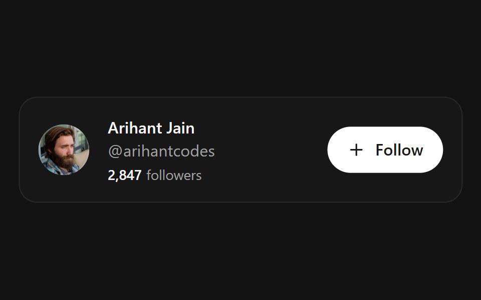 Follow ButtonSpectrum UI · ReactA morphing follow/unfollow button with a spring width morph, animated check draw, and a hover-revealed unfollow state
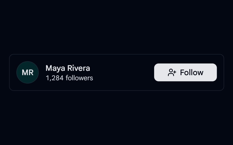 Toggle 06 - Follow ButtonShadcn Space · ReactFollow toggle in a profile row that switches to Following, shows Unfollow on hover, and updates the follower count.
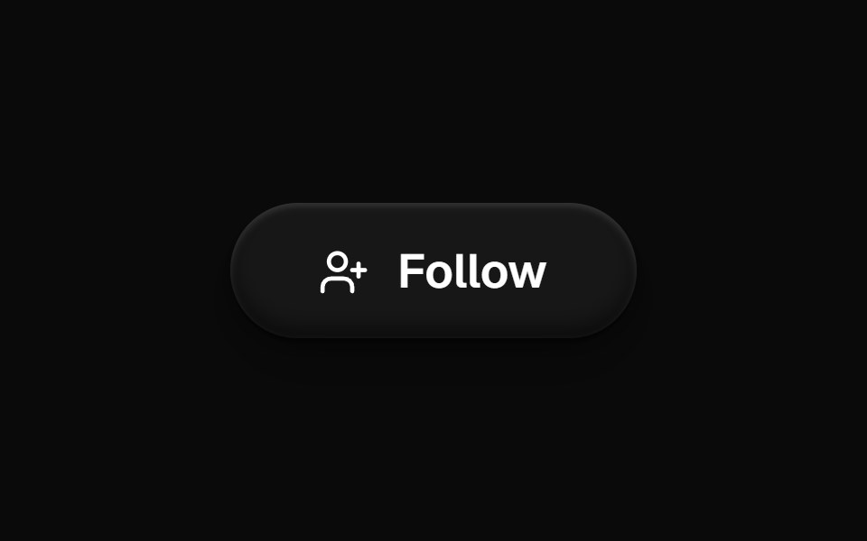 Follow ButtonOpenSourceUI · React
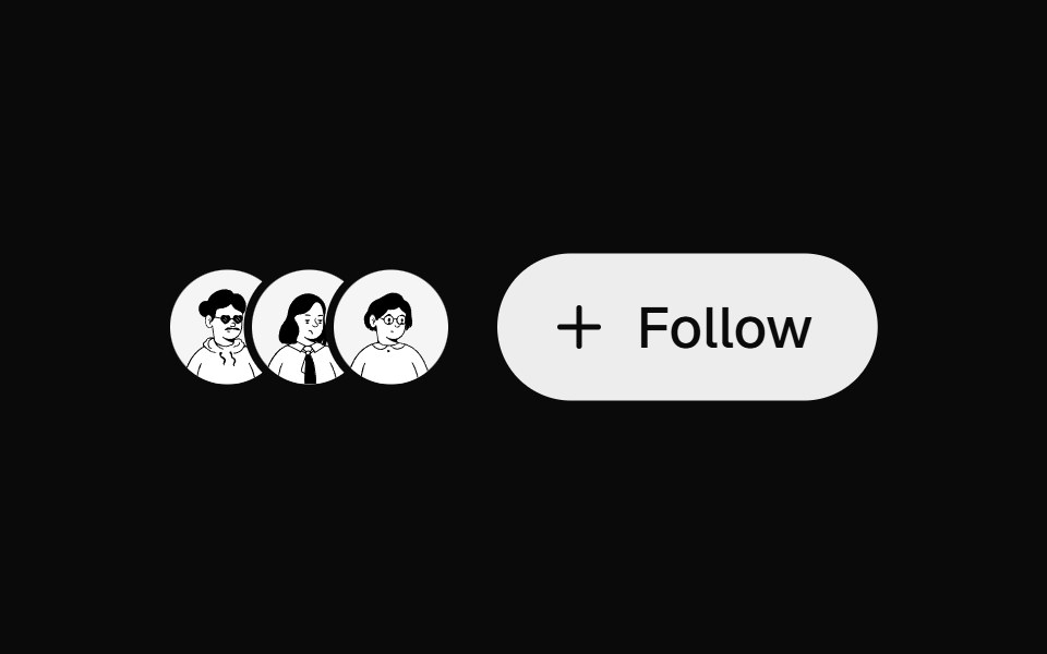 Follow ButtonUI Lab · ReactTurns its plus into a check as you follow, and warns before you unfollow.
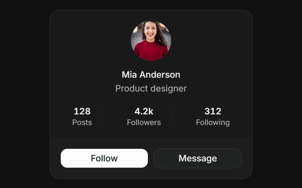 ProfileFLX UI · ReactCentered avatar, stats row, and follow / message actions.
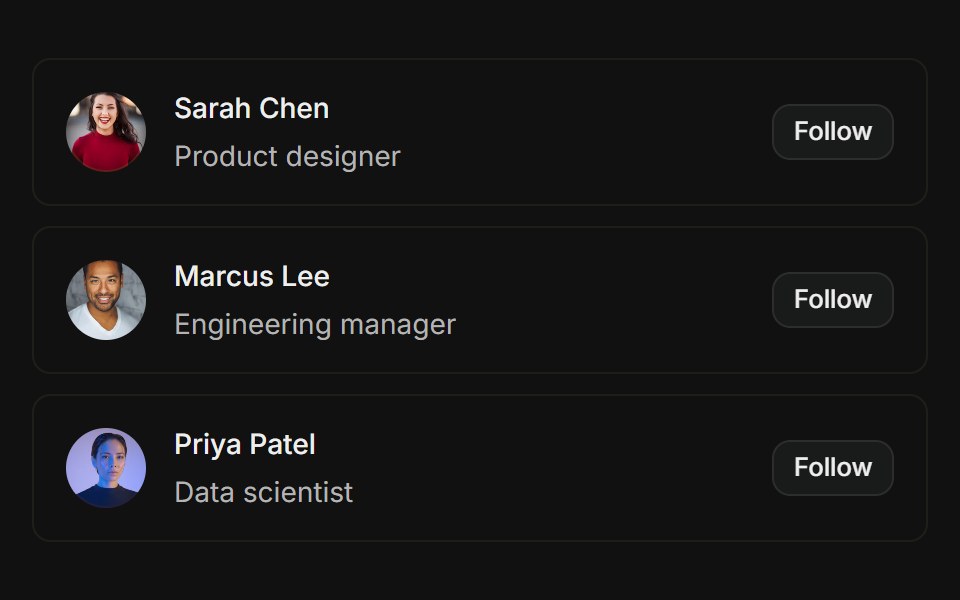 User listFLX UI · ReactAvatars with name, role, and Follow action per row.
Libraries with follow button components
Related categories
- Action Components
- Button Components
- Button Group Components
- Toggle Button Components
- Icon Button Components
- Link Components
- Theme Toggle Components
- CTA Button Components
- Copy Button Components
- Like Button Components
- FAB Components
- Social Login Button Components
- Hold Button Components
- Share Button Components
- Slide To Confirm Components
- Download Button Components