 Dev Design Library
Logo Cloud Components
Dev Design Library indexes 63 logo cloud components from 21 open-source UI libraries, with the most coming from cnblocks, Oxbow UI, sv-efferd, Nexvyn UI and Velora UI. Each one links to its page with the source code, a live preview where available, the library license and the install command. Logo cloud components belong to the Sections group.
 Logo LoopReact Bits · ReactContinuously looping marquee of brand or tech logos with seamless repeat and hover pause.
 Logo CarouselCult UI · ReactAnimated logo carousel with staggered animations and customizable columns
 Awesome Logo MarqueeLobe UI · React
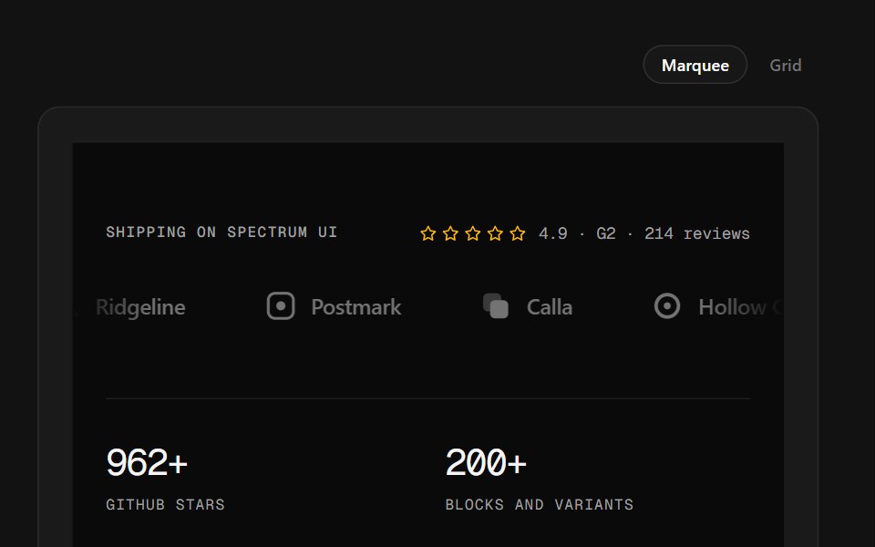 Logo Wall FooterSpectrum UI · ReactA customer logo wall — marquee or plotted grid — over stats and link columns.
 Logos CarouselSpell UI · ReactAnimated carousel component that cycles through sets of logos with staggered animations.
 Logo SliderVengeance UI · React
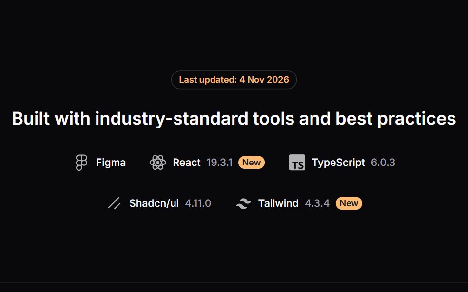 Logos SectionLaunch UI · React
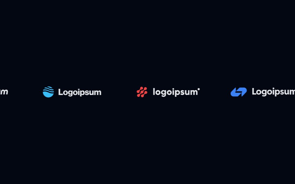 Logo Cloud 01Shadcn Space · ReactA simple logo cloud built with Shadcn styling, using a subtle background, underlined heading, and a flexible grid of…
 BrandsOpenSourceUI · React
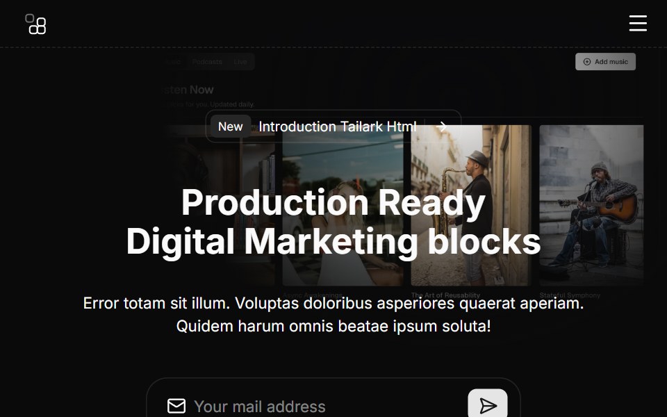 Hero Sixcnblocks · SvelteHero section with logo cloud below
 Spell Logo CarouselAnimations (Svelte) · Svelte
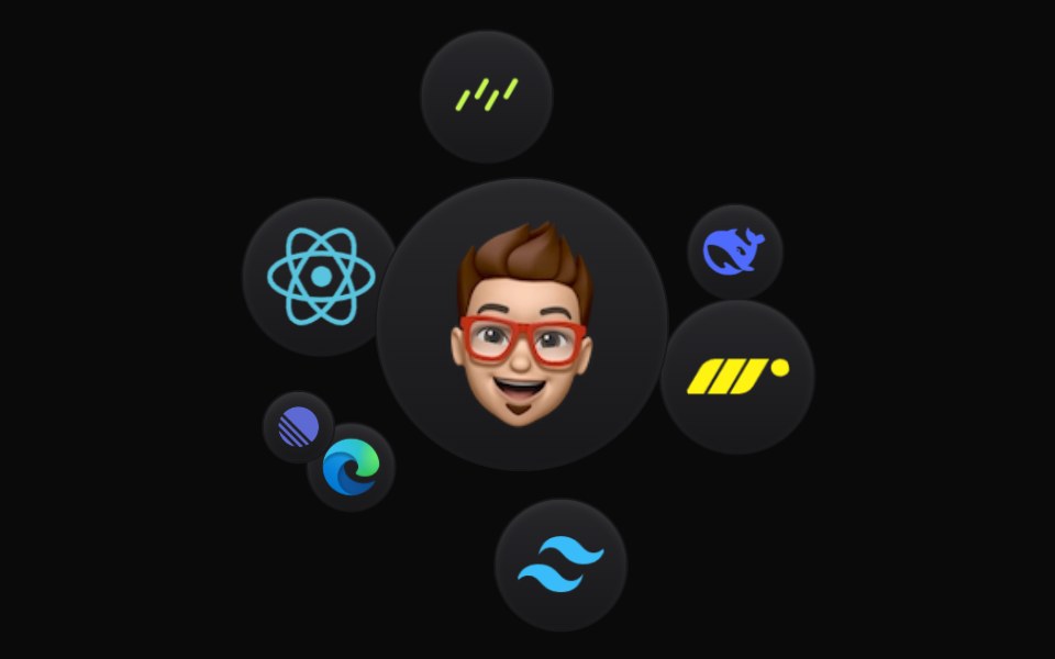 Cloud OrbitBadtz UI · ReactThis component creates a dynamic and interactive experience, where each icon orbits in a fluid motion. Fully…
 Logo Clouds 01Oxbow UI · Astro
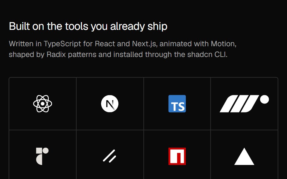 Social Proof Logo gridNexvyn UI · ReactThe tools a product is built with, as a quiet hairline logo grid under a short heading.
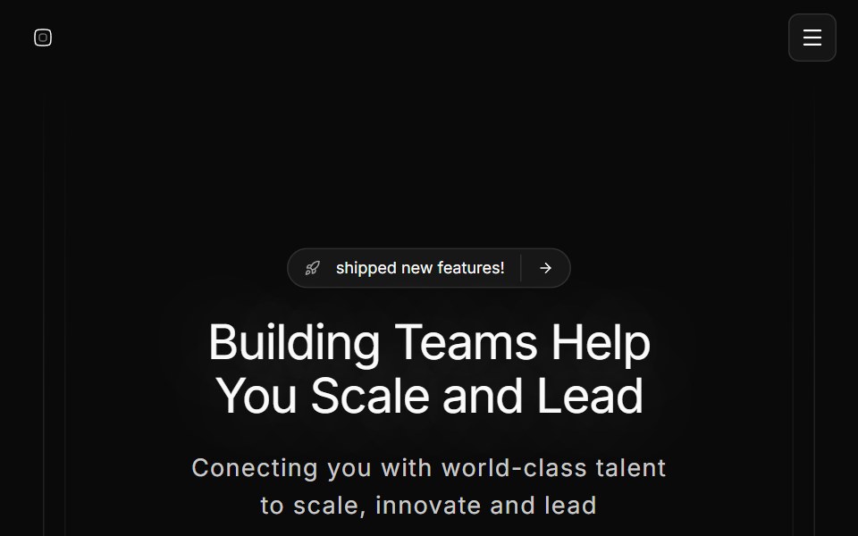 Hero Onesv-efferd · SvelteA full hero composition with sticky header, editorial spotlight, and a marquee trust band.
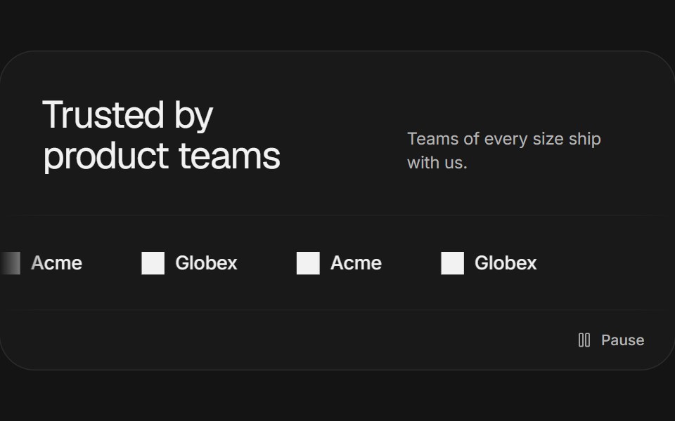 Logo marqueeArc Library · ReactA quiet, continuously moving row of brand marks with a pause control.
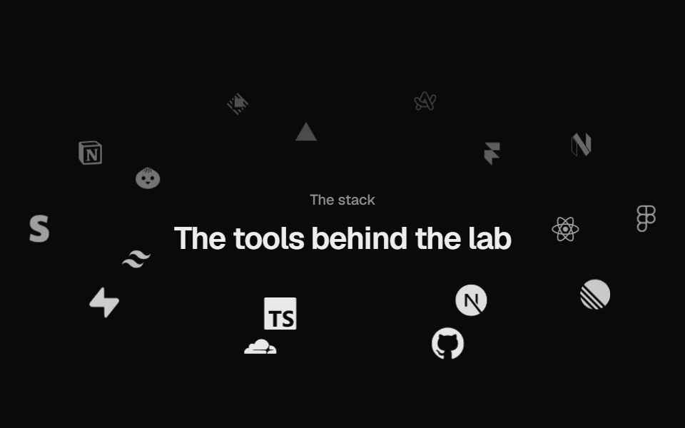 Logo OrbitUI Lab · ReactLogos orbit a heading on tilted rings, passing behind it, and brake to a stop when you point.
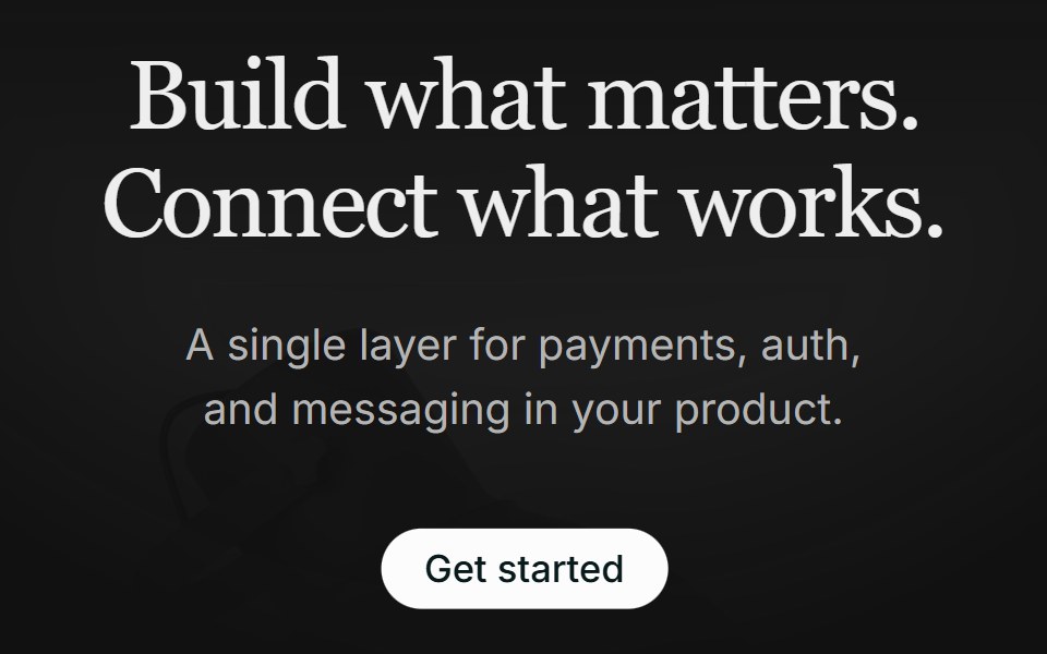 Hero 01FLX UI · ReactA centered serif hero with a soft gradient wash, pill CTA, and a floating integration cloud.
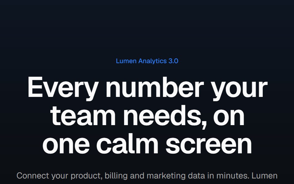 Product screenshot heroVelora UI · ReactCentered headline above a dashboard in a browser frame with a border beam and a logo row.
 Brand ShowcaseD2Studio UI · ReactA logo wall that rotates instead of scrolling. A marquee asks the eye to track a moving target; this holds a page of…
 Logo MarqueeReactFrame · ReactAn infinite scrolling row of client/partner logos with edge fade masks, grayscale-to-color hover reveal…
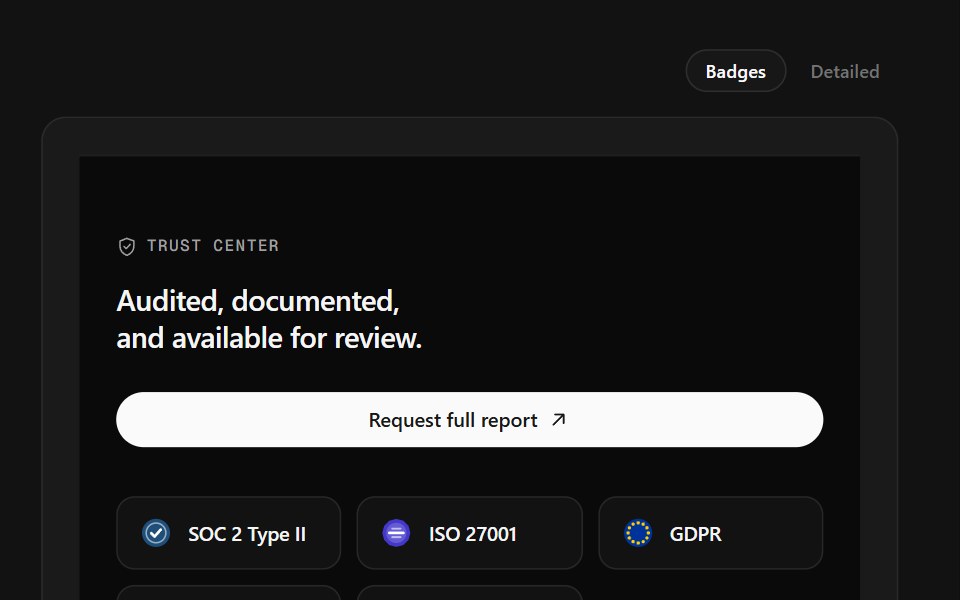 Trust Center FooterSpectrum UI · ReactCompliance marks that expand to scope, over a logo row and link columns.
 Stacked LogosVengeance UI · React
 Integration Cardscnblocks · SvelteCollection of integration card variants for logos
 Logo Clouds 02Oxbow UI · Astro
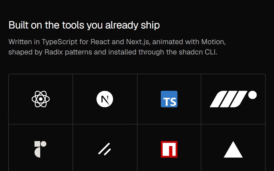 Social Proof Logo hoverNexvyn UI · ReactThe logo grid where the logos step back on hover or focus and a link fades in over them.
 Hero Threesv-efferd · SvelteA modern hero layout with mega-nav header, device mockup spotlight, and compact logo grid.
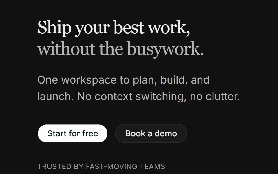 Hero 06FLX UI · ReactA split product hero with dual CTA, a compact logo row, and the Spot 01 illustration.
 Logo CloudVelora UI · ReactCustomer logos muted until hovered, so they read as texture.
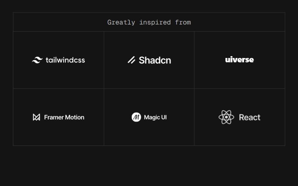 Cascade WallD2Studio UI · Reactbrand-showcase's rolling wall with the blur put back. The frame never moves and only the marks do: each cell is a…
 Testimonial LogosReactFrame · ReactA compact trust bar, a star rating with a helped-N-teams label above an infinite, edge-masked logo marquee.
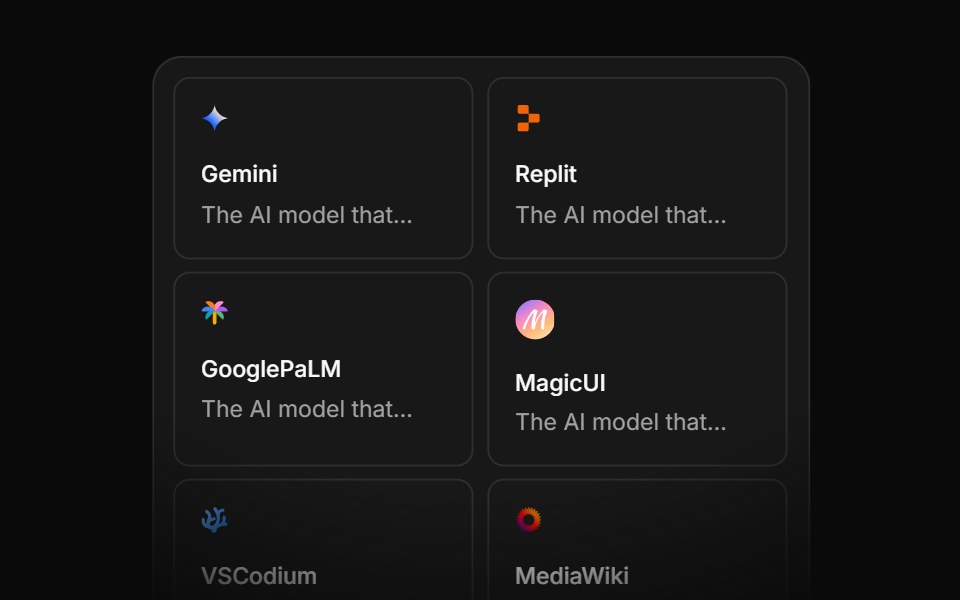 Integration Eightcnblocks · SvelteIntegration grid with animated connections
 Logo Clouds 03Oxbow UI · Astro
 Social Proof Logo marqueeNexvyn UI · ReactThe tools a product is built with, drifting in a slow seamless marquee with soft edges.
 Hero Twosv-efferd · SvelteA framed product hero with a floating screen, structured header, and bordered logo section.
 Logos 01FLX UI · ReactLogo carousel with auto-scroll, edge gradient and minimalist style.
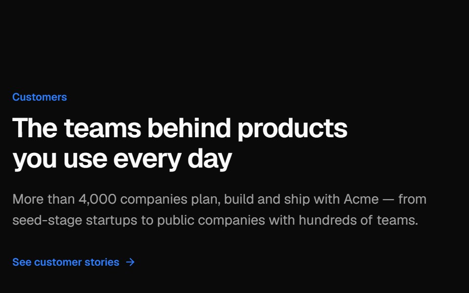 Logo gridVelora UI · ReactBordered grid of customer logos with a cursor spotlight per cell, beside a heading and stories link.
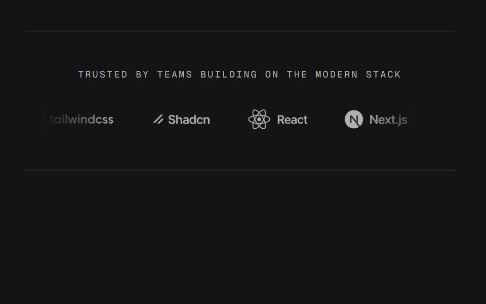 Logo MarqueeD2Studio UI · ReactA logo rail that never stops, and one the main thread never touches. The travel is a Web Animations API transform…
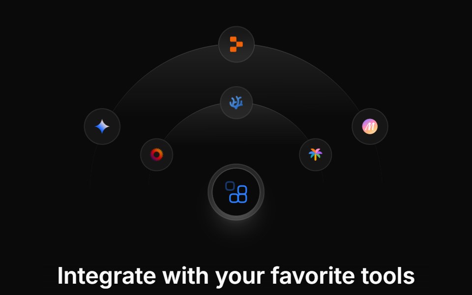 Integration Fivecnblocks · SvelteIntegration showcase with hover details
 Logo Clouds 04Oxbow UI · Astro
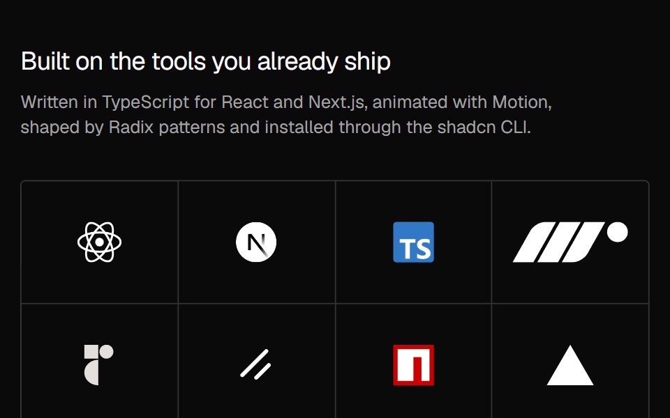 Social Proof Logo revealNexvyn UI · ReactThe logo grid with a staggered rise and fade that plays once when it first scrolls into view.
 Logo Cloud Fivesv-efferd · SvelteA flexible wrapped logo cloud designed for broader brand collections.
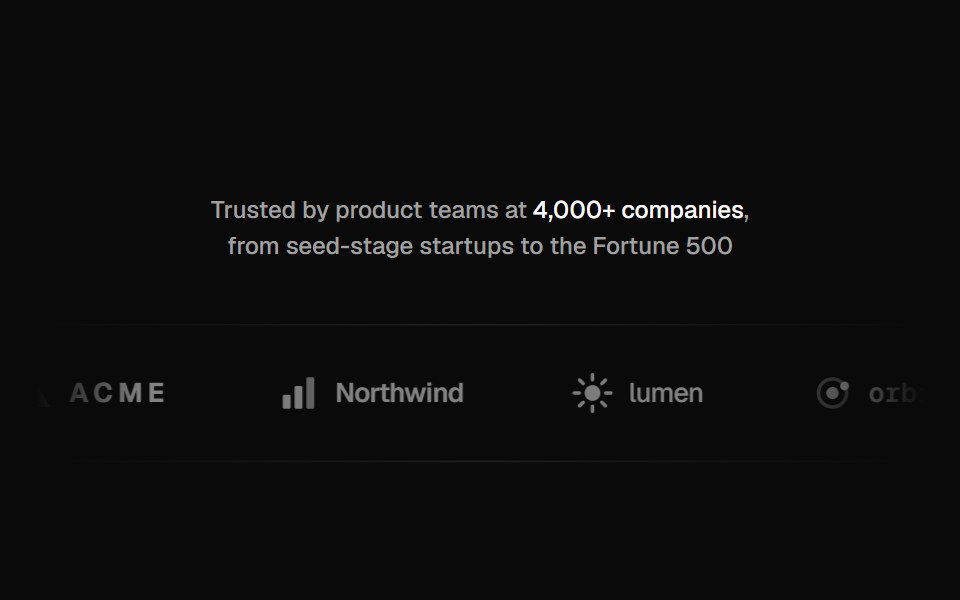 Logo marqueeVelora UI · ReactA “Trusted by” line over a scrolling strip of grayscale logos that take their colour on hover.
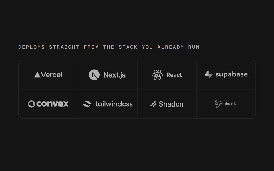 Logo RackD2Studio UI · ReactThe logo row with nothing moving in it: marks sitting still in ruled cells, which is the same shape a rack of machines…
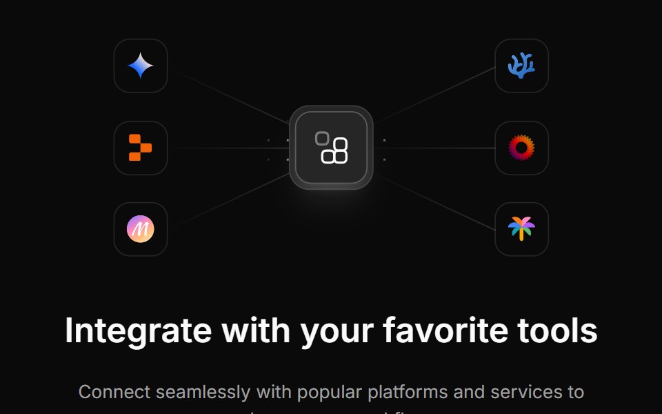 Integration Fourcnblocks · SvelteFour-column integration logo grid
 Logo Clouds 05Oxbow UI · Astro
 Logo Cloud Foursv-efferd · SvelteA marquee logo band with progressive edge blur and a layered track surface.
 Integration Onecnblocks · SvelteSimple integration logos in grid layout
 Logo Clouds 06Oxbow UI · Astro
 Logo Cloud Onesv-efferd · SvelteA clean partner grid with a framed card surface and balanced spacing.
 Integration Sevencnblocks · SvelteIntegration section with categories
 Logo Clouds 07Oxbow UI · Astro
 Logo Cloud Threesv-efferd · SvelteA scrolling logo marquee with a soft edge mask and editorial rhythm.
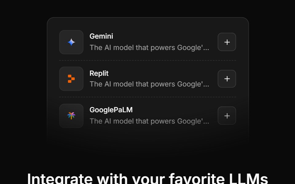 Integration Sixcnblocks · SvelteIntegration cards with descriptions
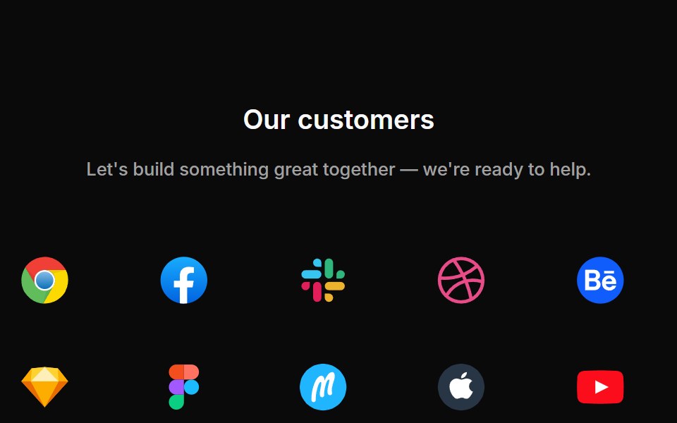 Logo Clouds 08Oxbow UI · Astro
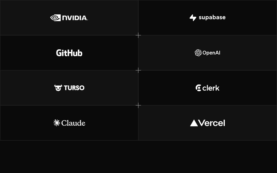 Logo Cloud Twosv-efferd · SvelteA bordered logo grid with alternating panels and decorative corner accents.
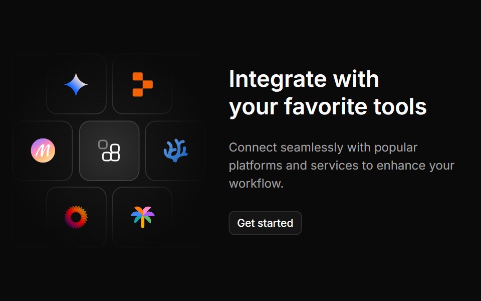 Integration Threecnblocks · SvelteThree-column integration with icons
 Logo Clouds 09Oxbow UI · Astro
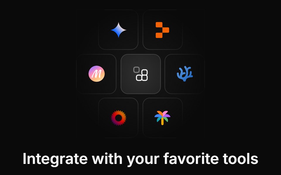 Integration Twocnblocks · SvelteTwo-row integration logo marquee
 Logo Clouds 10Oxbow UI · Astro
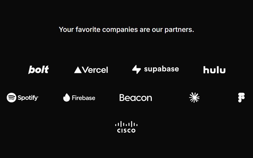 Logocloud Onecnblocks · SvelteLogo cloud with partner logos in a centered wrap layout
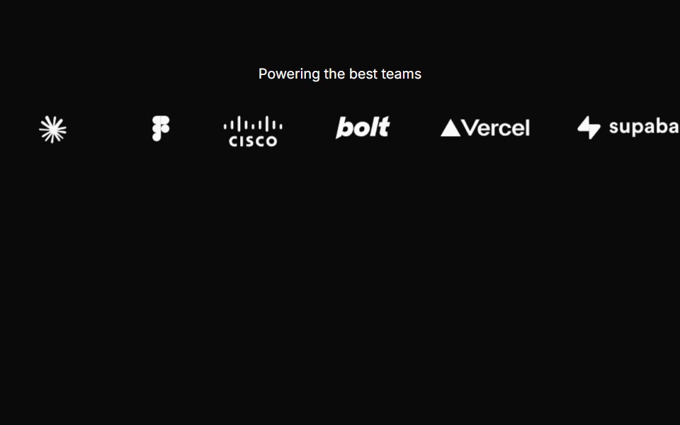 Logocloud Threecnblocks · SvelteScrolling logo cloud marquee with progressive blur edges
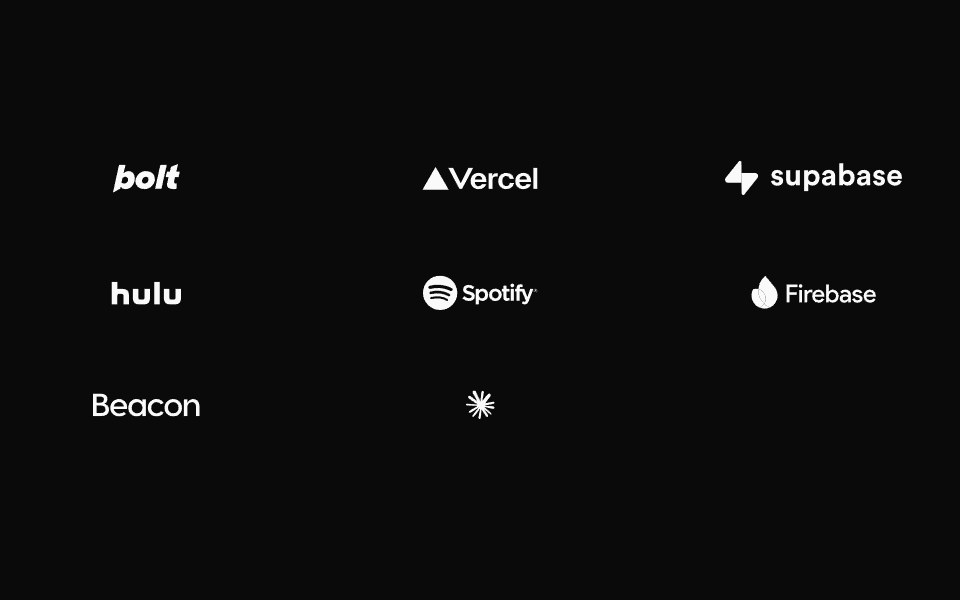 Logocloud Twocnblocks · SvelteInteractive logo cloud with hover call-to-action
Libraries with logo cloud components
Related categories
- React Logo Cloud Components
- Tailwind CSS Logo Cloud Components
- Svelte Logo Cloud Components
- Animated Logo Cloud Components
- Section Components
- Hero Components
- Feature Section Components
- Footer Components
- CTA Section Components
- FAQ Section Components
- Testimonials Section Components
- Gallery Section Components
- Integrations Section Components
- Stats Section Components
- Contact Section Components
- Team Section Components
- Blog Section Components
- Newsletter Section Components