 Dev Design Library
Hero Components
Dev Design Library indexes 134 hero components from 27 open-source UI libraries, with the most coming from Watermelon UI, FLX UI, Velora UI, cnblocks and Oxbow UI. Each one links to its page with the source code, a live preview where available, the library license and the install command. Hero components belong to the Sections group.
Showing 120 of 134, a mix from every library. Open a library to see all of its components.
 HerodaisyUI · CSS (Tailwind)
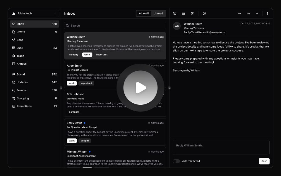 Hero Video DialogMagic UI · ReactA hero video dialog component.
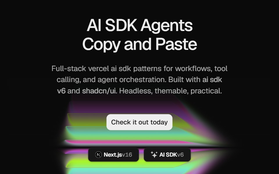 Hero Color PanelCult UI · ReactSplit-layout hero section with responsive ColorPanels shader visuals, CTA, and tech stack badges
- Magnetkit WebLibraries.dev · ReactLanding page of a magnetic UI kit: particles and elements pulled toward the cursor.
 Awesome HeroLobe UI · React
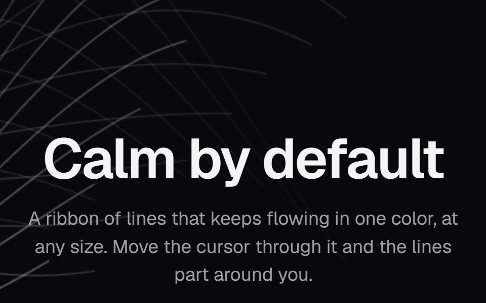 Background PathsKokonut UI · ReactA ribbon of lines in one color that keeps flowing at any size and parts around the cursor.
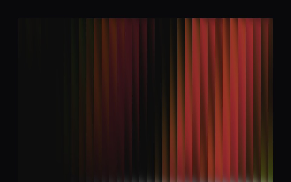 Aurora HeroVengeance UI · ReactFluted glass dynamic hero with interactive switch
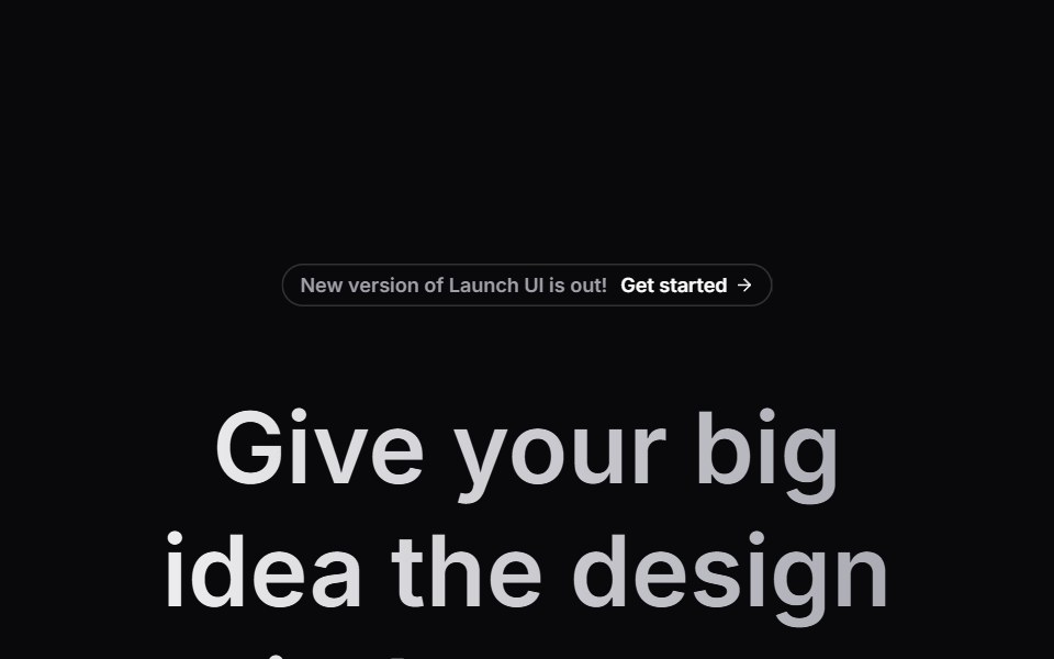 Hero SectionLaunch UI · React
 Hero 01 - Agency Hero SectionShadcn Space · ReactClean agency hero section designed for SaaS and startup websites, featuring bold headline, gradient background, trust…
 Hero Cover RevealPixel Perfect · ReactA scroll-driven hero cover reveal — the hero pins in place while the next section slides up and covers it, scrubbed by…
 LandingBoardUI · React
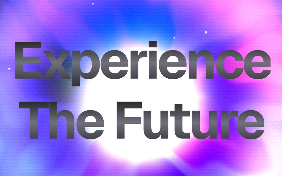 Dither Prism HeroComponentry · ReactStunning WebGL hero with advanced dithering, prismatic refraction, holographic iridescence, and center-focused energy.
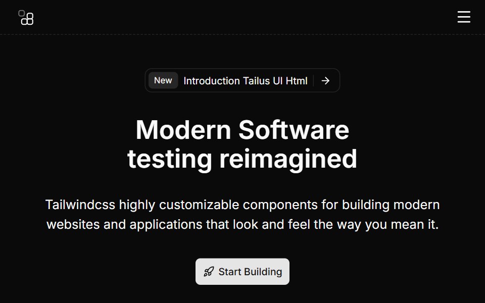 Hero Eightcnblocks · SvelteHero with video background and overlay
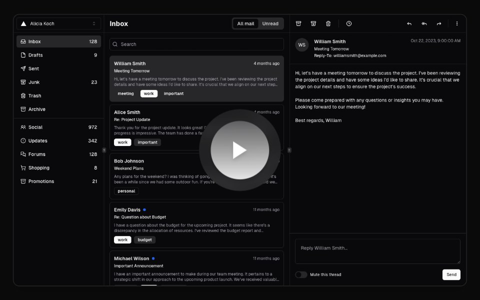 Hero Video DialogAnimations (Svelte) · SvelteA video dialog component with animated entrance effects, thumbnail support, and customizable animation styles.
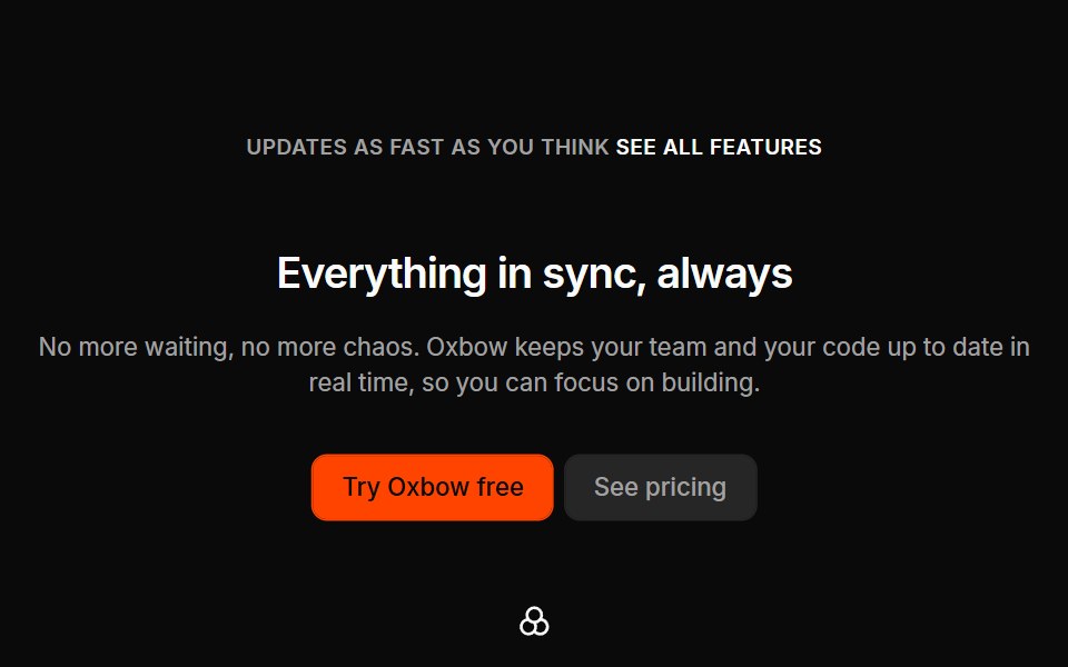 Marketing Heros 05Oxbow UI · AstroSimple with center text, image and features
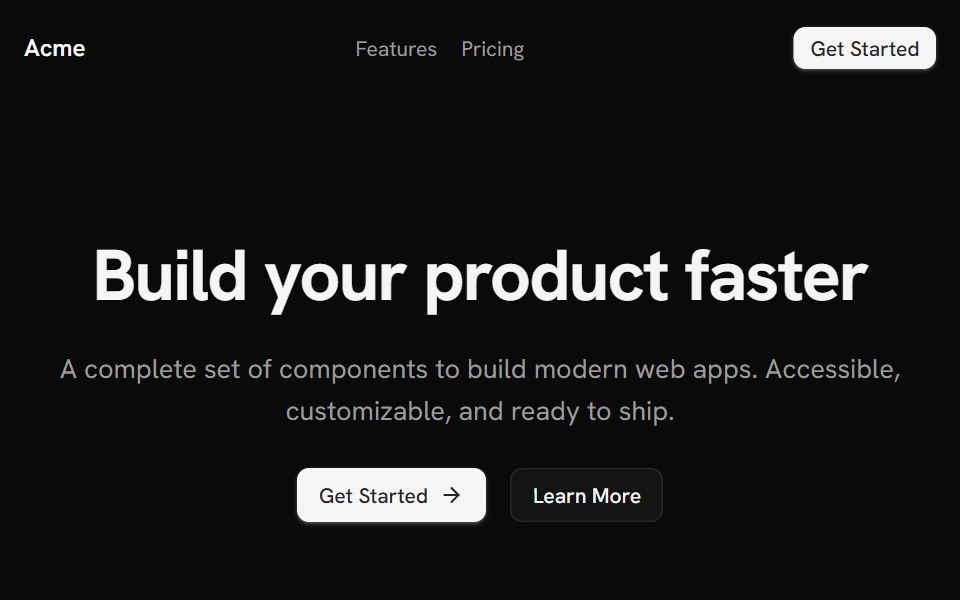 Template LandingShark UI · React
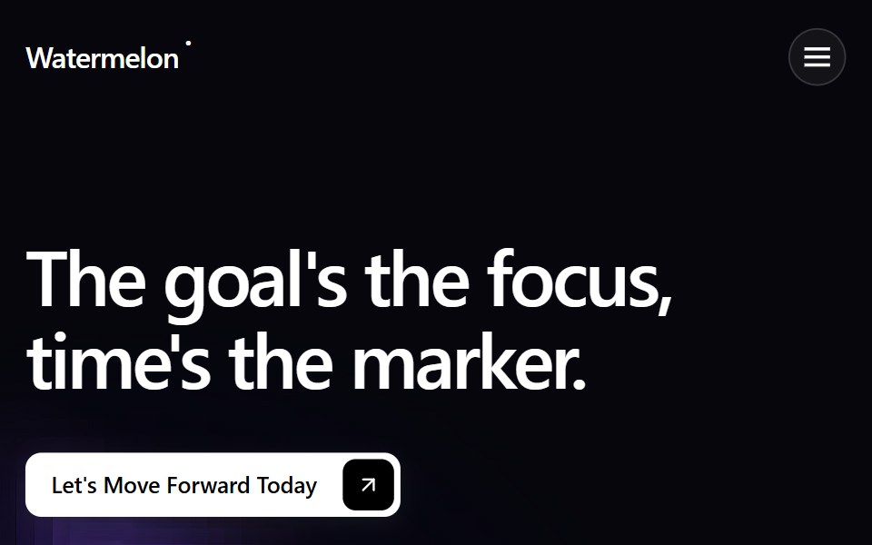 Hero 1Watermelon UI · React
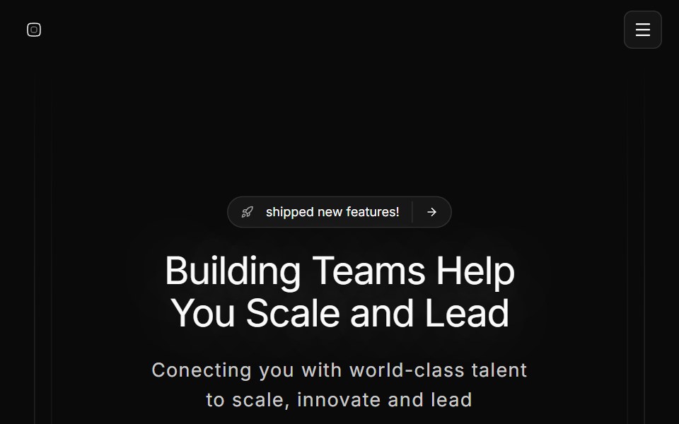 Hero Onesv-efferd · SvelteA full hero composition with sticky header, editorial spotlight, and a marquee trust band.
 Hero sectionArc Library · ReactThree full screen SaaS heroes: a live dashboard rising from the bottom edge over a drifting mesh, a workflow graph…
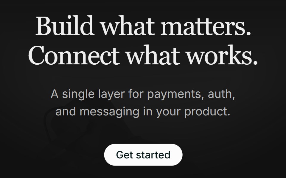 Hero 01FLX UI · ReactA centered serif hero with a soft gradient wash, pill CTA, and a floating integration cloud.
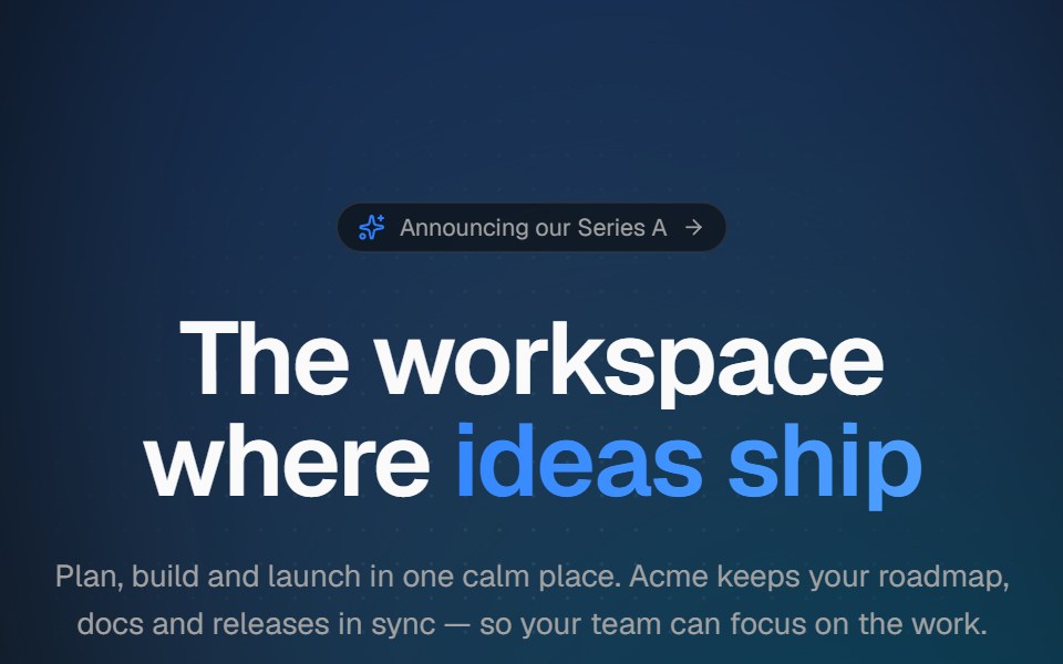 Aurora heroVelora UI · ReactCentered hero with a drifting aurora, dotted backdrop, announcement pill and staggered copy.
 Luna HeroPin UI · React
 Interactive Grid HeroSpaceUI · ReactInteractive proximity-reactive square cell grid canvas that softly rounds and insets cells within a focused radius…
 Interactive Grid HeroSkecher UI · ReactA full-page field of square cells that locally soften and round around a fine pointer.
 Hero 01D2Studio UI · ReactStartup mentorship landing hero with a headline, call to action and mentor avatar group.
 Cinematic Stacked GalleryReactFrame · ReactA fullscreen hero gallery where inactive slides collapse into a stacked deck of thumbnails; clicking one crossfades it…
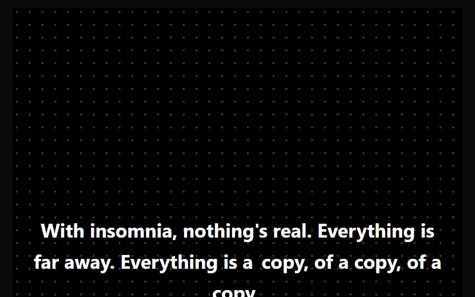 Hero HighlightAceternity UI · React
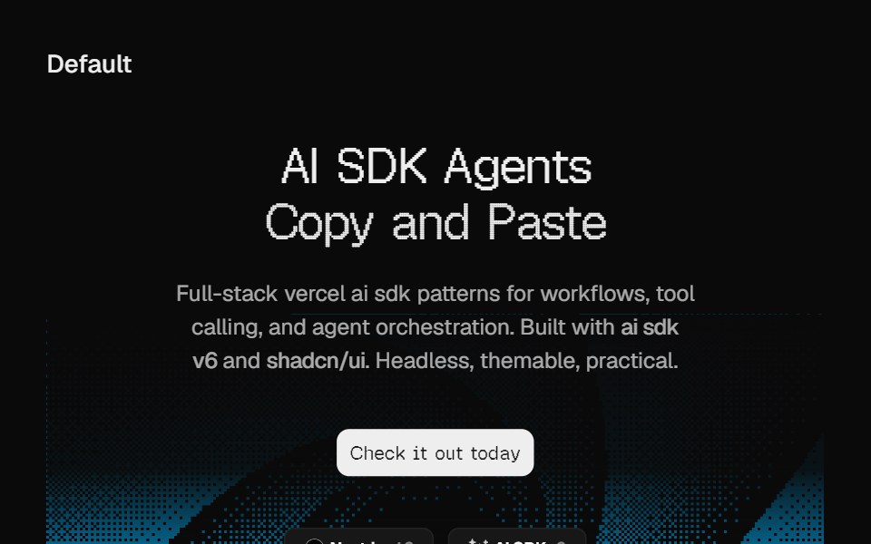 Hero DitheringCult UI · ReactSplit-layout hero section with responsive dithering shader visuals, CTA, and tech stack badges
 Awesome Landing HeroLobe UI · React
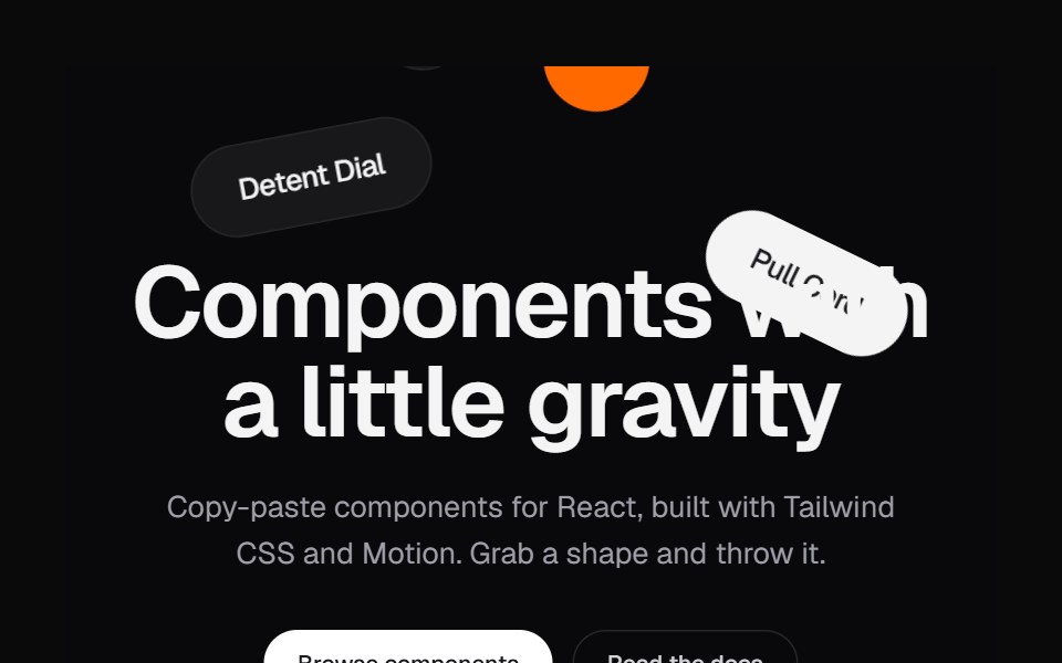 Shape HeroKokonut UI · ReactA landing hero where shapes drop in, pile up under the headline and can be grabbed and thrown.
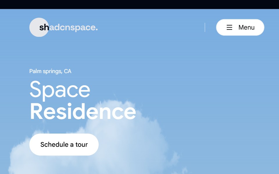 Hero 02 - Real Estate Hero SectionShadcn Space · ReactLuxury real estate hero section crafted for property listings, featuring immersive imagery, location highlight, key…
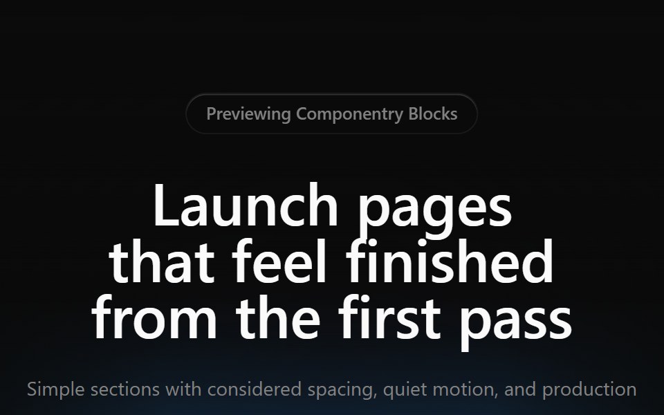 Gradient Hero 01Componentry · ReactA simple centered hero with a warm cinematic gradient, compact badge, short copy, and two actions.
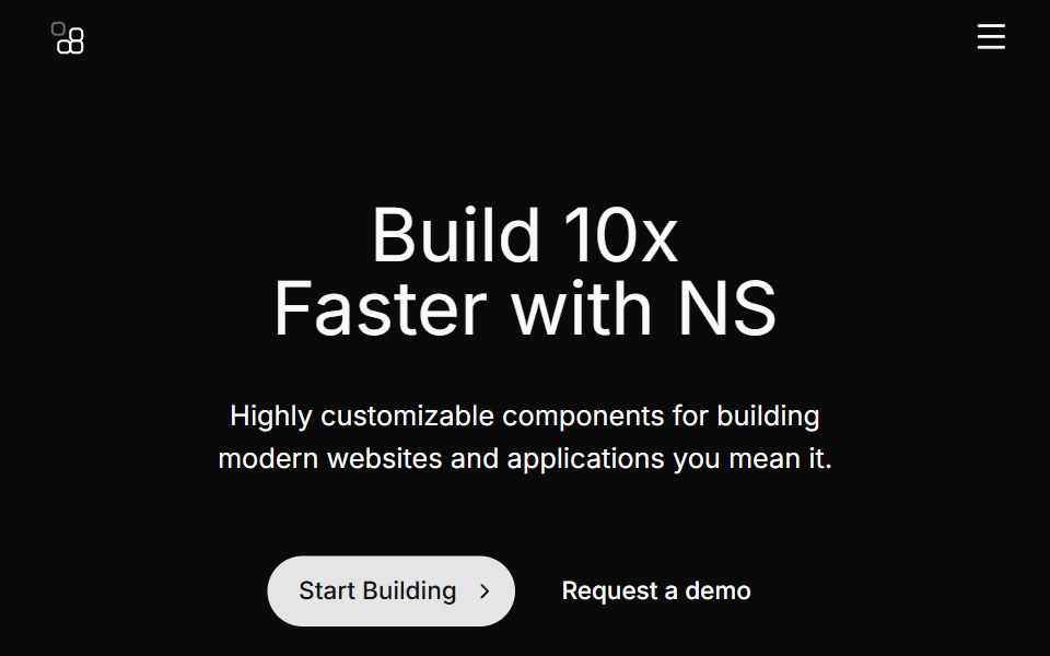 Hero Fivecnblocks · SvelteHero section with app mockup image
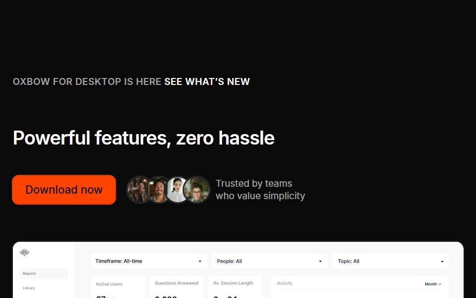 Marketing Heros 08Oxbow UI · AstroLeft aligned with imaged
 Hero 10Watermelon UI · React
 Hero Threesv-efferd · SvelteA modern hero layout with mega-nav header, device mockup spotlight, and compact logo grid.
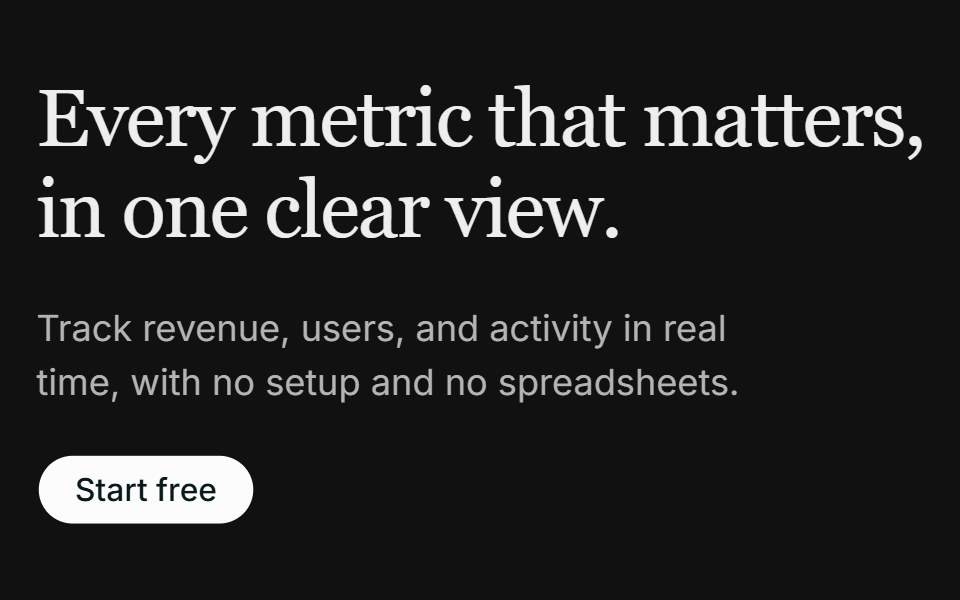 Hero 02FLX UI · ReactA left-aligned serif hero with a media panel: an image backdrop with a floating dashboard mockup on top.
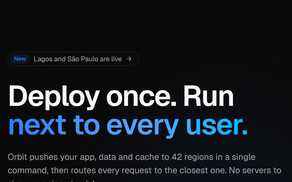 Globe split heroVelora UI · ReactSplit hero with copy, CTAs and live stats beside an interactive dotted globe with arcs.
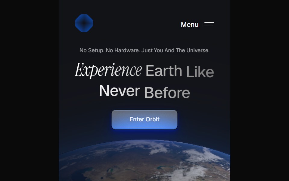 Orbit HeroPin UI · React
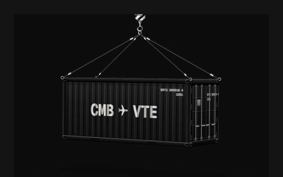 Container HeroD2Studio UI · ReactA one-screen hero on a plain background: a 20ft shipping container built as a real box in CSS 3D, three quarters on…
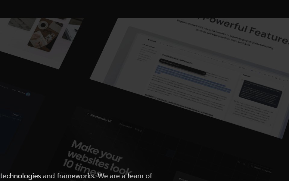 Hero ParallaxAceternity UI · React
 Hero HeatmapCult UI · ReactSplit-layout hero section with responsive Heatmap shader visuals, CTA, and tech stack badges
 Hero 03 - Digital Agency Hero SectionShadcn Space · ReactHigh-impact digital agency hero section with cinematic background video, bold typography, brand driven headline, and…
 Hero GeometricComponentry · ReactGeometric shapes and patterns for hero sections.
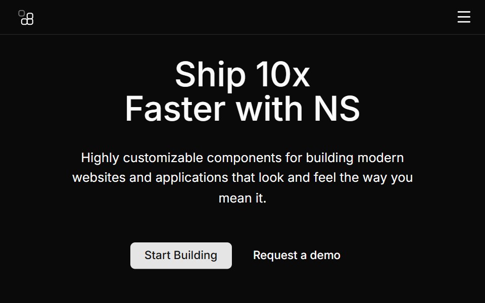 Hero Fourcnblocks · SvelteSplit hero with image on right side
 Marketing Heros 01Oxbow UI · Astro
 Hero 11Watermelon UI · React
 Hero Twosv-efferd · SvelteA framed product hero with a floating screen, structured header, and bordered logo section.
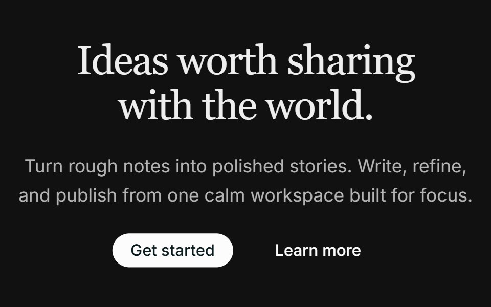 Hero 03FLX UI · ReactA centered hero with dual CTAs and an image that fades into the page below the copy.
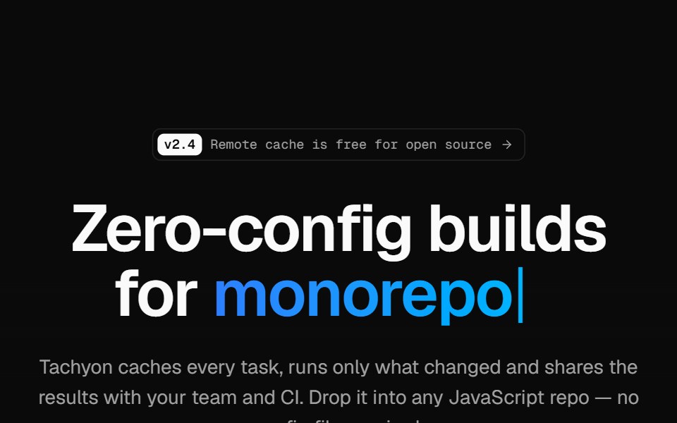 Developer tool heroVelora UI · ReactMinimal hero on a retro grid with a typed headline accent, an install terminal and two CTAs.
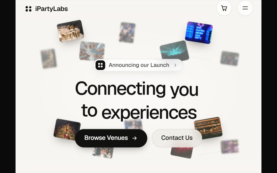 Partylabs HeroPin UI · React
 Hero Section 01D2Studio UI · ReactPremium landing page hero with a serif accent headline, badge and mentor avatar group.
 Images SliderAceternity UI · React
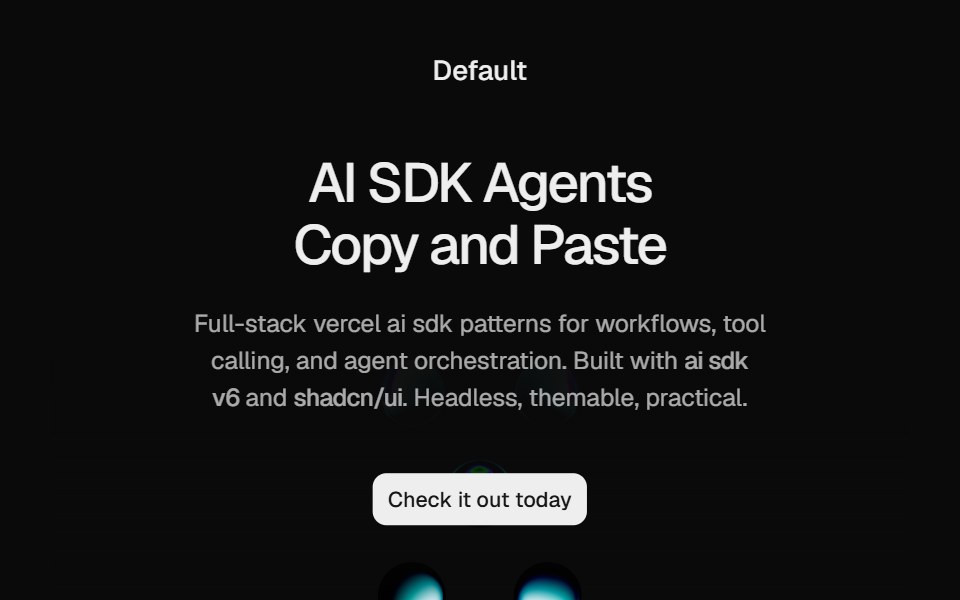 Hero Liquid MetalCult UI · ReactSplit-layout hero section with responsive LiquidMetal shader visuals, CTA, and tech stack badges
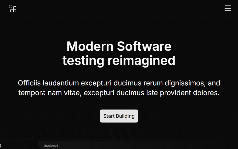 Hero Ninecnblocks · SvelteHero with animated background elements
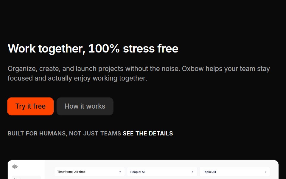 Marketing Heros 02Oxbow UI · Astro
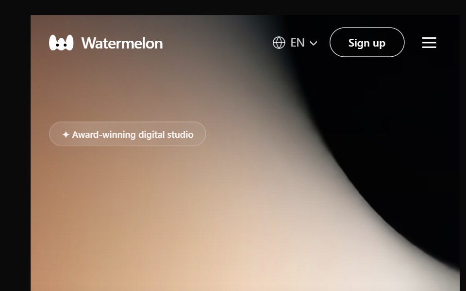 Hero 12Watermelon UI · React
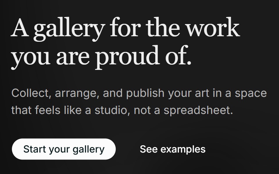 Hero 04FLX UI · ReactA two-column editorial hero with a soft background wash and a layered collage of two overlapping images.
 Hero ParallaxVelora UI · ReactHero copy over three card rows that slide apart as a tilted block flattens.
 Hero Section 02D2Studio UI · ReactModern landing page hero section with badge, headline and avatar social proof.
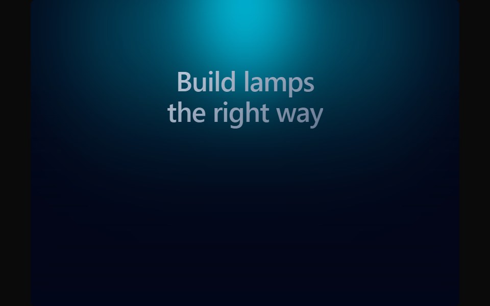 LampAceternity UI · React
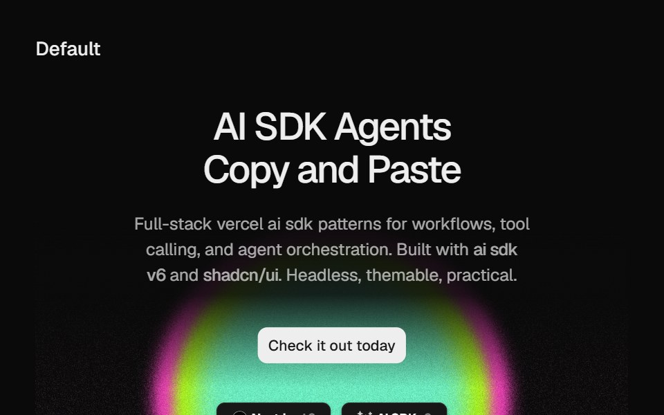 Hero Static Radial GradientCult UI · ReactSplit-layout hero section with responsive StaticRadialGradient shader visuals, CTA, and tech stack badges
 Hero Onecnblocks · SvelteClassic centered hero with headline and CTA
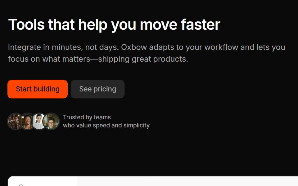 Marketing Heros 03Oxbow UI · Astro
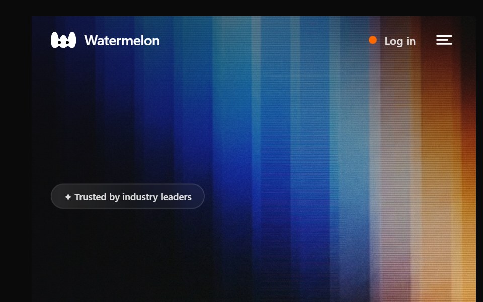 Hero 13Watermelon UI · React
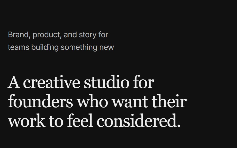 Hero 05FLX UI · ReactAn editorial hero with a left tagline, right-aligned headline and copy, and a full-width image below.
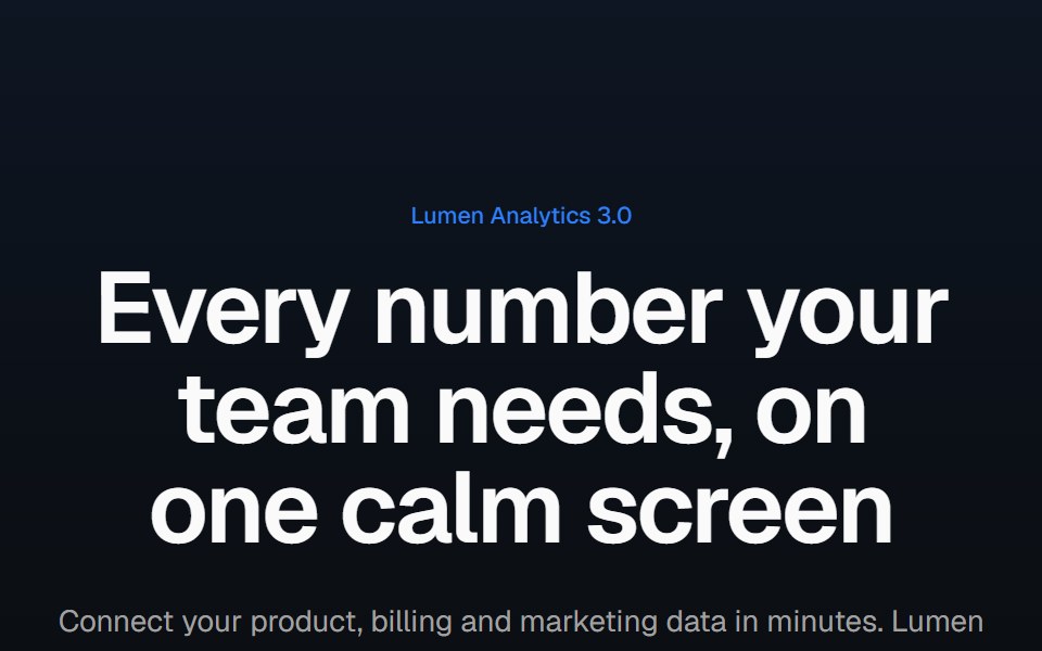 Product screenshot heroVelora UI · ReactCentered headline above a dashboard in a browser frame with a border beam and a logo row.
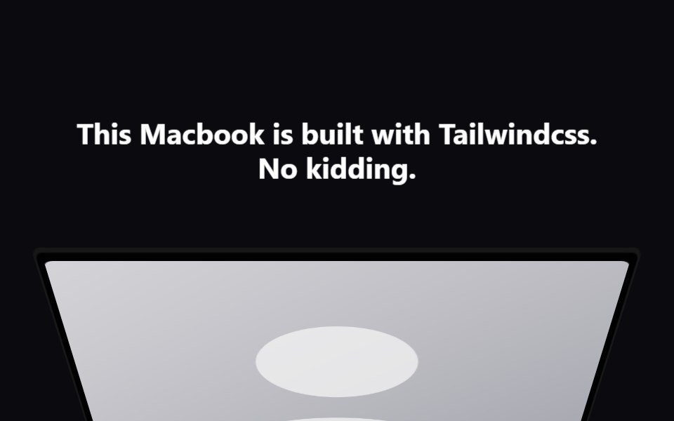 Macbook ScrollAceternity UI · React
 Marketing Hero AnalyticsCult UI · ReactAnalytics hero section for marketing pages
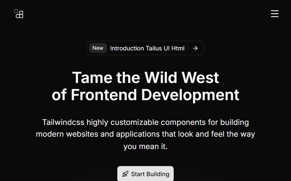 Hero Sevencnblocks · SvelteHero with gradient background and stats
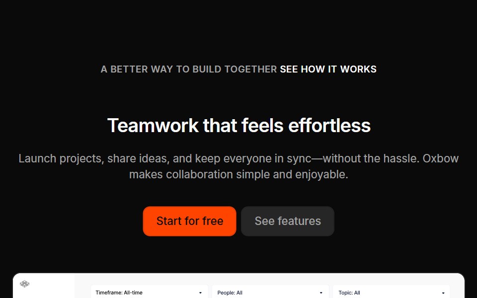 Marketing Heros 04Oxbow UI · Astro
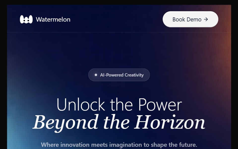 Hero 14Watermelon UI · React
 Hero 06FLX UI · ReactA split product hero with dual CTA, a compact logo row, and the Spot 01 illustration.
 Phone split heroVelora UI · ReactApp launch hero with an email capture on the left and an app screen in an iPhone frame.
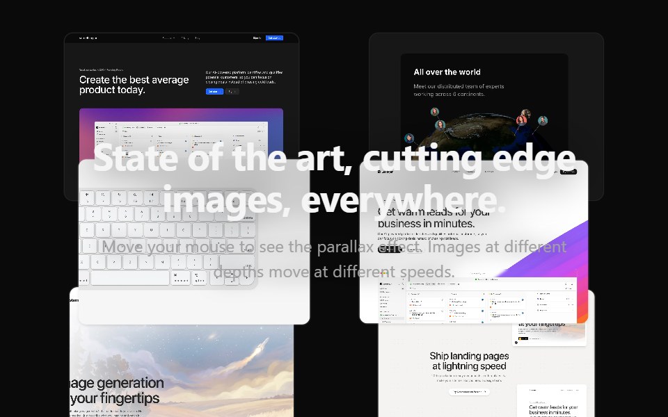 Parallax Hero ImagesAceternity UI · React
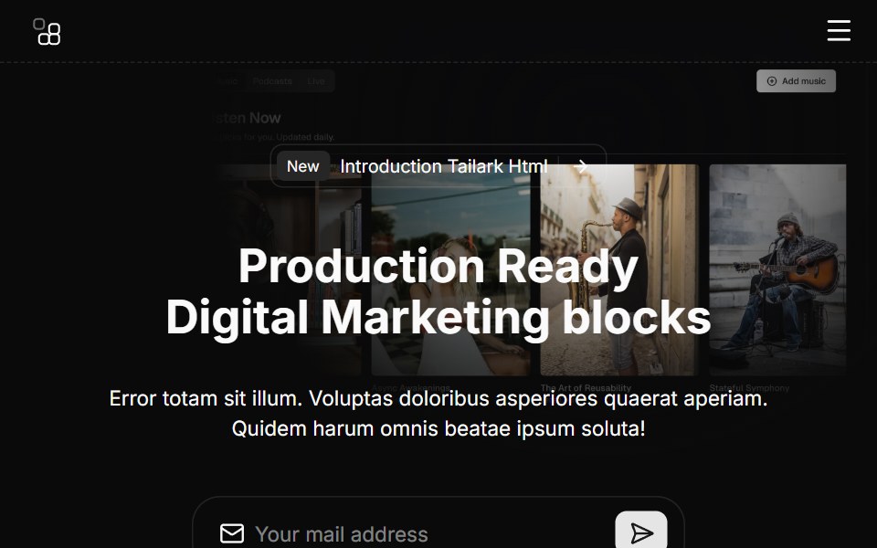 Hero Sixcnblocks · SvelteHero section with logo cloud below
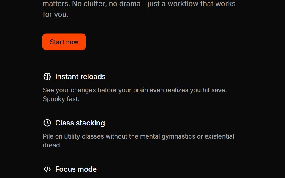 Marketing Heros 06Oxbow UI · Astro
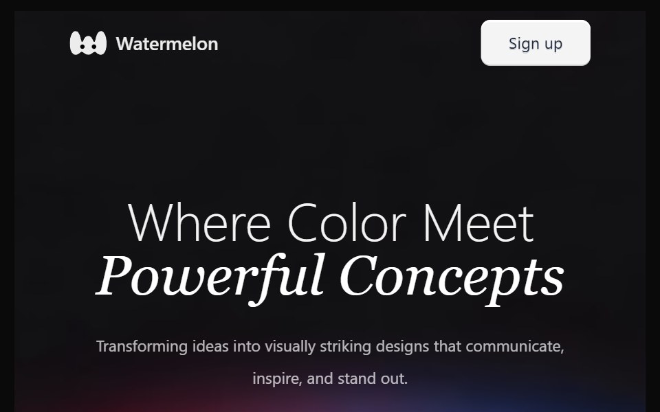 Hero 15Watermelon UI · React
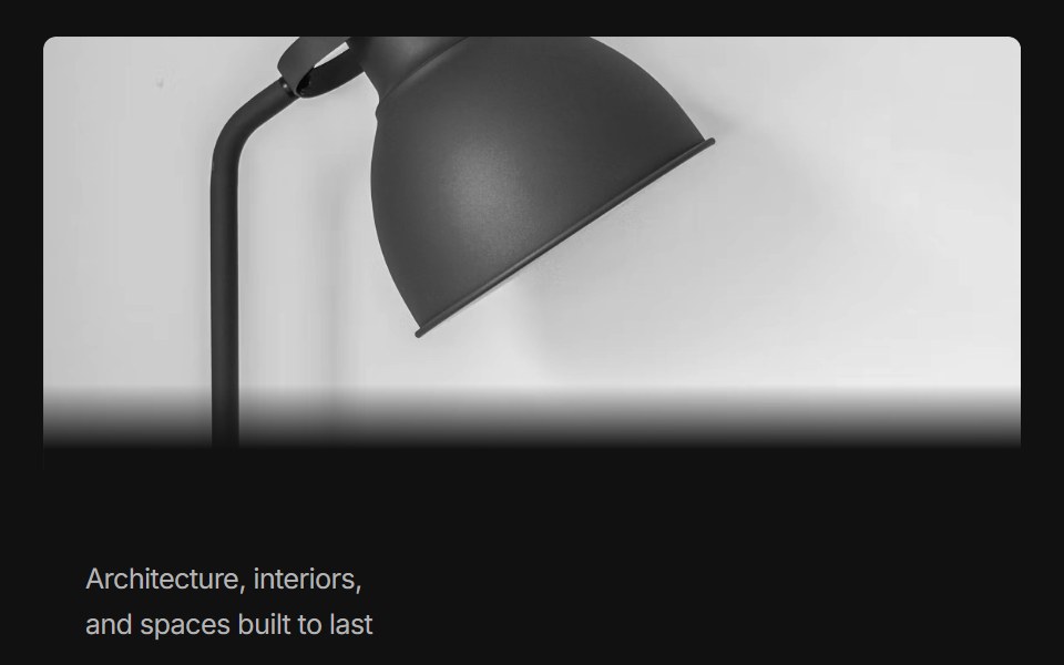 Hero 07FLX UI · ReactAn editorial hero with a full-width image above, a top-aligned tagline, and right-aligned headline and copy below.
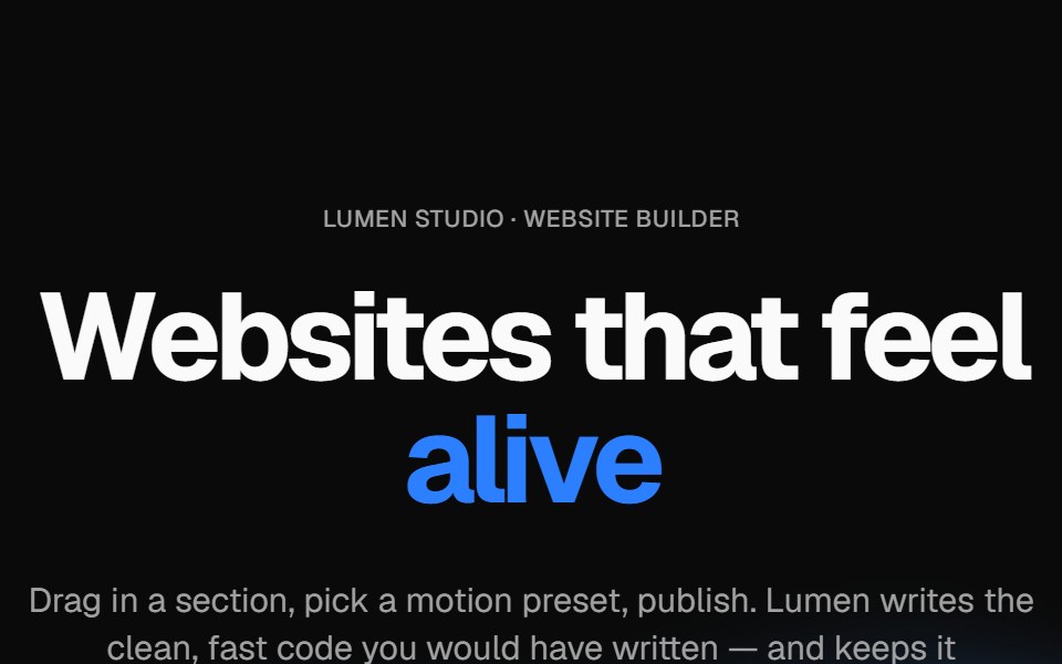 Wavy heroVelora UI · ReactBold centered hero over flowing waves, with a rotating headline word and avatar social proof.
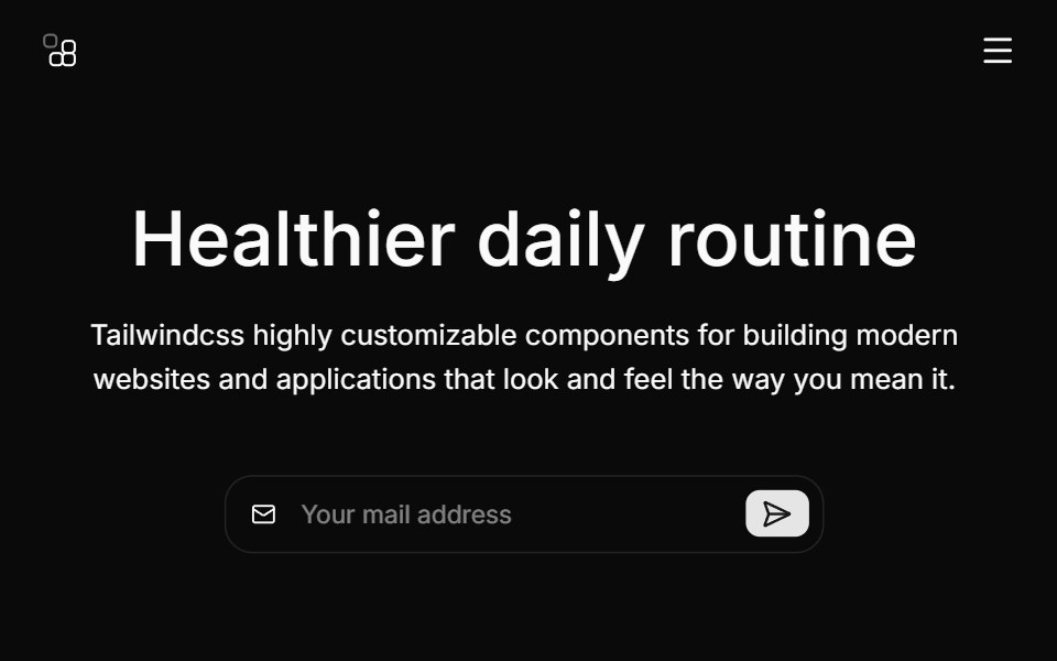 Hero Threecnblocks · SvelteHero with background image and overlay
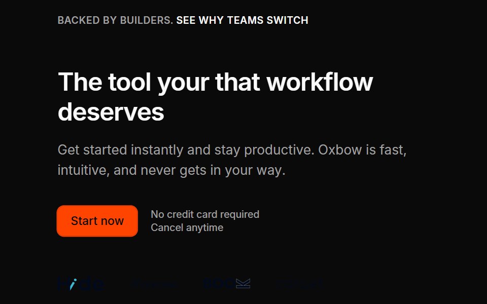 Marketing Heros 07Oxbow UI · Astro
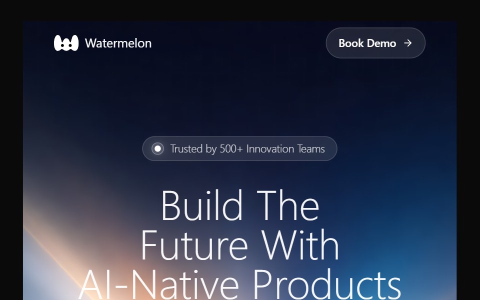 Hero 16Watermelon UI · React
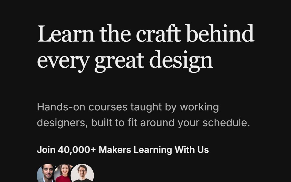 Hero 08FLX UI · ReactA split hero with a bold headline, avatar social proof, and two image cards with invertible overlay text and CTAs.
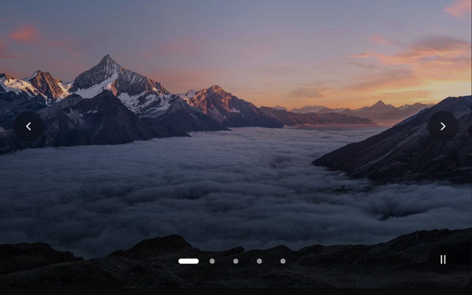 Image SliderVelora UI · ReactFull-bleed image slider with crossfade-zoom, autoplay, dots, arrows and swipe.
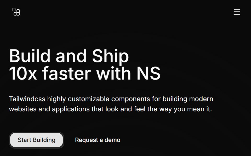 Hero Twocnblocks · SvelteTwo-column hero with image carousel
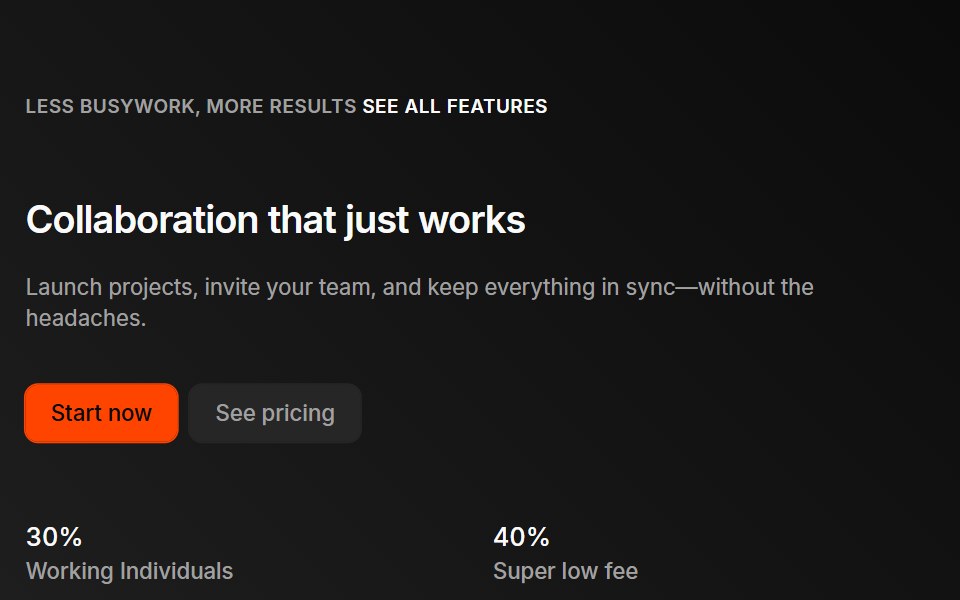 Marketing Heros 09Oxbow UI · Astro
 Hero 17Watermelon UI · React
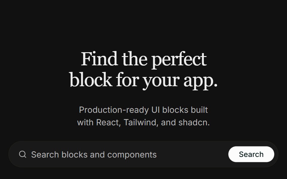 Hero 09FLX UI · ReactA centered real-estate hero with a search bar, a masked architecture image that fades into the page, and a split…
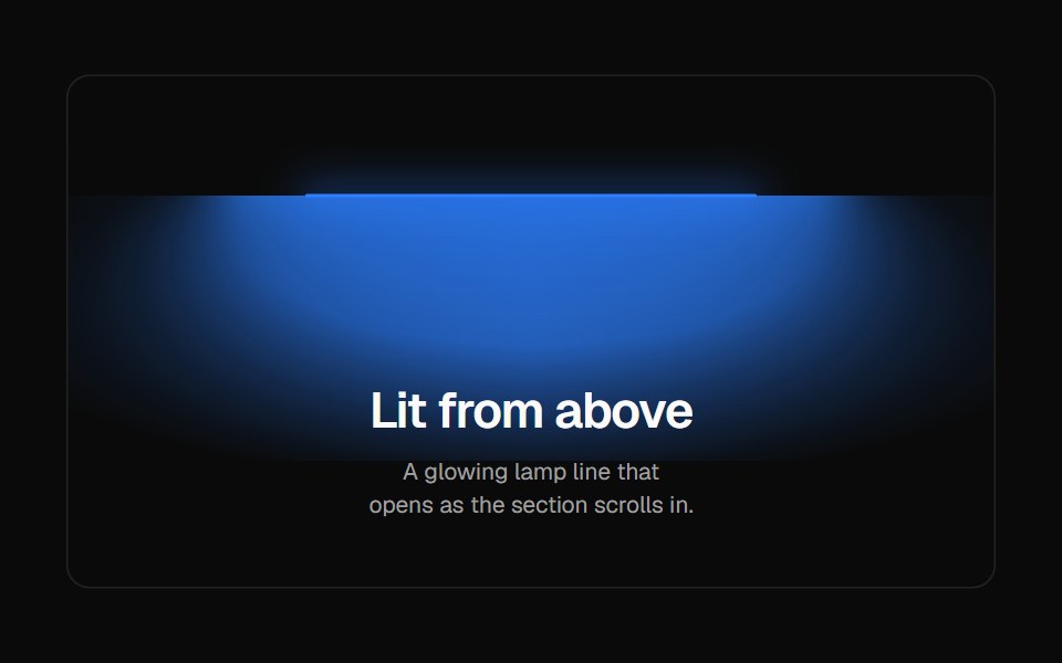 LampVelora UI · ReactA glowing lamp-line header that expands into view.
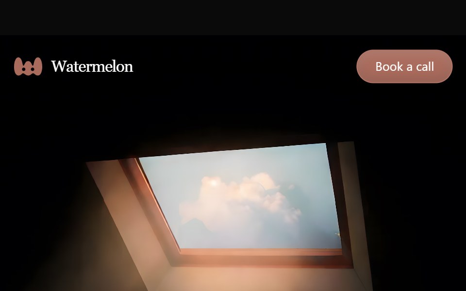 Hero 18Watermelon UI · React
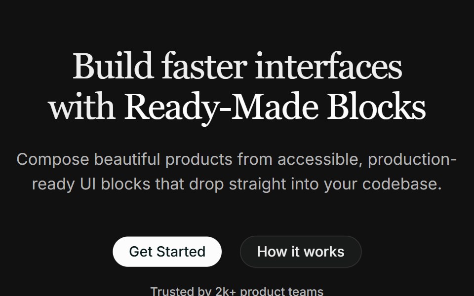 Hero 10FLX UI · ReactA centered hero with a highlighted headline, dual CTAs, social proof, and a fanned collage of three overlapping images.
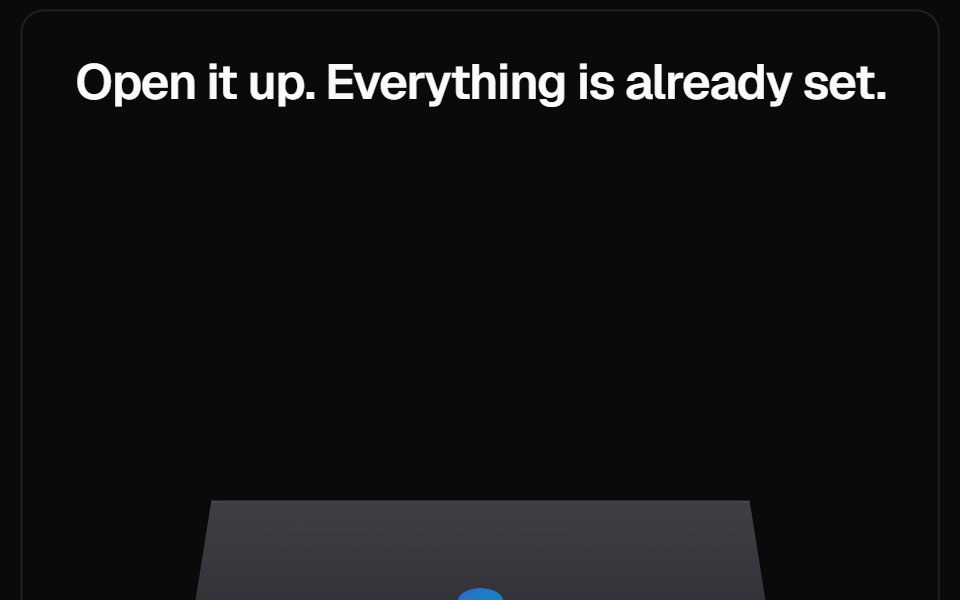 Macbook ScrollVelora UI · ReactA CSS-drawn laptop pins in place and opens its lid as the screenshot scales up.
 Hero 19Watermelon UI · React
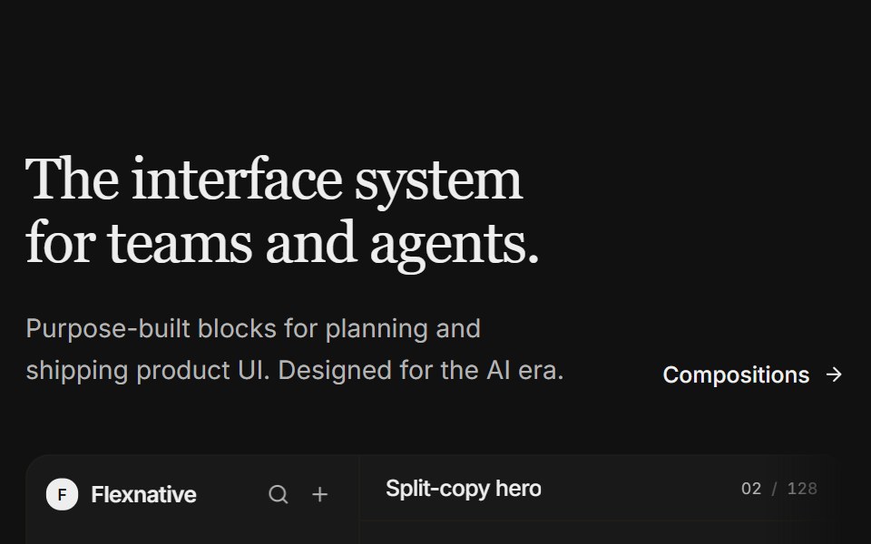 Hero 11FLX UI · ReactA split-copy hero with a light product studio mock — issue feed, properties, and a floating agent panel that fades…
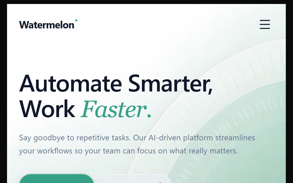 Hero 2Watermelon UI · React
 Hero 12FLX UI · ReactA full-bleed image hero with an oversized name, an established label, and a floating pill CTA anchored to the corner.
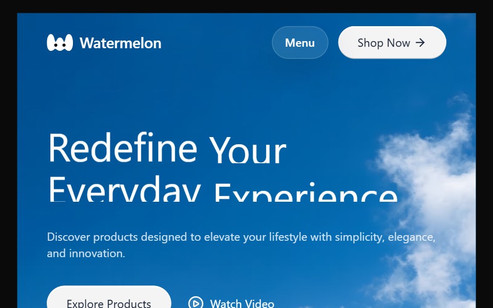 Hero 20Watermelon UI · React
 Hero 13FLX UI · ReactAsymmetric editorial hero with serif brand title, supporting copy, and two overlapping media frames.
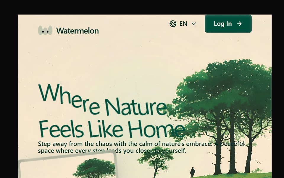 Hero 21Watermelon UI · React
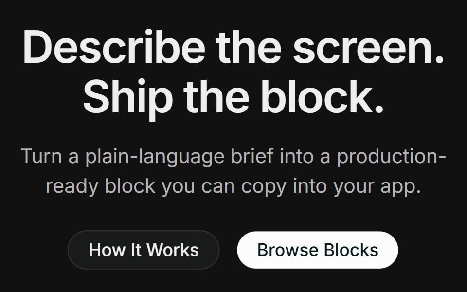 Hero 14FLX UI · ReactA centered product hero with dual CTAs, a full-width photo with a floating block-builder demo panel, and a logo strip.
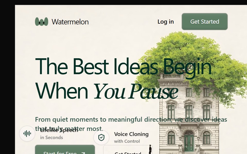 Hero 22Watermelon UI · React
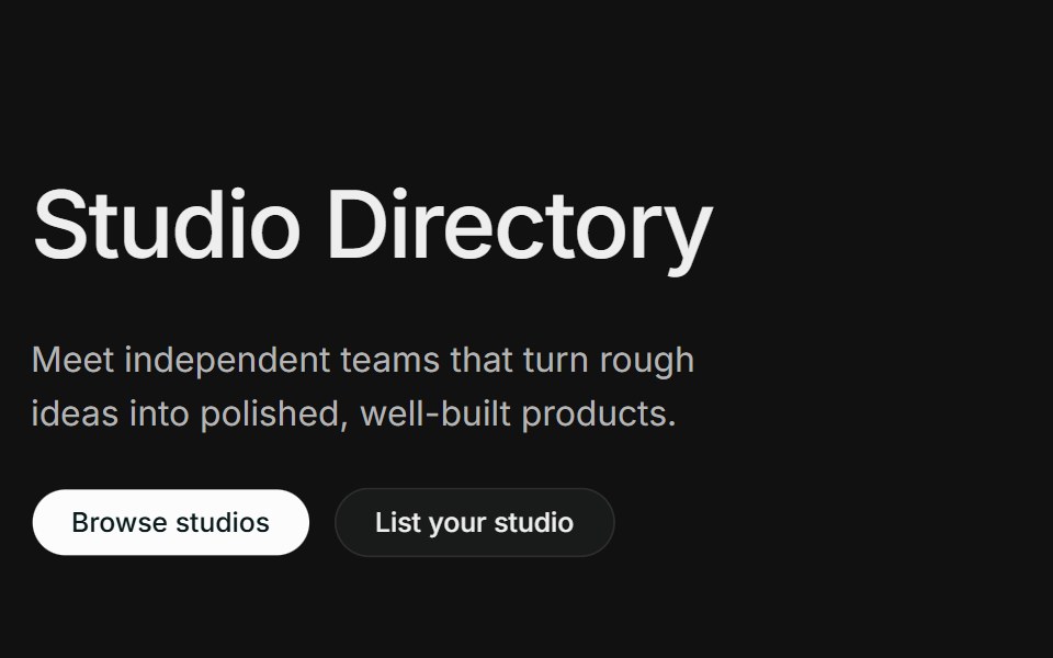 Hero 15FLX UI · ReactA directory-style hero with an oversized title, split intro with dual CTAs, and a row of wordmark cards with minimal…
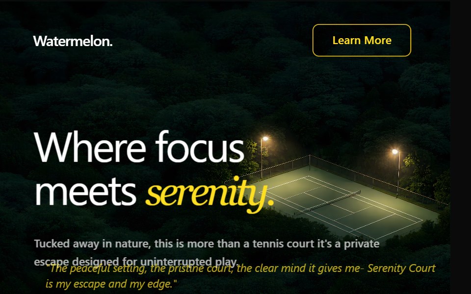 Hero 23Watermelon UI · React
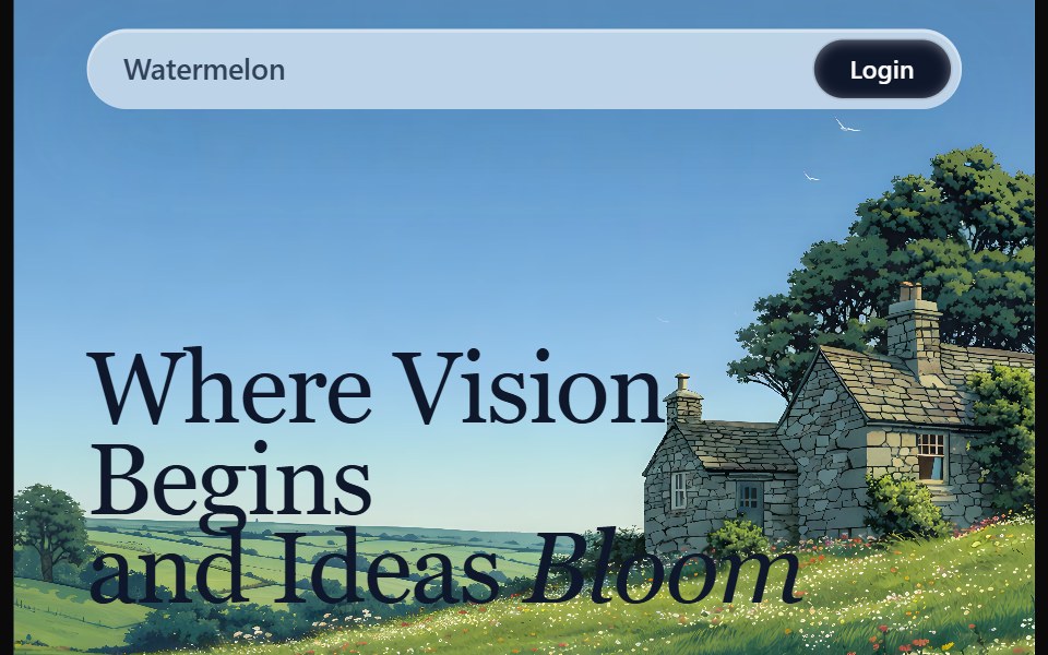 Hero 24Watermelon UI · React
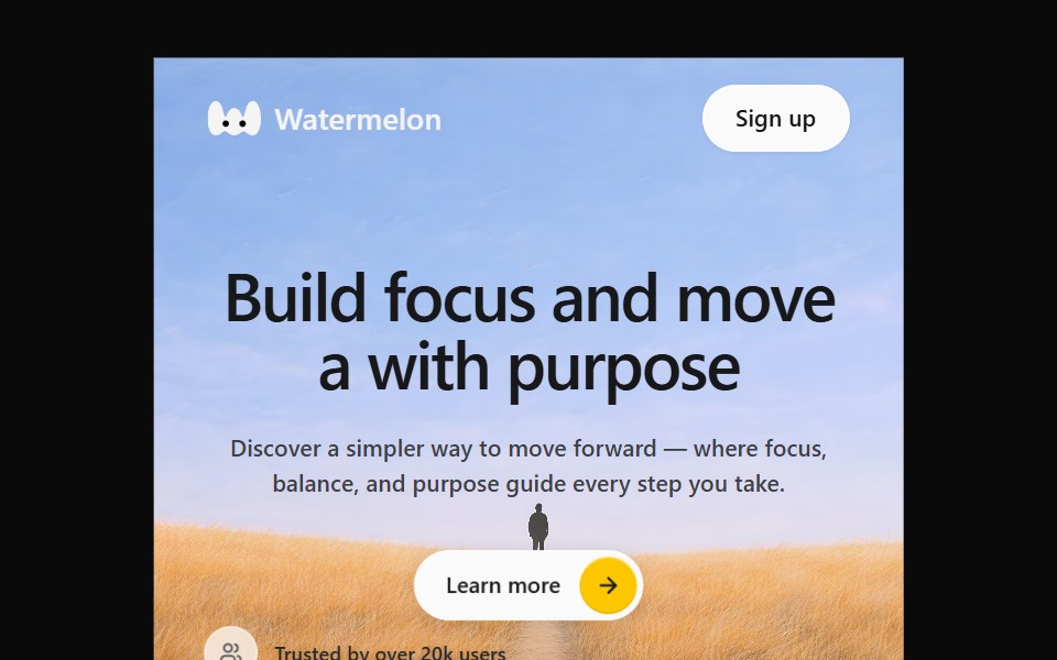 Hero 25Watermelon UI · React
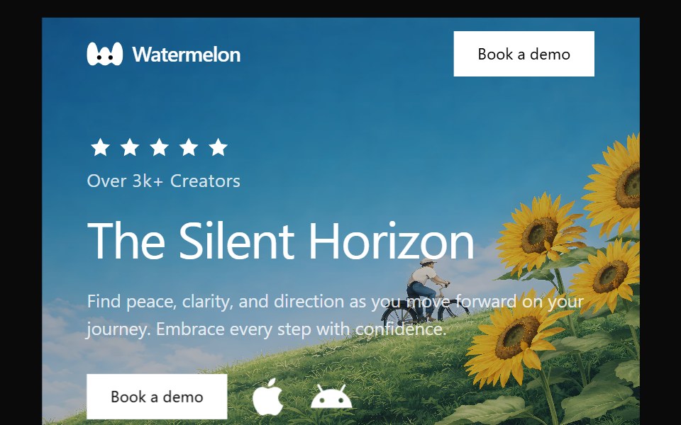 Hero 26Watermelon UI · React
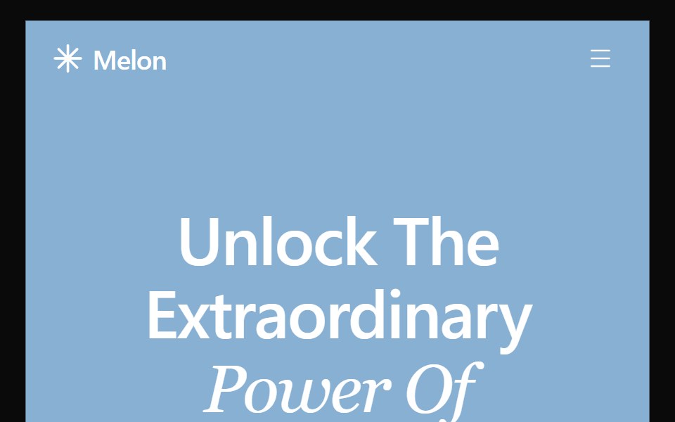 Hero 27Watermelon UI · React
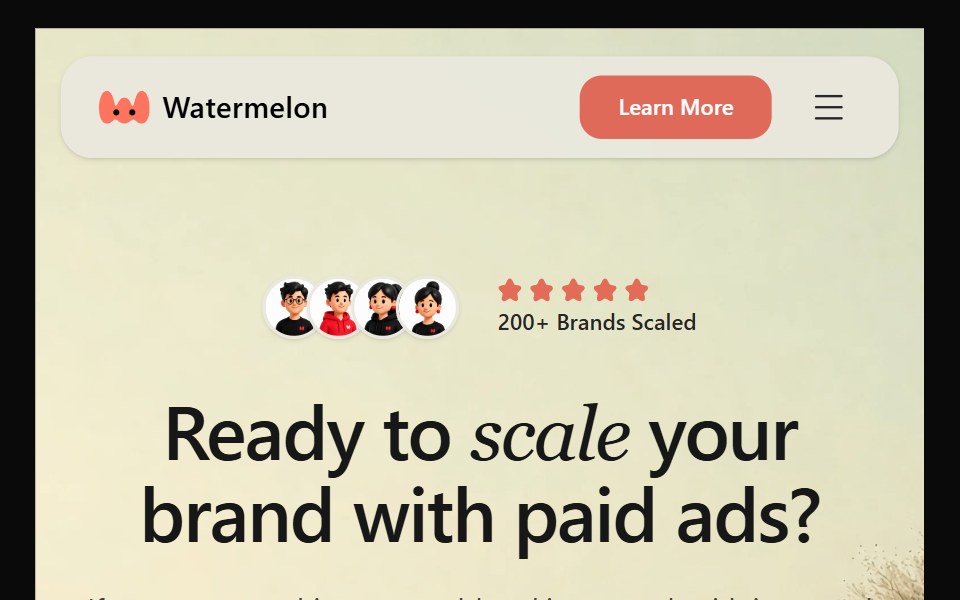 Hero 28Watermelon UI · React
 Hero 29Watermelon UI · React
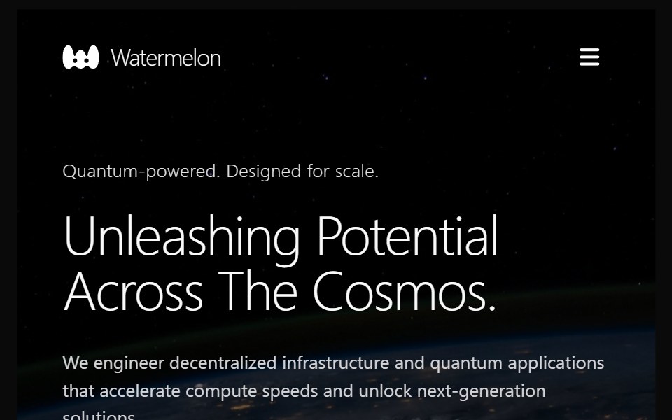 Hero 3Watermelon UI · React
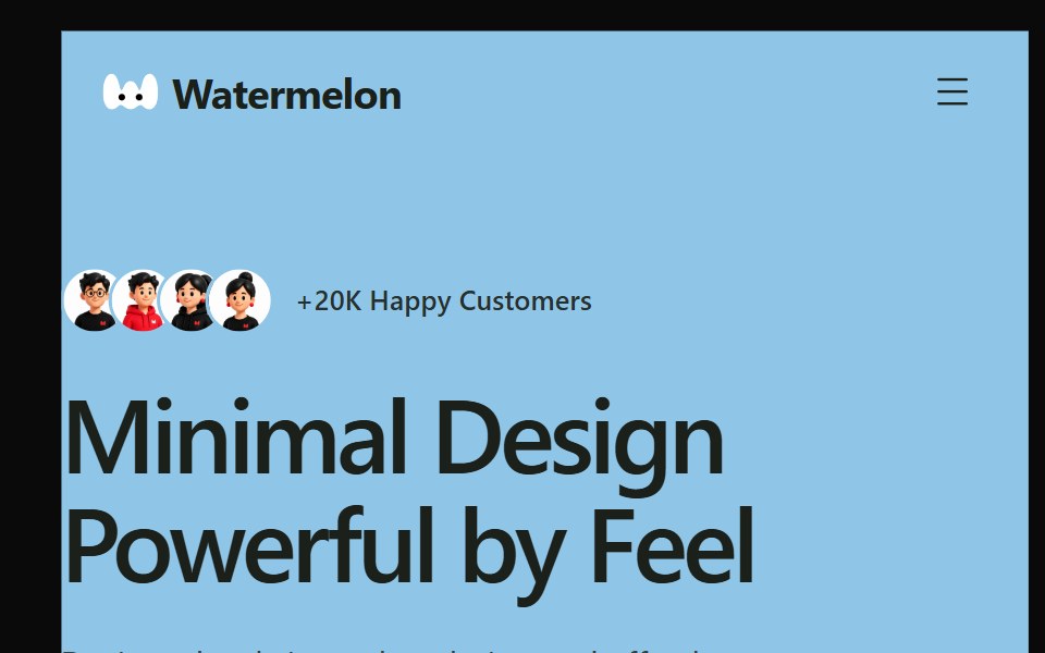 Hero 30Watermelon UI · React
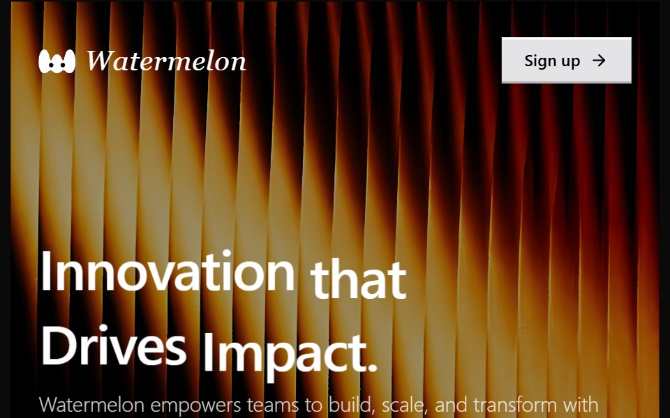 Hero 31Watermelon UI · React
 Hero 32Watermelon UI · React
 Hero 33Watermelon UI · React
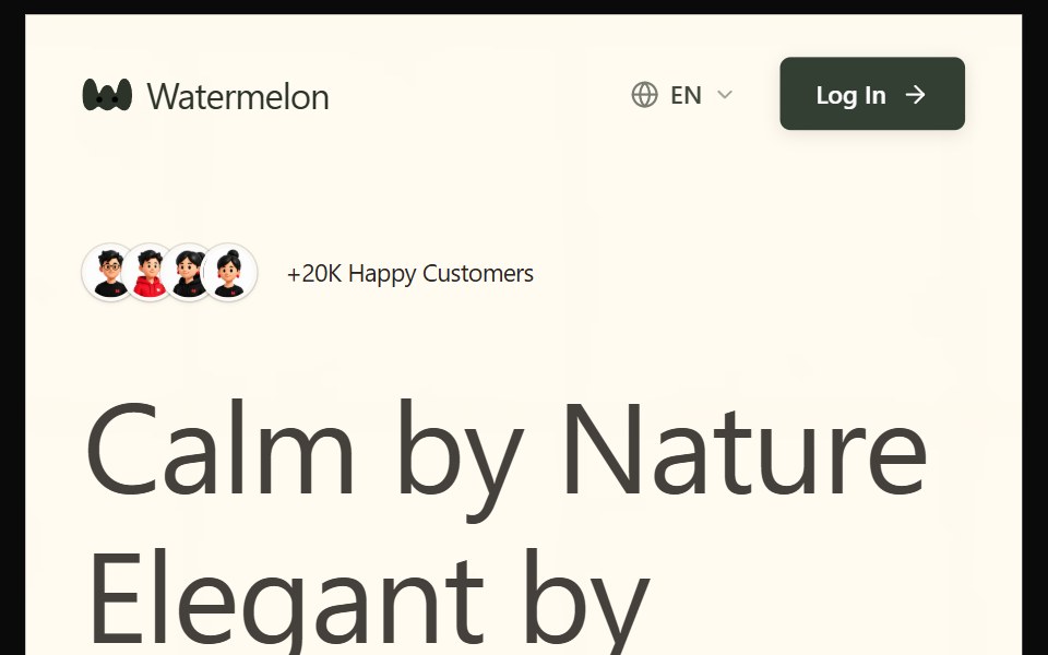 Hero 34Watermelon UI · React
 Hero 35Watermelon UI · React
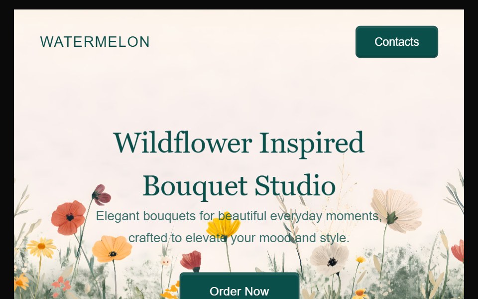 Hero 36Watermelon UI · React
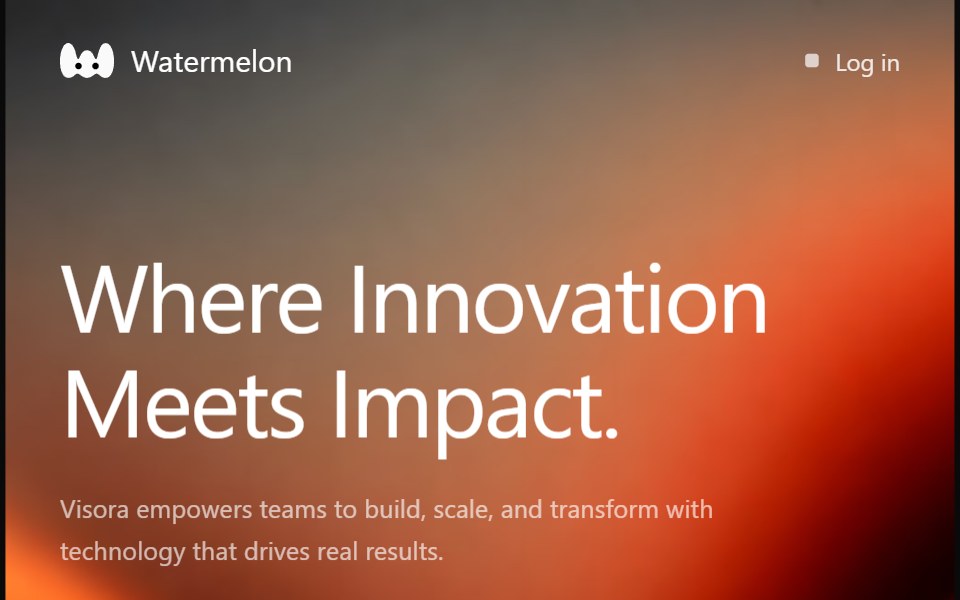 Hero 37Watermelon UI · React
 Hero 38Watermelon UI · React
Libraries with hero components
Related categories
- React Hero Components
- Tailwind CSS Hero Components
- Svelte Hero Components
- Animated Hero Components
- shadcn/ui Hero Components
- Section Components
- Feature Section Components
- Footer Components
- Logo Cloud Components
- CTA Section Components
- FAQ Section Components
- Testimonials Section Components
- Gallery Section Components
- Integrations Section Components
- Stats Section Components
- Contact Section Components
- Team Section Components
- Blog Section Components
- Newsletter Section Components