 Dev Design Library
shadcn/ui Hero Components
Dev Design Library indexes 34 shadcn/ui hero components from 6 open-source UI libraries, with the most coming from FLX UI, Velora UI, Cult UI, Watermelon UI and D2Studio UI. Each one links to its page with the source code, a live preview where available, the library license and the install command. They follow the shadcn/ui conventions, so most install with the shadcn CLI and drop into a Tailwind project. Hero components belong to the Sections group.
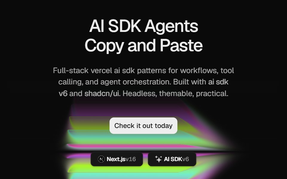 Hero Color PanelCult UI · ReactSplit-layout hero section with responsive ColorPanels shader visuals, CTA, and tech stack badges
 Hero 01 - Agency Hero SectionShadcn Space · ReactClean agency hero section designed for SaaS and startup websites, featuring bold headline, gradient background, trust…
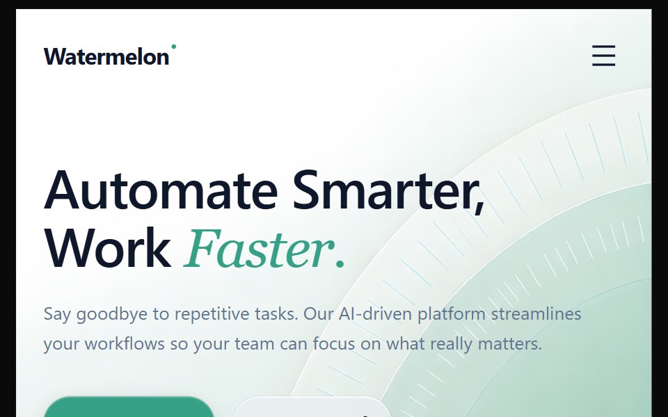 Hero 2Watermelon UI · React
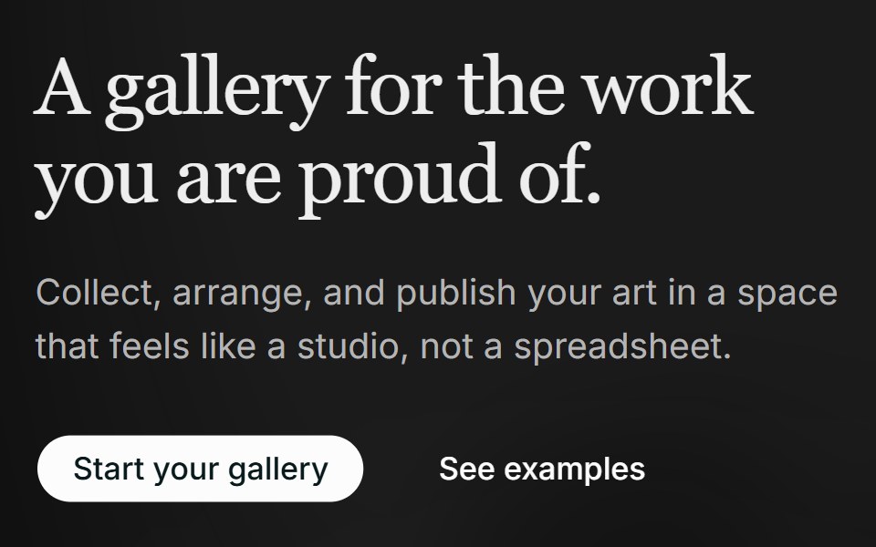
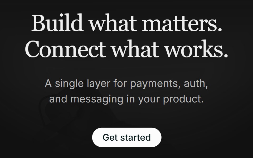 Hero 01FLX UI · ReactA centered serif hero with a soft gradient wash, pill CTA, and a floating integration cloud.
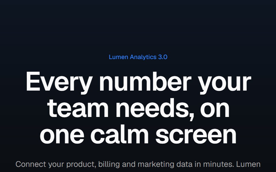
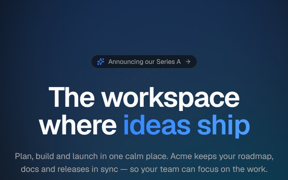 Aurora heroVelora UI · ReactCentered hero with a drifting aurora, dotted backdrop, announcement pill and staggered copy.
 Hero 01D2Studio UI · ReactStartup mentorship landing hero with a headline, call to action and mentor avatar group.
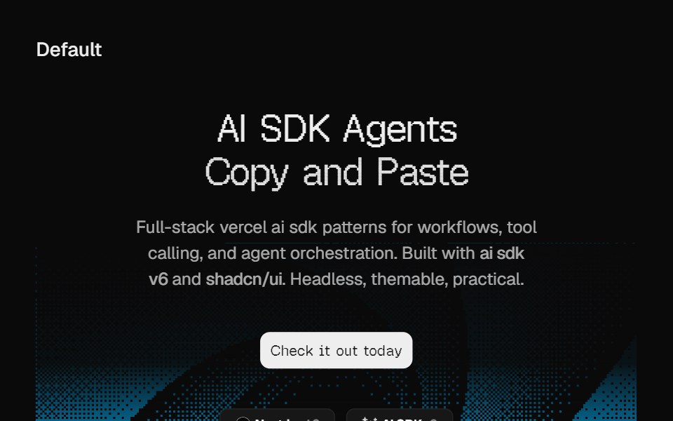 Hero DitheringCult UI · ReactSplit-layout hero section with responsive dithering shader visuals, CTA, and tech stack badges
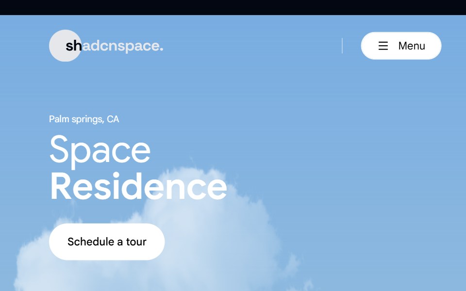 Hero 02 - Real Estate Hero SectionShadcn Space · ReactLuxury real estate hero section crafted for property listings, featuring immersive imagery, location highlight, key…
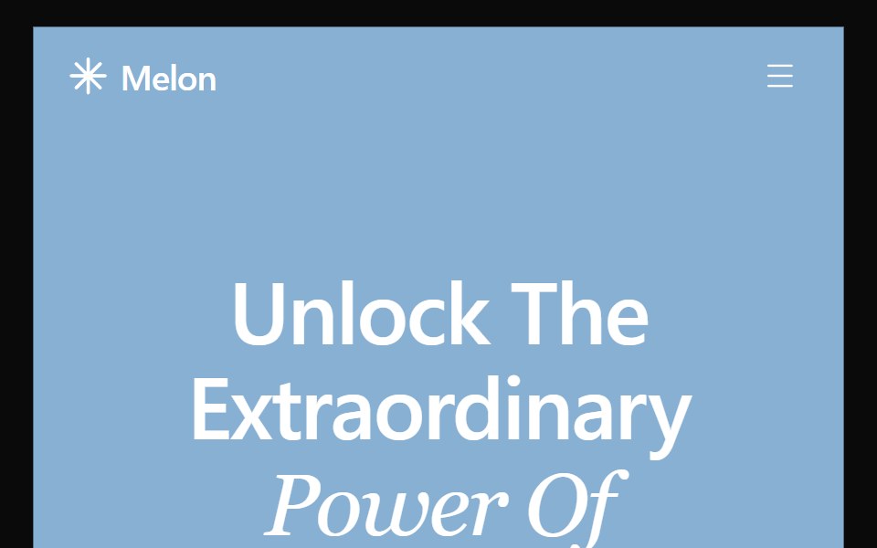 Hero 27Watermelon UI · React
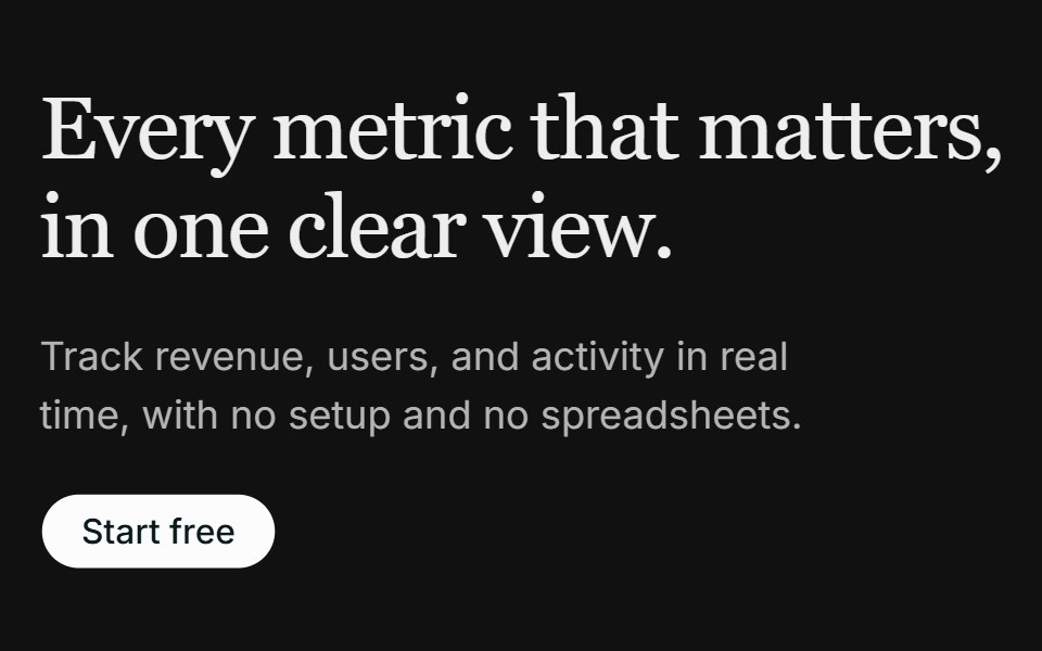 Hero 02FLX UI · ReactA left-aligned serif hero with a media panel: an image backdrop with a floating dashboard mockup on top.
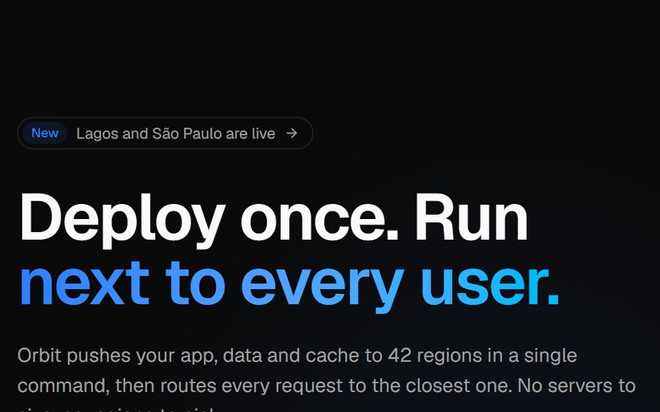 Globe split heroVelora UI · ReactSplit hero with copy, CTAs and live stats beside an interactive dotted globe with arcs.
 Hero Section 01D2Studio UI · ReactPremium landing page hero with a serif accent headline, badge and mentor avatar group.
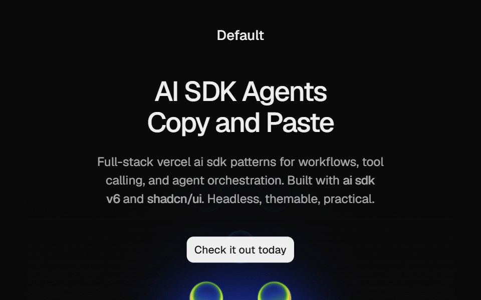 Hero HeatmapCult UI · ReactSplit-layout hero section with responsive Heatmap shader visuals, CTA, and tech stack badges
 Hero 03 - Digital Agency Hero SectionShadcn Space · ReactHigh-impact digital agency hero section with cinematic background video, bold typography, brand driven headline, and…
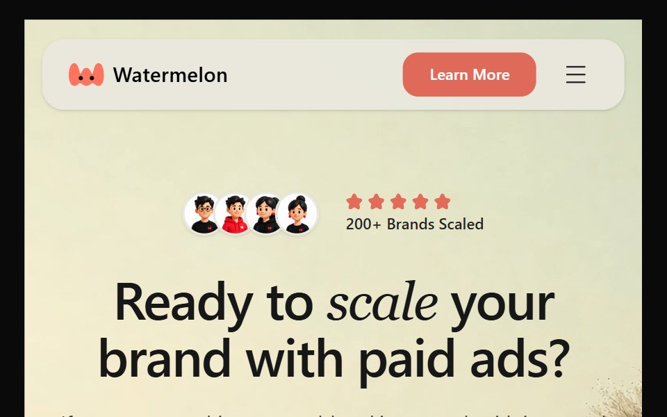 Hero 28Watermelon UI · React
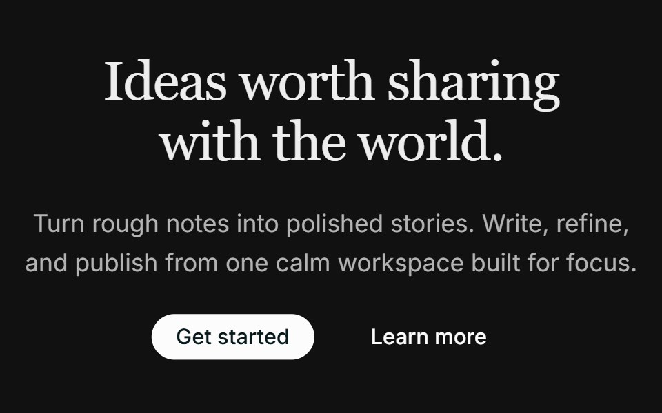 Hero 03FLX UI · ReactA centered hero with dual CTAs and an image that fades into the page below the copy.
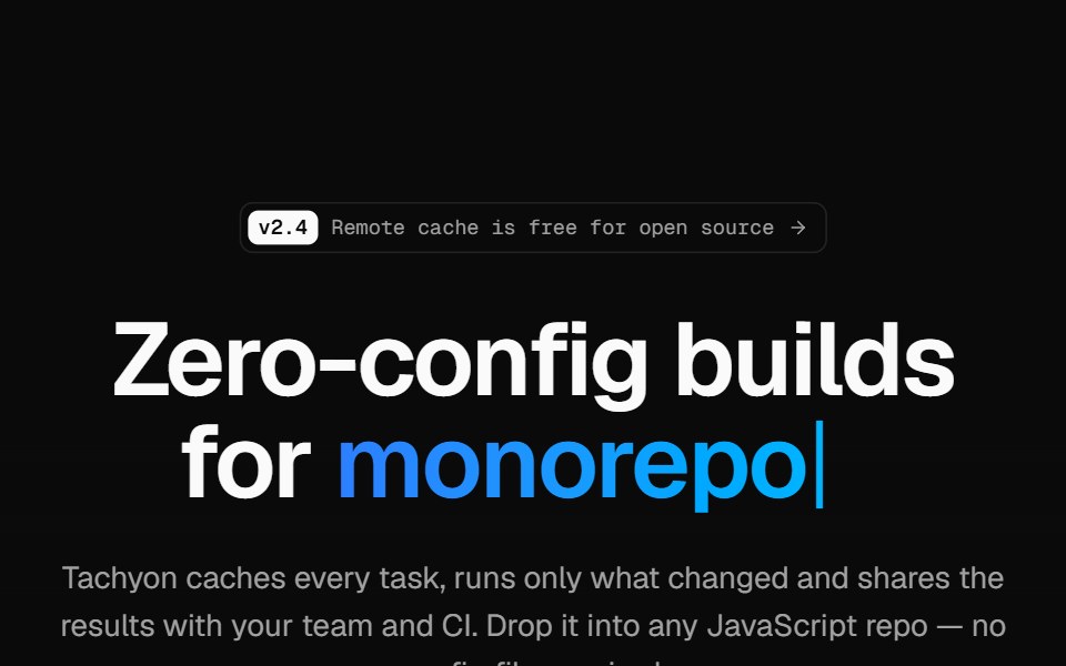 Developer tool heroVelora UI · ReactMinimal hero on a retro grid with a typed headline accent, an install terminal and two CTAs.
 Hero Section 02D2Studio UI · ReactModern landing page hero section with badge, headline and avatar social proof.
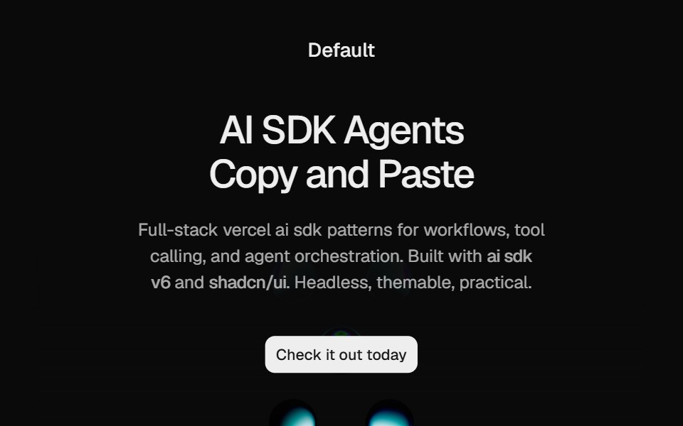 Hero Liquid MetalCult UI · ReactSplit-layout hero section with responsive LiquidMetal shader visuals, CTA, and tech stack badges
 Hero 29Watermelon UI · React
 Hero 04FLX UI · ReactA two-column editorial hero with a soft background wash and a layered collage of two overlapping images.
 Product screenshot heroVelora UI · ReactCentered headline above a dashboard in a browser frame with a border beam and a logo row.
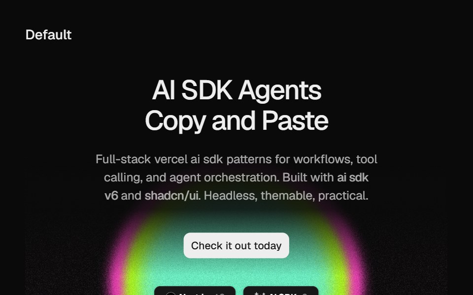 Hero Static Radial GradientCult UI · ReactSplit-layout hero section with responsive StaticRadialGradient shader visuals, CTA, and tech stack badges
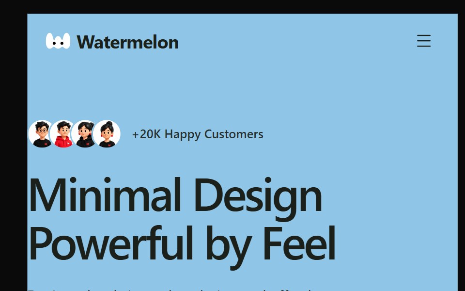 Hero 30Watermelon UI · React
 Hero 06FLX UI · ReactA split product hero with dual CTA, a compact logo row, and the Spot 01 illustration.
 Phone split heroVelora UI · ReactApp launch hero with an email capture on the left and an app screen in an iPhone frame.
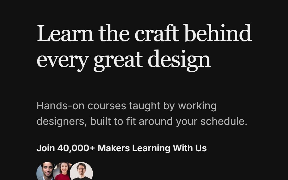 Hero 08FLX UI · ReactA split hero with a bold headline, avatar social proof, and two image cards with invertible overlay text and CTAs.
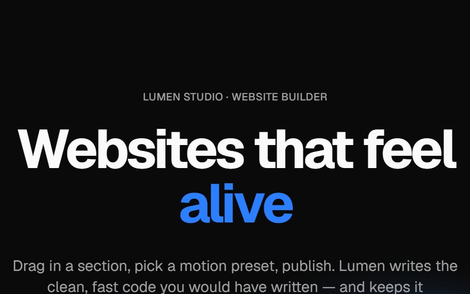 Wavy heroVelora UI · ReactBold centered hero over flowing waves, with a rotating headline word and avatar social proof.
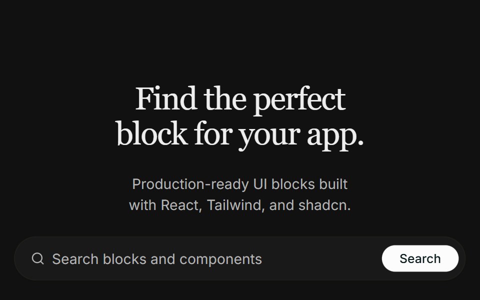 Hero 09FLX UI · ReactA centered real-estate hero with a search bar, a masked architecture image that fades into the page, and a split…
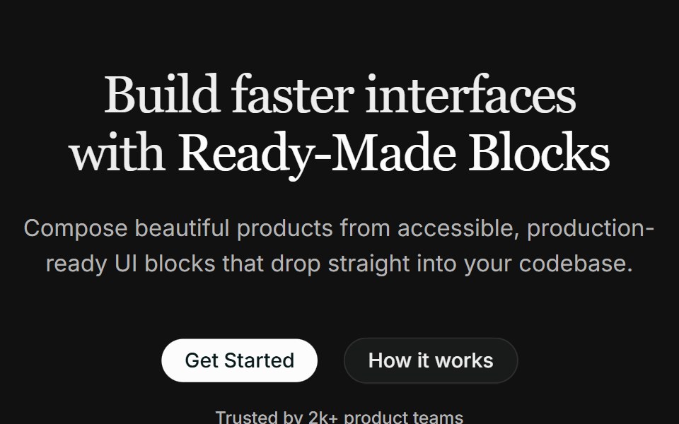 Hero 10FLX UI · ReactA centered hero with a highlighted headline, dual CTAs, social proof, and a fanned collage of three overlapping images.
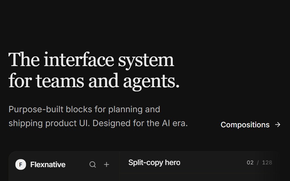 Hero 11FLX UI · ReactA split-copy hero with a light product studio mock — issue feed, properties, and a floating agent panel that fades…
 Hero 12FLX UI · ReactA full-bleed image hero with an oversized name, an established label, and a floating pill CTA anchored to the corner.
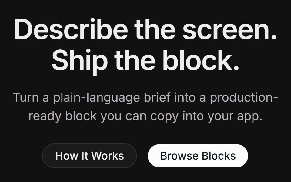 Hero 14FLX UI · ReactA centered product hero with dual CTAs, a full-width photo with a floating block-builder demo panel, and a logo strip.
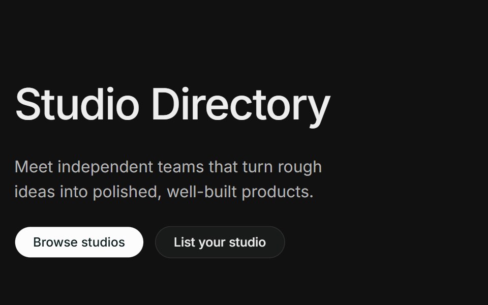 Hero 15FLX UI · ReactA directory-style hero with an oversized title, split intro with dual CTAs, and a row of wordmark cards with minimal…
Libraries with shadcn/ui hero components
Related categories
- Hero Components
- React Hero Components
- Tailwind CSS Hero Components
- Svelte Hero Components
- Animated Hero Components
- shadcn/ui Section Components
- shadcn/ui Feature Section Components
- shadcn/ui Footer Components
- shadcn/ui FAQ Section Components
- shadcn/ui CTA Section Components
- shadcn/ui Testimonials Section Components
- shadcn/ui Newsletter Section Components