 Dev Design Library
shadcn/ui Section Components
Dev Design Library indexes 175 shadcn/ui section components from 9 open-source UI libraries, with the most coming from Watermelon UI, FLX UI, Shadcn Space, Velora UI and Spectrum UI. Each one links to its page with the source code, a live preview where available, the library license and the install command. They follow the shadcn/ui conventions, so most install with the shadcn CLI and drop into a Tailwind project.
Showing 120 of 175, a mix from every library. Open a library to see all of its components.
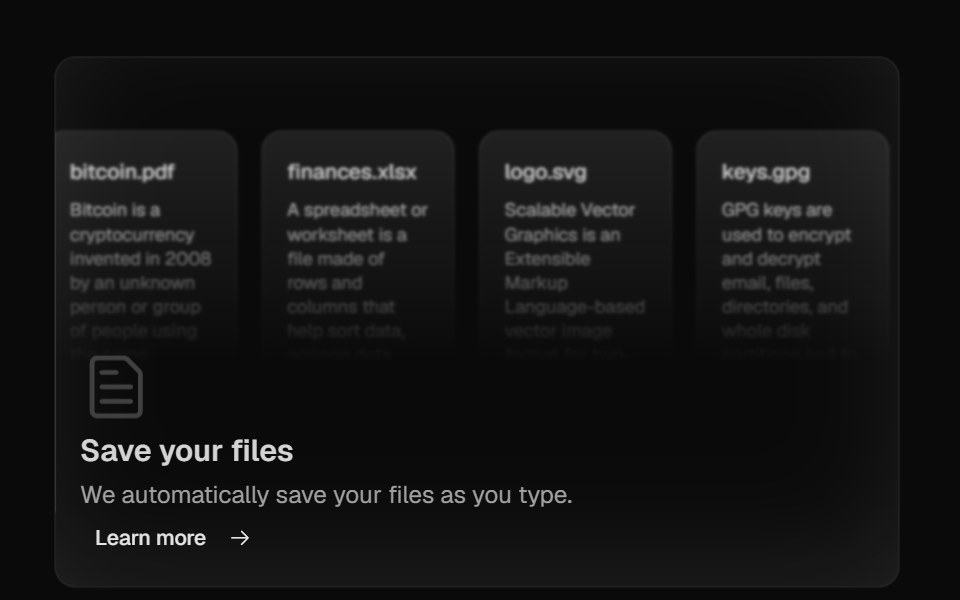 Bento GridMagic UI · ReactBento grid is a layout used to showcase the features of a product in a simple and elegant way.
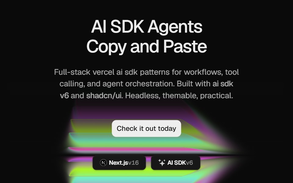 Hero Color PanelCult UI · ReactSplit-layout hero section with responsive ColorPanels shader visuals, CTA, and tech stack badges
 Animated TestimonialsSpectrum UI · Reactcomponent for the Animated Testimonials
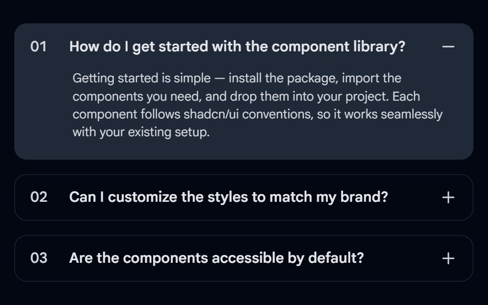 Accordion-03 - Numbered FAQShadcn Space · ReactFAQ accordion with numbered items, background fill on open, and +/- toggle
 Bento GridAnimations (Svelte) · SvelteA flexible grid layout with interchangeable BentoCard items for showcasing content in a responsive masonry style.
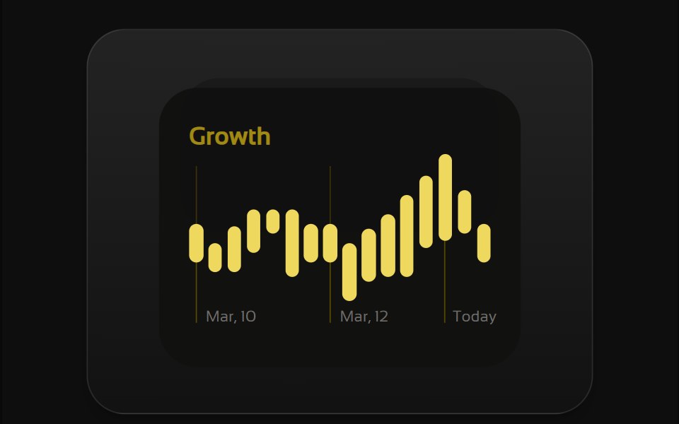 Bento 1Watermelon UI · React
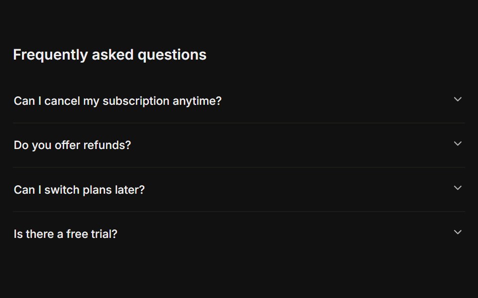 FAQFLX UI · ReactA titled question-and-answer list.
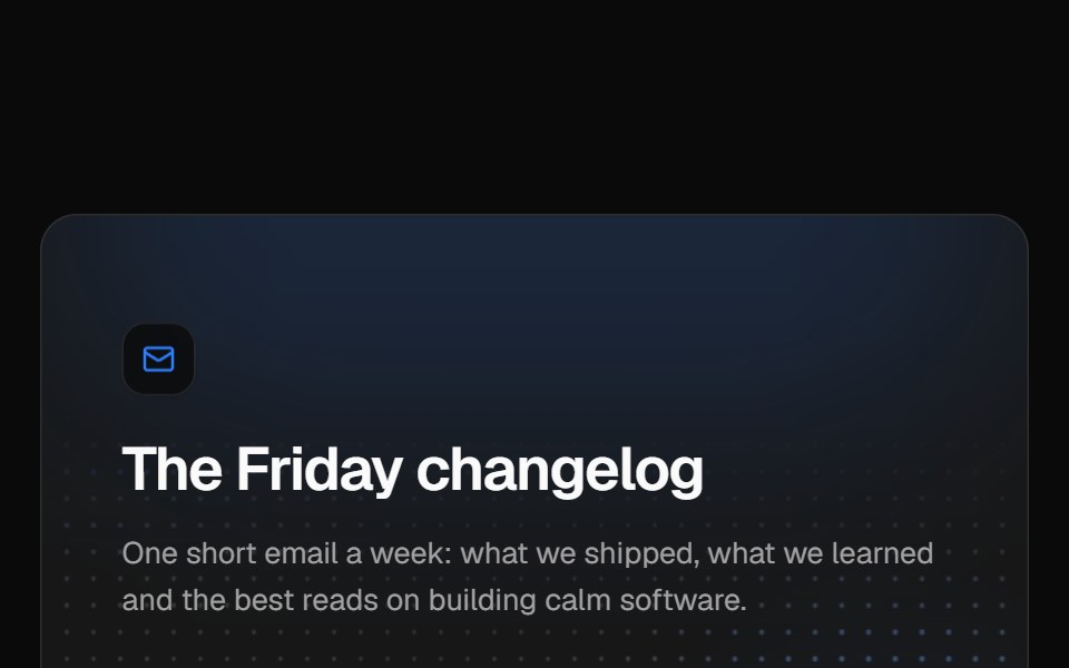 Newsletter sign-upVelora UI · ReactNewsletter card over a glowing dot grid with a labelled email field, subscriber avatars and a privacy note.
 Hero 01D2Studio UI · ReactStartup mentorship landing hero with a headline, call to action and mentor avatar group.
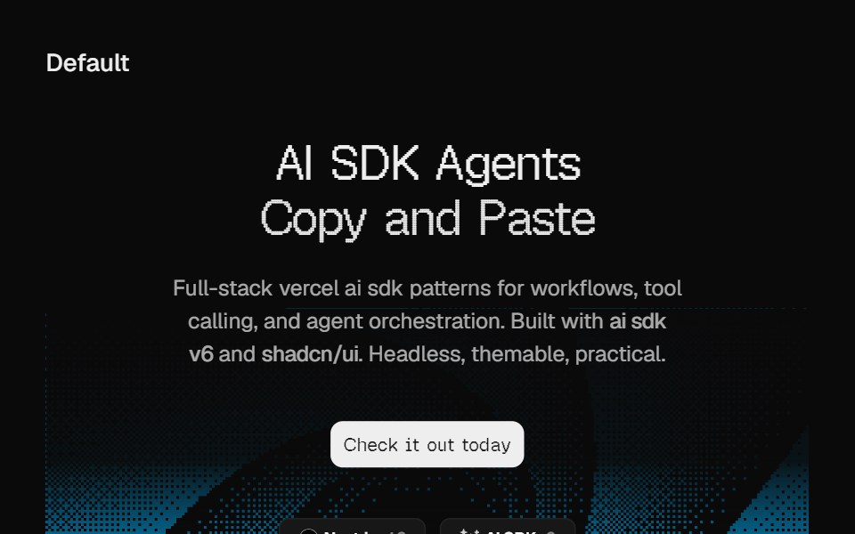 Hero DitheringCult UI · ReactSplit-layout hero section with responsive dithering shader visuals, CTA, and tech stack badges
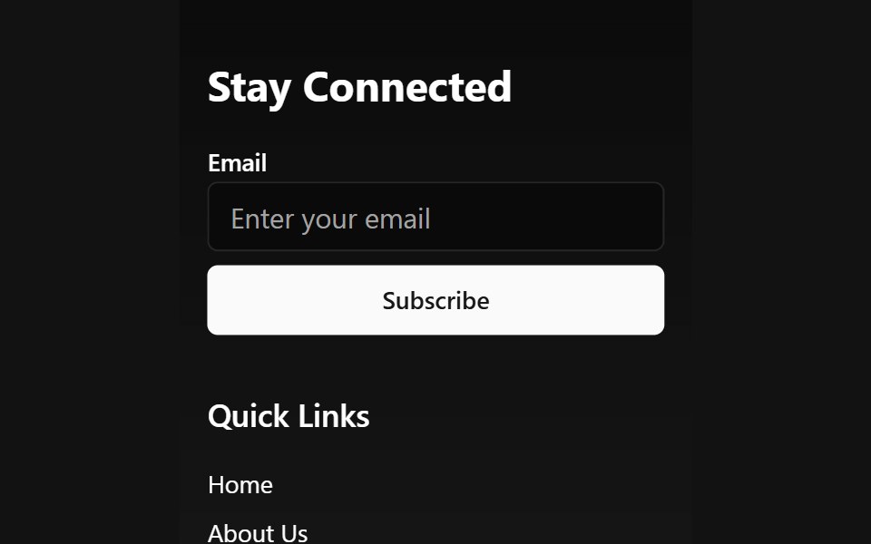 Animated Wave FooterSpectrum UI · Reactcomponent for the Animated Wave Footer
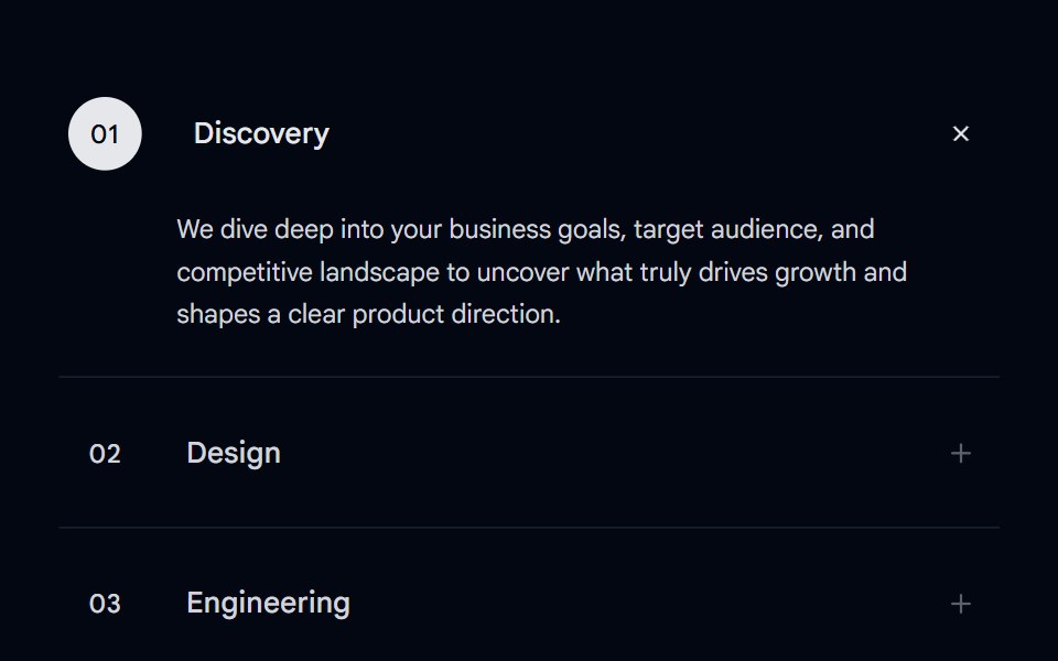 Accordion-07 - Motion ServicesShadcn Space · ReactAnimated accordion with a number bubble, sliding title shift, and an expanding bottom line on hover and active states…
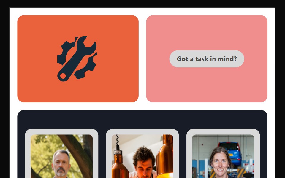 Bento 10Watermelon UI · React
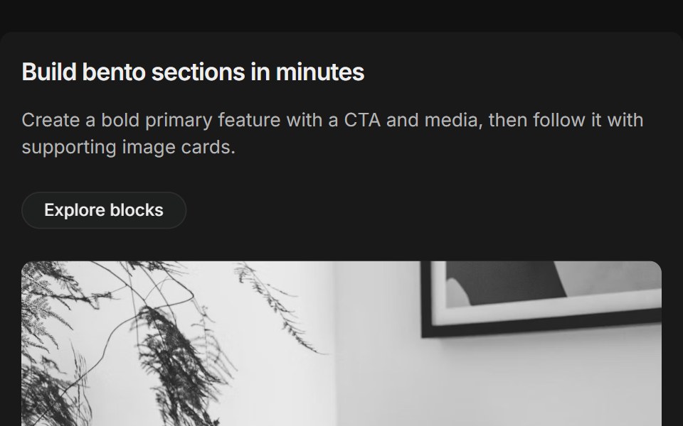 Bento grids 01FLX UI · ReactThree-column bento: primary tile (two-thirds) with title, description, CTA and media, plus supporting image cards.
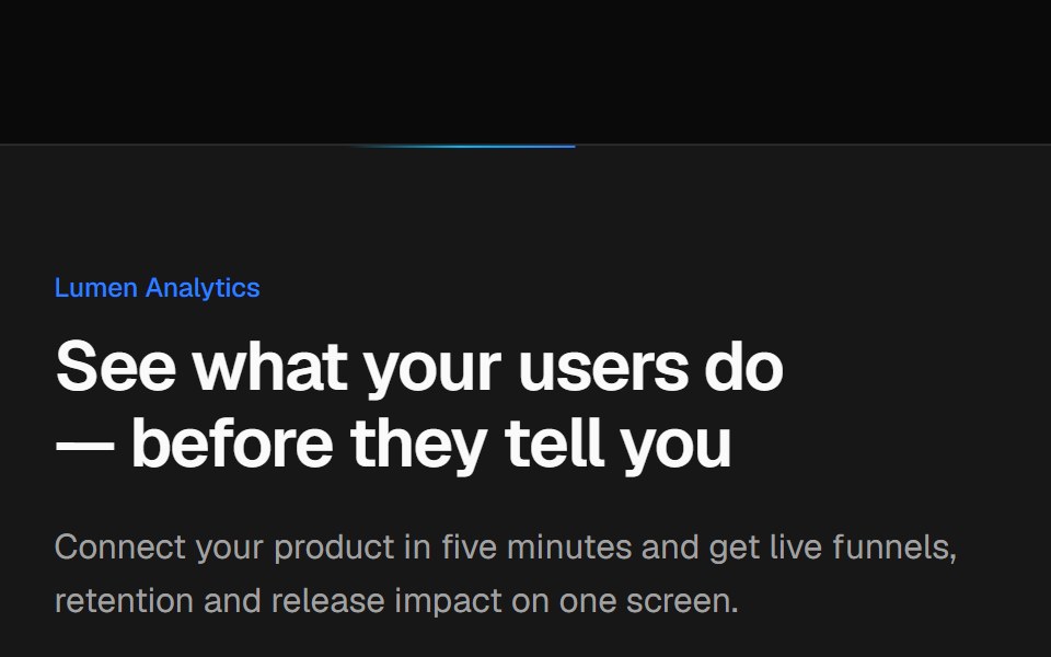 Split CTA with product visualVelora UI · ReactTwo-column CTA card with a benefit list and a dashboard mock-up, traced by an animated border beam.
 Hero Section 01D2Studio UI · ReactPremium landing page hero with a serif accent headline, badge and mentor avatar group.
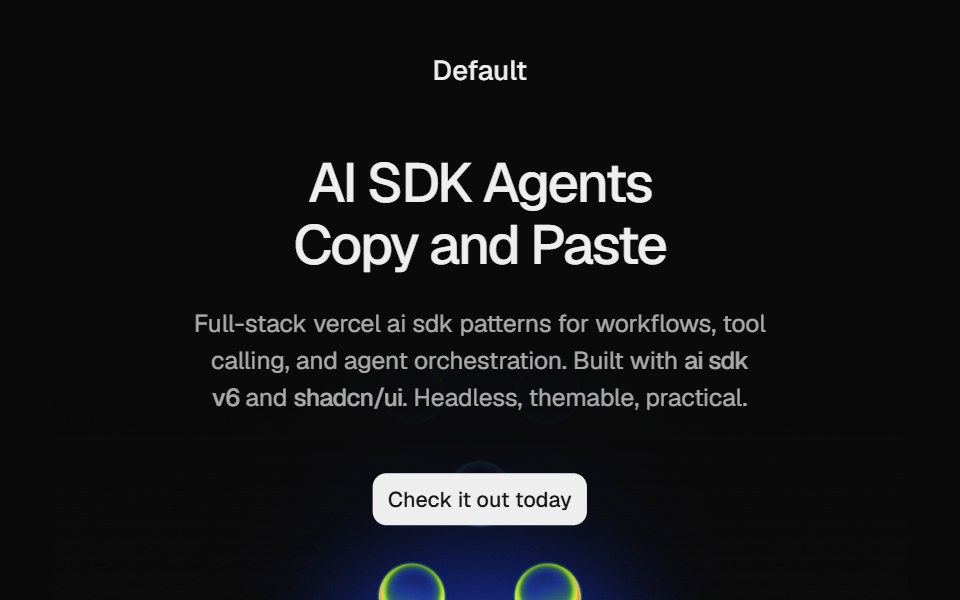 Hero HeatmapCult UI · ReactSplit-layout hero section with responsive Heatmap shader visuals, CTA, and tech stack badges
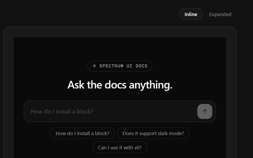 Ask Docs FooterSpectrum UI · ReactA docs question box that streams a cited answer, over link columns.
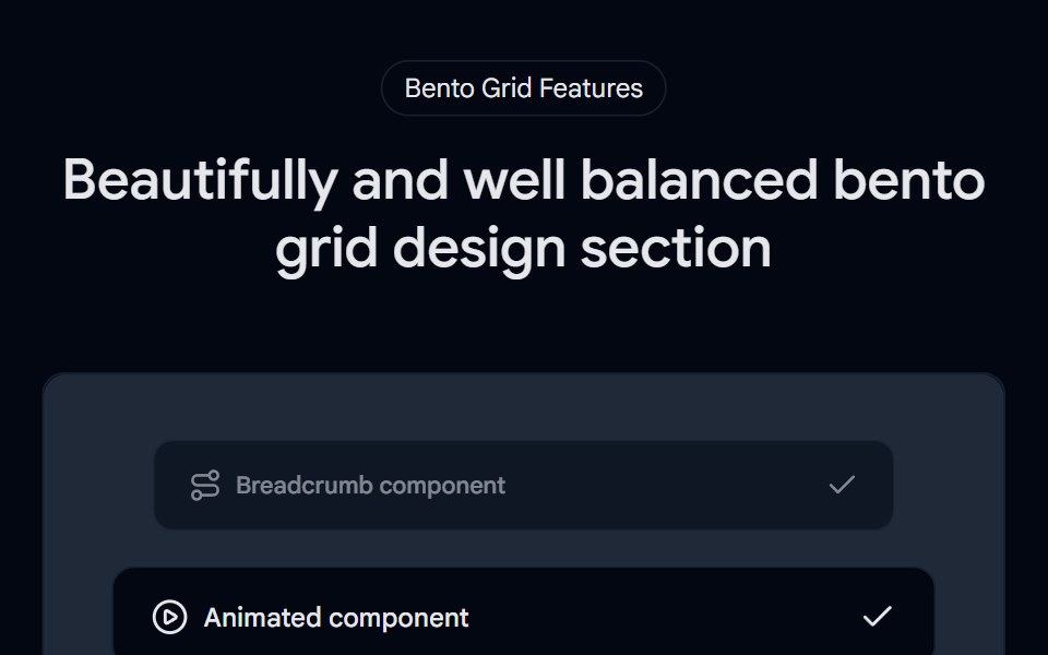 Bento Grid 01 - Bento Grid SectionShadcn Space · ReactA visually rich bento grid that brings the world closer—highlighting stunning locations, cultural moments, and…
 Bento 11Watermelon UI · React
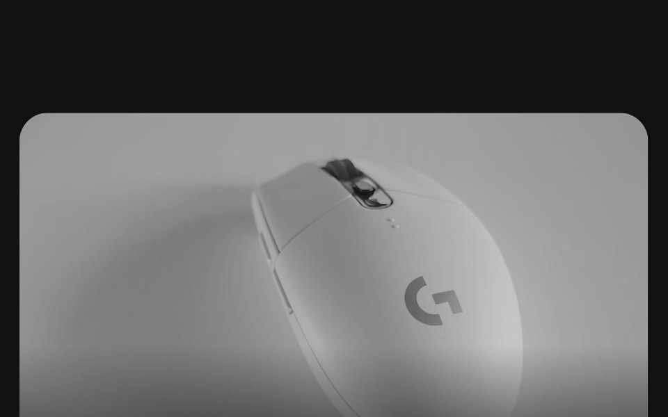 Bento grids 02FLX UI · ReactA row of collection cards, one twice as wide, each with a product photo bleeding off the top, a title, a short…
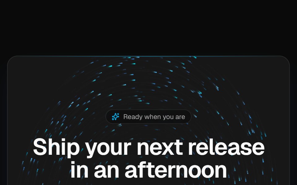 Vortex CTA bandVelora UI · ReactDark rounded call-to-action band over a brand-tinted particle vortex, with two actions and fine print.
 Hero Section 02D2Studio UI · ReactModern landing page hero section with badge, headline and avatar social proof.
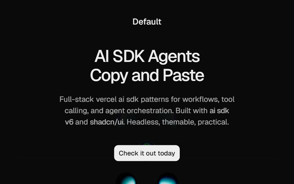 Hero Liquid MetalCult UI · ReactSplit-layout hero section with responsive LiquidMetal shader visuals, CTA, and tech stack badges
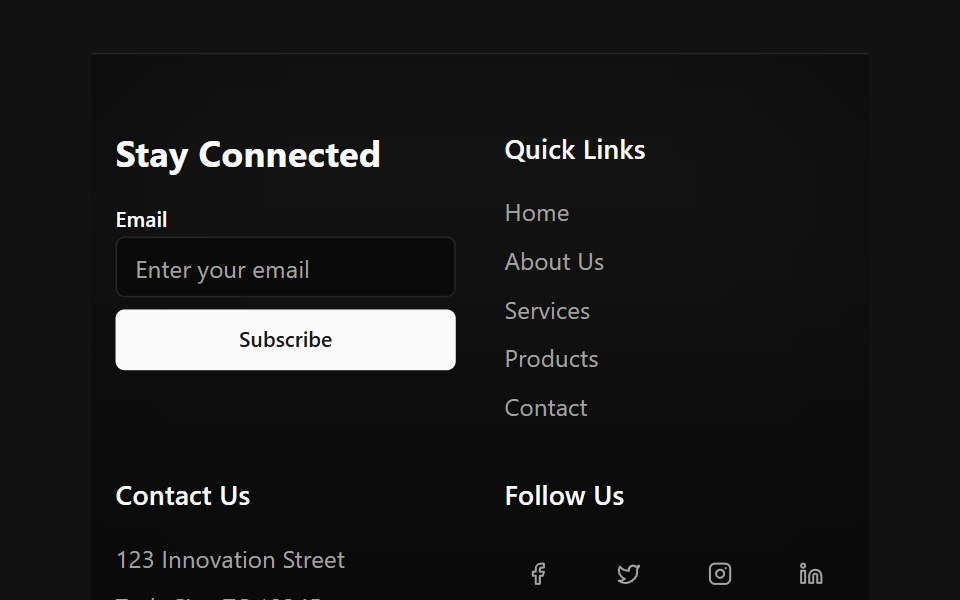 Floating Particle FooterSpectrum UI · Reactcomponent for the Floating Particle Footer
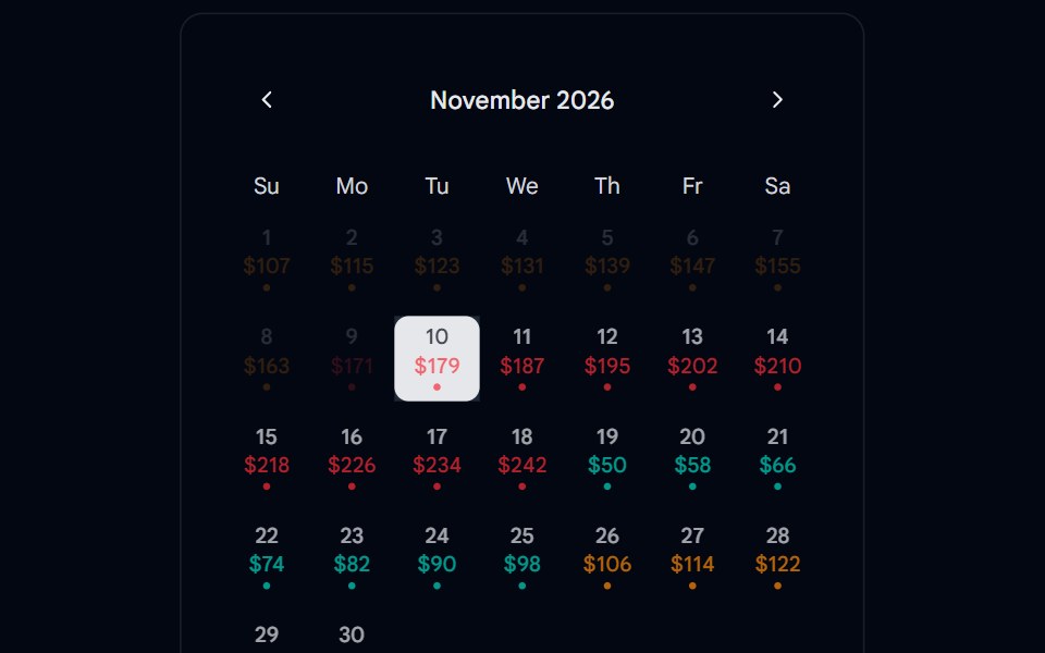 Calendar 15 - With PricingShadcn Space · ReactCalendar component
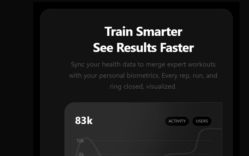 Bento 12Watermelon UI · React
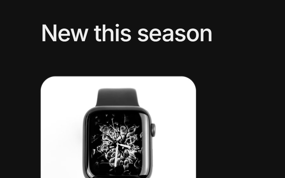 Bento grids 03FLX UI · ReactA product grid with a tall featured item in the center, four smaller items around it, category badges, prices and names.
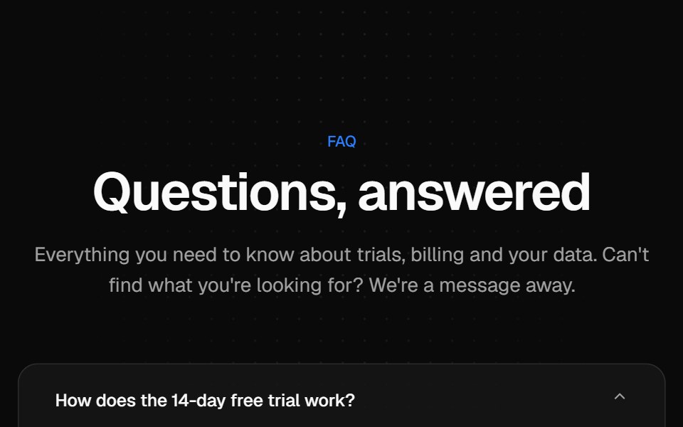 Centered FAQ accordionVelora UI · ReactCentered heading over an accordion of eight questions, closed by a contact row.
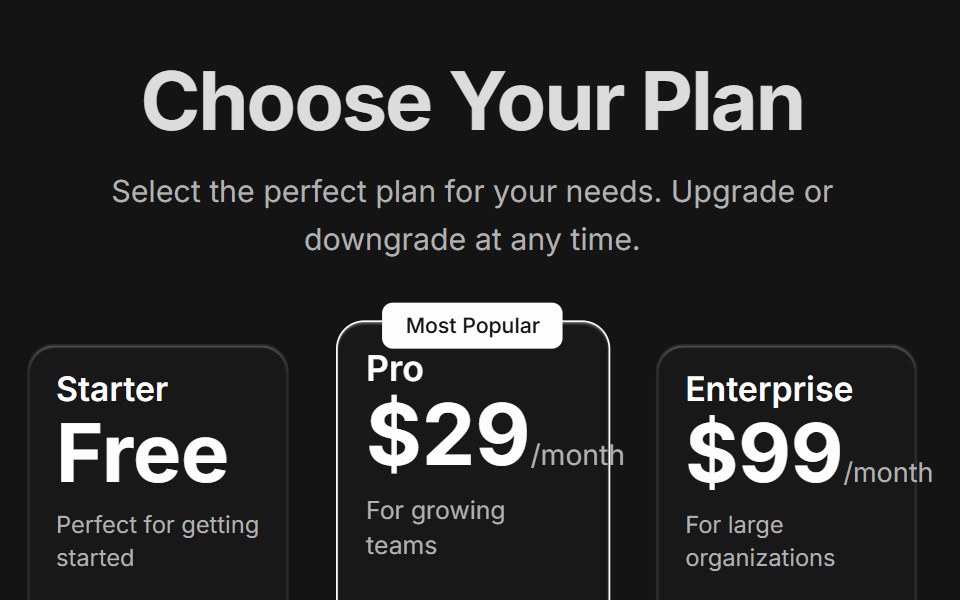 Pricing CardsD2Studio UI · ReactResponsive three-tier pricing cards with feature comparison and popular plan highlighting
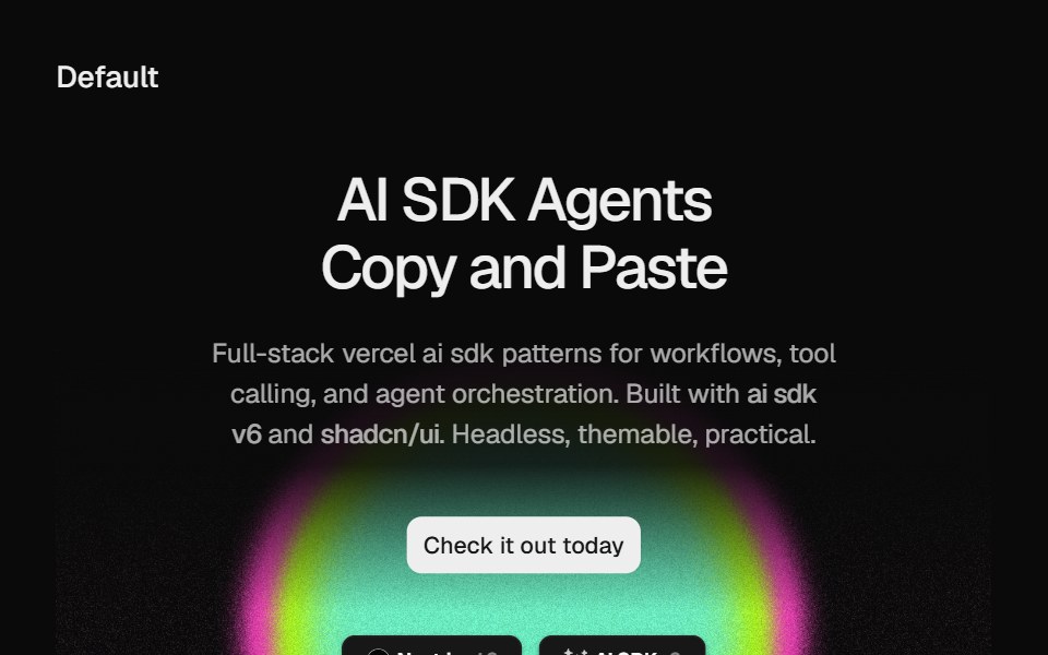 Hero Static Radial GradientCult UI · ReactSplit-layout hero section with responsive StaticRadialGradient shader visuals, CTA, and tech stack badges
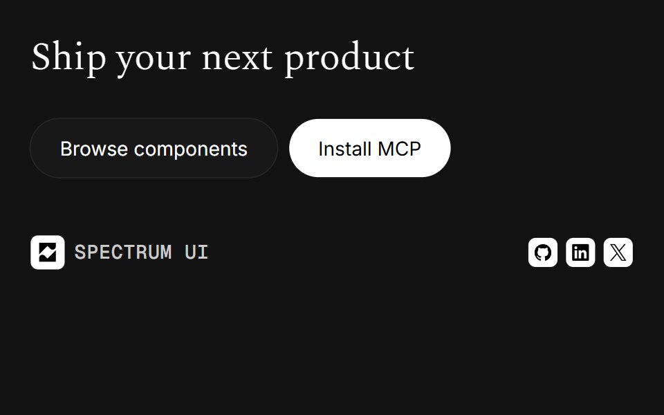 FooterSpectrum UI · Reactcomponent for the Footer
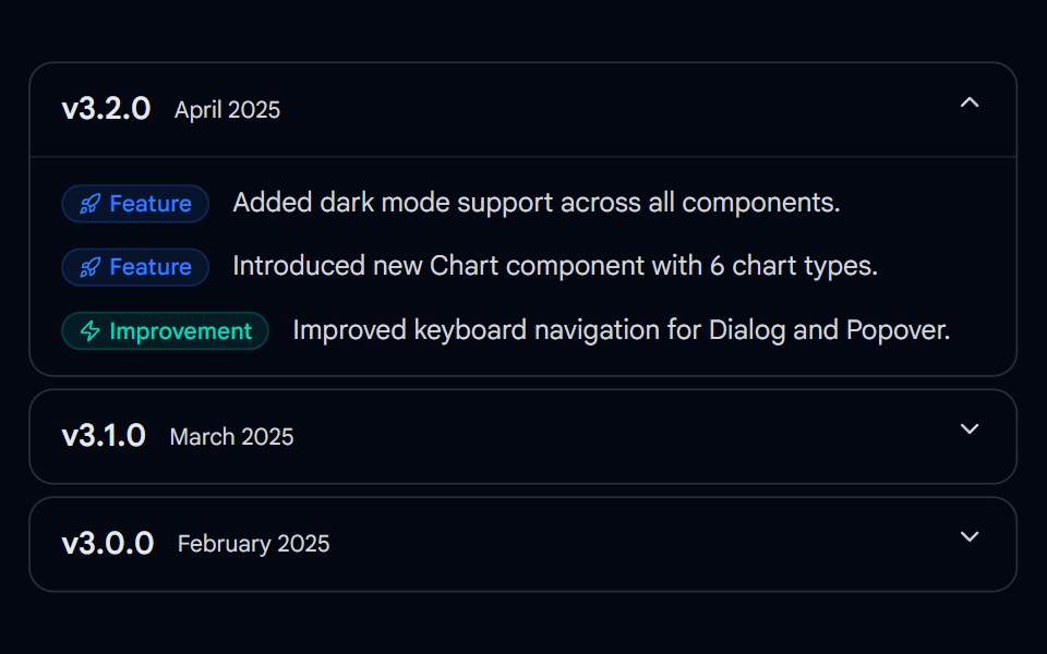 Collapsible 01 - Release ChangelogShadcn Space · ReactAn expandable release changelog with per-version collapsible panels, typed badge labels (Feature, Fix, Breaking), and…
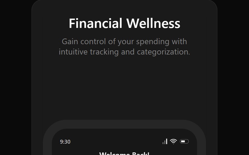 Bento 13Watermelon UI · React
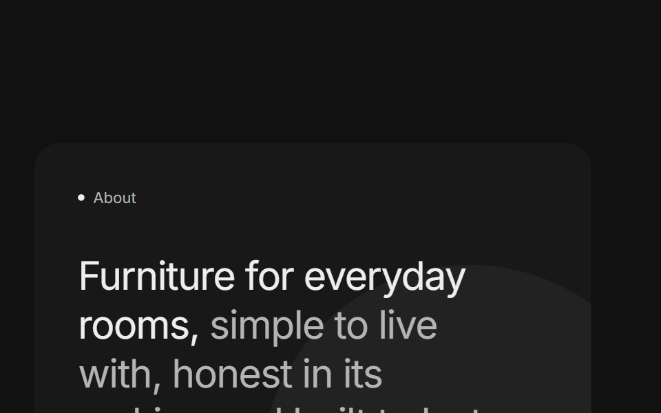 Bento grids 04FLX UI · ReactTwo stacked cards with a two-tone title, a paragraph and a pill button beside a product photo surrounded by short…
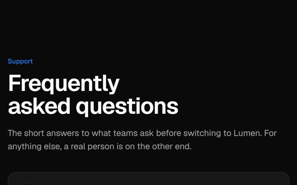 Two-column FAQVelora UI · ReactSticky intro and contact card on the left, an accordion of questions on the right.
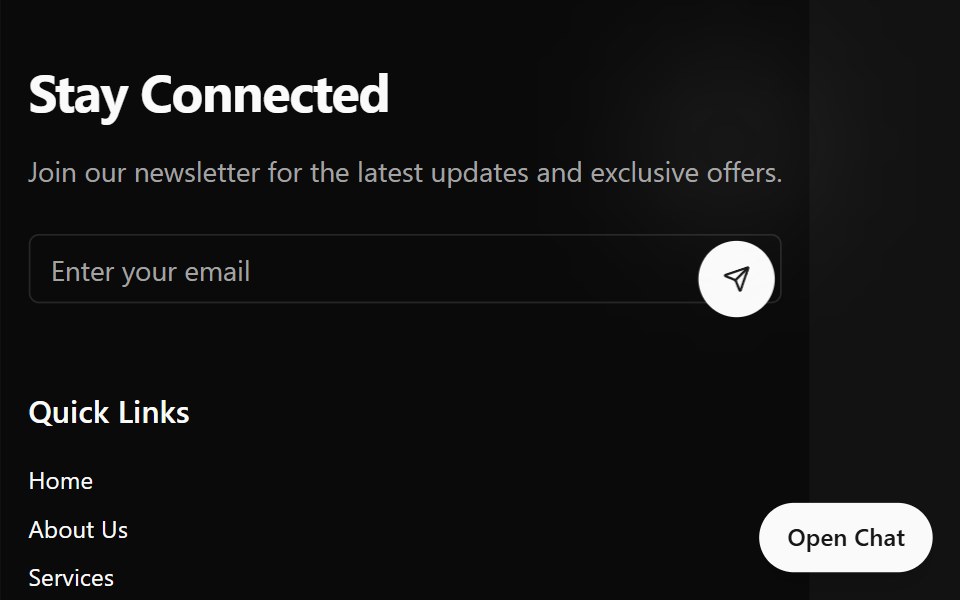 Footers DemoSpectrum UI · Reactcomponent for the Footers Demo
 CTA 02 - Video Background CTAShadcn Space · ReactA high impact call-to-action section with autoplay background video, bold overlay headline, primary button, and…
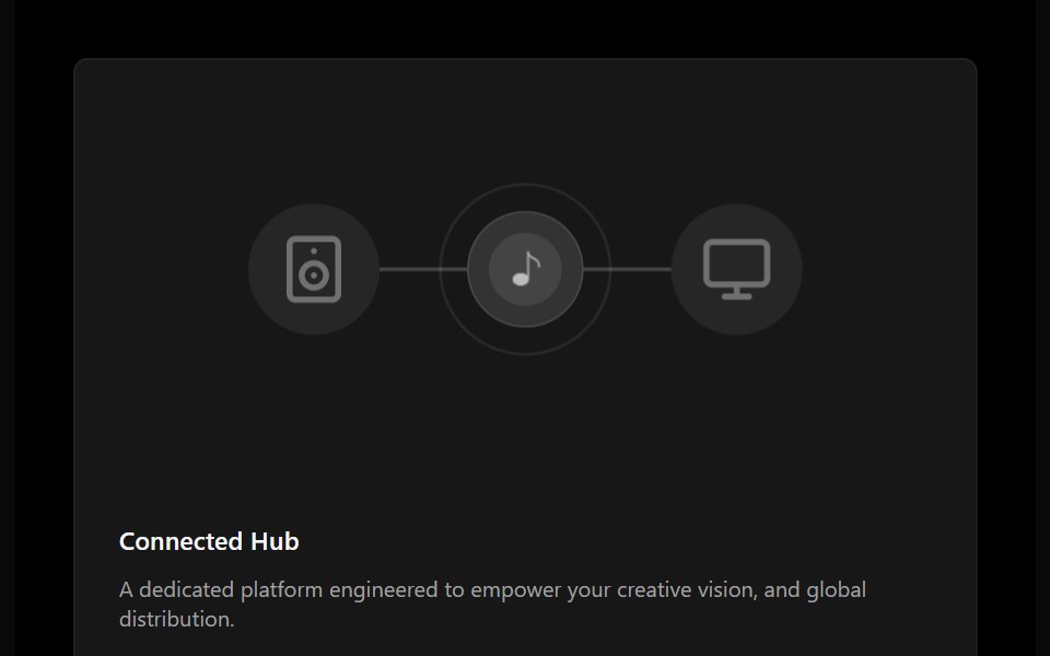 Bento 14Watermelon UI · React
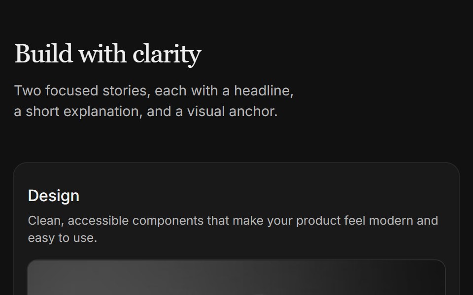 Content 04FLX UI · ReactTwo-column card grid with a serif section header and copy above each image.
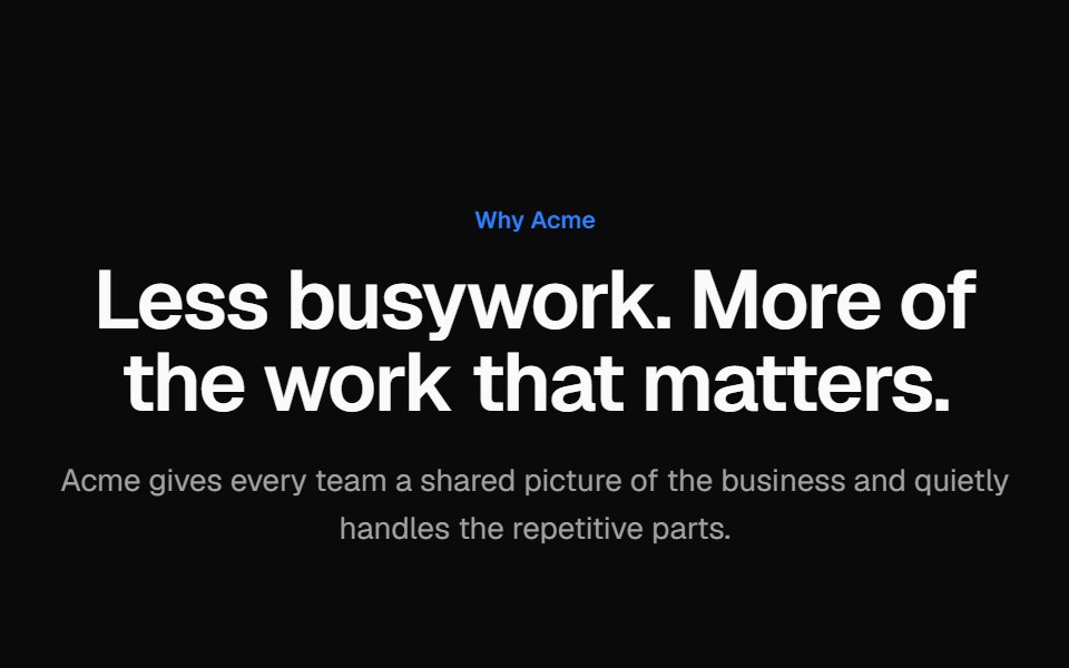 Alternating screenshot rowsVelora UI · ReactTwo alternating rows of copy with a checklist beside a browser-framed dashboard mock, sides swapped.
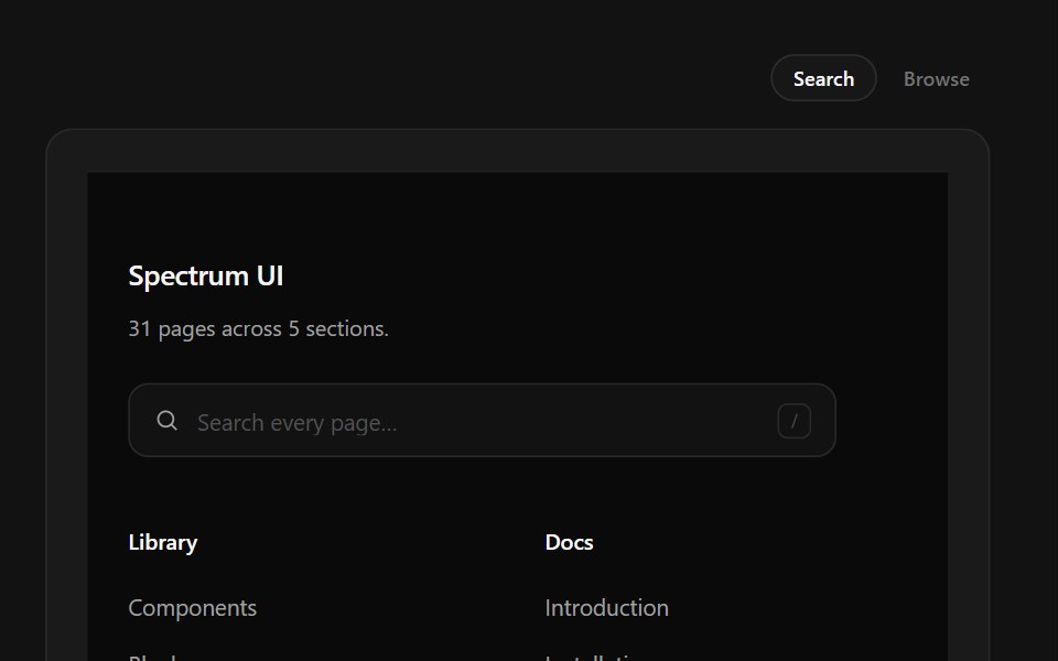 Link Search FooterSpectrum UI · ReactType-to-filter across every footer link, with arrow-key navigation.
 Dialog 07 - Connect IntegrationShadcn Space · ReactDialog with a decorative header connecting two app icons — ideal for third-party integration and calendar connect flows.
 Bento 15Watermelon UI · React
 Content 06FLX UI · ReactTwo-column split with serif headline, supporting copy, optional CTA, and a media panel.
 Link columns footerVelora UI · ReactFooter with logo, tagline and social links, four link columns and a copyright bar with legal links.
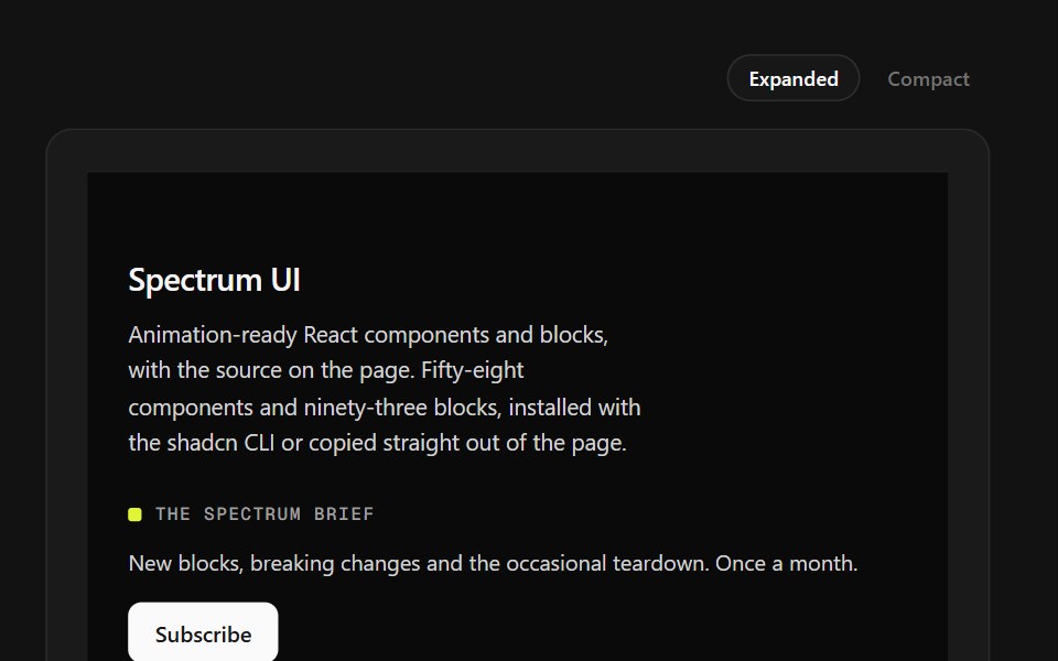 Mega Sitemap FooterSpectrum UI · ReactA five-column sitemap with region and language selectors and mobile accordions.
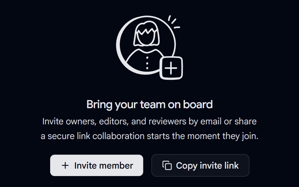 Empty State 02 - Invite Your TeamShadcn Space · ReactA centered empty state with a custom illustration, heading, description, and two calls-to-action for inviting…
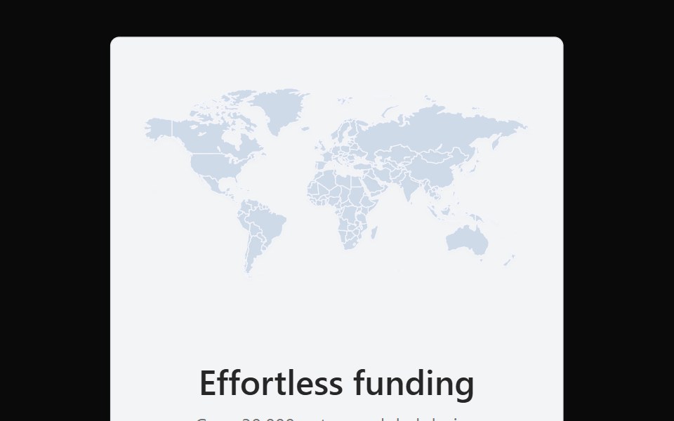 Bento 16Watermelon UI · React
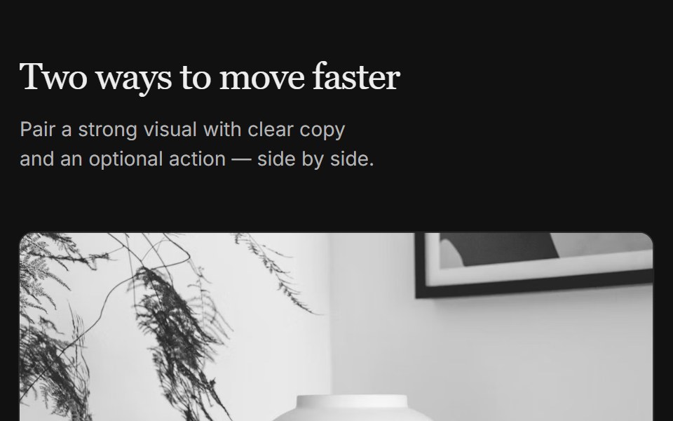 Content 07FLX UI · ReactTwo-column grid with serif header, media on top, copy, and optional CTA per column.
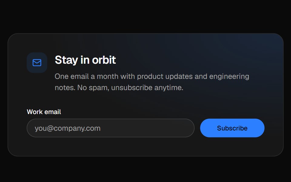 Newsletter footerVelora UI · ReactFooter with a newsletter sign-up row, link columns and a live “All systems normal” status badge.
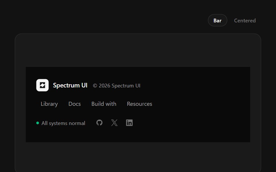 Minimal FooterSpectrum UI · ReactA single-line footer with hover-expanding link clusters, status and socials.
 FAQ 01 - Expandable FAQ SectionShadcn Space · ReactA clean accordion style FAQ section with expandable answers, ideal for agencies or SaaS sites to address common…
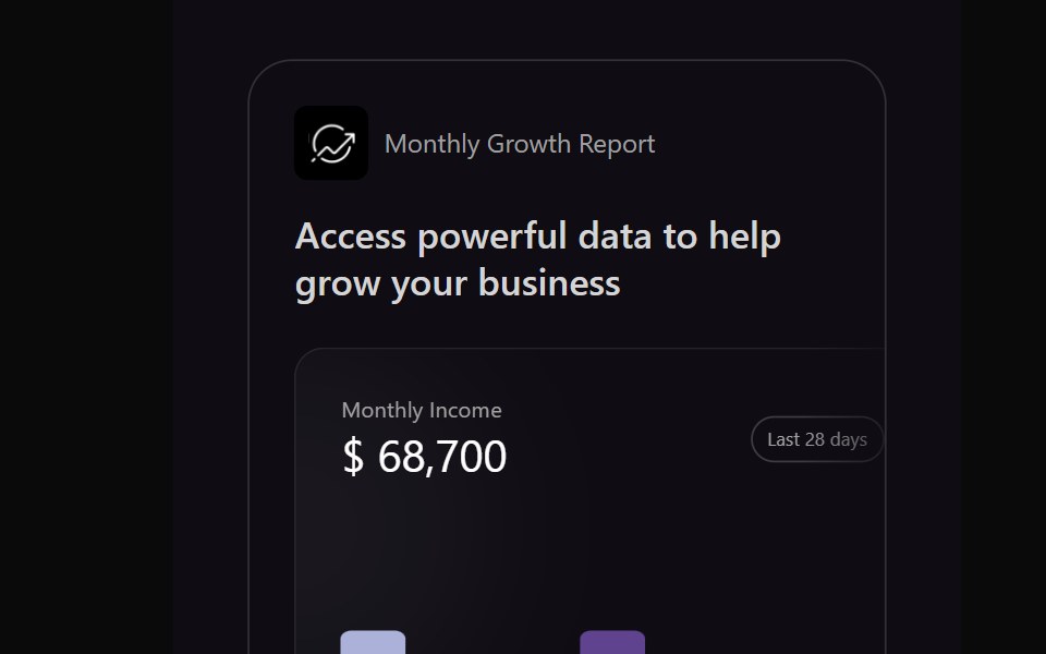 Bento 17Watermelon UI · React
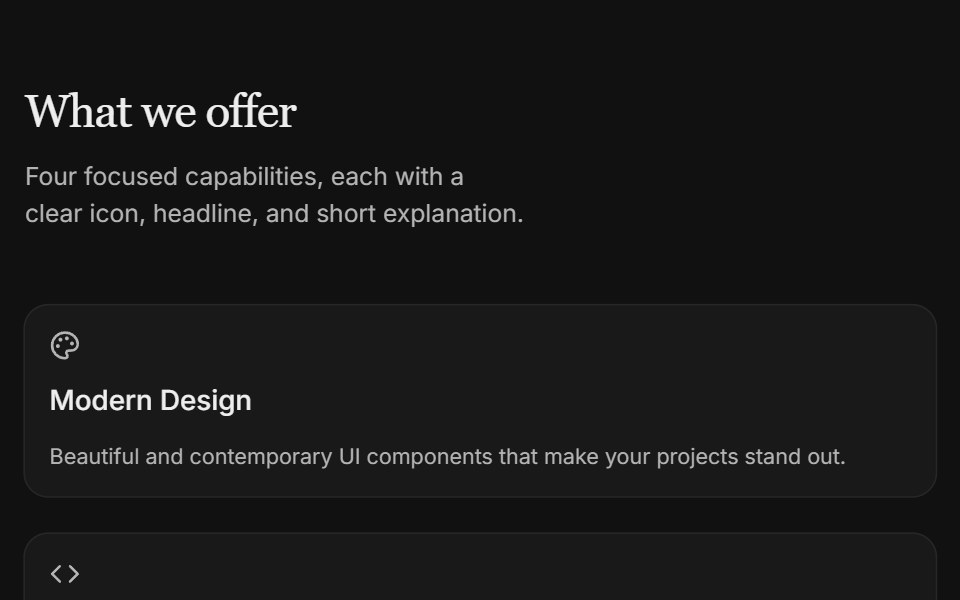 Content 09FLX UI · ReactTwo-column icon card grid with serif section header and subtle entrance motion.
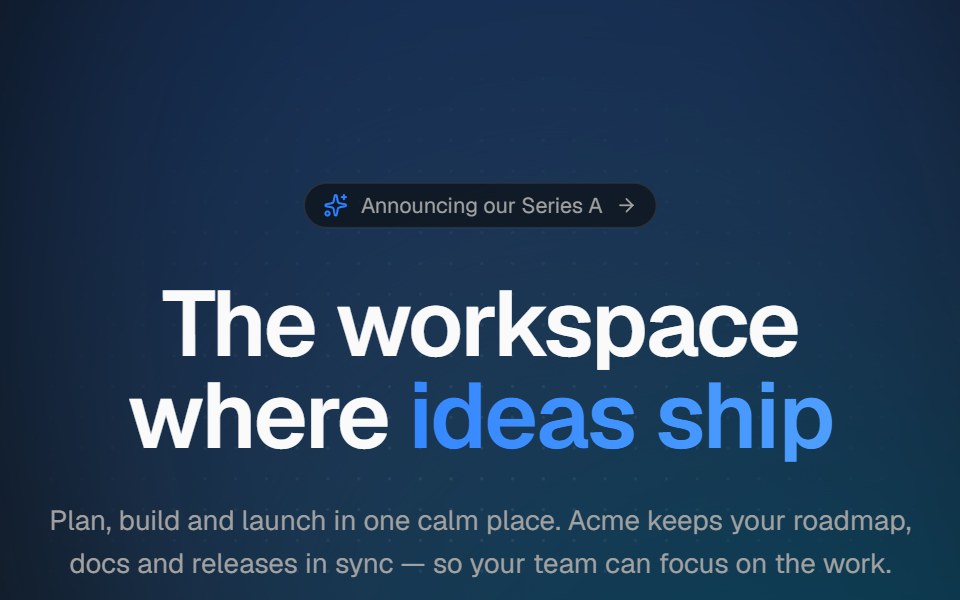 Aurora heroVelora UI · ReactCentered hero with a drifting aurora, dotted backdrop, announcement pill and staggered copy.
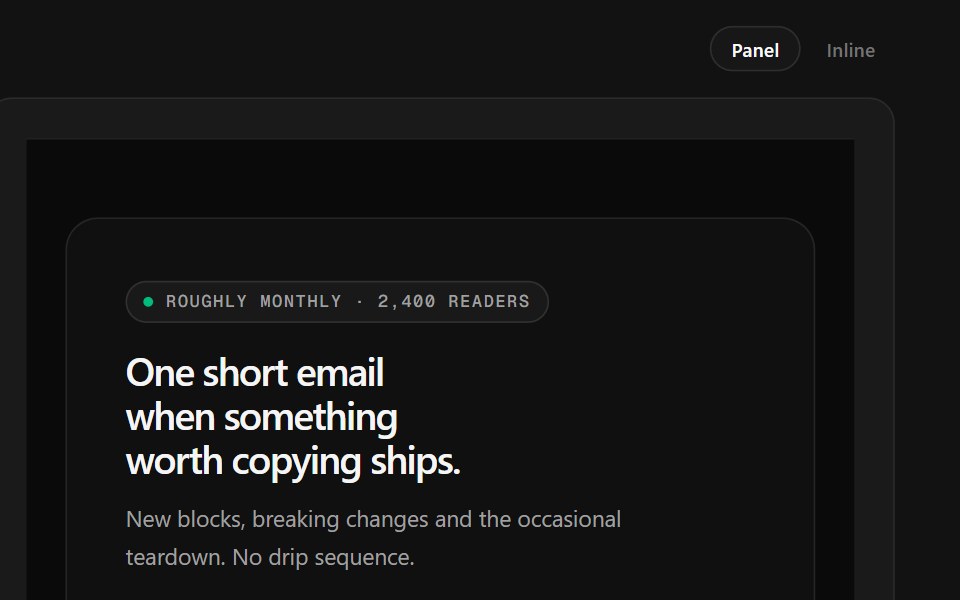 Newsletter FooterSpectrum UI · ReactA newsletter panel with a value checklist, reader stack and inline validation.
 Footer 02 - Dark Conversion FooterShadcn Space · ReactA bold dark themed footer with newsletter signup, strong contact CTA, navigation links, and legal pages, ideal for…
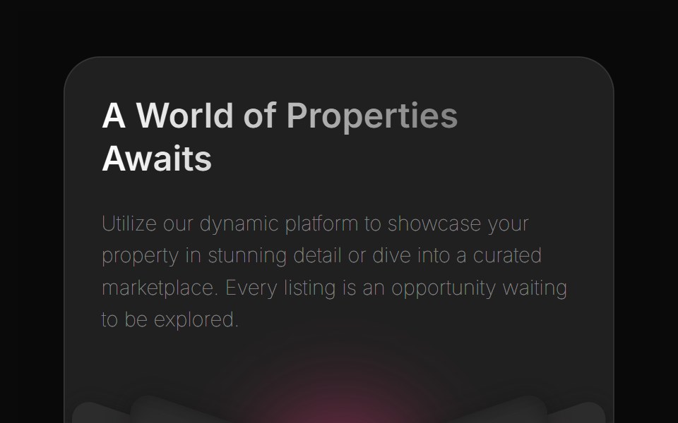 Bento 2Watermelon UI · React
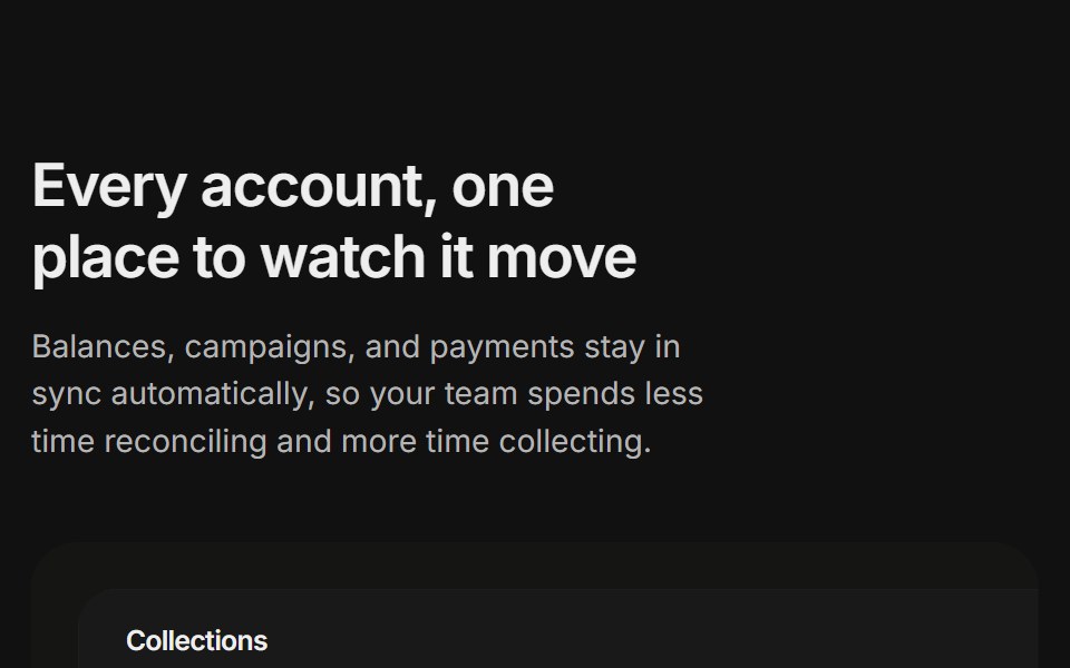 Content 11FLX UI · ReactA billing overview split with a dashboard preview card and two feature highlights, built for the app-shell preset.
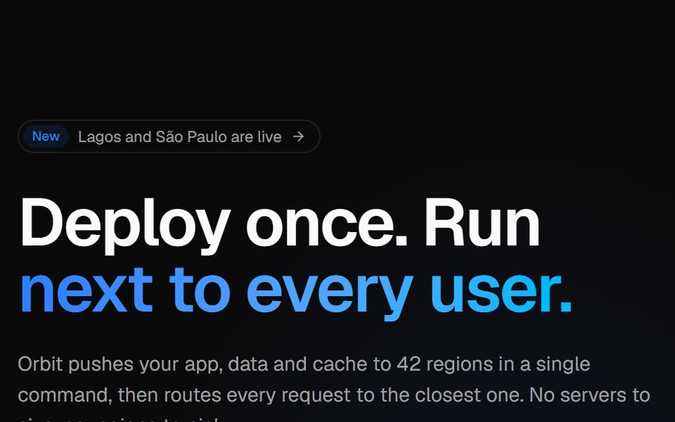 Globe split heroVelora UI · ReactSplit hero with copy, CTAs and live stats beside an interactive dotted globe with arcs.
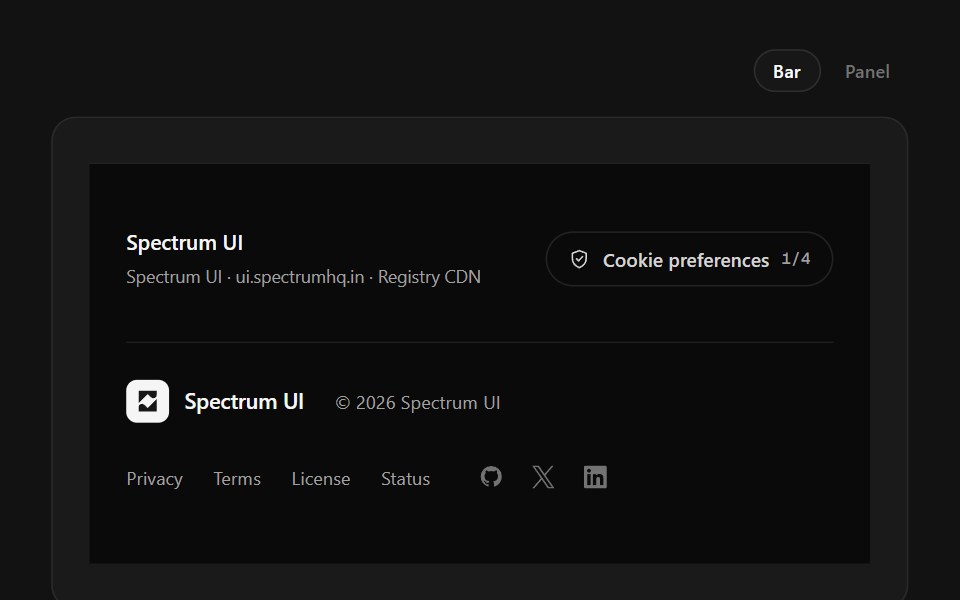 Policy FooterSpectrum UI · ReactCookie-category switches with a save state, over a layered legal row.
 Gallery 01 - Image Gallery SectionShadcn Space · ReactExplore a curated collection of breathtaking destinations and unforgettable experiences from around the world.
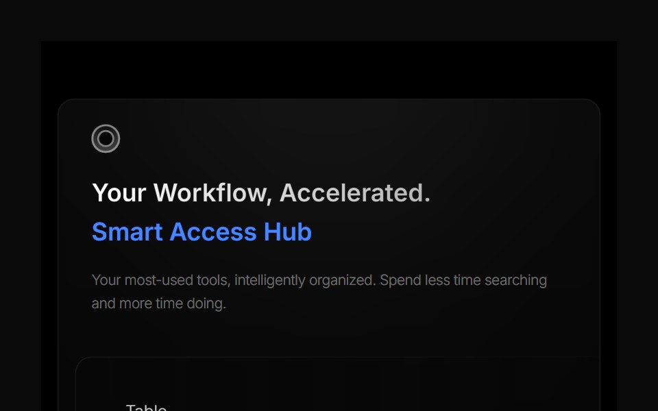 Bento 3Watermelon UI · React
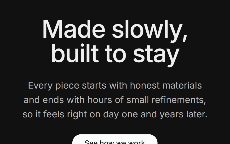 Content 12FLX UI · ReactA centered section header with supporting copy and a CTA, followed by two large side-by-side photos.
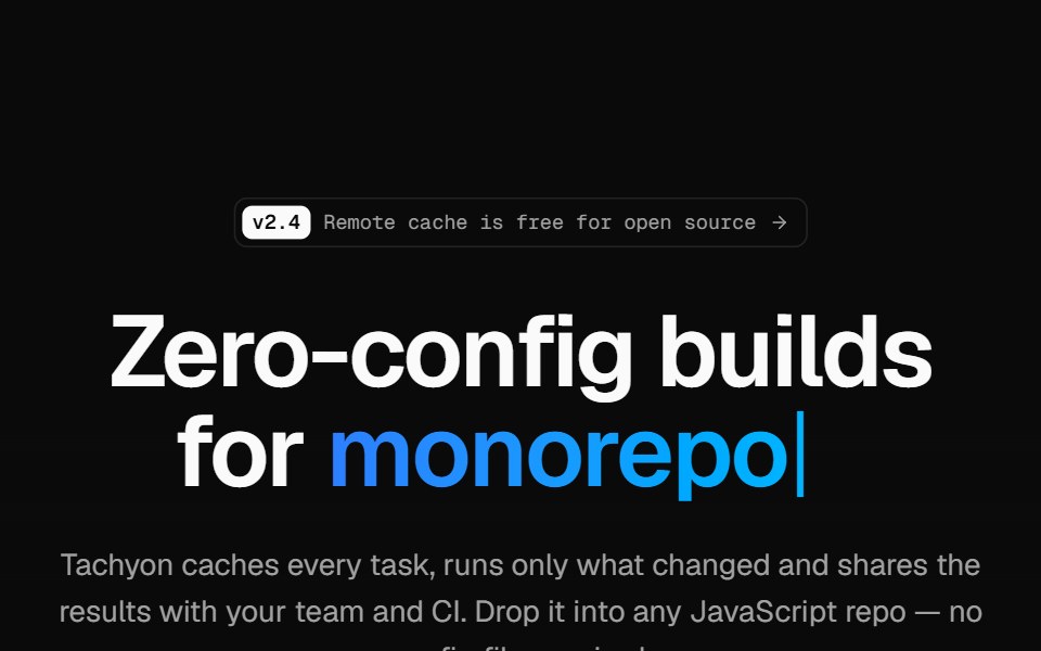 Developer tool heroVelora UI · ReactMinimal hero on a retro grid with a typed headline accent, an install terminal and two CTAs.
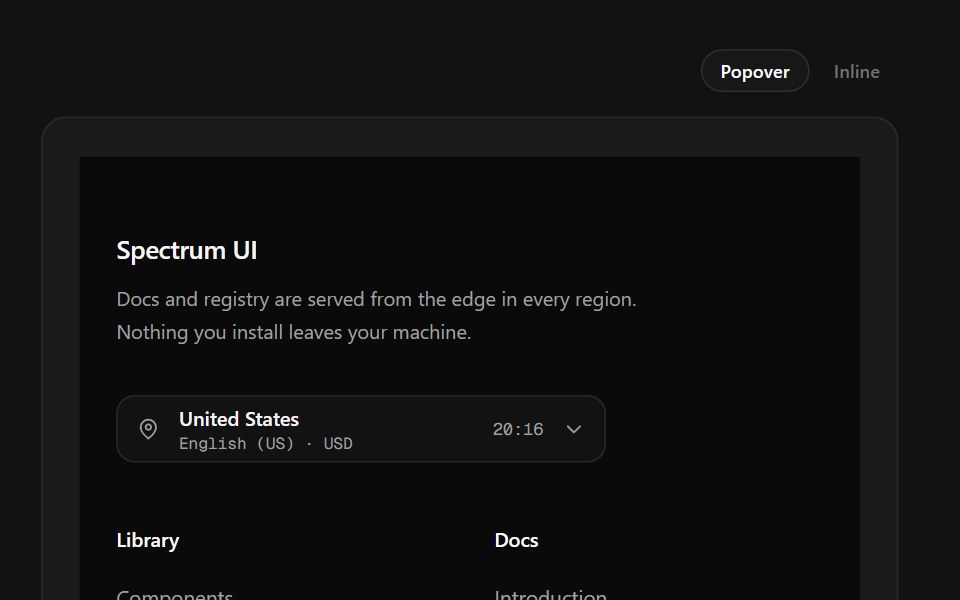 Region Picker FooterSpectrum UI · ReactA region popover with locale, currency, data residency and live local time.
 Hero 01 - Agency Hero SectionShadcn Space · ReactClean agency hero section designed for SaaS and startup websites, featuring bold headline, gradient background, trust…
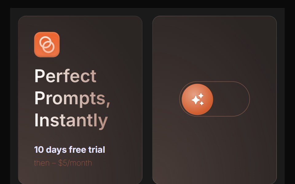 Bento 4Watermelon UI · React
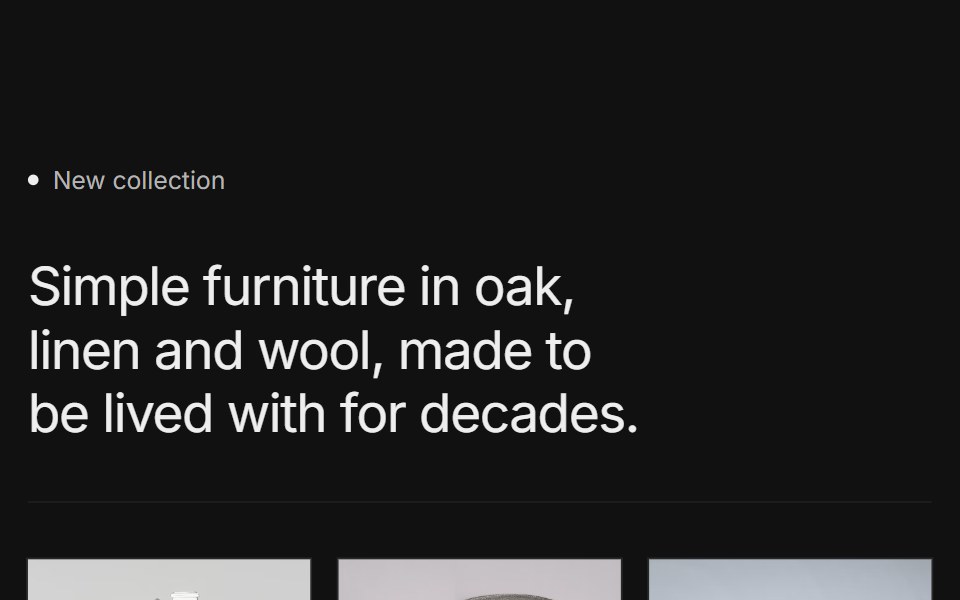 Content 15FLX UI · ReactA labeled collection intro with a short headline, a row of three product photos with names, and a CTA, framed by thin…
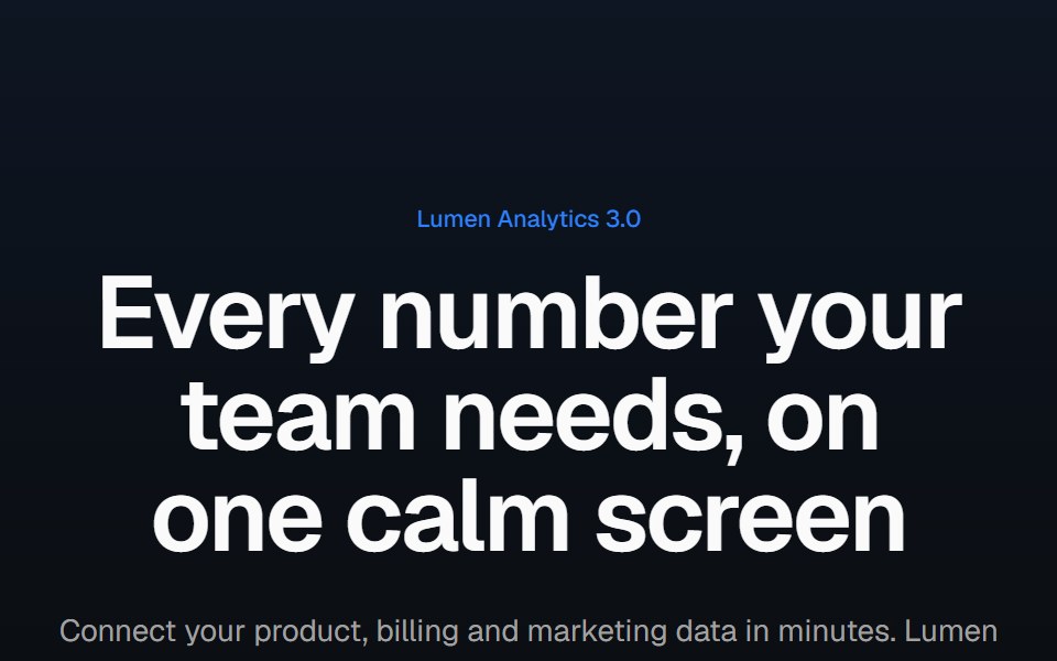 Product screenshot heroVelora UI · ReactCentered headline above a dashboard in a browser frame with a border beam and a logo row.
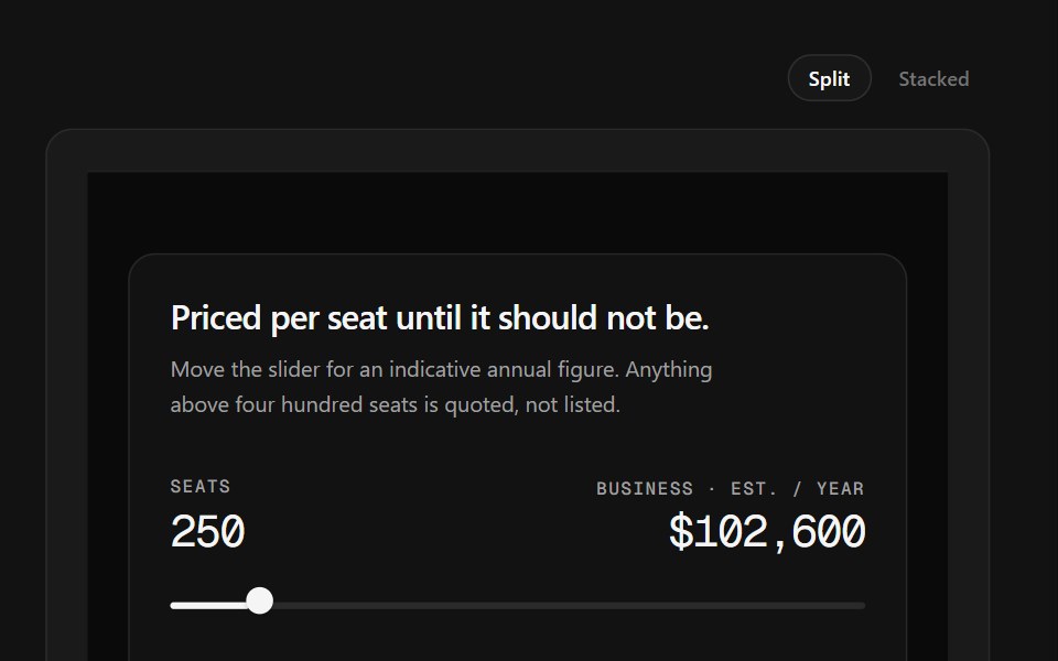 Sales CTA FooterSpectrum UI · ReactA seat slider that prices a tier live, beside the link grid.
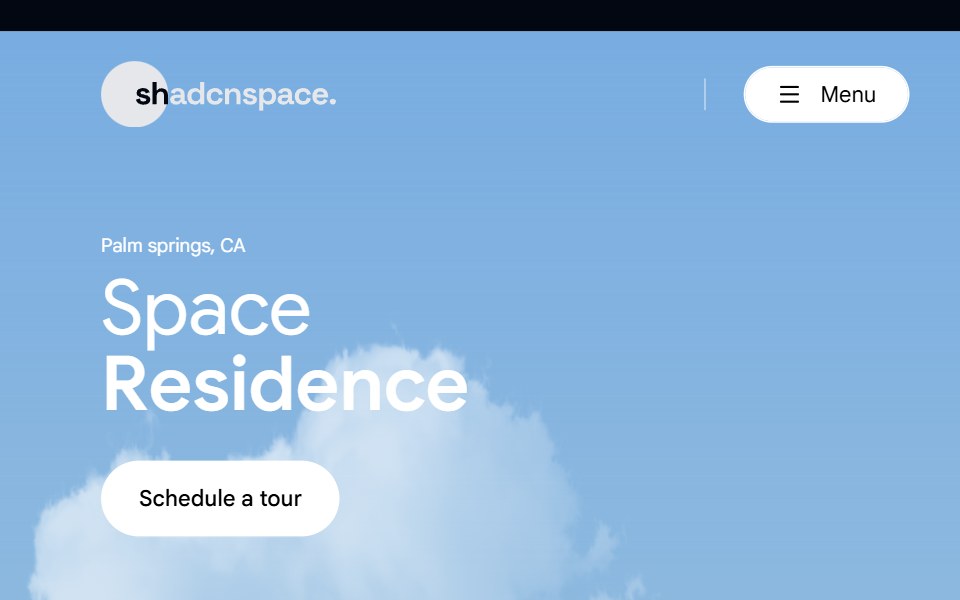 Hero 02 - Real Estate Hero SectionShadcn Space · ReactLuxury real estate hero section crafted for property listings, featuring immersive imagery, location highlight, key…
 Bento 5Watermelon UI · React
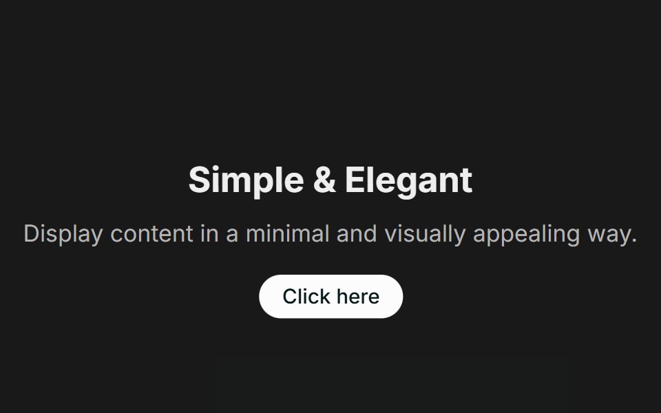 Call to Action 01FLX UI · ReactA centered text block with a title, description, and CTA.
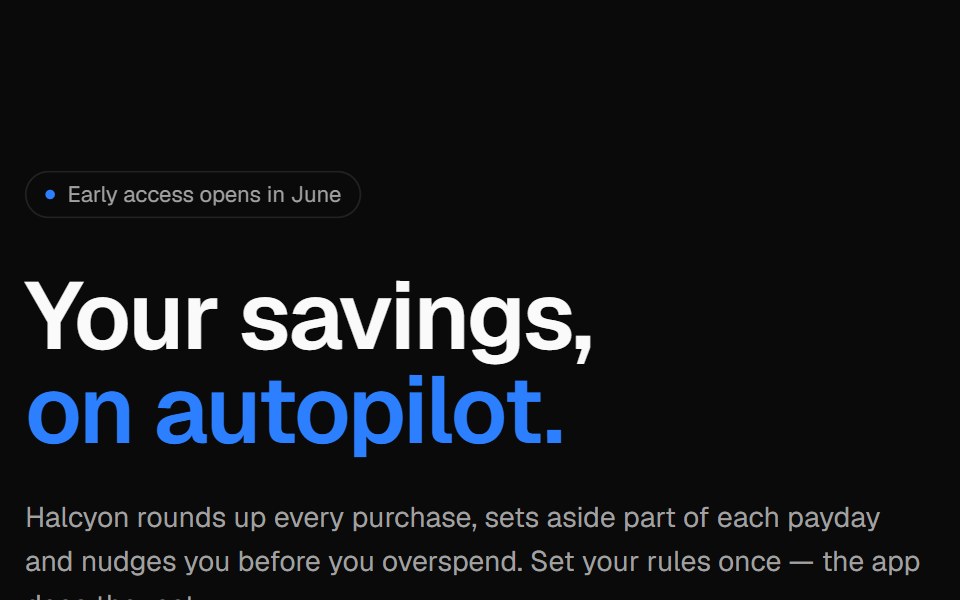 Phone split heroVelora UI · ReactApp launch hero with an email capture on the left and an app screen in an iPhone frame.
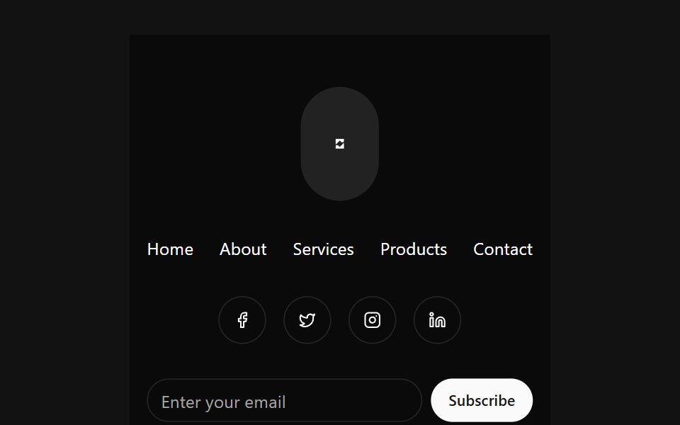 Stacked Circular FooterSpectrum UI · Reactcomponent for the Stacked Circular Footer
 Hero 03 - Digital Agency Hero SectionShadcn Space · ReactHigh-impact digital agency hero section with cinematic background video, bold typography, brand driven headline, and…
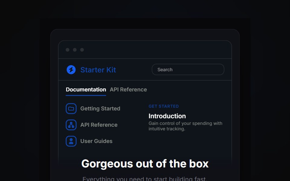 Bento 6Watermelon UI · React
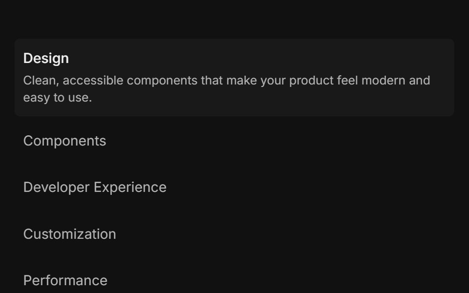 Feature 01FLX UI · ReactList of items: select one to reveal its description and media.
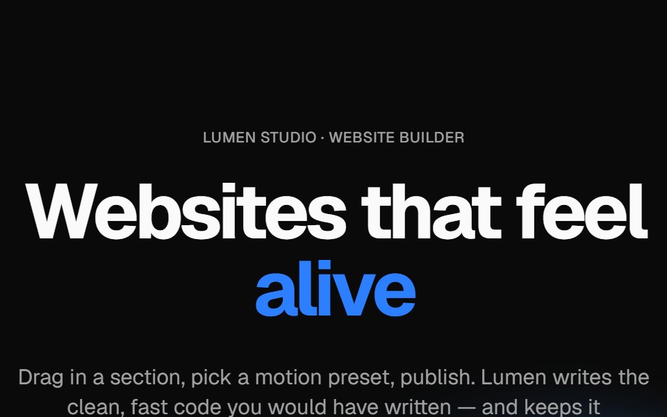 Wavy heroVelora UI · ReactBold centered hero over flowing waves, with a rotating headline word and avatar social proof.
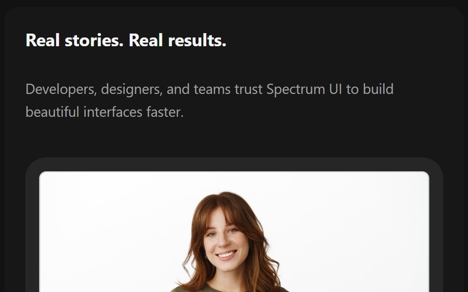 TestimonialsSpectrum UI · Reactcomponent for the Testimonials
 Marquee 04 - Fashion Video ShowcaseShadcn Space · ReactFashion video showcase marquee component
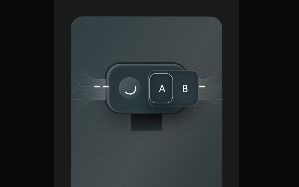 Bento 7Watermelon UI · React
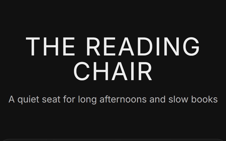 Feature 05FLX UI · ReactA centered product title over three icon features, a large product photo and a product card with finish swatches and a…
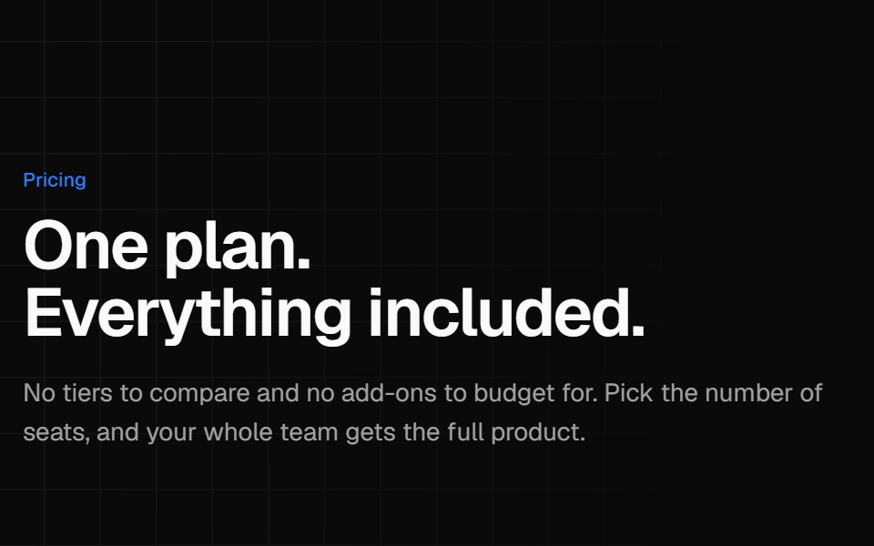 Single plan pricingVelora UI · ReactOne all-inclusive plan card beside a benefit list and short reassurance answers.
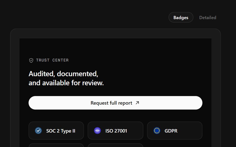 Trust Center FooterSpectrum UI · ReactCompliance marks that expand to scope, over a logo row and link columns.
 Newsletter 01 - Newsletter Subscription CTAShadcn Space · ReactA minimal newsletter signup section with bold headline, social-proof subtext, and inline email form, ideal for…
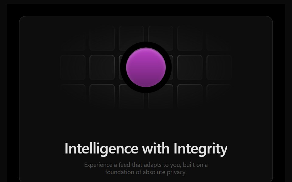 Bento 8Watermelon UI · React
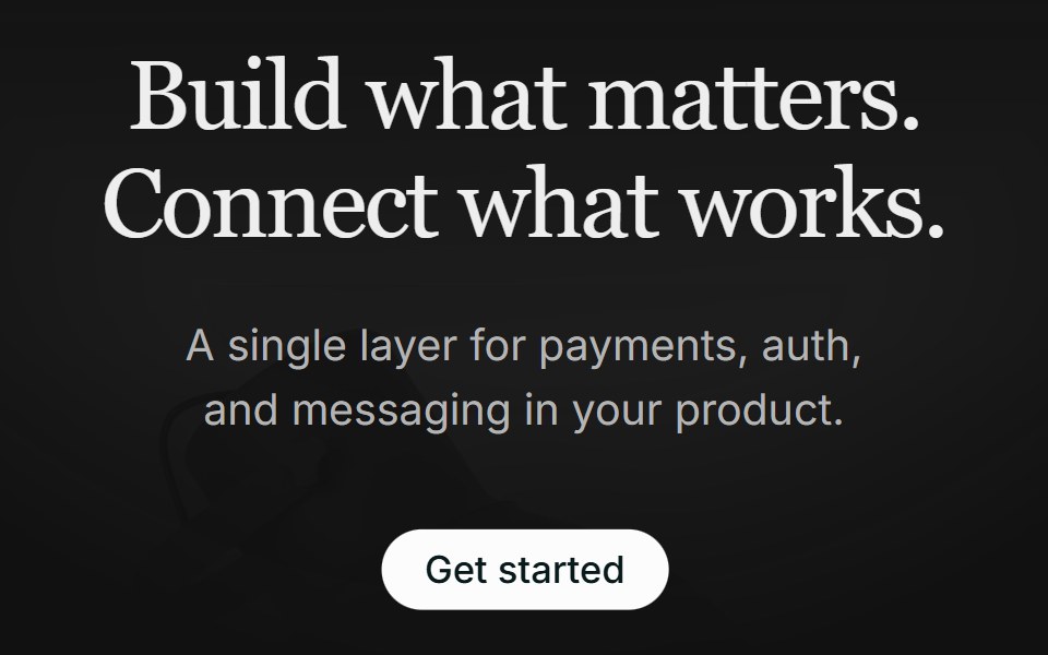 Hero 01FLX UI · ReactA centered serif hero with a soft gradient wash, pill CTA, and a floating integration cloud.
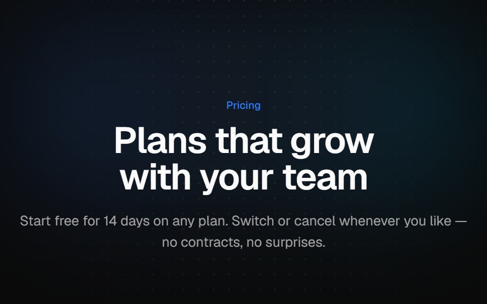 Three-tier pricingVelora UI · ReactThree plan cards with a monthly/yearly switch, a savings badge and a highlighted middle plan.
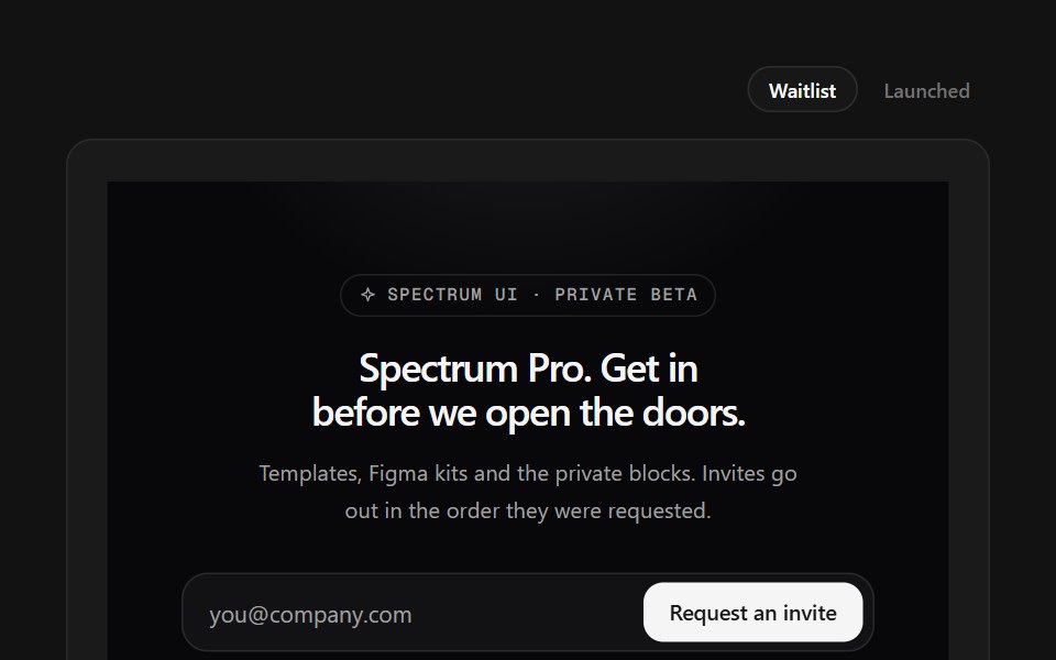 Waitlist FooterSpectrum UI · ReactWaitlist capture with an avatar stack and a live position counter.
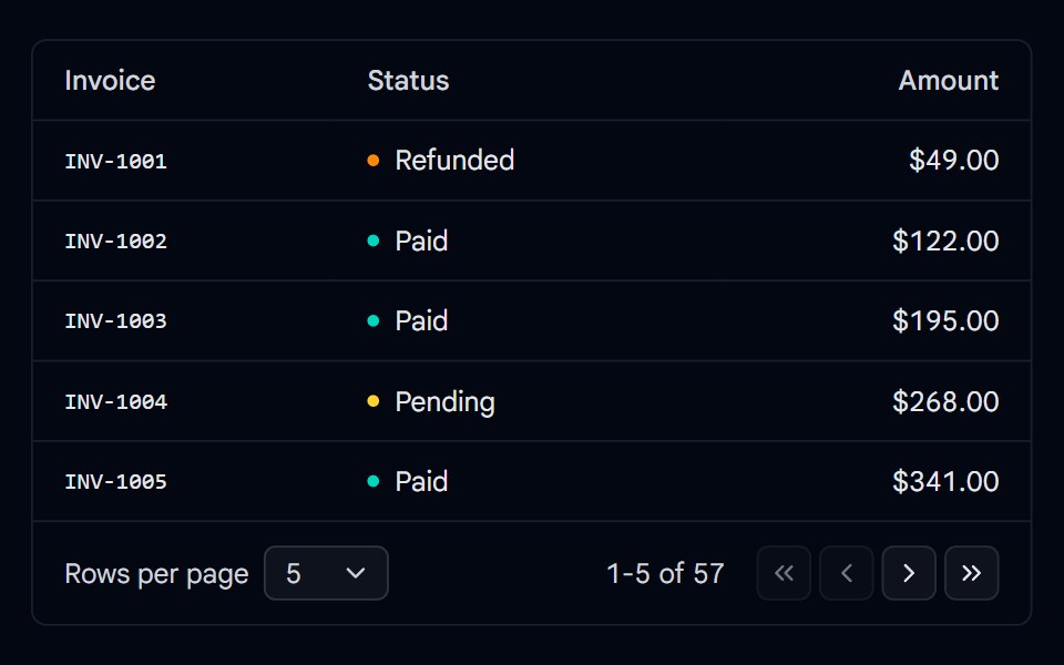 Pagination 05 - Table FooterShadcn Space · ReactInvoice table with a rows per page select, a showing range label, and first, previous, next, and last page buttons.
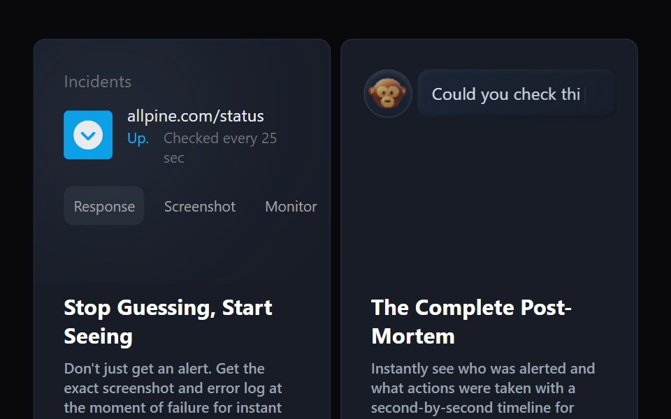 Bento 9Watermelon UI · React
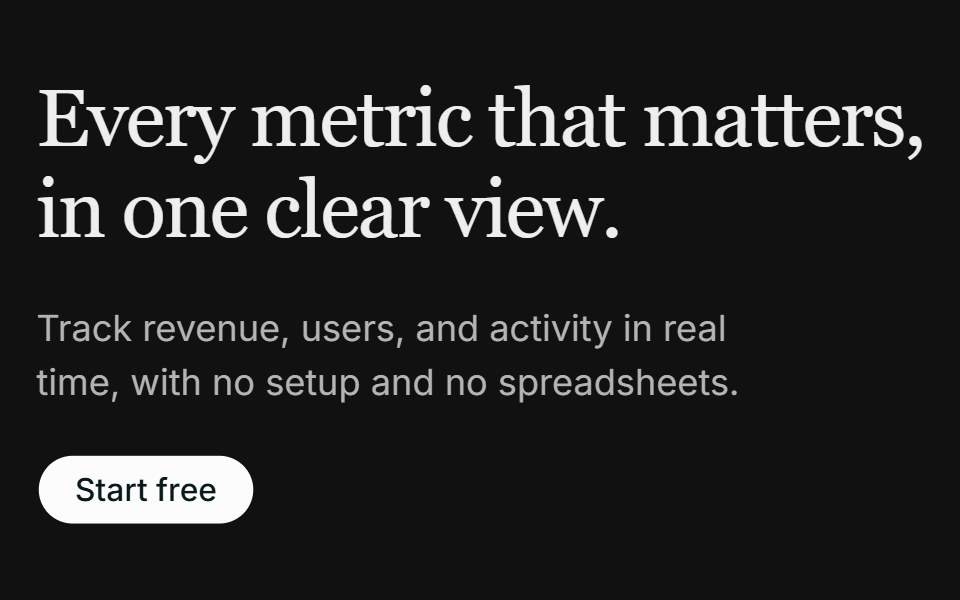 Hero 02FLX UI · ReactA left-aligned serif hero with a media panel: an image backdrop with a floating dashboard mockup on top.
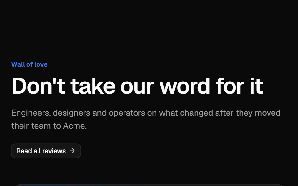 Testimonial gridVelora UI · ReactMasonry wall of social posts and quote cards, led by a wide case-study quote with a headline metric.
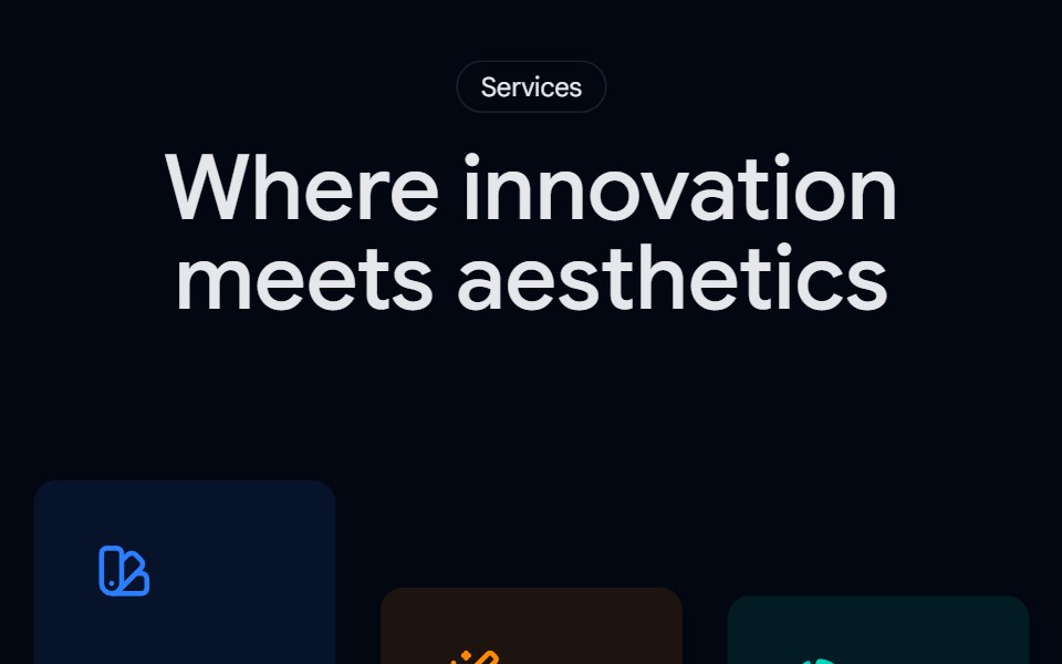 Services 01 - Creative Services OverviewShadcn Space · ReactA colorful services section with icon cards and dual CTAs, perfect for agencies to present core offerings, guide…
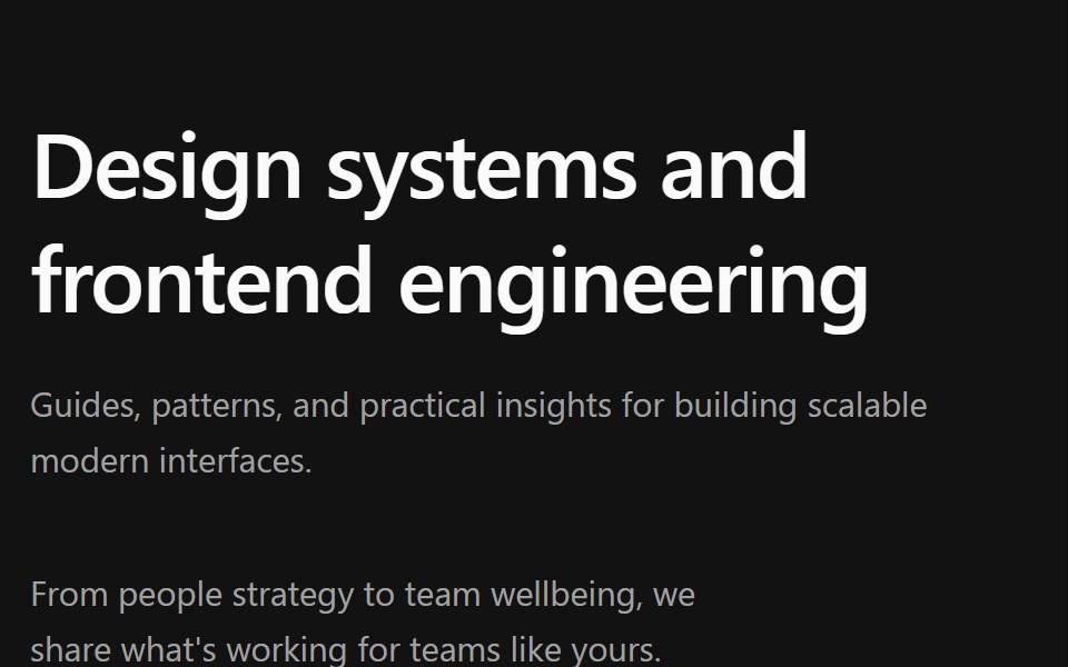 Blog 4Watermelon UI · React
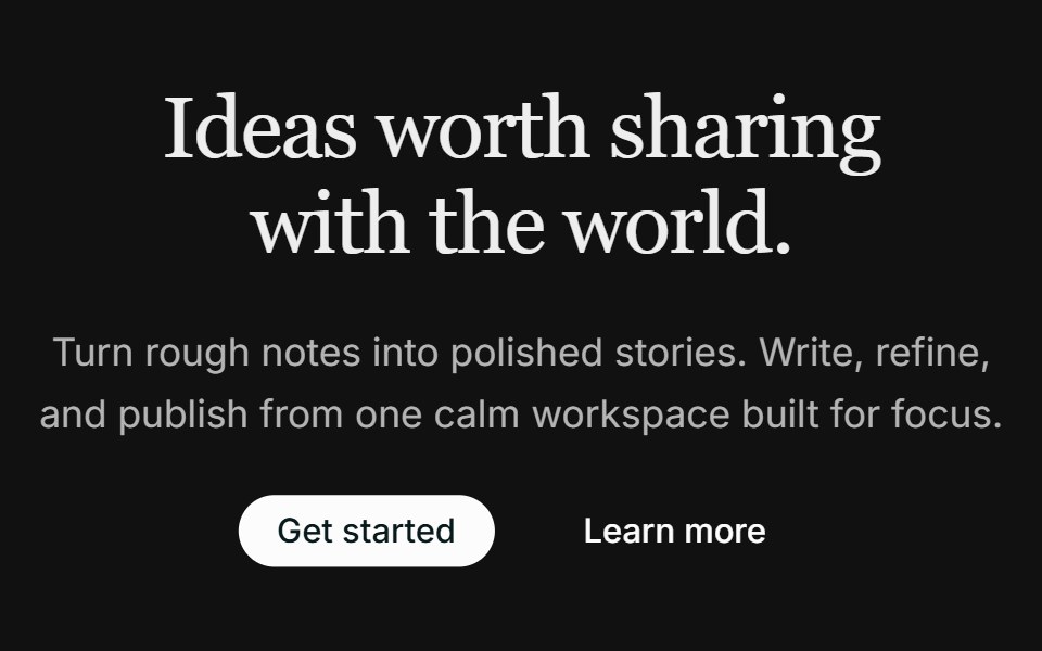 Hero 03FLX UI · ReactA centered hero with dual CTAs and an image that fades into the page below the copy.
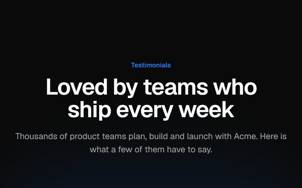 Testimonial marqueeVelora UI · ReactTwo rows of review cards scrolling in opposite directions, with faded edges and pause on hover or focus.
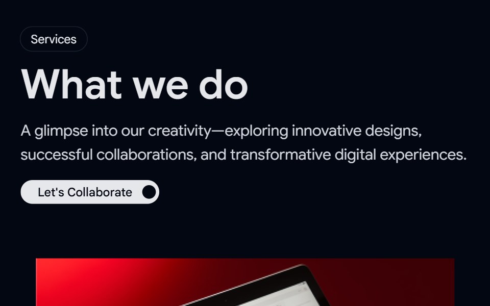 Services 02 - Services Animated BlockShadcn Space · ReactA premium dark mode services section with interactive list, visual preview, and detailed descriptions, ideal for…
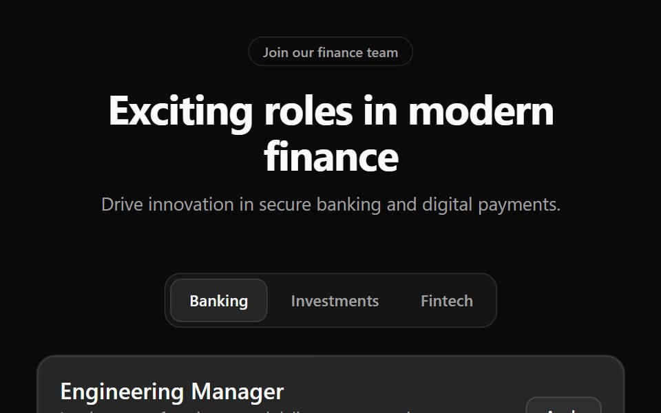 Career 2Watermelon UI · React
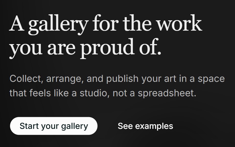 Hero 04FLX UI · ReactA two-column editorial hero with a soft background wash and a layered collage of two overlapping images.
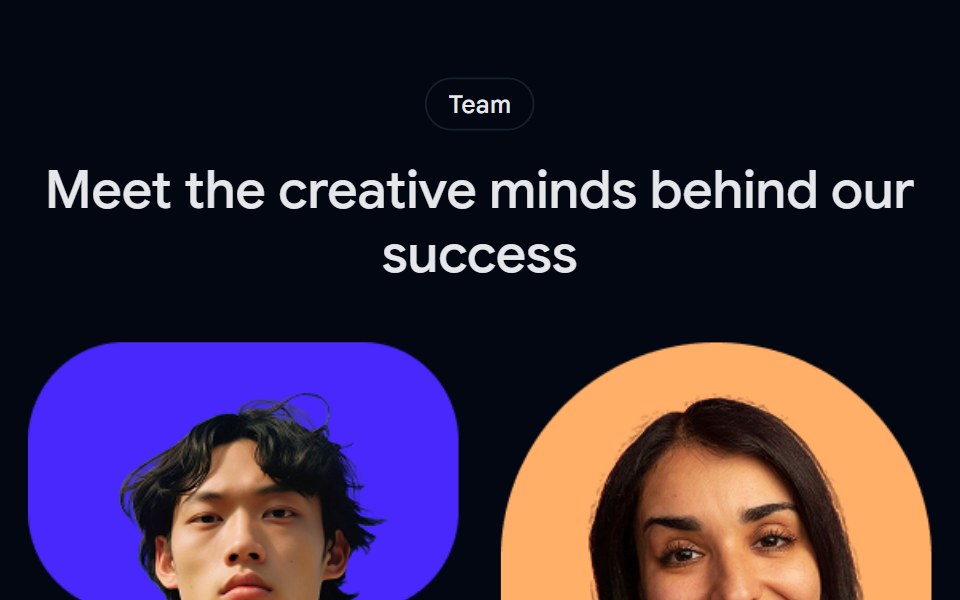 Team 01 - Creative Team ShowcaseShadcn Space · ReactA vibrant team section featuring profile cards with roles and social links, perfect for agencies or startups to…
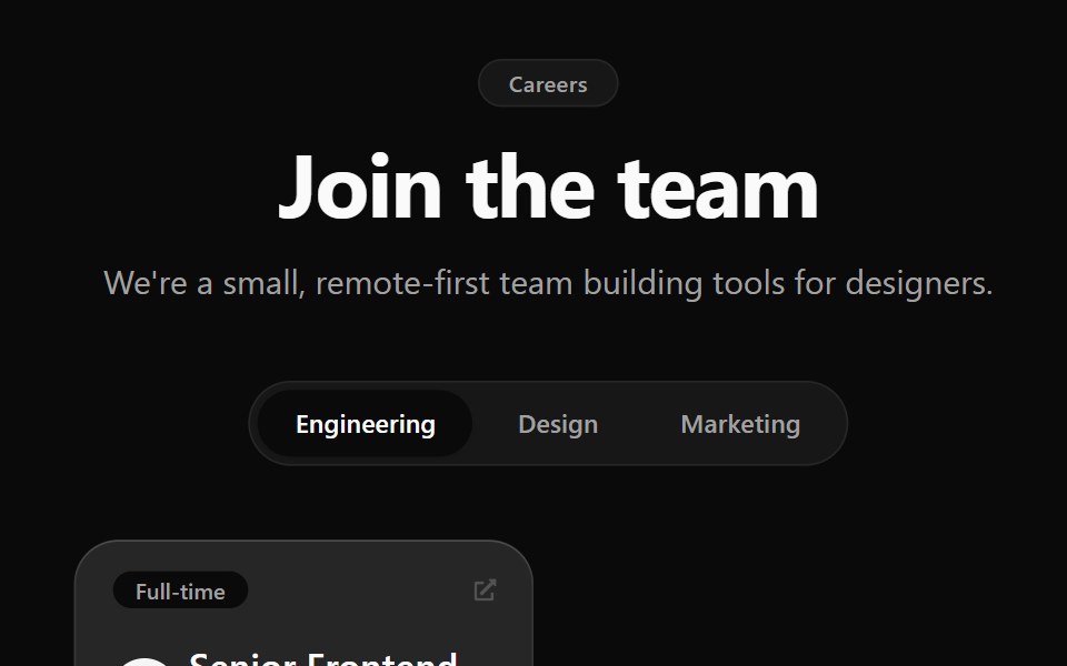 Career 3Watermelon UI · React
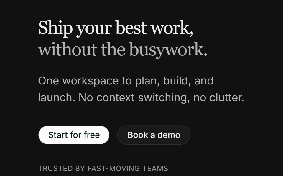 Hero 06FLX UI · ReactA split product hero with dual CTA, a compact logo row, and the Spot 01 illustration.
 Testimonial 02 - Testimonial Slider ShowcaseShadcn Space · ReactA clean testimonial slider with customer photo, detailed quote, navigation controls, and partner logos—perfect for…
 Career 4Watermelon UI · React
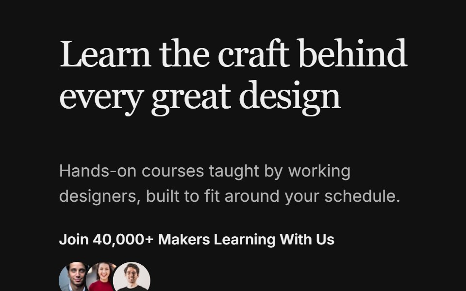 Hero 08FLX UI · ReactA split hero with a bold headline, avatar social proof, and two image cards with invertible overlay text and CTAs.
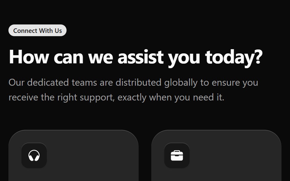 Contact 1Watermelon UI · React
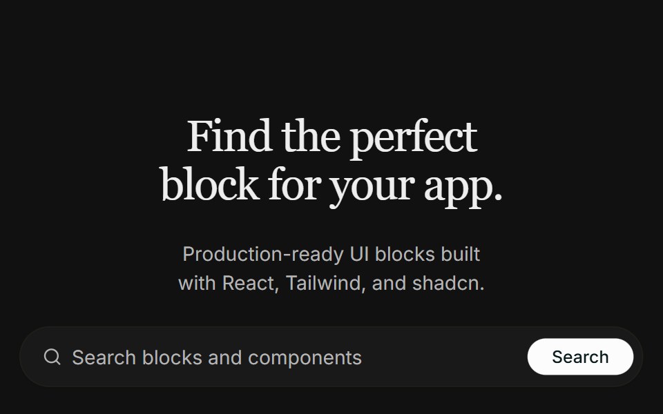 Hero 09FLX UI · ReactA centered real-estate hero with a search bar, a masked architecture image that fades into the page, and a split…
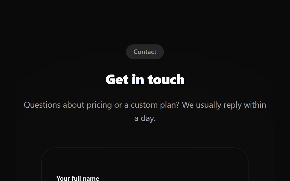 Contact 2Watermelon UI · React
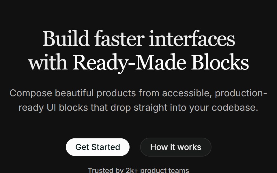 Hero 10FLX UI · ReactA centered hero with a highlighted headline, dual CTAs, social proof, and a fanned collage of three overlapping images.
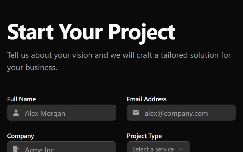 Contact 3Watermelon UI · React
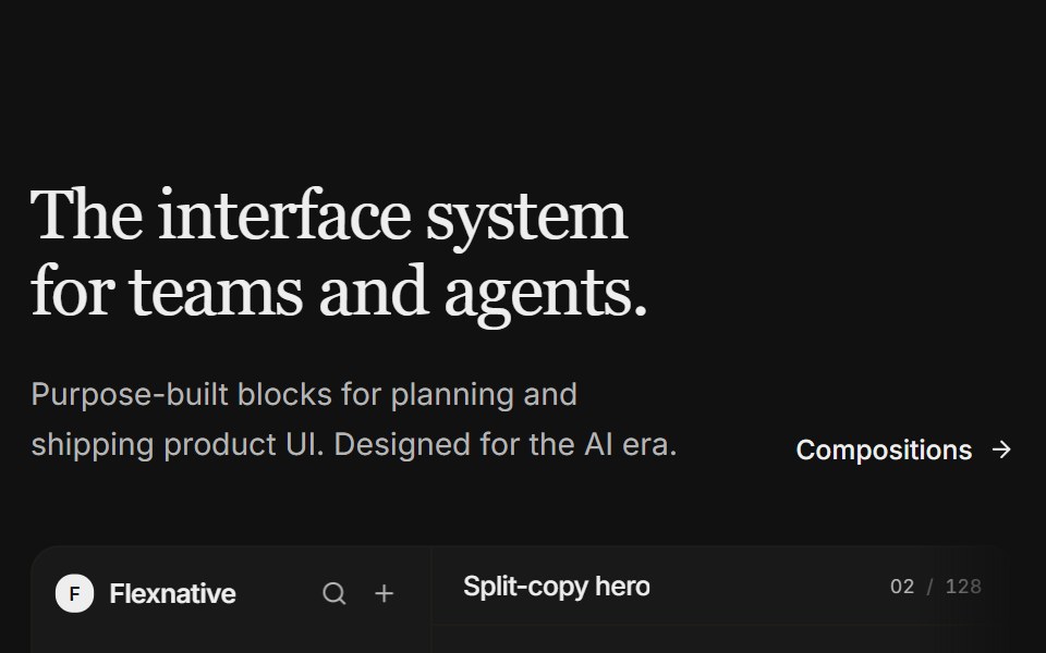 Hero 11FLX UI · ReactA split-copy hero with a light product studio mock — issue feed, properties, and a floating agent panel that fades…
 Contact 4Watermelon UI · React
 Hero 12FLX UI · ReactA full-bleed image hero with an oversized name, an established label, and a floating pill CTA anchored to the corner.
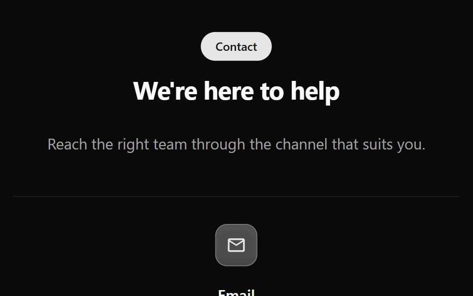 Contact 5Watermelon UI · React
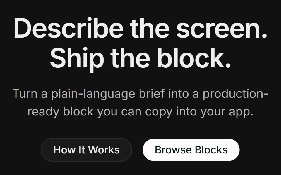 Hero 14FLX UI · ReactA centered product hero with dual CTAs, a full-width photo with a floating block-builder demo panel, and a logo strip.
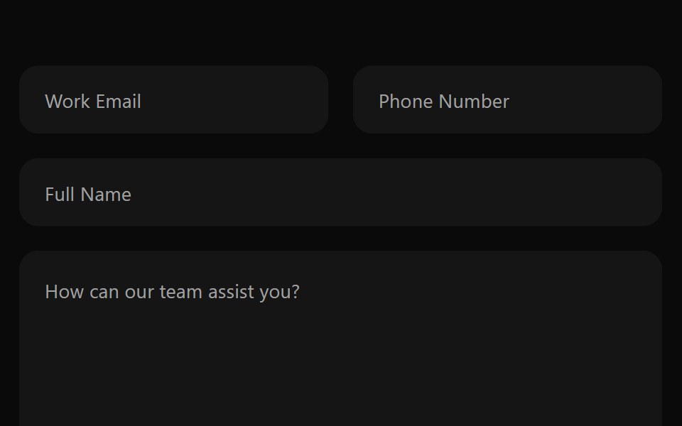 Contact 6Watermelon UI · React
Libraries with shadcn/ui section components
Related categories
- Section Components
- React Section Components
- Tailwind CSS Section Components
- Svelte Section Components
- Animated Section Components
- shadcn/ui Hero Components
- shadcn/ui Feature Section Components
- shadcn/ui Footer Components
- shadcn/ui FAQ Section Components
- shadcn/ui CTA Section Components
- shadcn/ui Testimonials Section Components
- shadcn/ui Newsletter Section Components