 Dev Design Library
Svelte Section Components
Dev Design Library indexes 128 Svelte section components from 3 open-source UI libraries, with the most coming from cnblocks, sv-efferd and Animations (Svelte). Each one links to its page with the source code, a live preview where available, the library license and the install command. Every library in this list targets Svelte.
Showing 120 of 128, a mix from every library. Open a library to see all of its components.
 Comparator Onecnblocks · SvelteBefore/after image comparison slider block
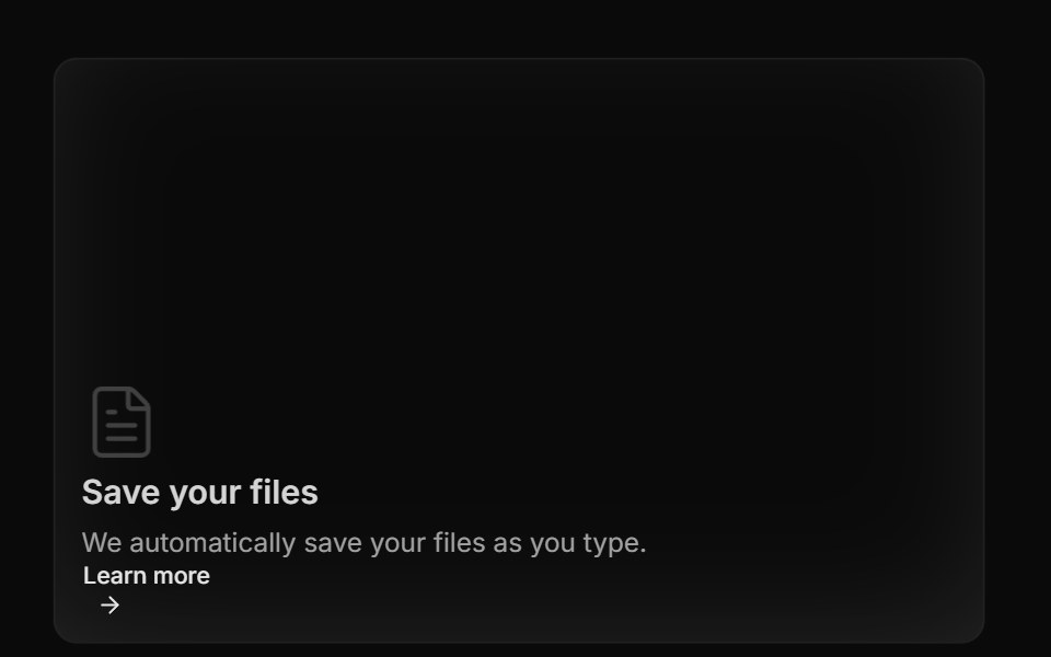 Bento GridAnimations (Svelte) · SvelteA flexible grid layout with interchangeable BentoCard items for showcasing content in a responsive masonry style.
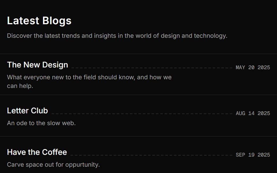 Blog Onesv-efferd · SvelteA vertical editorial list with full-width dividers and compact summaries.
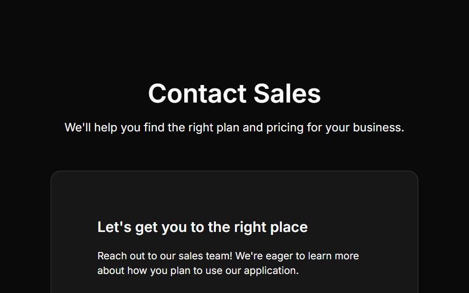 Contact Onecnblocks · SvelteContact form with input fields and submit button
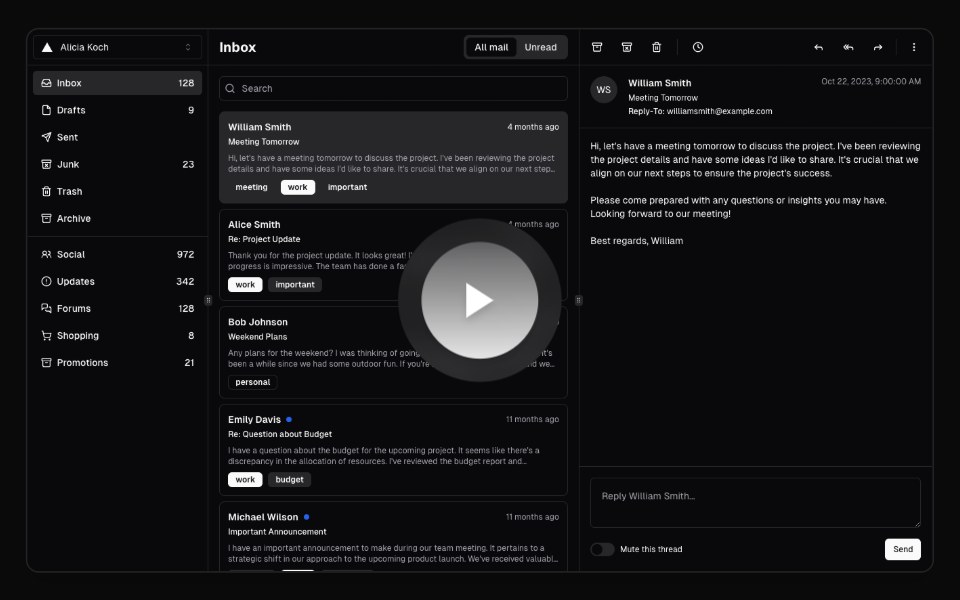 Hero Video DialogAnimations (Svelte) · SvelteA video dialog component with animated entrance effects, thumbnail support, and customizable animation styles.
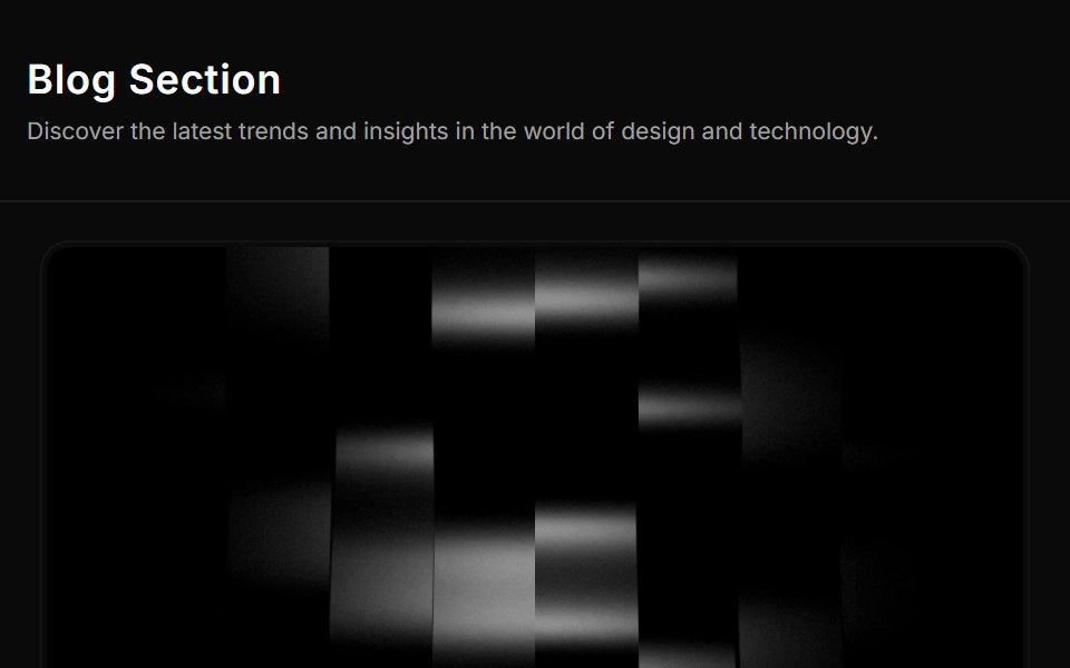 Blog Threesv-efferd · SvelteA card-based blog grid with media thumbnails and richer reading metadata.
 Contact Twocnblocks · SvelteTwo-column contact section with form and info
 Spell Logo CarouselAnimations (Svelte) · Svelte
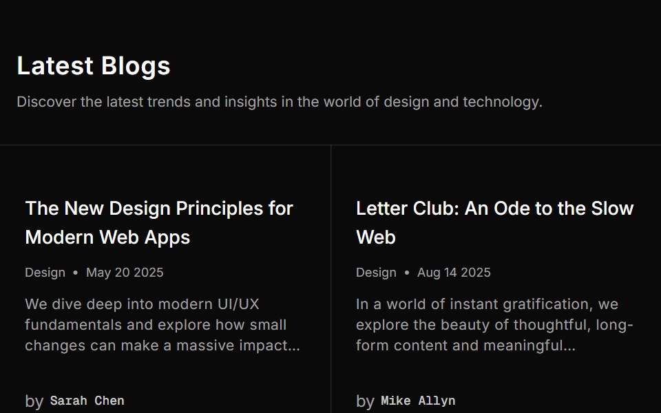 Blog Twosv-efferd · SvelteA structured blog grid with metadata rows and filler cells for balance.
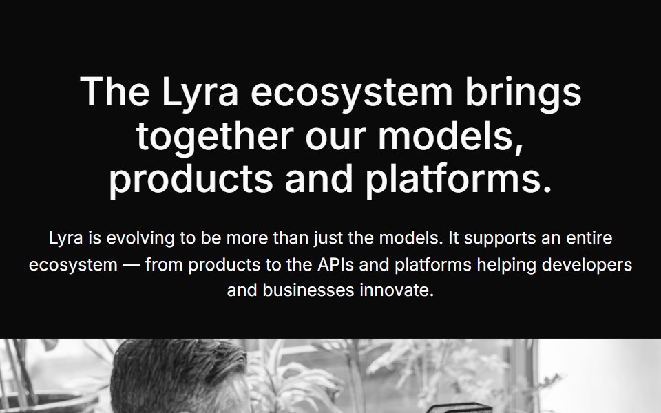 Content Fivecnblocks · SvelteContent block with image and text in grid layout
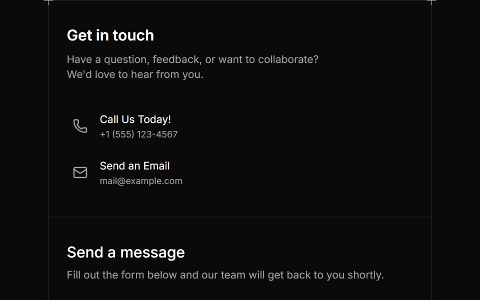 Contact Fivesv-efferd · SvelteA bordered contact card pairing essential details with a reusable message form.
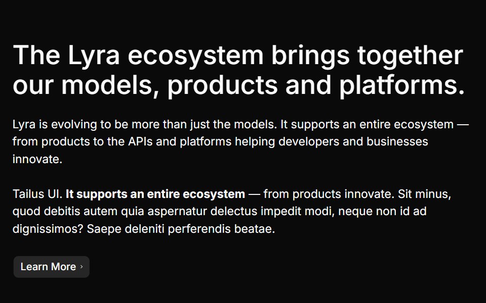 Content Fourcnblocks · SvelteContent section with feature highlights
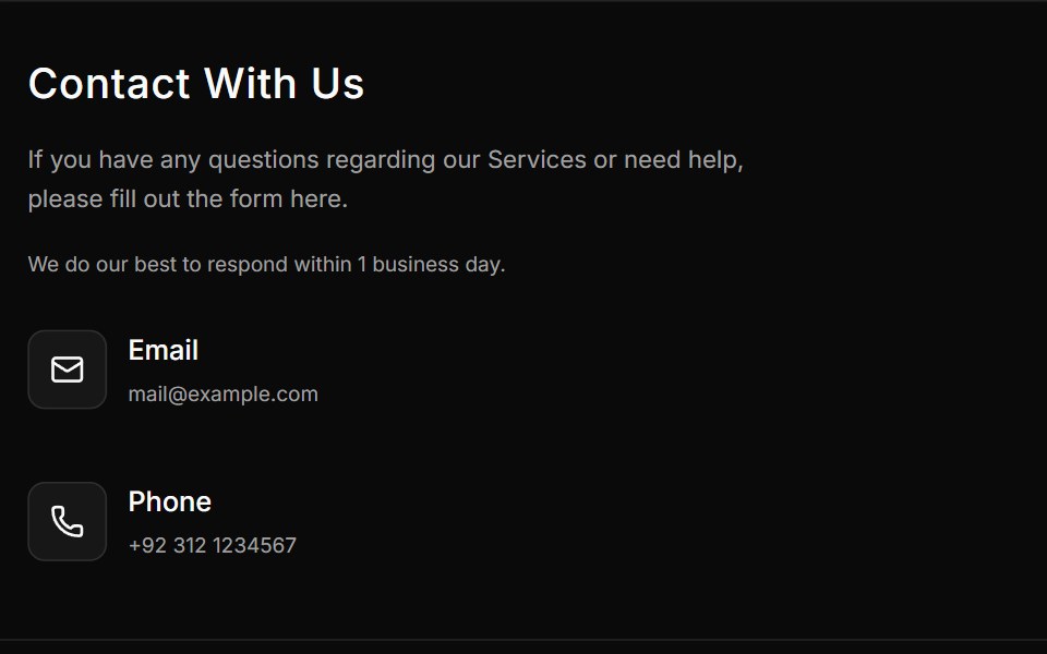 Contact Foursv-efferd · SvelteA split contact form with direct support details and a structured inquiry panel.
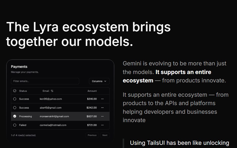 Content Onecnblocks · SvelteSimple content block with heading and description
 Contact Onesv-efferd · SvelteA compact contact strip with quick details framed by full-width dividers.
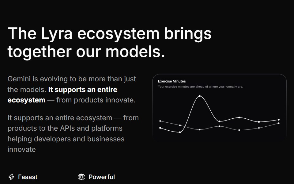 Content Sevencnblocks · SvelteContent block with alternating layout
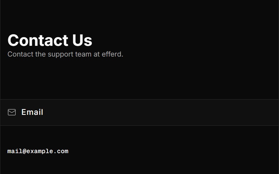 Contact Threesv-efferd · SvelteA full-page contact layout with detailed channels, office info, and social links.
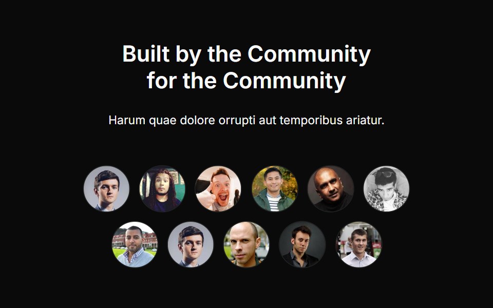 Content Sixcnblocks · SvelteContent section with icons and descriptions
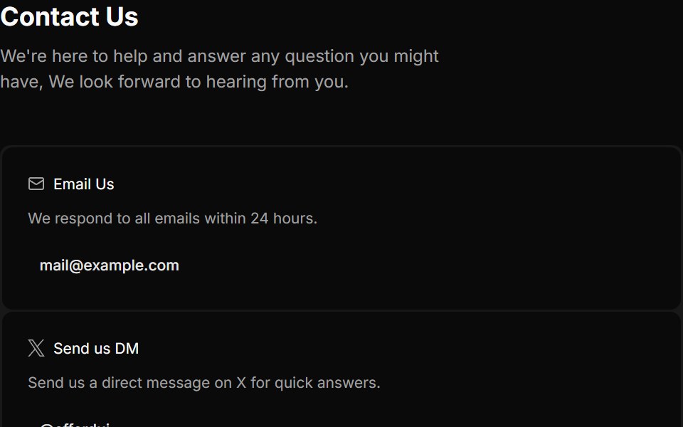 Contact Twosv-efferd · SvelteA three-column contact hub for email, social DMs, and community support.
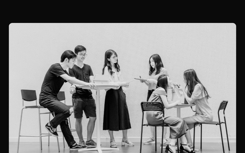 Content Threecnblocks · SvelteTwo-column content with image sidebar
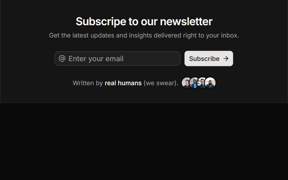 CTA Fivesv-efferd · SvelteA newsletter CTA that blends subscription form controls with social proof.
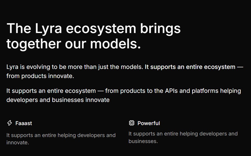 Content Twocnblocks · SvelteContent block with centered text and CTA
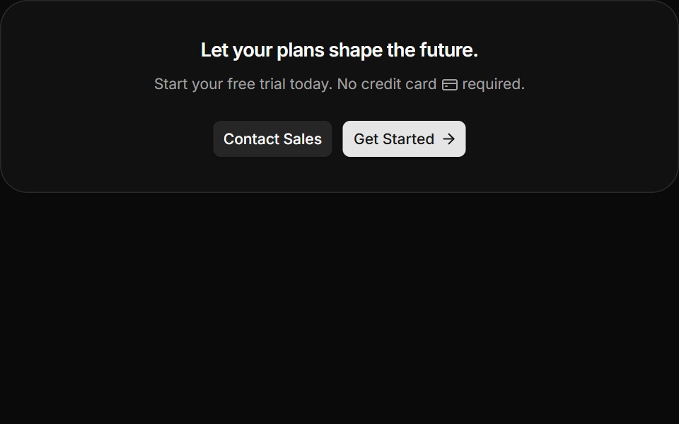 CTA Foursv-efferd · SvelteA compact card CTA with credit-card reassurance and elevated actions.
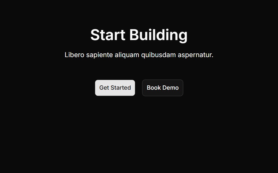 Cta Onecnblocks · SvelteCall-to-action block with centered heading and buttons
 CTA Onesv-efferd · SvelteA split CTA with quiet structure, balanced actions, and full-width dividers.
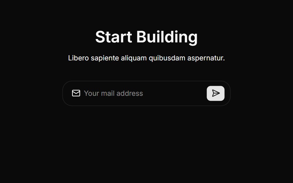 Cta Threecnblocks · SvelteCTA section with background gradient
 CTA Threesv-efferd · SvelteA more decorative CTA with corner accents and a stronger editorial feel.
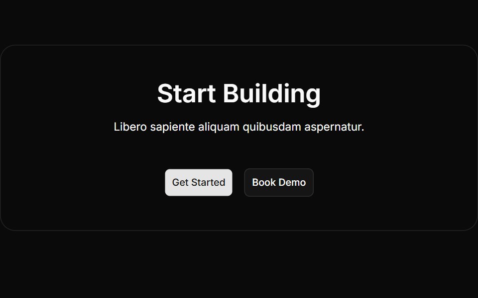 Cta Twocnblocks · SvelteTwo-column CTA with text and action buttons
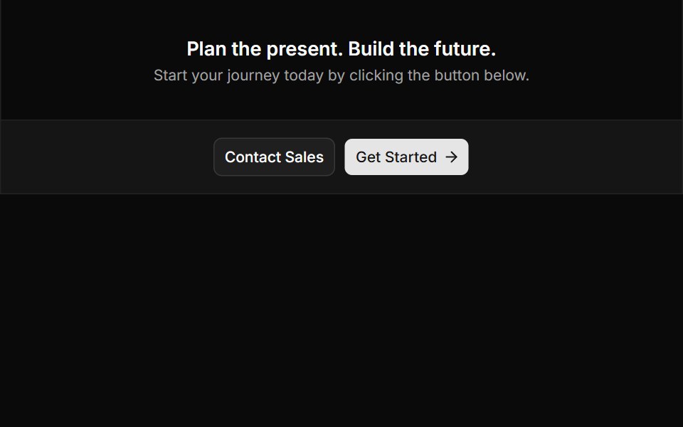 CTA Twosv-efferd · SvelteA centered CTA with a softer secondary band and directional primary action.
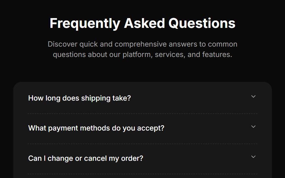 Faq Fourcnblocks · SvelteFAQ section with search and categories
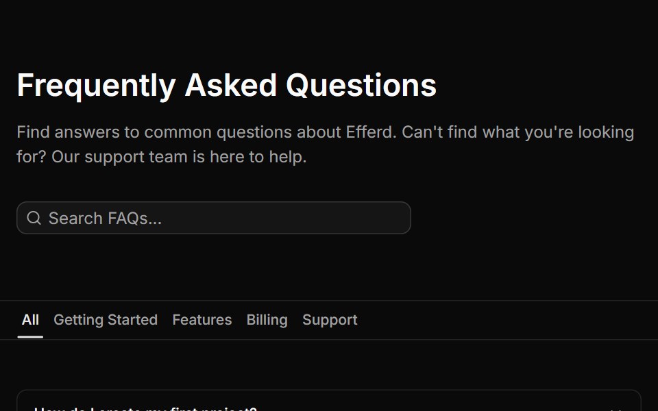 FAQ Fivesv-efferd · SvelteA searchable FAQ page with category filters, empty state handling, and structured dividers.
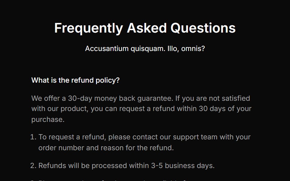 Faq Onecnblocks · SvelteSimple accordion-style FAQ block
 FAQ Foursv-efferd · SvelteA categorized FAQ explorer with topic switching and softly framed accordion rows.
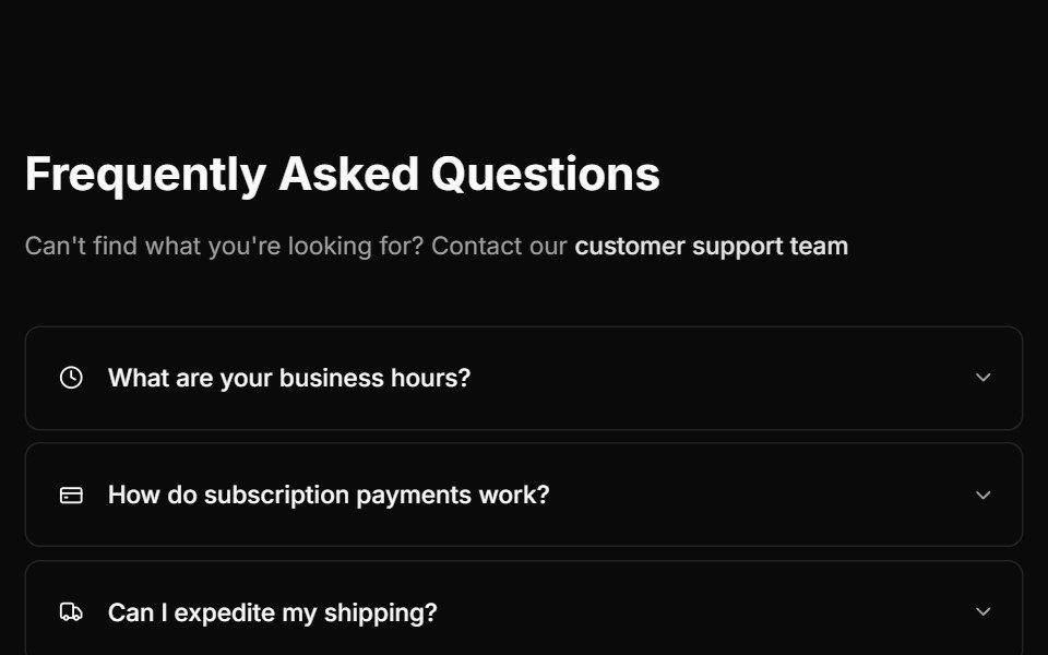 Faq Threecnblocks · SvelteFAQ with two-column layout
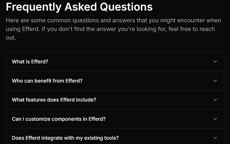 FAQ Onesv-efferd · SvelteA compact FAQ stack with a centered heading and a classic single-column accordion.
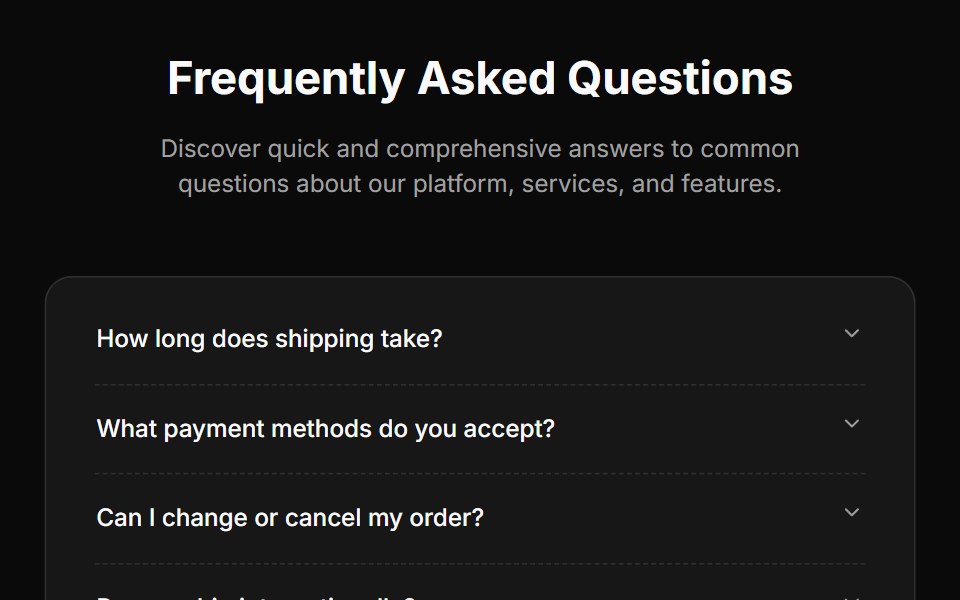 Faq Twocnblocks · SvelteFAQ section with expandable items
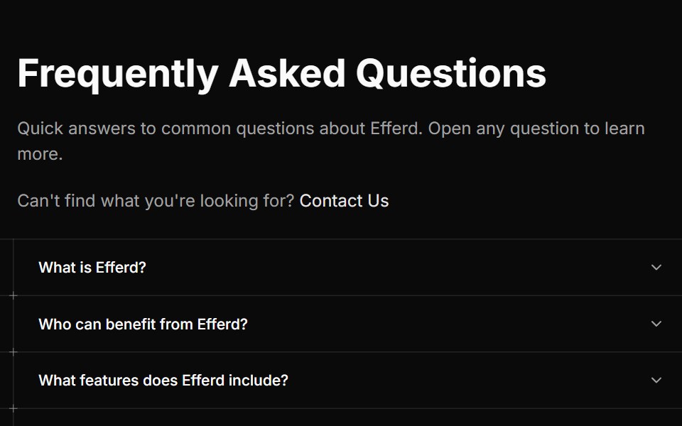 FAQ Threesv-efferd · SvelteA guided editorial FAQ with divider rails and decorative timeline markers.
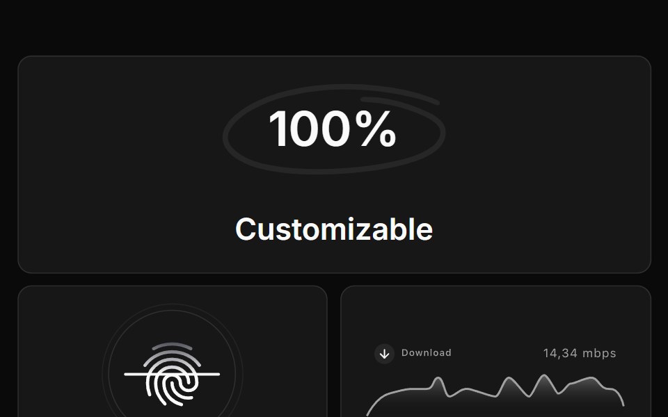 Feature Eightcnblocks · SvelteFeature grid with icons in circular containers
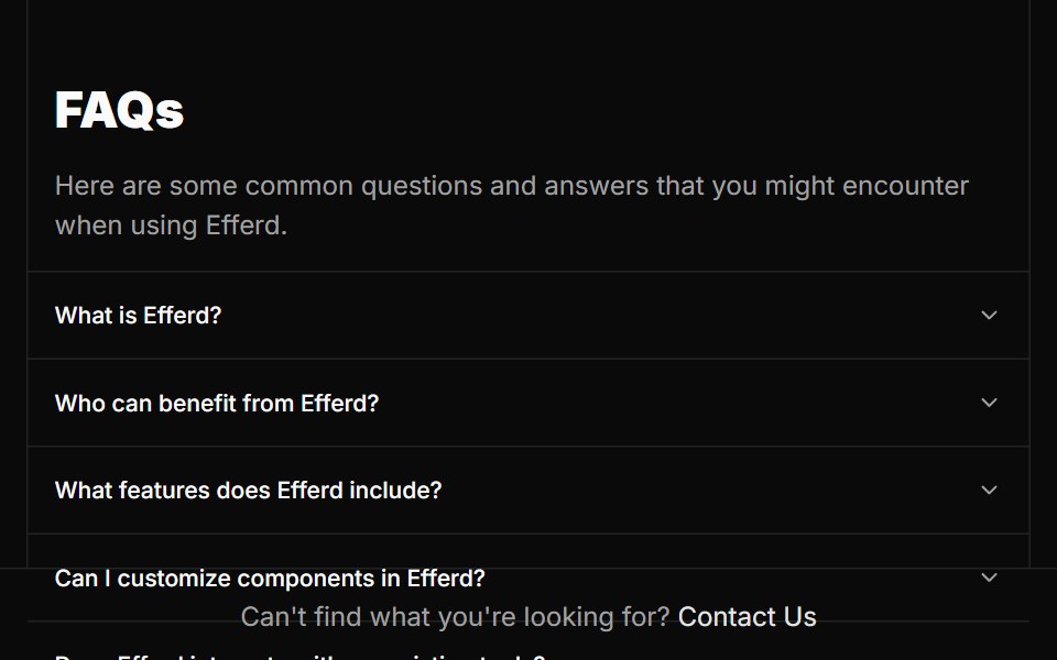 FAQ Twosv-efferd · SvelteA split FAQ layout with a fixed intro column and full-height answer rail.
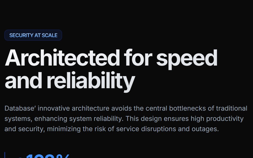 Feature Elevencnblocks · SvelteFeature section with alternating image/text rows
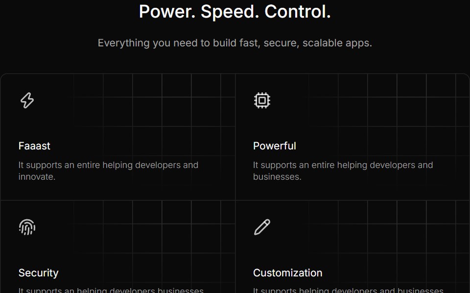 Feature Fivesv-efferd · SvelteA dense capability grid with patterned card backgrounds and a stronger product voice.
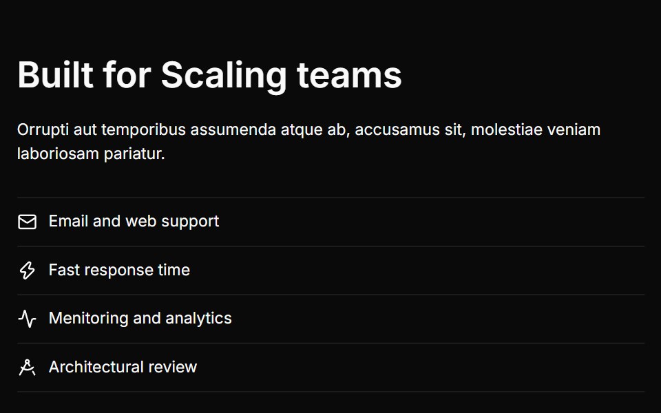 Feature Fivecnblocks · SvelteFeature block with large image and bullet points
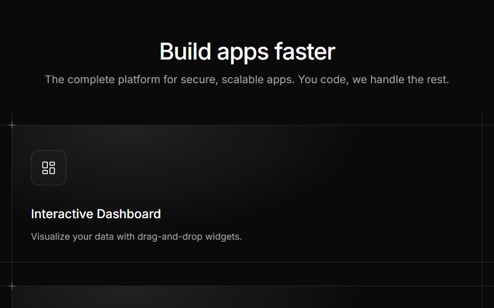 Feature Foursv-efferd · SvelteA product-feature showcase with structured cards and subtle editorial chrome.
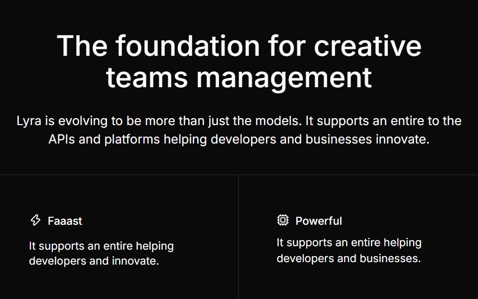 Feature Fourcnblocks · SvelteFour-column feature grid with icons
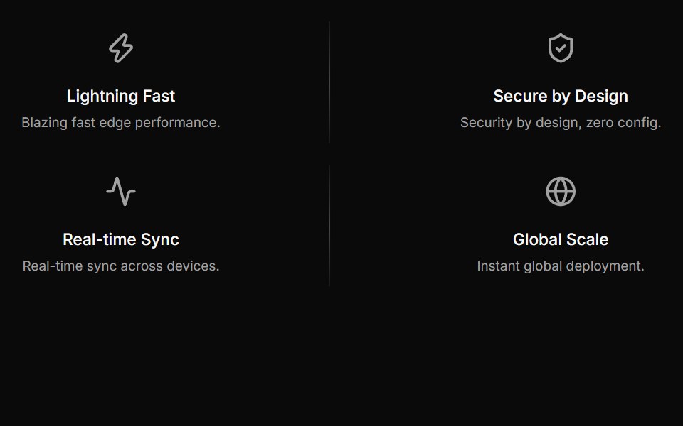 Feature Onesv-efferd · SvelteA compact four-column feature strip with lightweight icon-led messaging.
 Feature Fourteencnblocks · SvelteFeature section with numbered steps
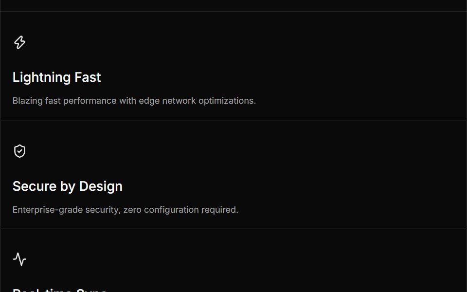 Feature Threesv-efferd · SvelteA bordered feature grid with full-width divider rails and stronger product framing.
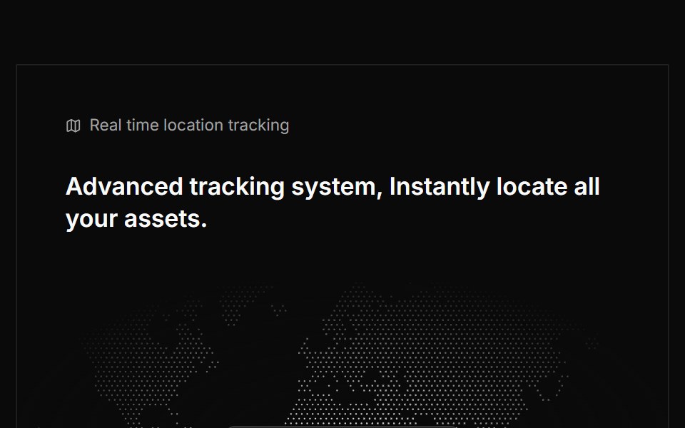 Feature Ninecnblocks · SvelteFeature list with checkmarks and descriptions
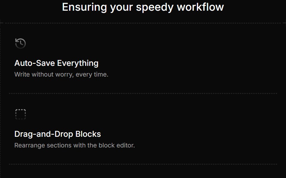 Feature Twosv-efferd · SvelteAn editorial feature frame with dashed rails, corner accents, and three focused highlights.
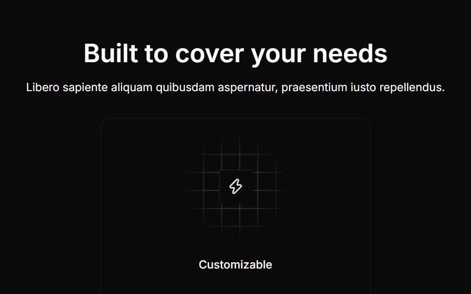 Feature Onecnblocks · SvelteSimple three-column feature grid
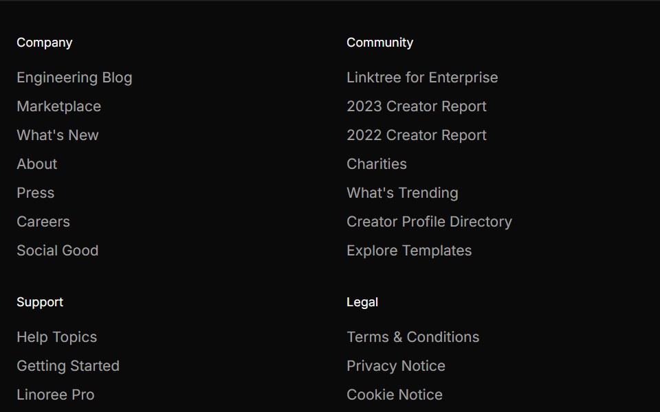 Footer Fivesv-efferd · SvelteA marketplace-style footer with store badges, social actions, and dense support links.
 Feature Sevencnblocks · SvelteFeature section with tabs and content panels
 Footer Foursv-efferd · SvelteA directory-style footer with stacked social headers and nested link groups.
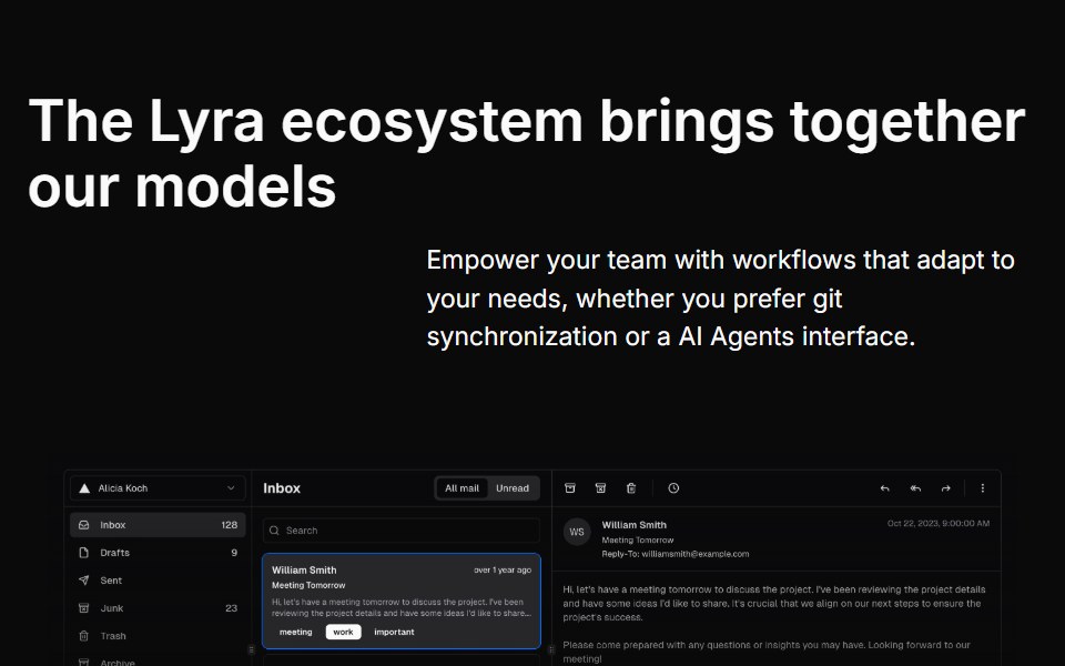 Feature Sixcnblocks · SvelteSix-column feature grid with hover effects
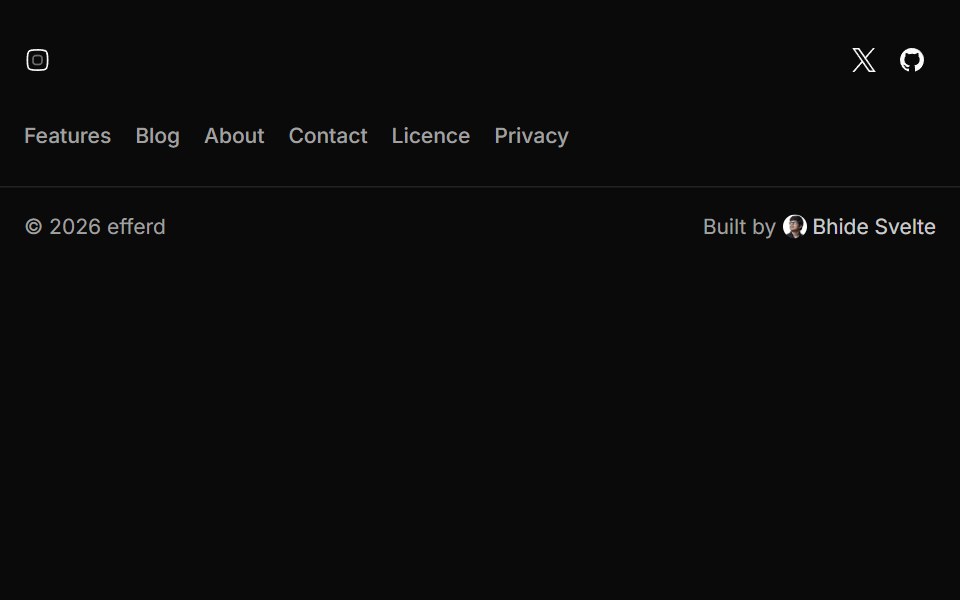 Footer Onesv-efferd · SvelteA compact product footer with inline social links and a simple closing bar.
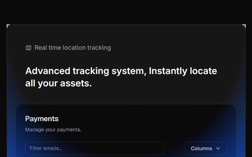 Feature Tencnblocks · SvelteFeature block with centered image and cards
 Footer Sixsv-efferd · SvelteA cinematic sticky footer with animated columns and a long-form enterprise sitemap.
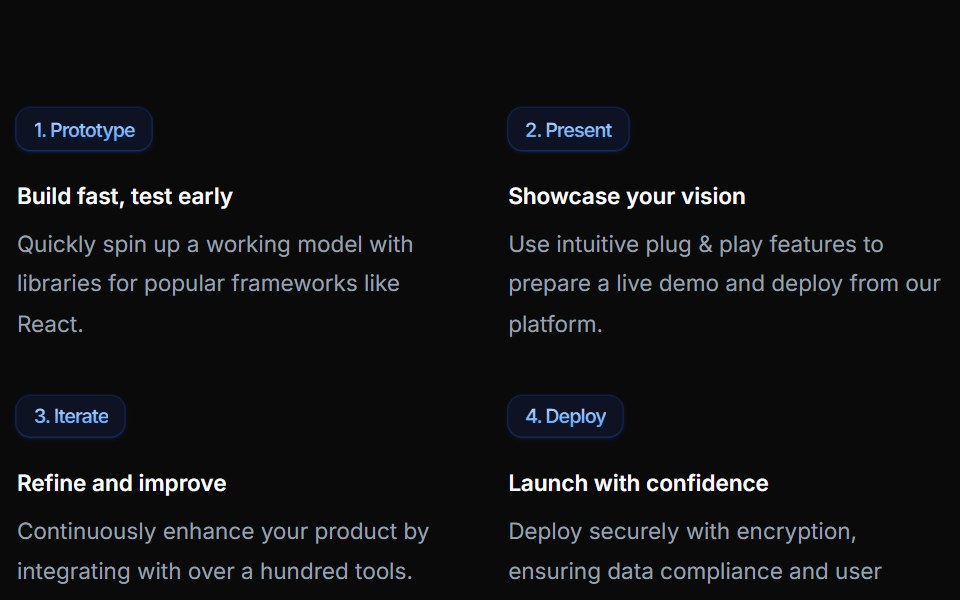 Feature Thirteencnblocks · SvelteFeature section with large hero image
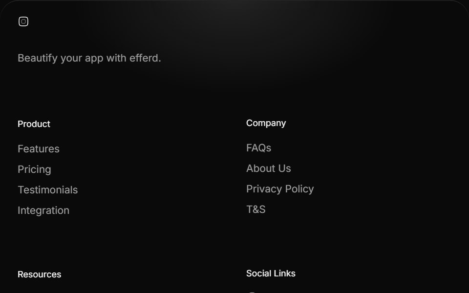 Footer Threesv-efferd · SvelteAn animated rounded footer with grouped link columns and softer visual depth.
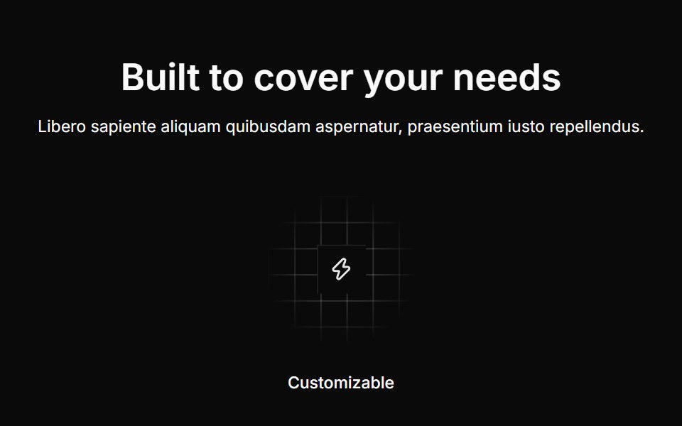 Feature Threecnblocks · SvelteThree-column feature cards with borders
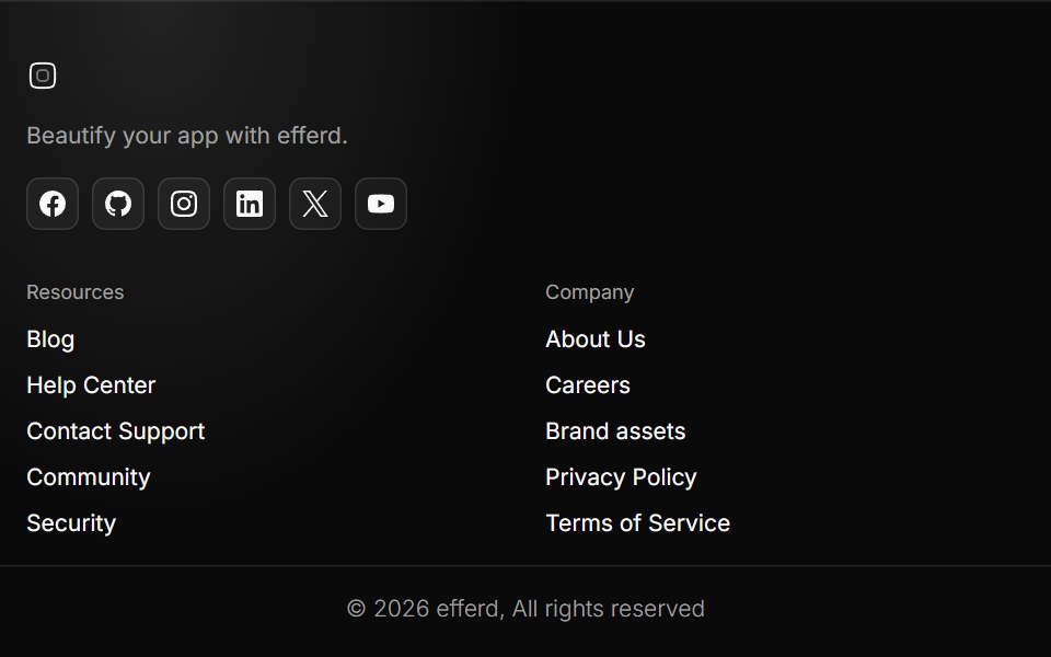 Footer Twosv-efferd · SvelteA structured multi-column footer with brand intro and outlined social actions.
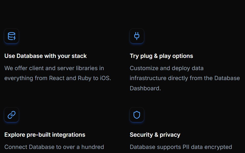 Feature Twelvecnblocks · SvelteFeature grid with gradient backgrounds
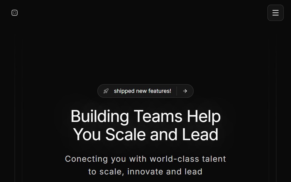 Hero Onesv-efferd · SvelteA full hero composition with sticky header, editorial spotlight, and a marquee trust band.
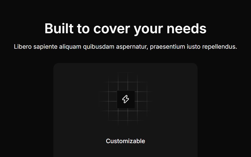 Feature Twocnblocks · SvelteTwo-column feature with image on side
 Hero Threesv-efferd · SvelteA modern hero layout with mega-nav header, device mockup spotlight, and compact logo grid.
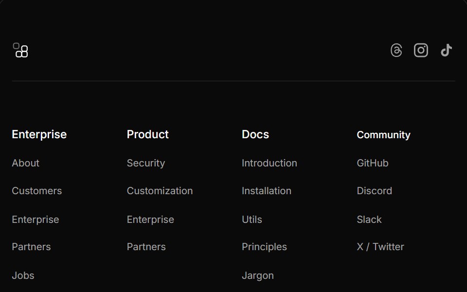 Footer Fivecnblocks · SvelteFooter with newsletter signup and social links
 Hero Twosv-efferd · SvelteA framed product hero with a floating screen, structured header, and bordered logo section.
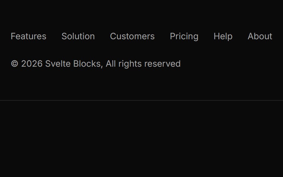 Footer Fourcnblocks · SvelteMulti-column footer with sitemap links
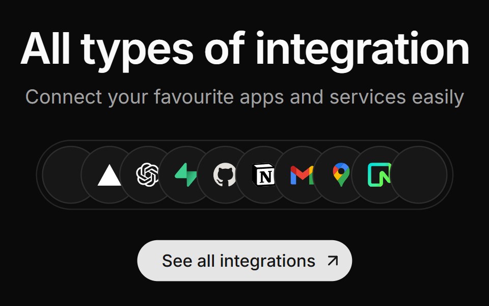 Integration Fivesv-efferd · SvelteA centered integration cluster with overlapping logo pills and a stronger primary CTA.
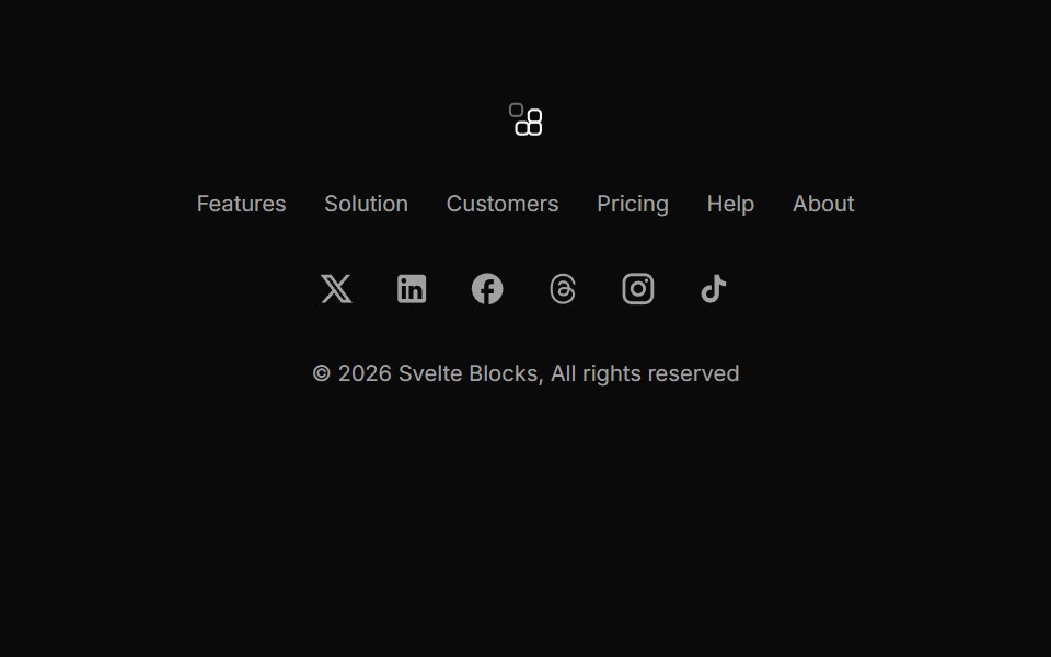 Footer Onecnblocks · SvelteSimple centered footer with logo and links
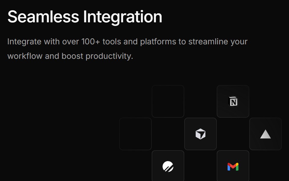 Integration Foursv-efferd · SvelteA bolder integration grid pairing a large product statement with floating logo tiles.
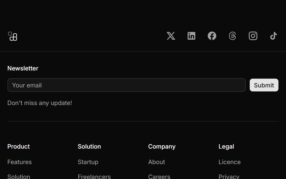 Footer Threecnblocks · SvelteThree-column footer with contact info
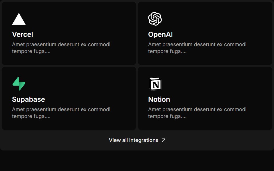 Integration Onesv-efferd · SvelteA compact integration strip with lightweight cards and a simple link-out action.
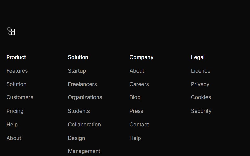 Footer Twocnblocks · SvelteTwo-row footer with links and copyright
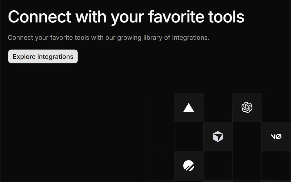 Integration Threesv-efferd · SvelteA split integration hero with grid-positioned logos and divider rails.
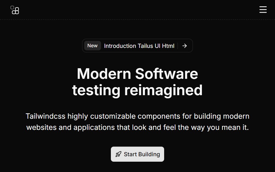 Hero Eightcnblocks · SvelteHero with video background and overlay
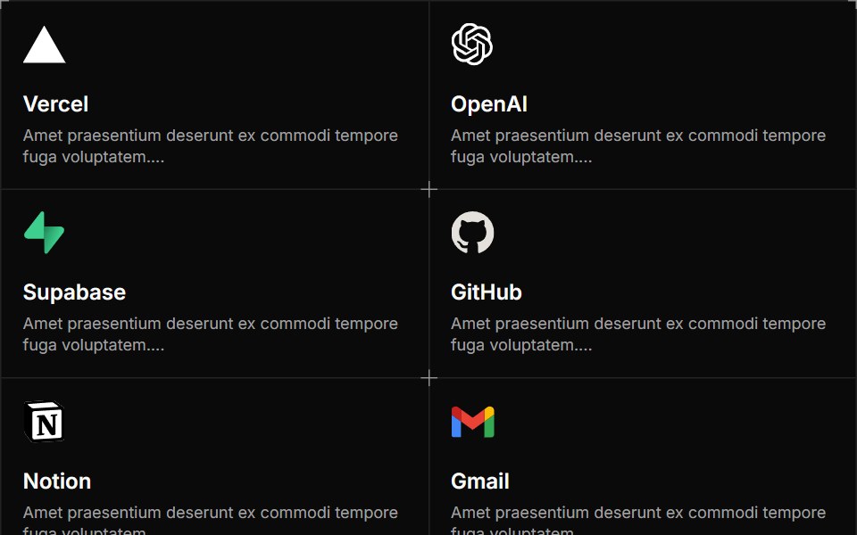 Integration Twosv-efferd · SvelteA structured integration grid with framed cards and decorative corner accents.
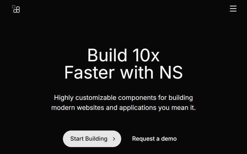 Hero Fivecnblocks · SvelteHero section with app mockup image
 Logo Cloud Fivesv-efferd · SvelteA flexible wrapped logo cloud designed for broader brand collections.
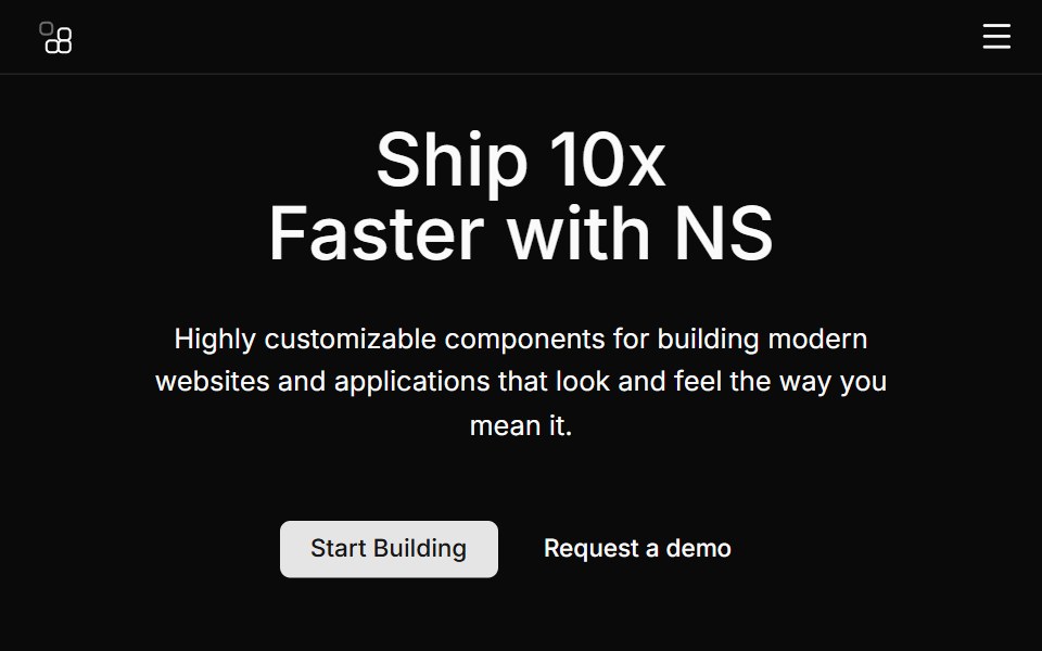 Hero Fourcnblocks · SvelteSplit hero with image on right side
 Logo Cloud Foursv-efferd · SvelteA marquee logo band with progressive edge blur and a layered track surface.
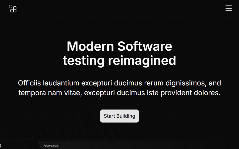 Hero Ninecnblocks · SvelteHero with animated background elements
 Logo Cloud Onesv-efferd · SvelteA clean partner grid with a framed card surface and balanced spacing.
 Hero Onecnblocks · SvelteClassic centered hero with headline and CTA
 Logo Cloud Threesv-efferd · SvelteA scrolling logo marquee with a soft edge mask and editorial rhythm.
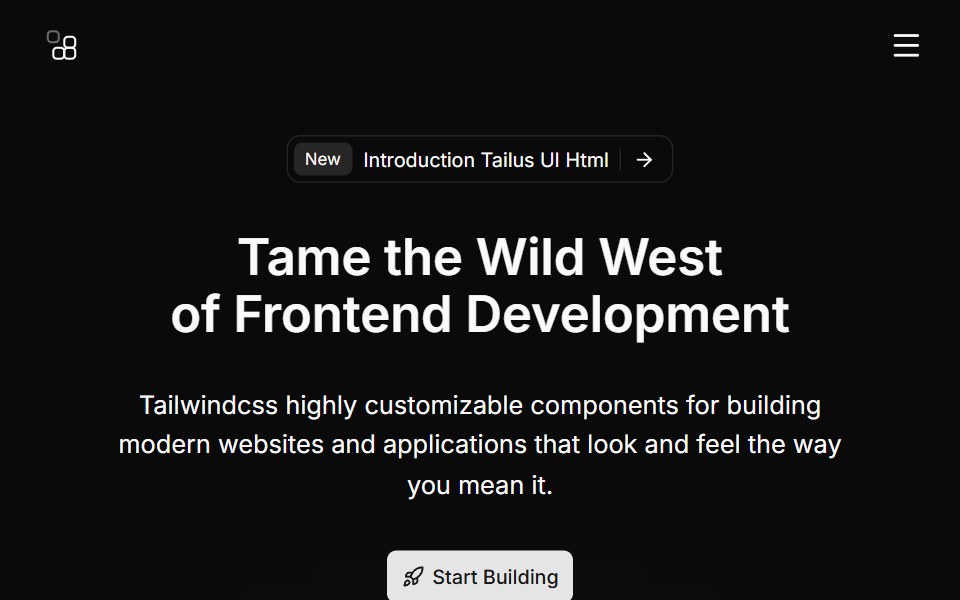 Hero Sevencnblocks · SvelteHero with gradient background and stats
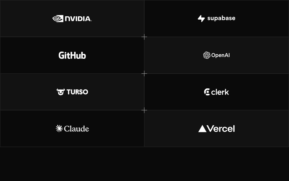 Logo Cloud Twosv-efferd · SvelteA bordered logo grid with alternating panels and decorative corner accents.
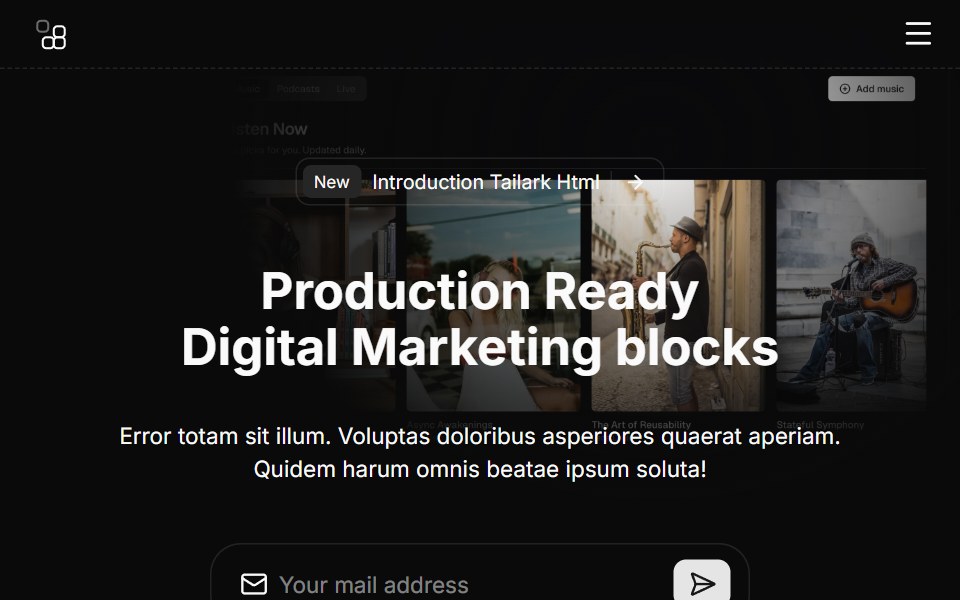 Hero Sixcnblocks · SvelteHero section with logo cloud below
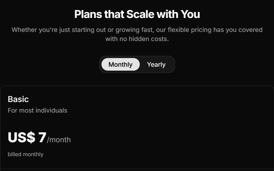 Pricing Foursv-efferd · SvelteAn animated pricing table with monthly-yearly toggles, live number transitions, and motion badges.
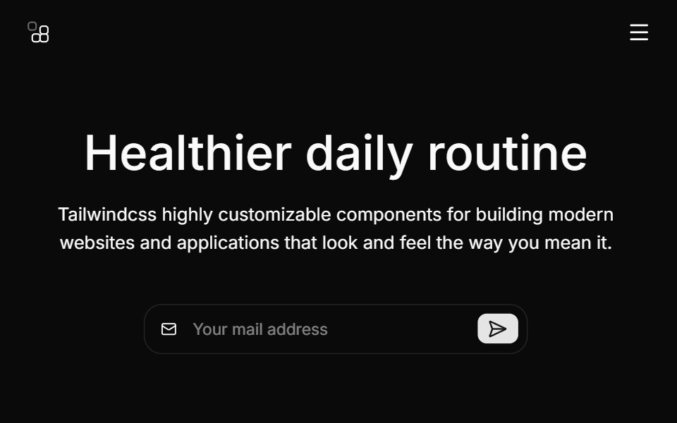 Hero Threecnblocks · SvelteHero with background image and overlay
 Pricing Onesv-efferd · SvelteA two-plan comparison with corner accents, compact savings callouts, and a stronger featured tier.
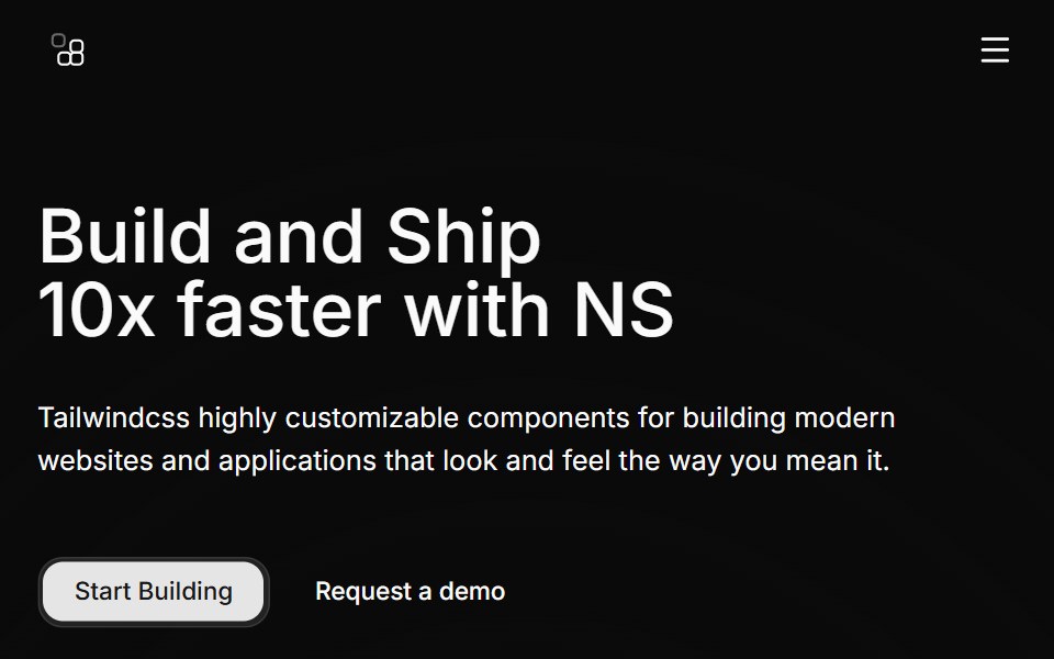 Hero Twocnblocks · SvelteTwo-column hero with image carousel
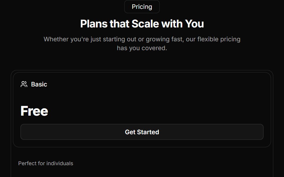 Pricing Threesv-efferd · SvelteA reusable three-tier pricing layout with icon-led cards and a highlighted middle plan.
 Integration Cardscnblocks · SvelteCollection of integration card variants for logos
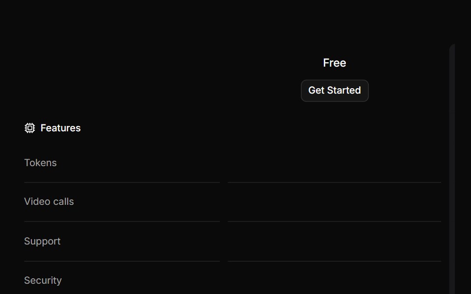
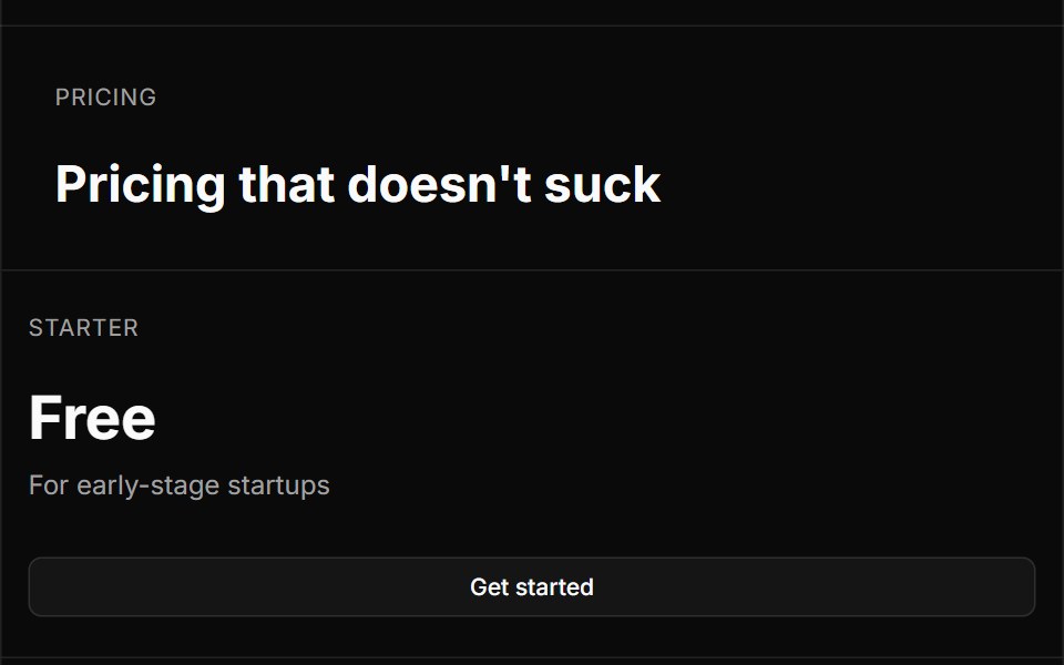 Pricing Twosv-efferd · SvelteA bordered editorial pricing grid with divider rails, concise plan summaries, and feature checklists.
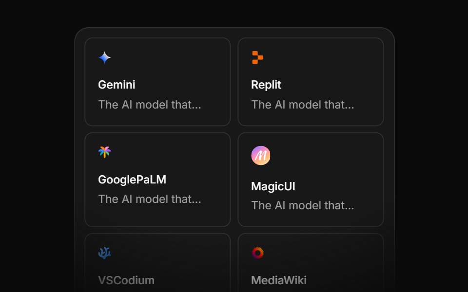 Integration Eightcnblocks · SvelteIntegration grid with animated connections
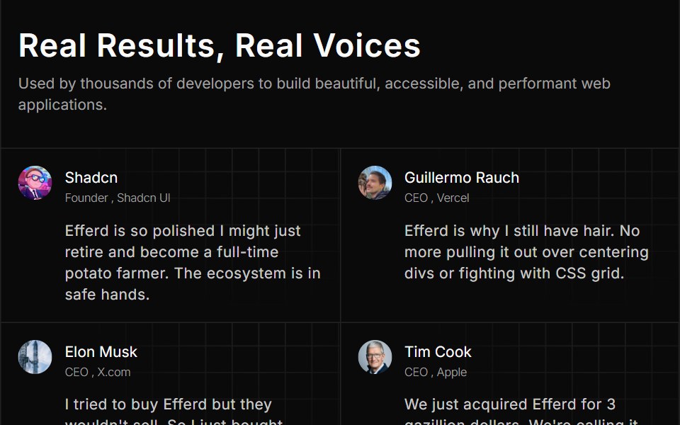 Testimonial Fivesv-efferd · SvelteA dense social-proof wall with grid fillers, patterned cards, and a long-form testimonial mosaic.
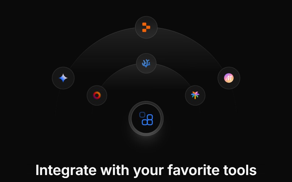 Integration Fivecnblocks · SvelteIntegration showcase with hover details
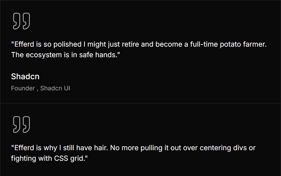 Testimonial Foursv-efferd · SvelteA split testimonial layout with divider rails, dense quote cards, and a stronger editorial grid.
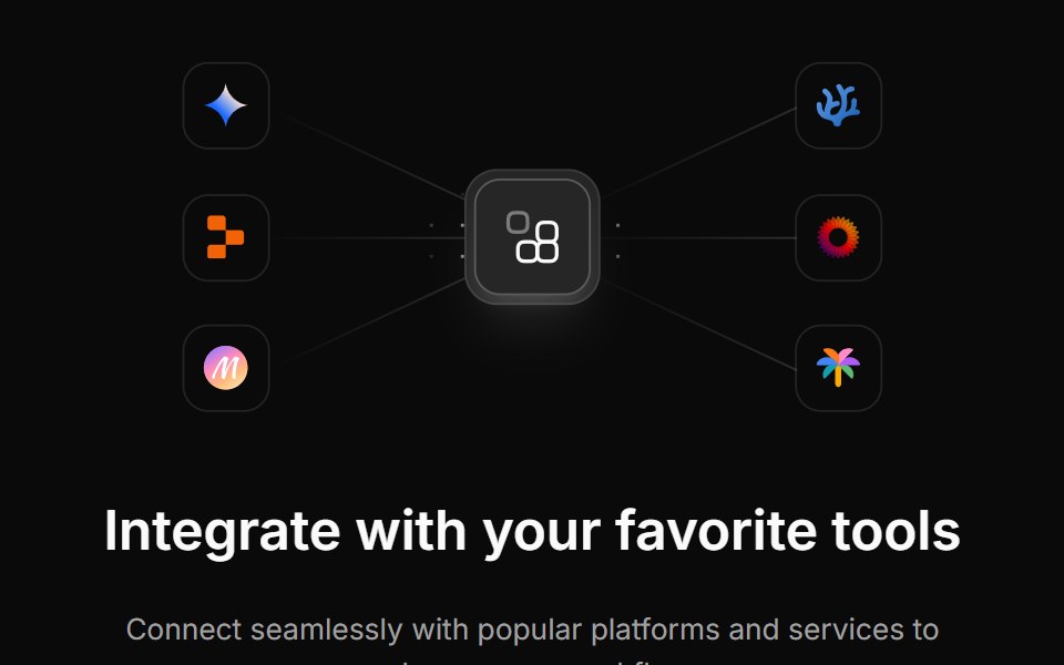 Integration Fourcnblocks · SvelteFour-column integration logo grid
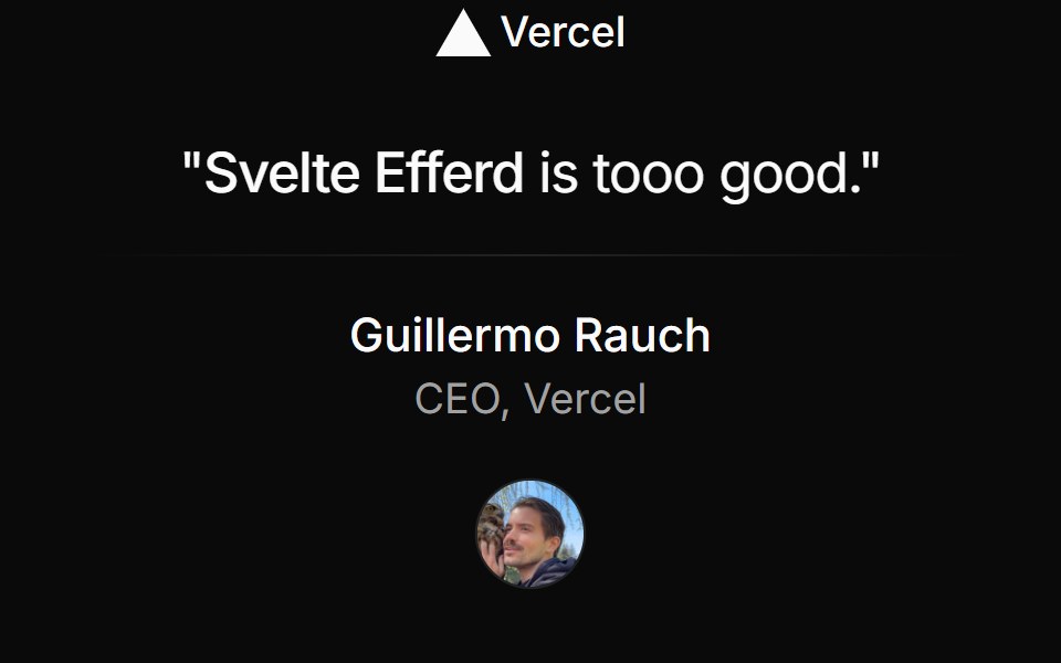 Testimonial Onesv-efferd · SvelteA centered single testimonial with brand mark, compact author block, and soft editorial framing.
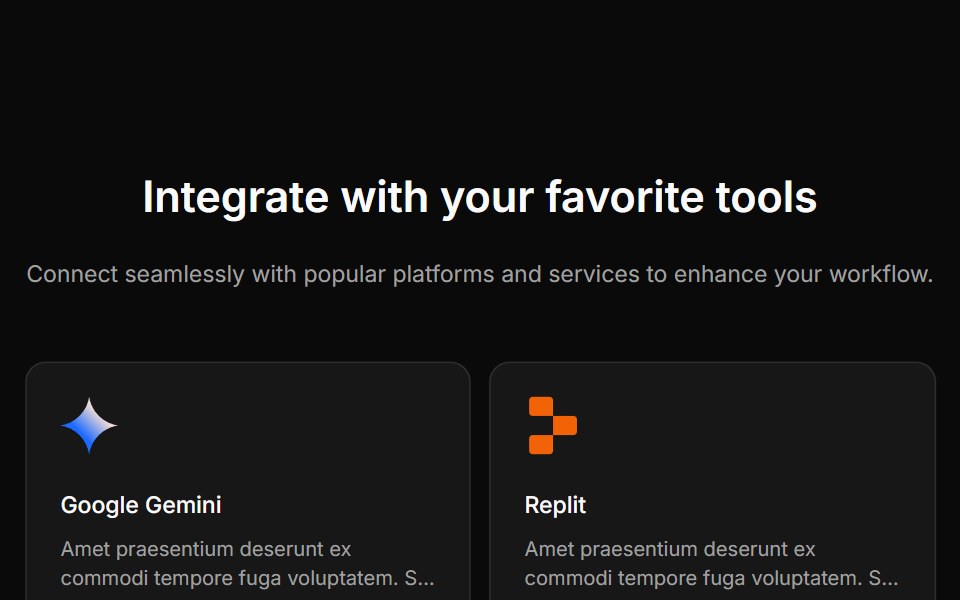 Integration Onecnblocks · SvelteSimple integration logos in grid layout
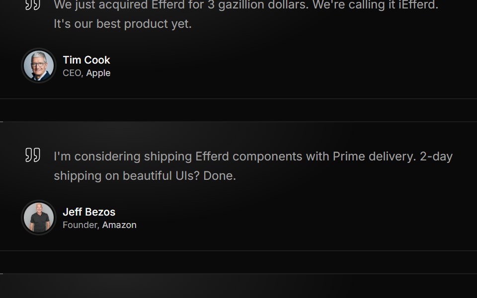 Testimonial Threesv-efferd · SvelteA three-card testimonial grid with decorative corners, lifted middle emphasis, and richer profile metadata.
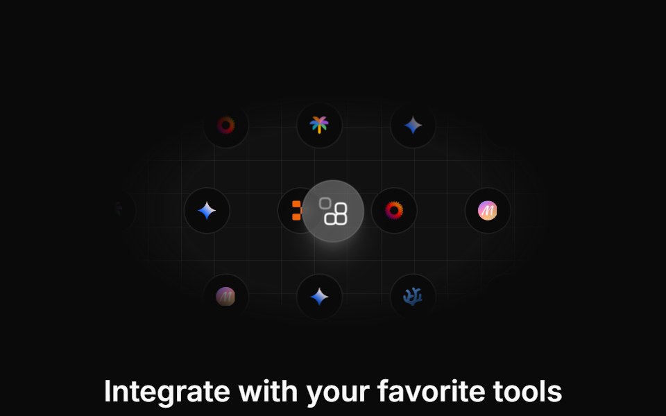 Integration Sevencnblocks · SvelteIntegration section with categories
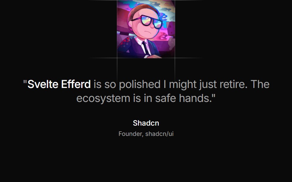 Testimonial Twosv-efferd · SvelteA framed testimonial layout with masked divider rails, asymmetrical composition, and avatar-led emphasis.
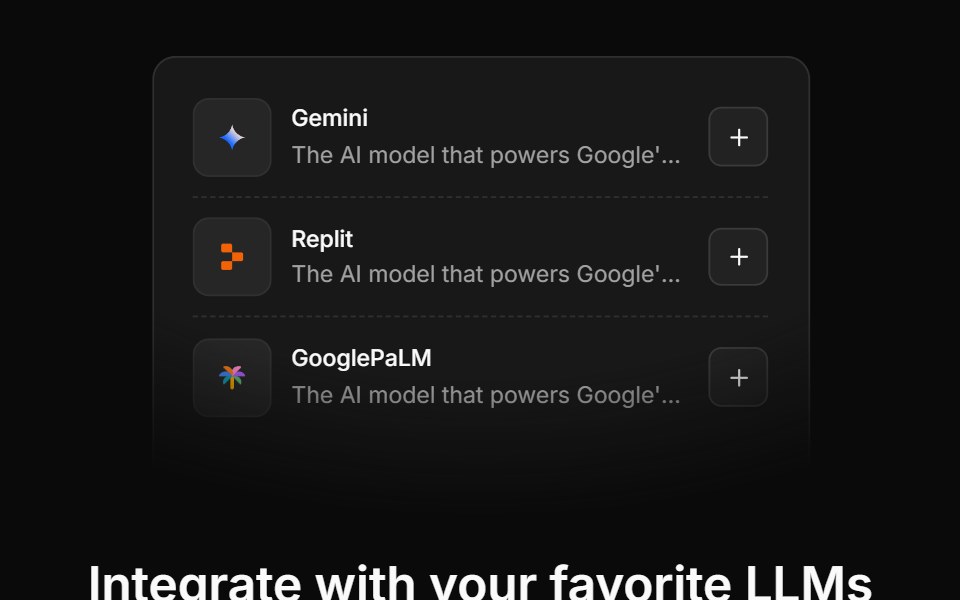 Integration Sixcnblocks · SvelteIntegration cards with descriptions
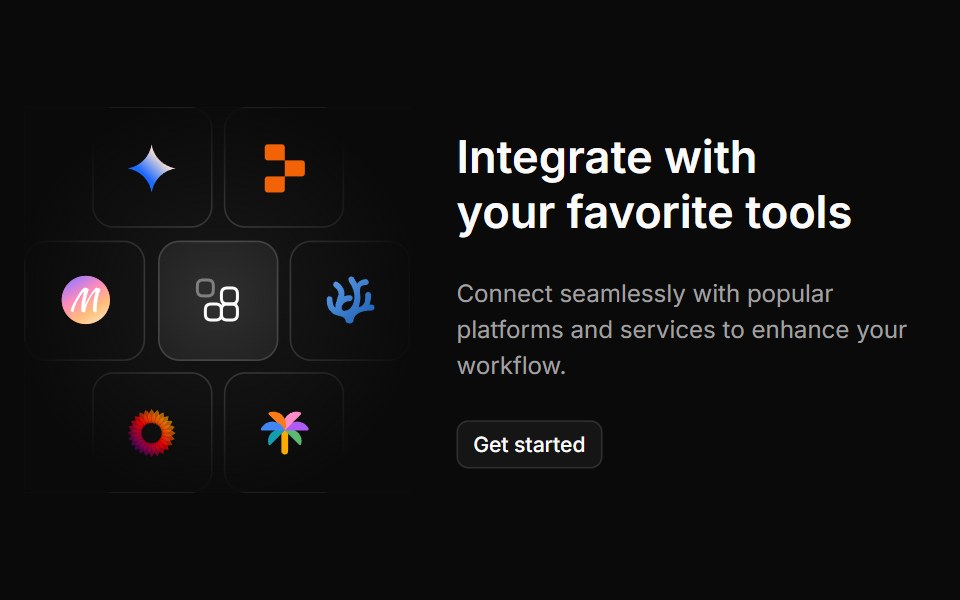 Integration Threecnblocks · SvelteThree-column integration with icons
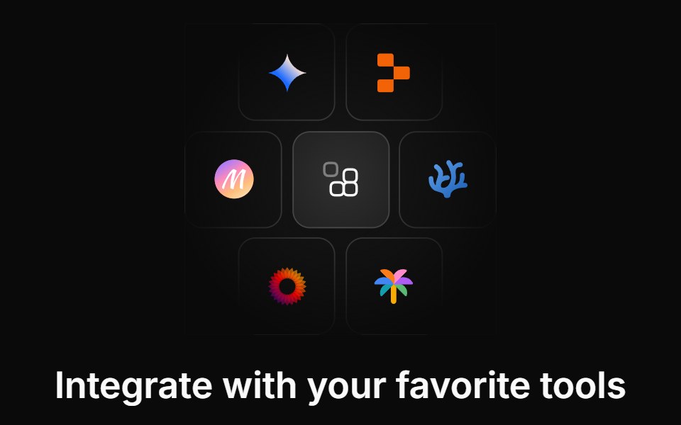 Integration Twocnblocks · SvelteTwo-row integration logo marquee
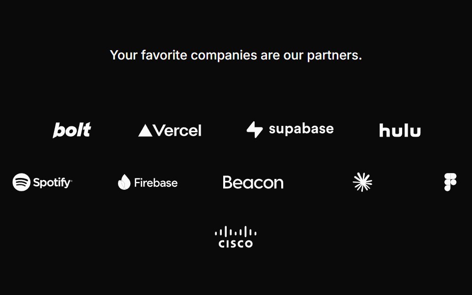 Logocloud Onecnblocks · SvelteLogo cloud with partner logos in a centered wrap layout
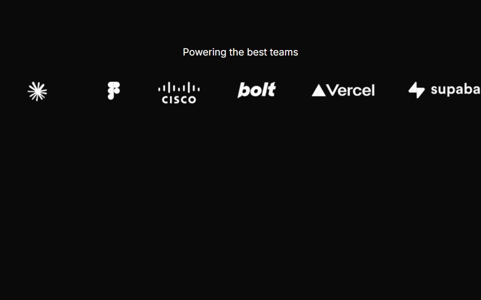 Logocloud Threecnblocks · SvelteScrolling logo cloud marquee with progressive blur edges
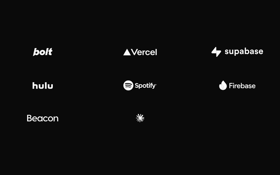 Logocloud Twocnblocks · SvelteInteractive logo cloud with hover call-to-action
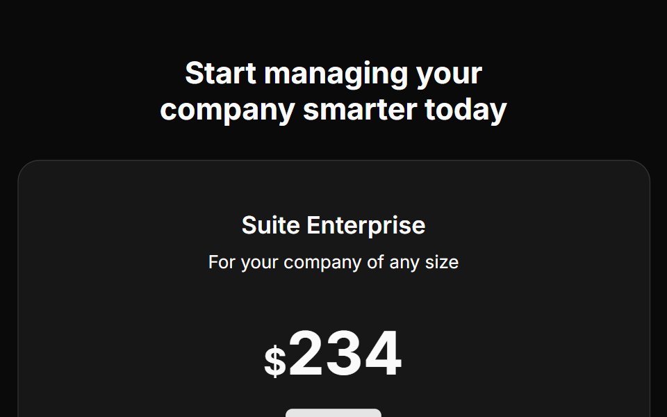 Pricing Fivecnblocks · SveltePricing table with feature comparison
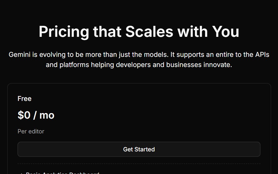 Pricing Fourcnblocks · SvelteFour-tier pricing with toggle switch
 Pricing Onecnblocks · SvelteSimple three-tier pricing cards
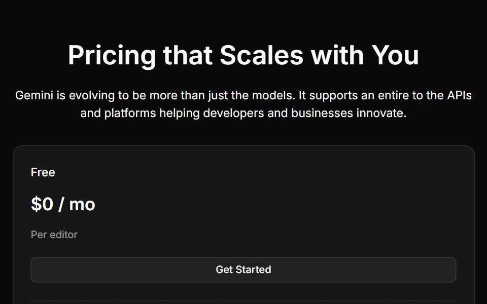 Pricing Threecnblocks · SveltePricing with highlighted popular plan
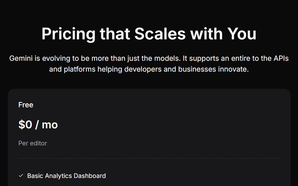 Pricing Twocnblocks · SvelteTwo-column pricing with monthly/yearly toggle
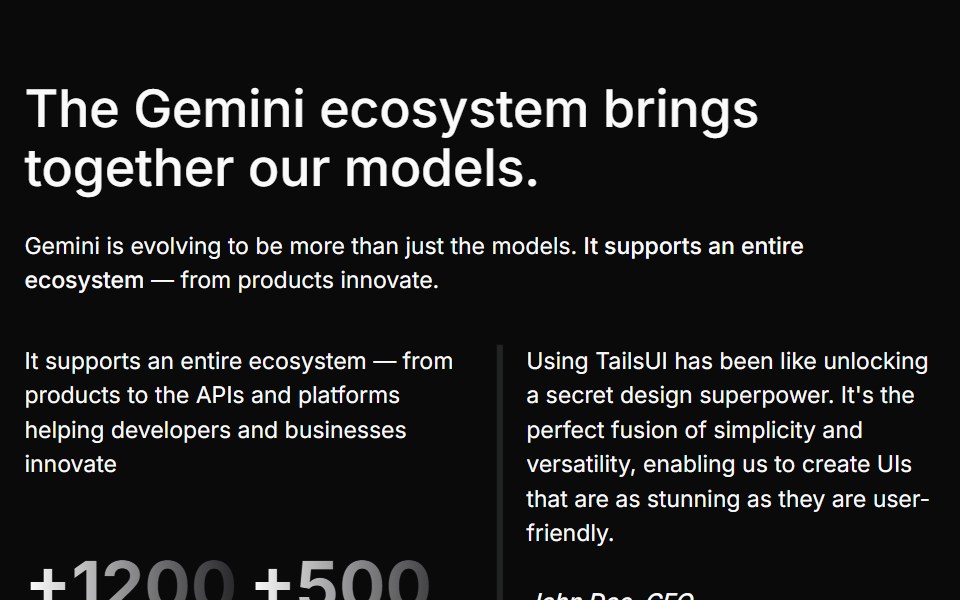 Stats Fourcnblocks · SvelteFour-column stats with icons
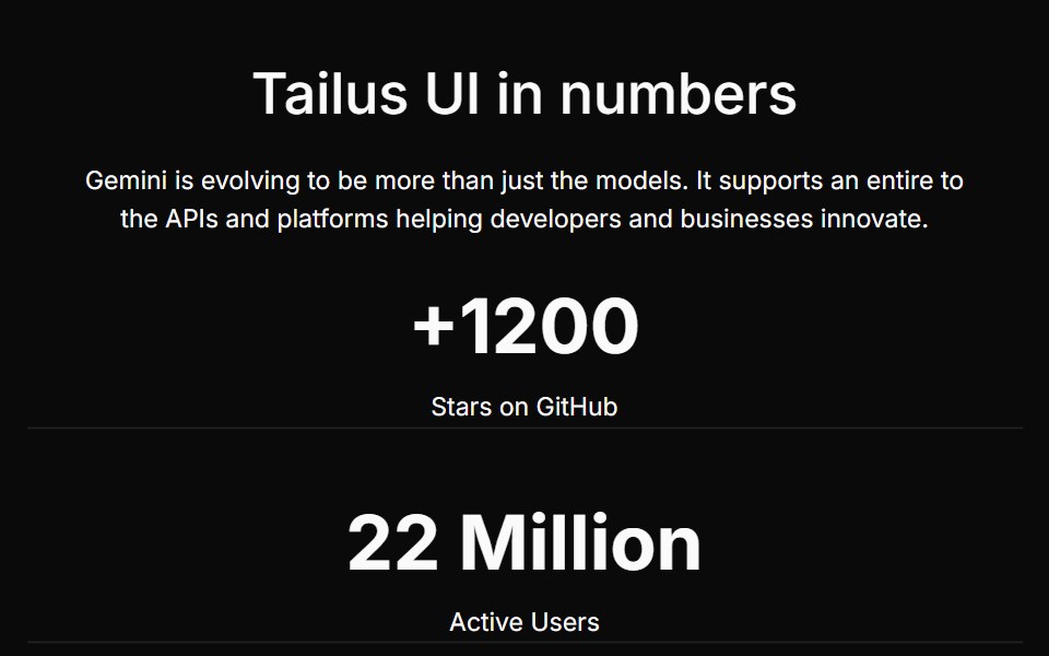 Stats Onecnblocks · SvelteSimple stats row with large numbers
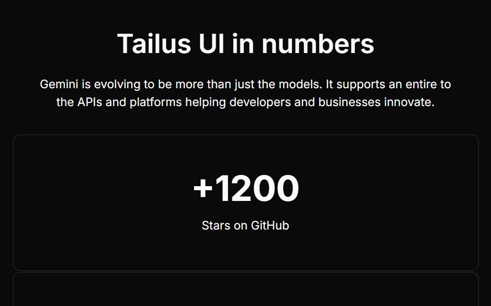 Stats Threecnblocks · SvelteStats cards with descriptions
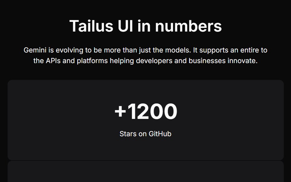 Stats Twocnblocks · SvelteTwo-column stats with side image
Libraries with Svelte section components
Related categories
- Section Components
- React Section Components
- Tailwind CSS Section Components
- Animated Section Components
- shadcn/ui Section Components
- Svelte Logo Cloud Components
- Svelte Feature Section Components
- Svelte Hero Components
- Svelte Integrations Section Components
- Svelte Footer Components
- Svelte Testimonials Section Components
- Svelte FAQ Section Components
- Svelte CTA Section Components
- Svelte Contact Section Components