 Dev Design Library
Svelte Integrations Section Components
Dev Design Library indexes 13 Svelte integrations section components from 2 open-source UI libraries, with the most coming from cnblocks and sv-efferd. Each one links to its page with the source code, a live preview where available, the library license and the install command. Every library in this list targets Svelte. Integrations section components belong to the Sections group.
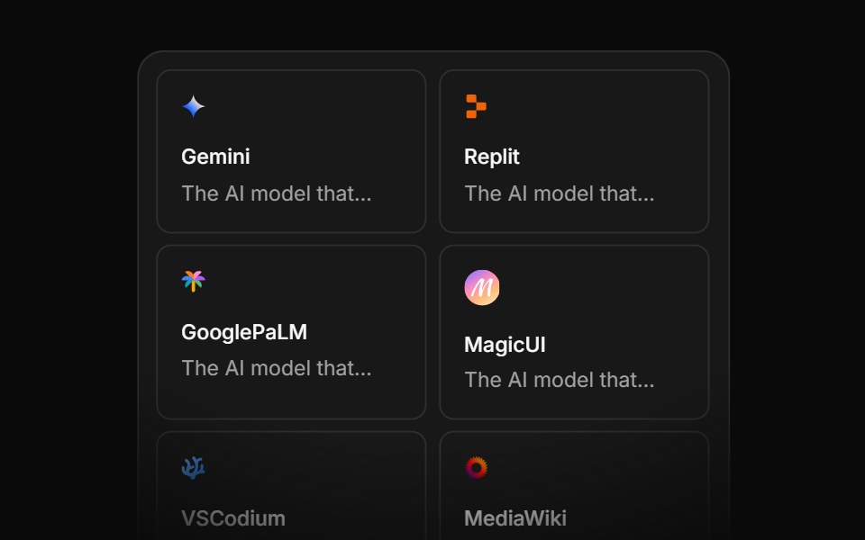 Integration Eightcnblocks · SvelteIntegration grid with animated connections
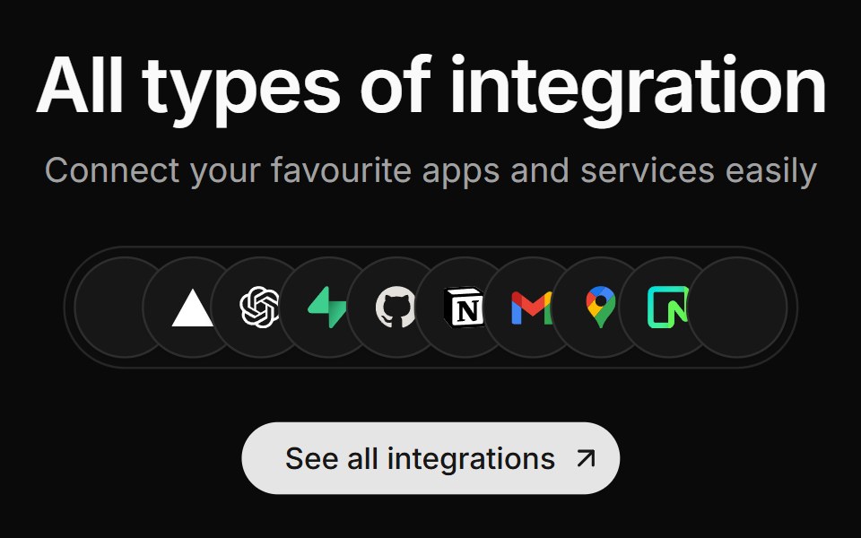 Integration Fivesv-efferd · SvelteA centered integration cluster with overlapping logo pills and a stronger primary CTA.
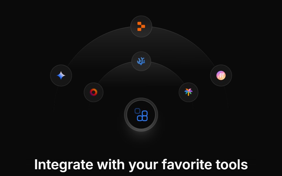 Integration Fivecnblocks · SvelteIntegration showcase with hover details
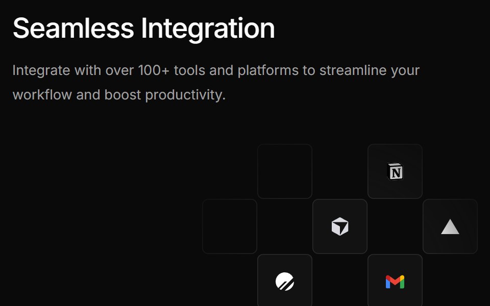 Integration Foursv-efferd · SvelteA bolder integration grid pairing a large product statement with floating logo tiles.
 Integration Fourcnblocks · SvelteFour-column integration logo grid
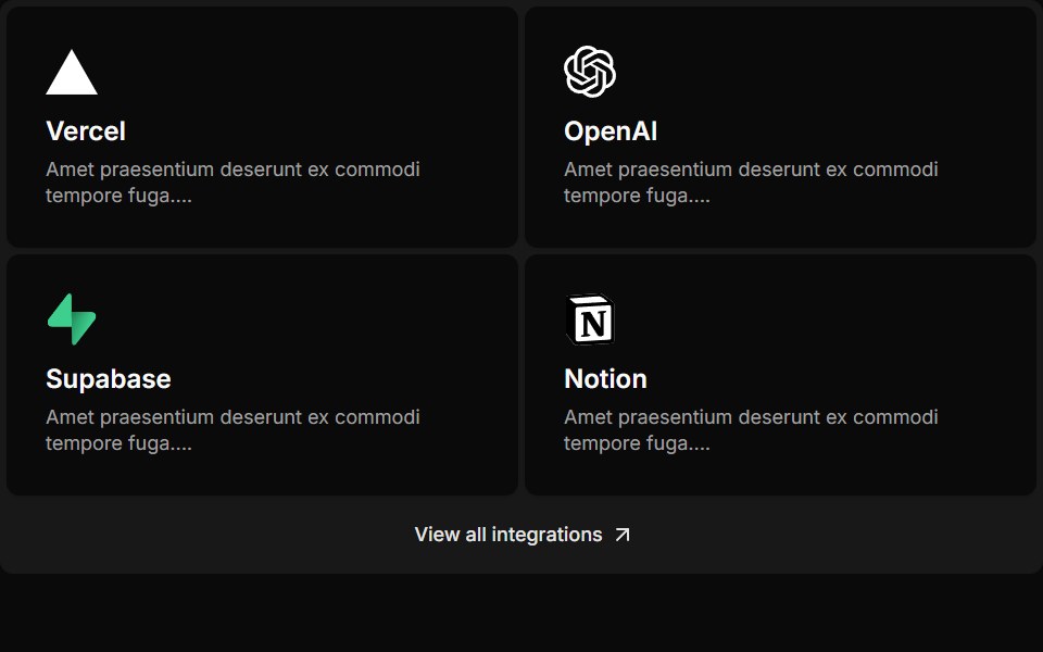 Integration Onesv-efferd · SvelteA compact integration strip with lightweight cards and a simple link-out action.
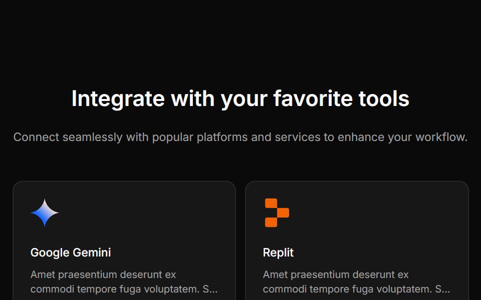 Integration Onecnblocks · SvelteSimple integration logos in grid layout
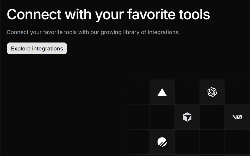 Integration Threesv-efferd · SvelteA split integration hero with grid-positioned logos and divider rails.
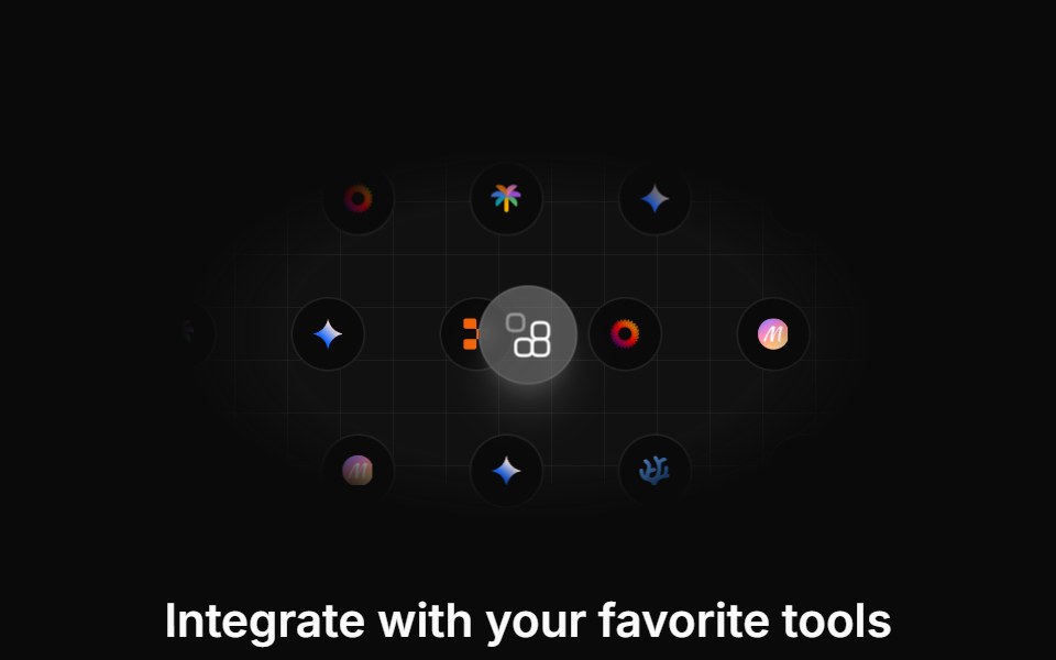 Integration Sevencnblocks · SvelteIntegration section with categories
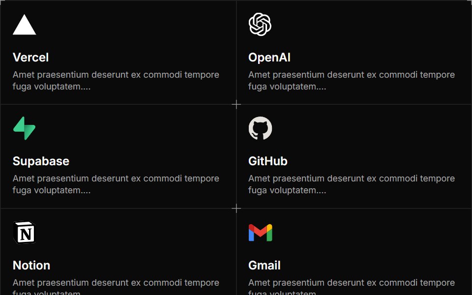 Integration Twosv-efferd · SvelteA structured integration grid with framed cards and decorative corner accents.
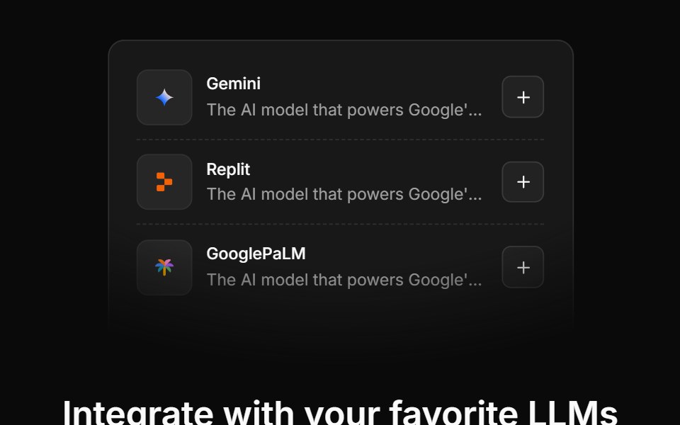 Integration Sixcnblocks · SvelteIntegration cards with descriptions
 Integration Threecnblocks · SvelteThree-column integration with icons
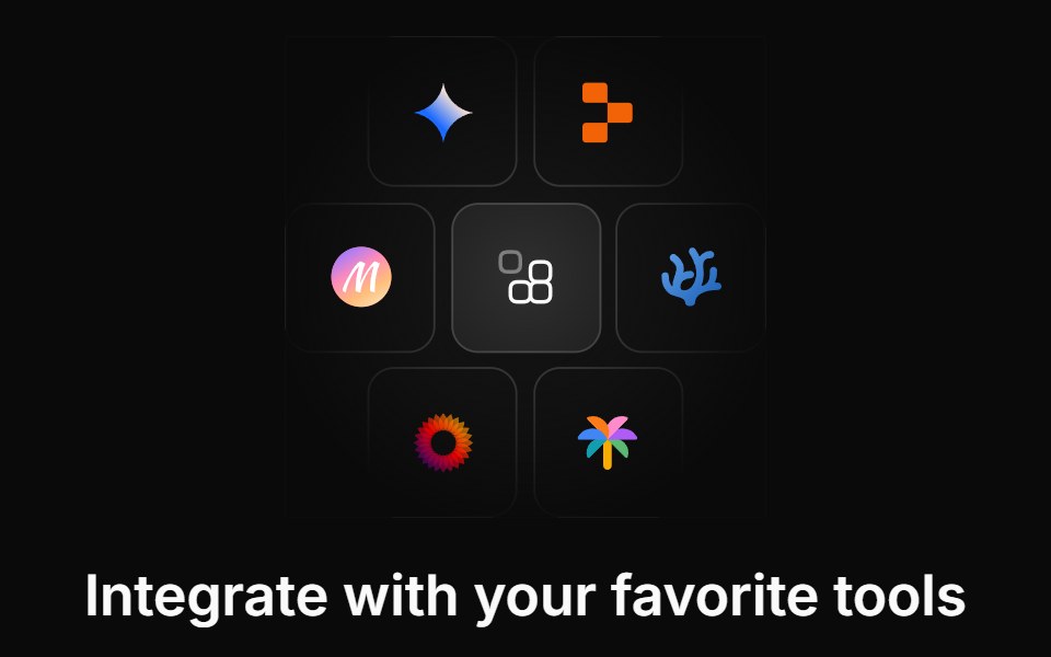 Integration Twocnblocks · SvelteTwo-row integration logo marquee
Libraries with Svelte integrations section components
Related categories
- Integrations Section Components
- React Integrations Section Components
- Animated Integrations Section Components
- Svelte Section Components
- Svelte Logo Cloud Components
- Svelte Feature Section Components
- Svelte Hero Components
- Svelte Footer Components
- Svelte Testimonials Section Components
- Svelte FAQ Section Components
- Svelte CTA Section Components
- Svelte Contact Section Components