 Dev Design Library
Animated Integrations Section Components
Dev Design Library indexes 6 Animated integrations section components from 4 open-source UI libraries, with the most coming from sv-efferd, cnblocks, Spectrum UI and Shadcn Space. Each one links to its page with the source code, a live preview where available, the library license and the install command. These are the integrations section components tagged as animated: motion on hover, on scroll or on load, usually built with CSS transitions or Framer Motion. Integrations section components belong to the Sections group.
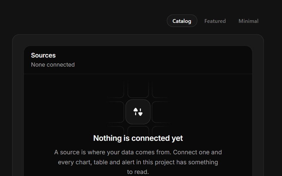 Connect a SourceSpectrum UI · ReactA connector grid where tiles run a real connect sequence and settle into connected.
 Dialog 07 - Connect IntegrationShadcn Space · ReactDialog with a decorative header connecting two app icons — ideal for third-party integration and calendar connect flows.
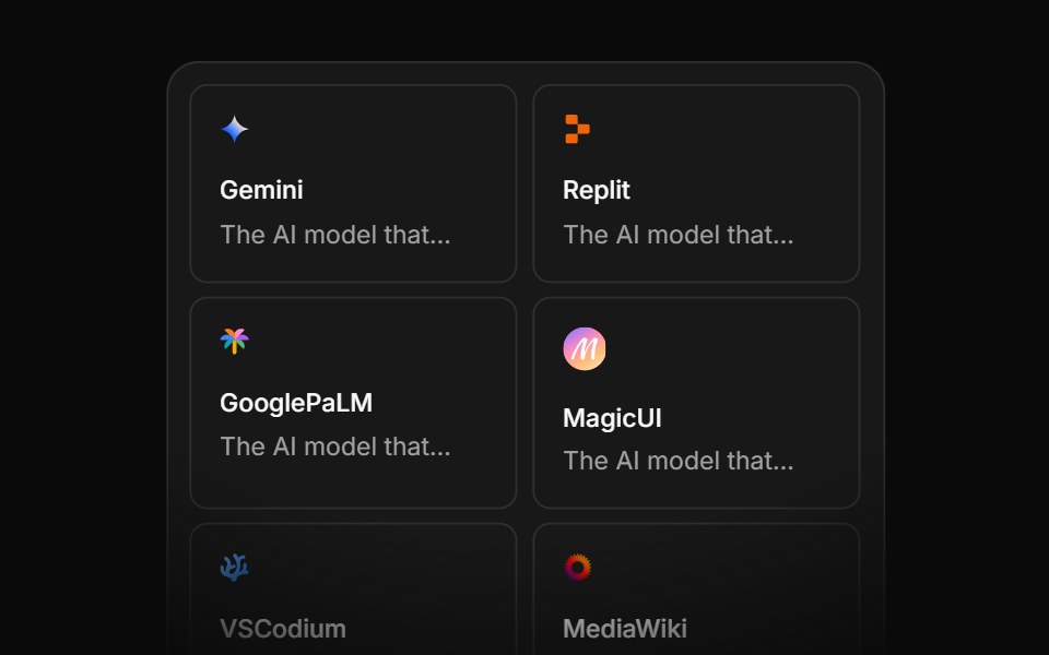 Integration Eightcnblocks · SvelteIntegration grid with animated connections
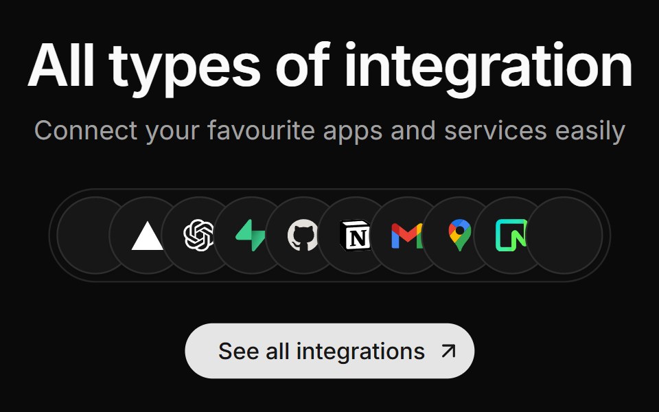 Integration Fivesv-efferd · SvelteA centered integration cluster with overlapping logo pills and a stronger primary CTA.
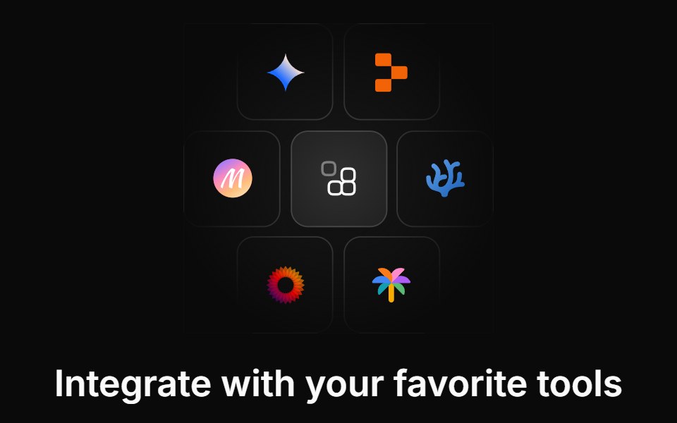 Integration Twocnblocks · SvelteTwo-row integration logo marquee
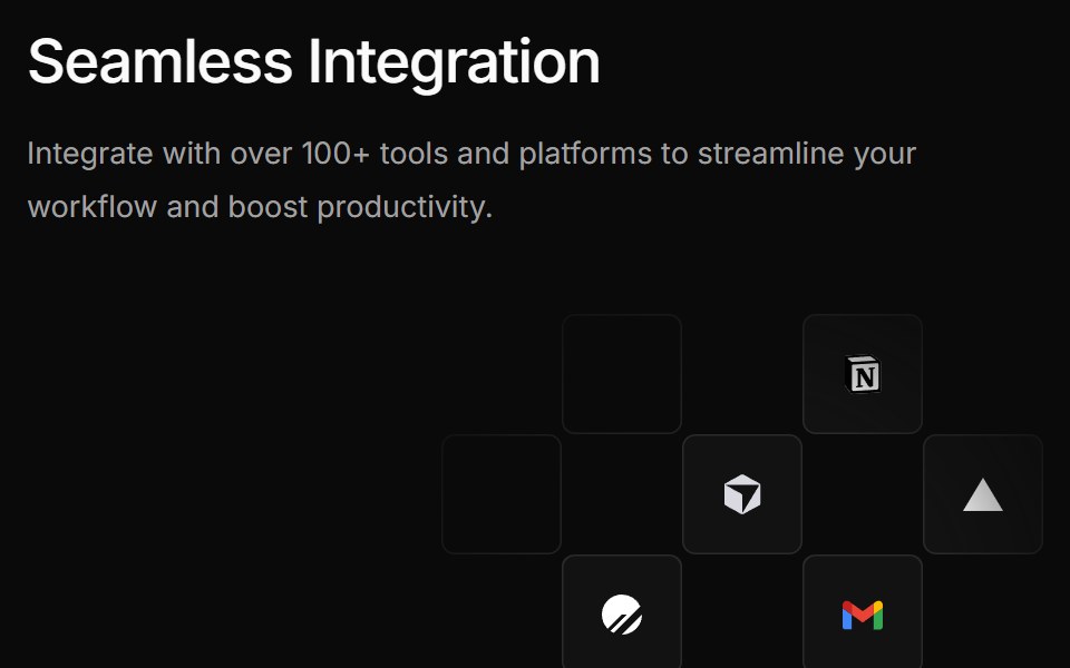 Integration Foursv-efferd · SvelteA bolder integration grid pairing a large product statement with floating logo tiles.
Libraries with Animated integrations section components
Related categories
- Integrations Section Components
- React Integrations Section Components
- Svelte Integrations Section Components
- Animated Section Components
- Animated Hero Components
- Animated Footer Components
- Animated Logo Cloud Components
- Animated Feature Section Components
- Animated FAQ Section Components
- Animated Testimonials Section Components
- Animated CTA Section Components
- Animated Stats Section Components