 Dev Design Library
Animated Footer Components
Dev Design Library indexes 28 Animated footer components from 9 open-source UI libraries, with the most coming from Spectrum UI, 23rd.dev, sv-efferd, Velora UI and Pin UI. Each one links to its page with the source code, a live preview where available, the library license and the install command. These are the footer components tagged as animated: motion on hover, on scroll or on load, usually built with CSS transitions or Framer Motion. Footer components belong to the Sections group.
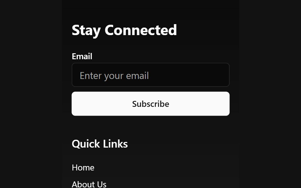 Animated Wave FooterSpectrum UI · Reactcomponent for the Animated Wave Footer
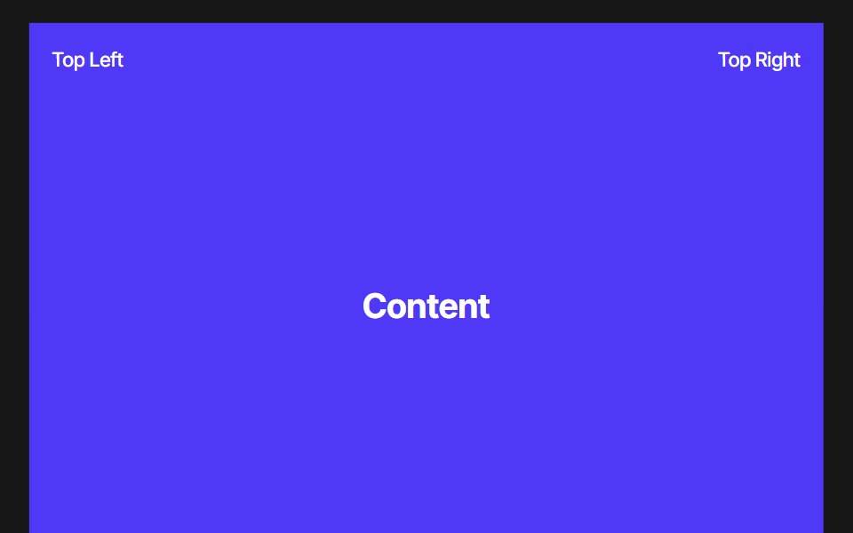 Footer RevealPixel Perfect · ReactA scroll-driven footer reveal — the footer sits pinned in place while the content above slides up to uncover it. Pure…
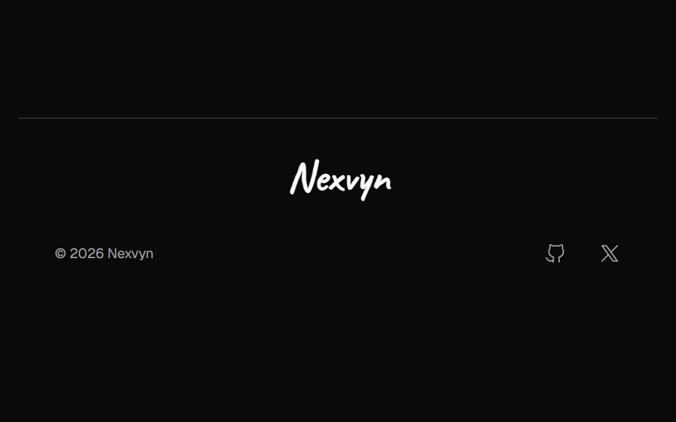 Footer SignatureNexvyn UI · ReactA one row footer with a handwritten signature that draws itself once.
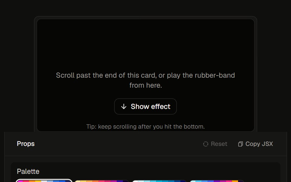 Stretchy Footer23rd.dev · ReactDia-style rubber overscroll: rainbow aurora stretches up past the bottom, then snaps back.
 Footer Sixsv-efferd · SvelteA cinematic sticky footer with animated columns and a long-form enterprise sitemap.
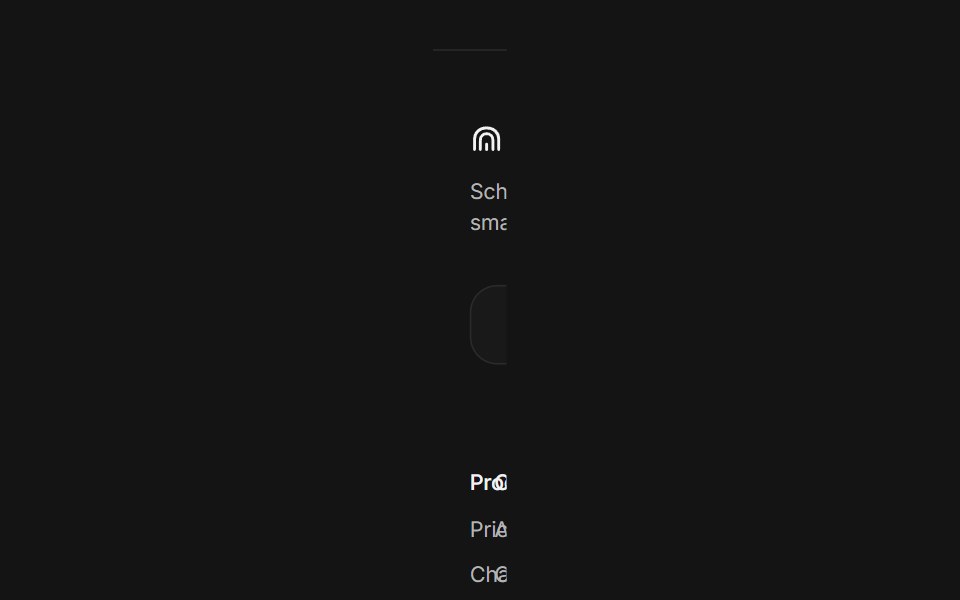 Site footerArc Library · ReactA website footer with link columns and newsletter, a minimal layout, and a large fading Arc mark.
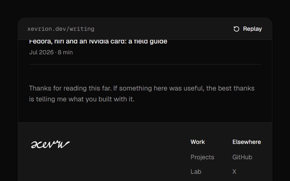 Footer SignatureUI Lab · ReactSigns the footer by hand when it scrolls into view, slowing through every loop.
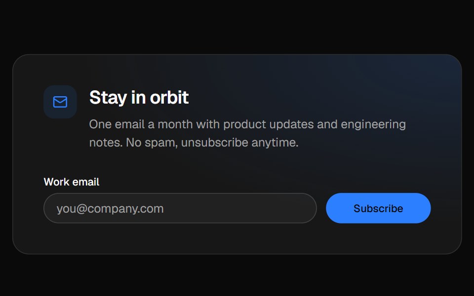 Newsletter footerVelora UI · ReactFooter with a newsletter sign-up row, link columns and a live “All systems normal” status badge.
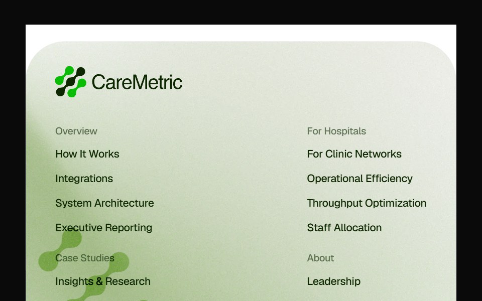 Caremetric FooterPin UI · React
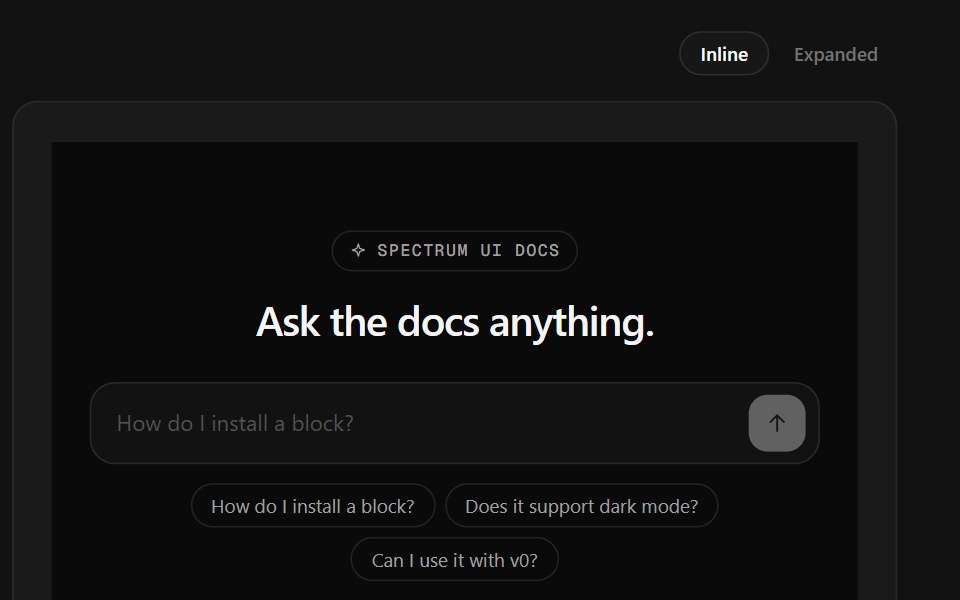 Ask Docs FooterSpectrum UI · ReactA docs question box that streams a cited answer, over link columns.
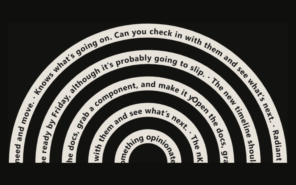 Tangle Footer23rd.dev · ReactA footer of tangled SVG ribbons — thick dark strokes with white text running along each path via textPath.
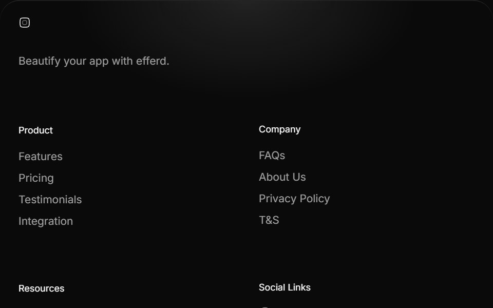 Footer Threesv-efferd · SvelteAn animated rounded footer with grouped link columns and softer visual depth.
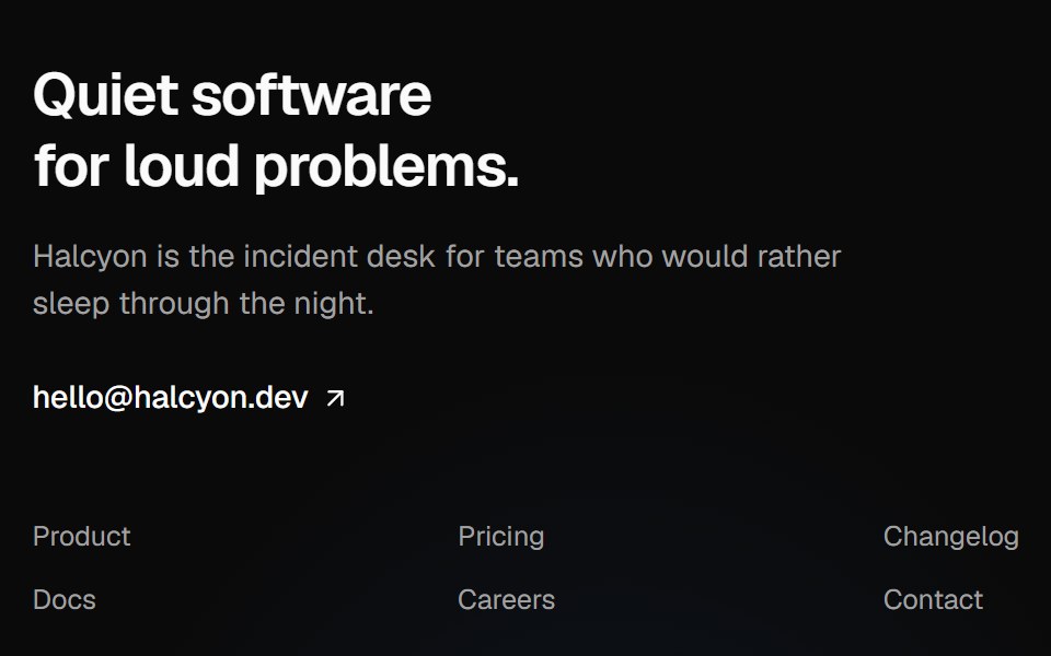 Giant wordmark footerVelora UI · ReactMinimal footer that ends in an oversized outlined wordmark lighting up in brand colours under the pointer.
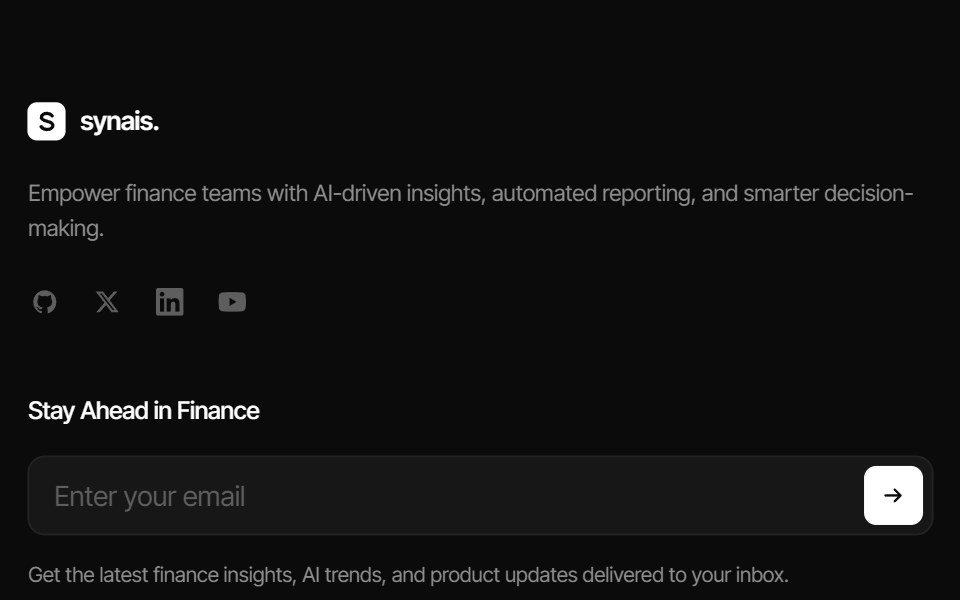 Synais FooterPin UI · React
 Careers FooterSpectrum UI · ReactA rolling three-role window with department filters, over link columns.
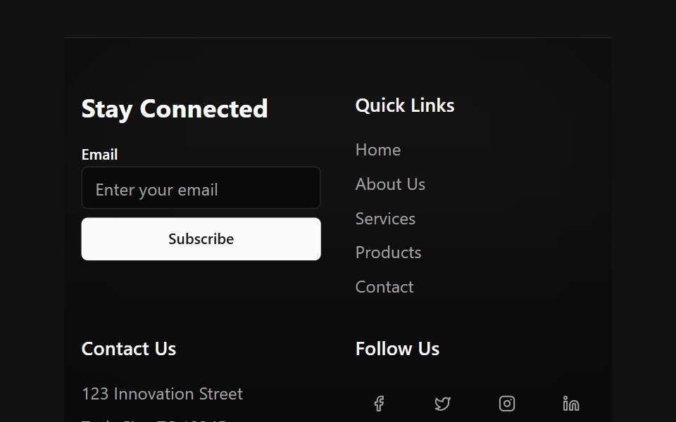 Floating Particle FooterSpectrum UI · Reactcomponent for the Floating Particle Footer
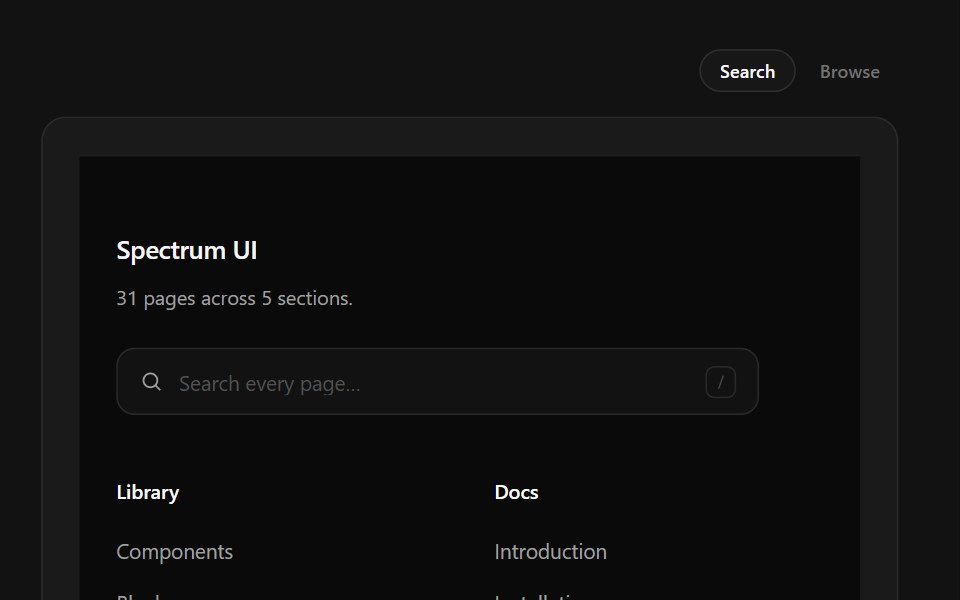 Link Search FooterSpectrum UI · ReactType-to-filter across every footer link, with arrow-key navigation.
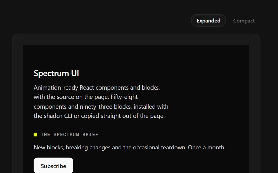 Mega Sitemap FooterSpectrum UI · ReactA five-column sitemap with region and language selectors and mobile accordions.
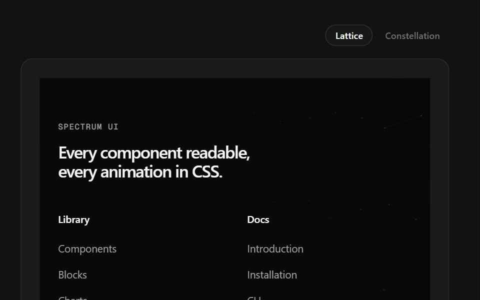 Neural Grid FooterSpectrum UI · ReactAn SVG node lattice that lights up under the pointer.
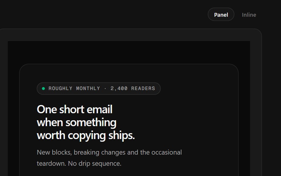 Newsletter FooterSpectrum UI · ReactA newsletter panel with a value checklist, reader stack and inline validation.
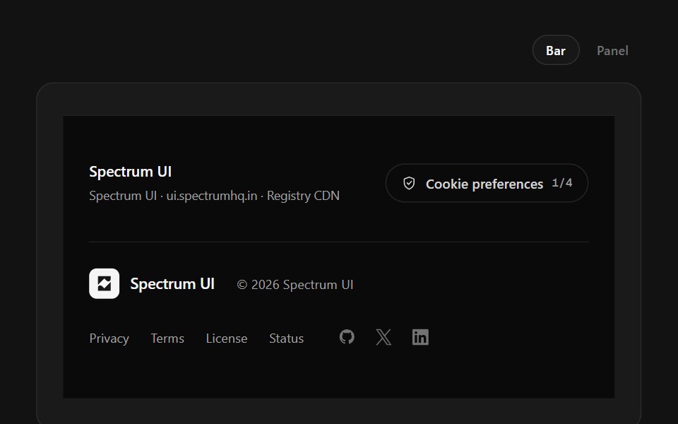 Policy FooterSpectrum UI · ReactCookie-category switches with a save state, over a layered legal row.
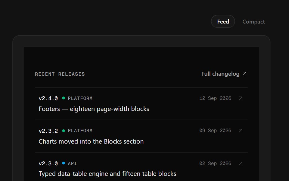 Release Feed FooterSpectrum UI · ReactA changelog list with version, kind and date on hairline rows.
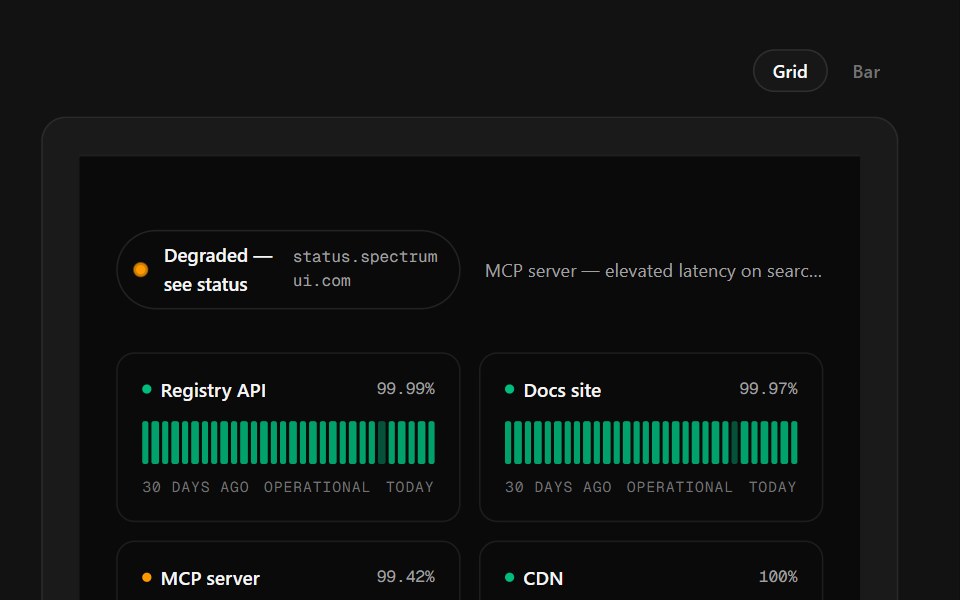 Service Status FooterSpectrum UI · ReactThirty days of per-service uptime bars with a rolling incident ticker.
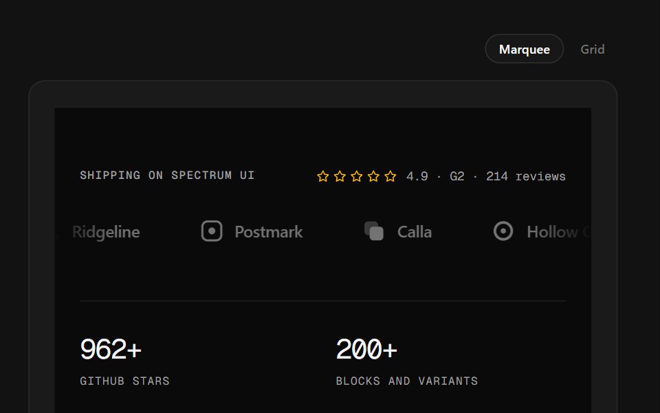 Logo Wall FooterSpectrum UI · ReactA customer logo wall — marquee or plotted grid — over stats and link columns.
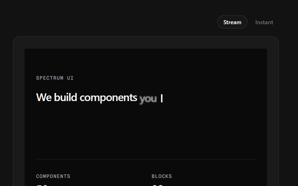 Token Stream FooterSpectrum UI · ReactA one-line manifesto that types itself in, over a metric row.
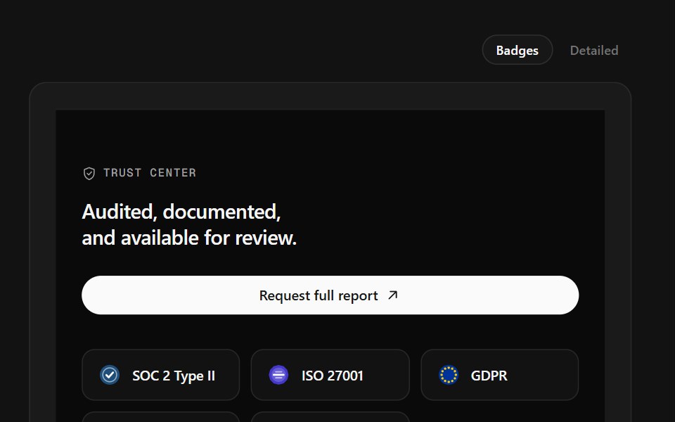 Trust Center FooterSpectrum UI · ReactCompliance marks that expand to scope, over a logo row and link columns.
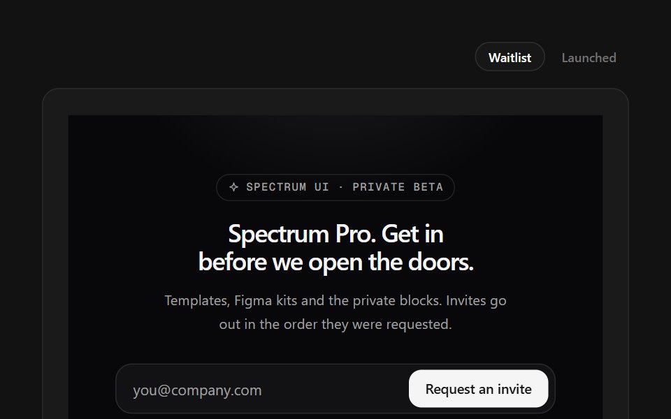 Waitlist FooterSpectrum UI · ReactWaitlist capture with an avatar stack and a live position counter.
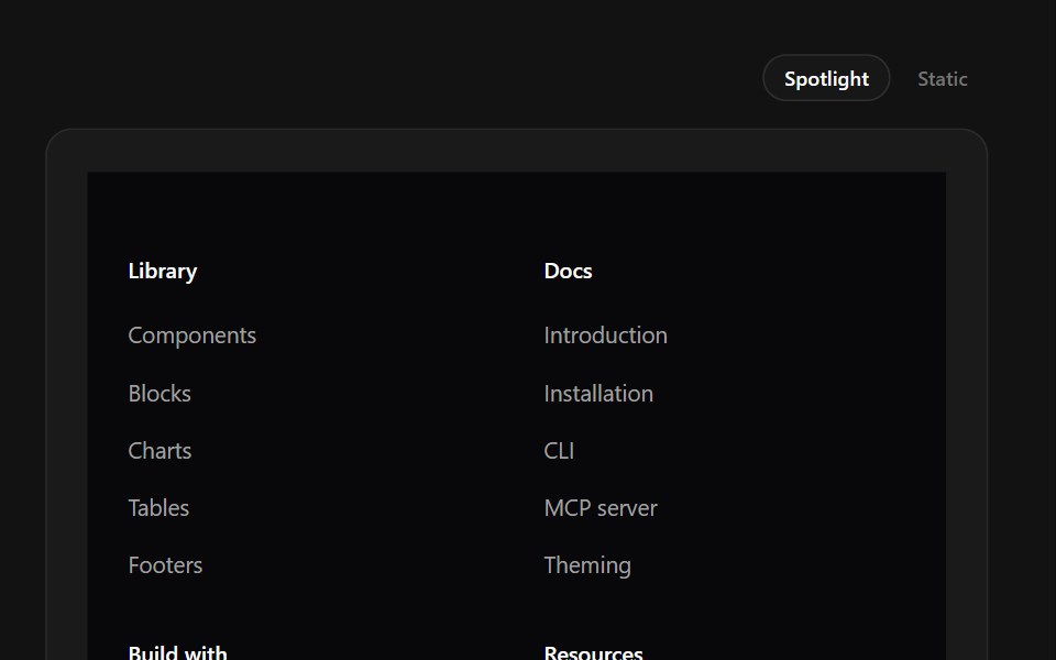 Wordmark Spotlight FooterSpectrum UI · ReactA full-bleed wordmark lit by a spotlight that follows the pointer.
Libraries with Animated footer components
Related categories
- Footer Components
- React Footer Components
- Tailwind CSS Footer Components
- Svelte Footer Components
- shadcn/ui Footer Components
- Animated Section Components
- Animated Hero Components
- Animated Logo Cloud Components
- Animated Feature Section Components
- Animated FAQ Section Components
- Animated Testimonials Section Components
- Animated CTA Section Components
- Animated Integrations Section Components
- Animated Stats Section Components