 Dev Design Library
Animated Section Components
Dev Design Library indexes 181 Animated section components from 35 open-source UI libraries, with the most coming from Velora UI, Spectrum UI, Shadcn Space, sv-efferd and Arc Library. Each one links to its page with the source code, a live preview where available, the library license and the install command. These are the section components tagged as animated: motion on hover, on scroll or on load, usually built with CSS transitions or Framer Motion.
Showing 120 of 181, a mix from every library. Open a library to see all of its components.
 Logo LoopReact Bits · ReactContinuously looping marquee of brand or tech logos with seamless repeat and hover pause.
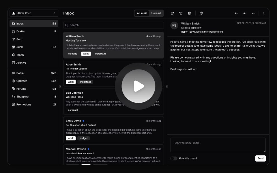 Hero Video DialogMagic UI · ReactA hero video dialog component.
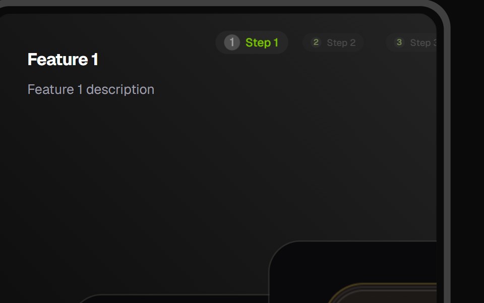 Feature CarouselCult UI · ReactFeature carousel component with smooth transitions and customizable layouts
- Magnetkit WebLibraries.dev · ReactLanding page of a magnetic UI kit: particles and elements pulled toward the cursor.
 Awesome Logo MarqueeLobe UI · React
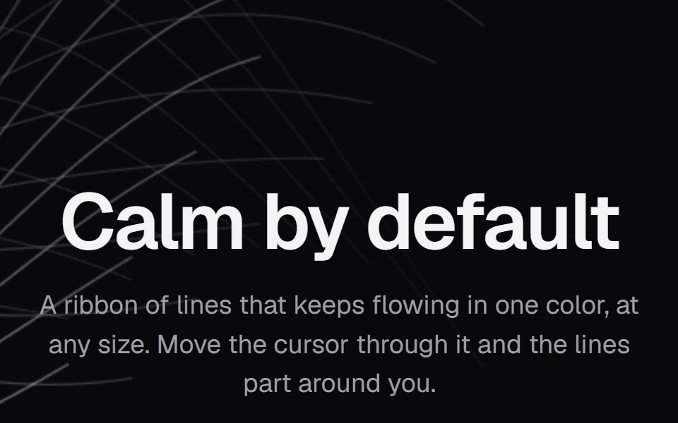 Background PathsKokonut UI · ReactA ribbon of lines in one color that keeps flowing at any size and parts around the cursor.
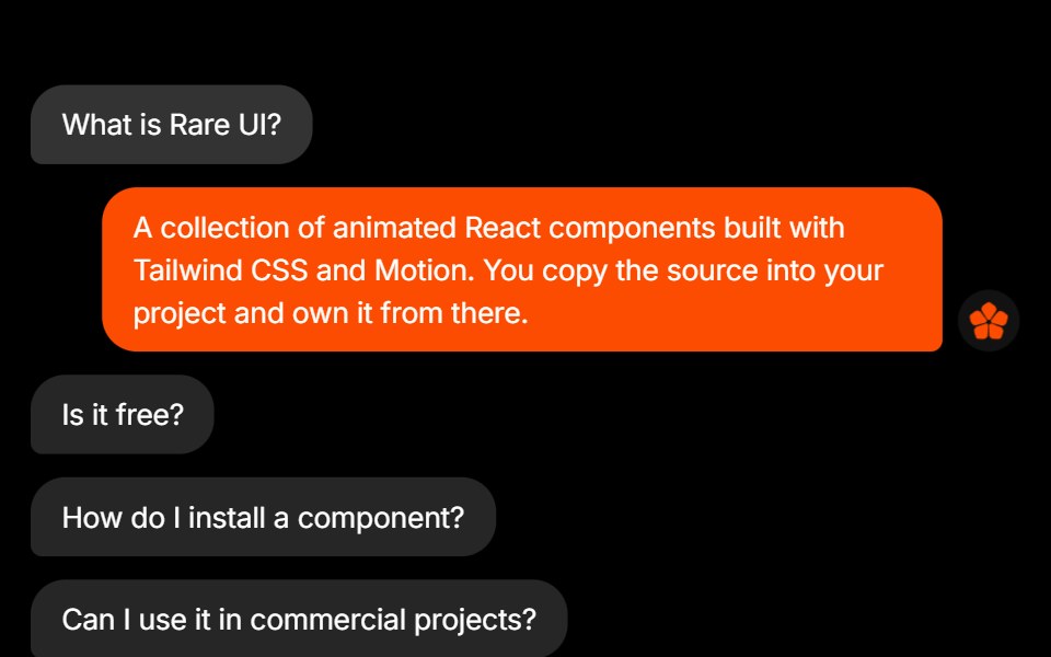 FAQRare UI · ReactAn FAQ styled as a message thread, with each answer sent as a reply bubble.
 Animated TestimonialsSpectrum UI · Reactcomponent for the Animated Testimonials
 Logos CarouselSpell UI · ReactAnimated carousel component that cycles through sets of logos with staggered animations.
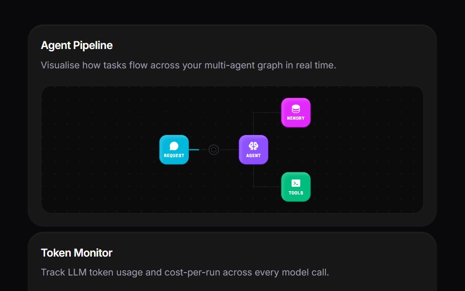 Agent Bento GridVengeance UI · ReactMulti-agent workspace grid layout
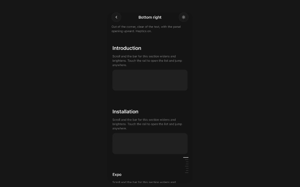 Section RailPanel UI · React NativeFloating section navigator for a long screen.
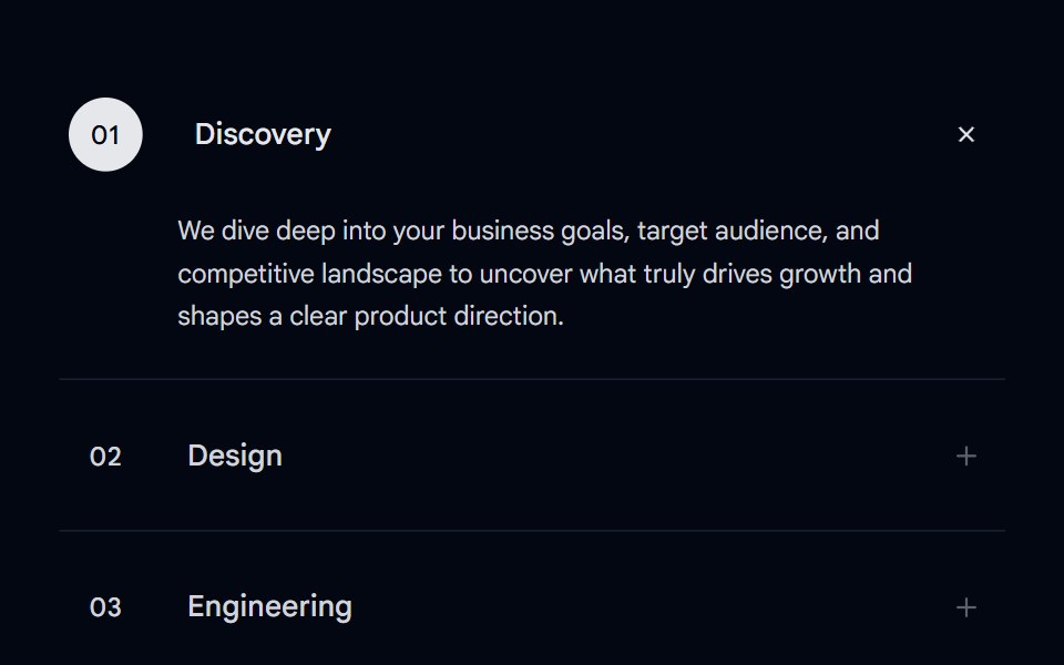 Accordion-07 - Motion ServicesShadcn Space · ReactAnimated accordion with a number bubble, sliding title shift, and an expanding bottom line on hover and active states…
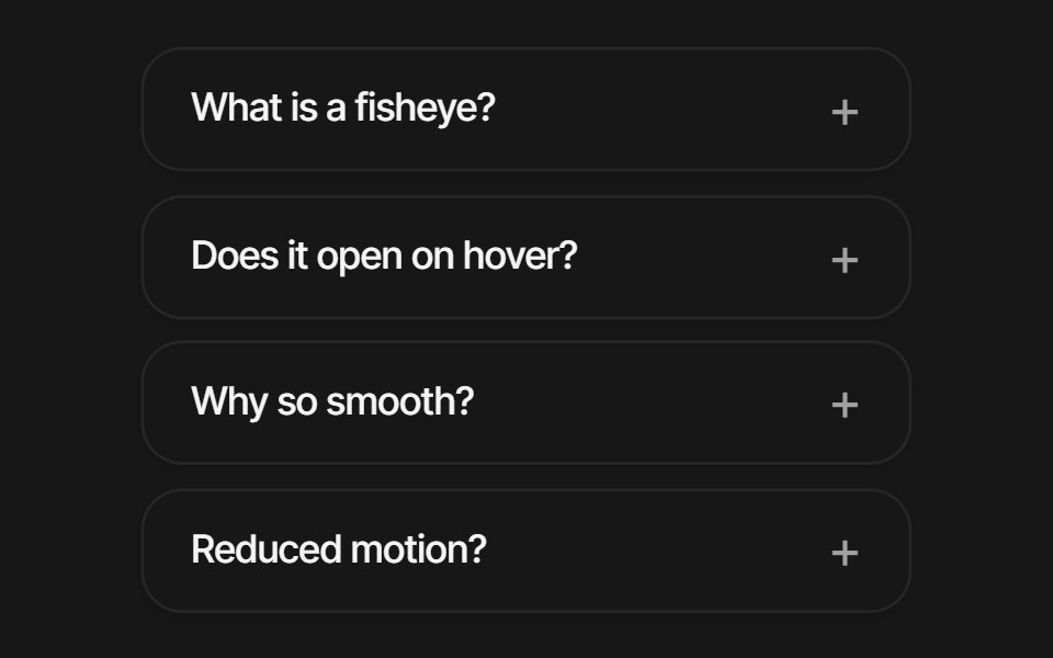 Fisheye FaqPixel Perfect · ReactA vertical FAQ list with macOS-Dock fisheye magnification — rows scale by their distance from the cursor and the…
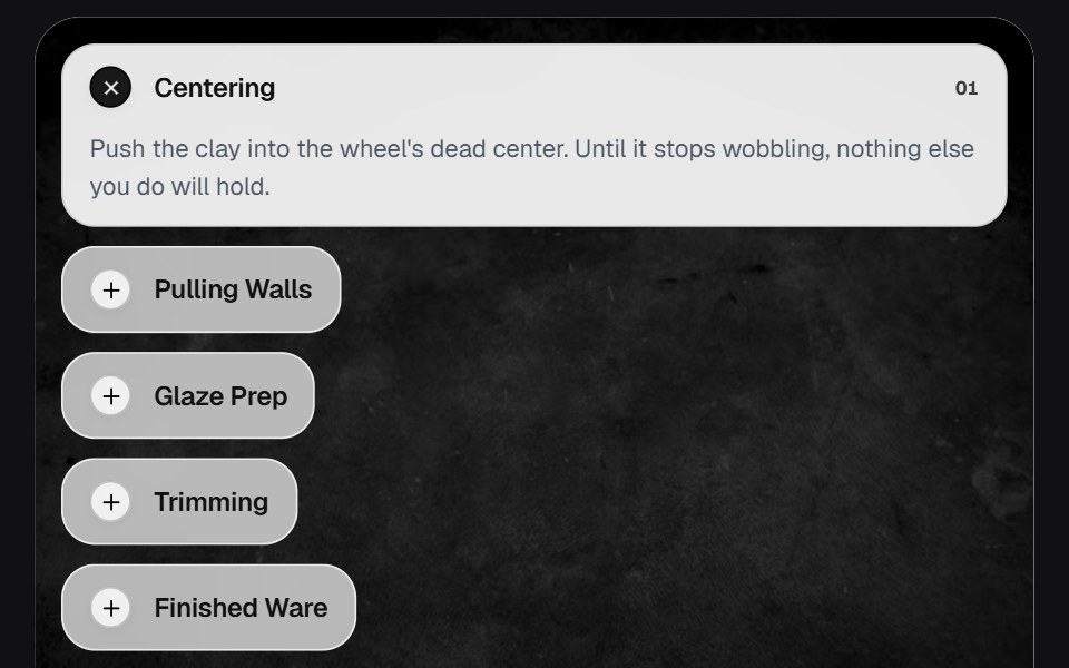 AccordionOSuselayouts · ReactInteractive accordion showcase with animated content, image transitions, hover effects, keyboard navigation, autoplay…
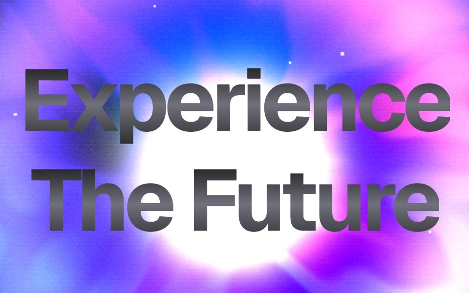 Dither Prism HeroComponentry · ReactStunning WebGL hero with advanced dithering, prismatic refraction, holographic iridescence, and center-focused energy.
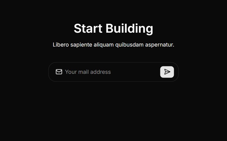 Cta Threecnblocks · SvelteCTA section with background gradient
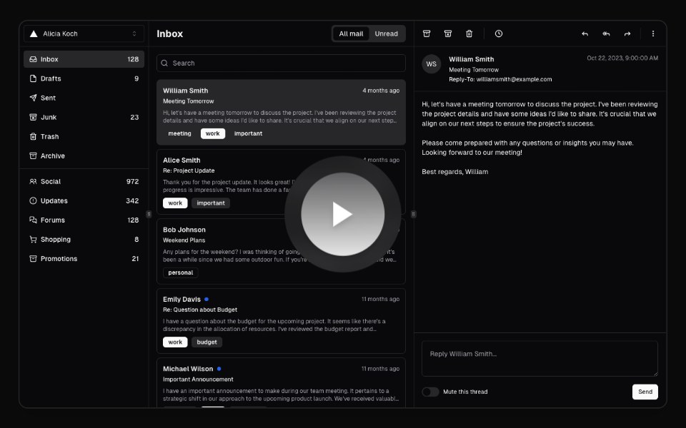 Hero Video DialogAnimations (Svelte) · SvelteA video dialog component with animated entrance effects, thumbnail support, and customizable animation styles.
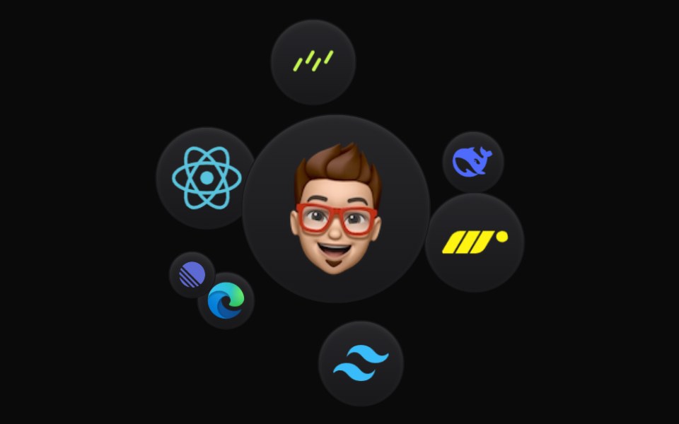 Cloud OrbitBadtz UI · ReactThis component creates a dynamic and interactive experience, where each icon orbits in a fluid motion. Fully…
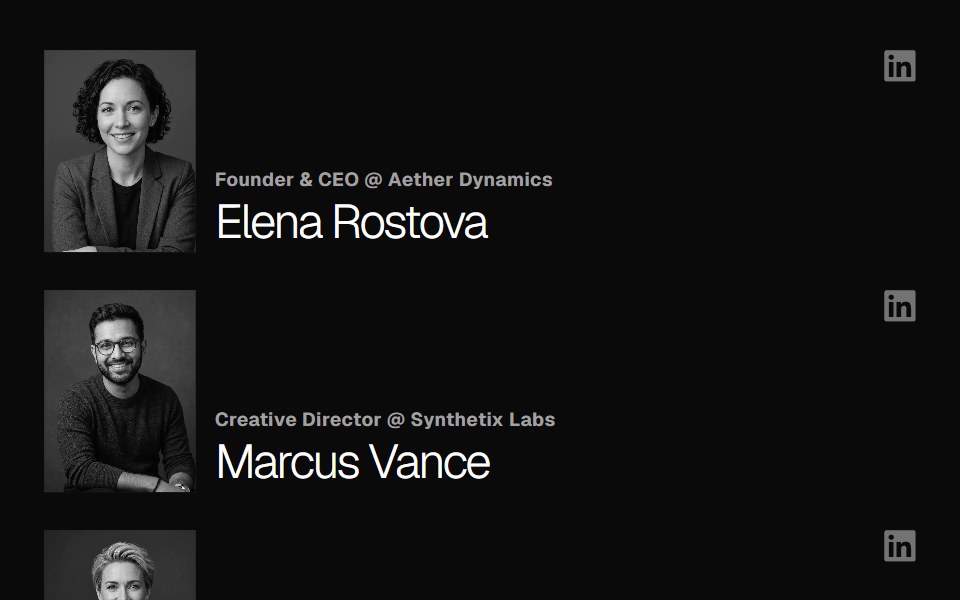 Team SectionGreatUI · React
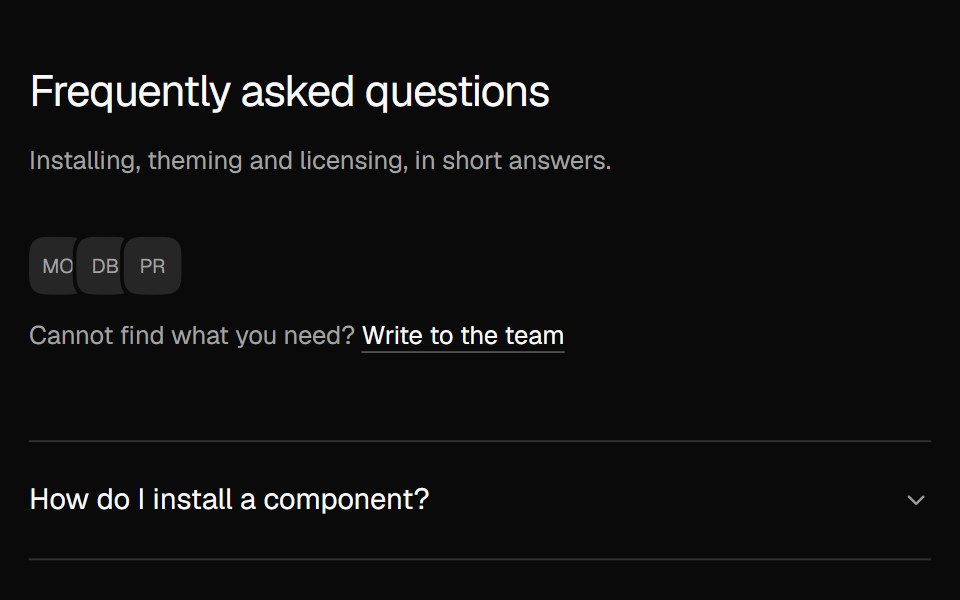 FAQ AccordionNexvyn UI · ReactA two column FAQ accordion with a contact line.
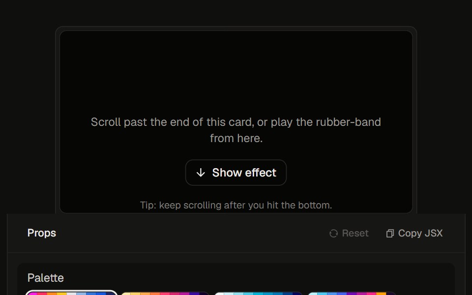 Stretchy Footer23rd.dev · ReactDia-style rubber overscroll: rainbow aurora stretches up past the bottom, then snaps back.
 Radial IntroWatermelon UI · React
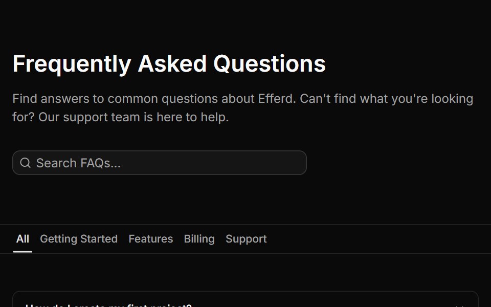 FAQ Fivesv-efferd · SvelteA searchable FAQ page with category filters, empty state handling, and structured dividers.
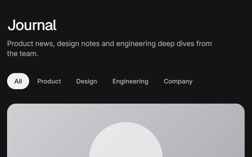 Blog gridArc Library · ReactA blog index with a featured post, category filter, post cards, pagination and an in-place reader.
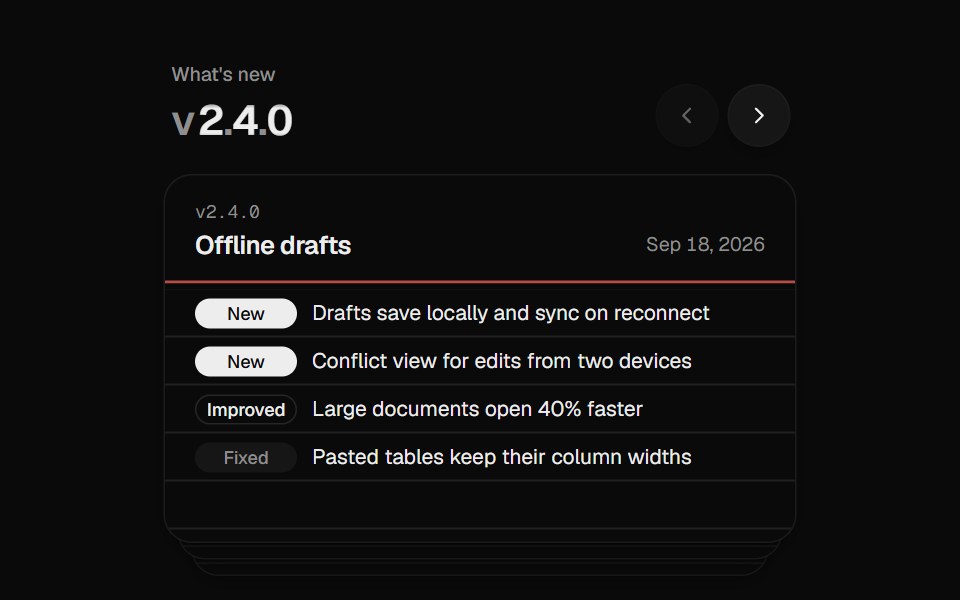 Changelog StackUI Lab · ReactFiles each release card behind the stack like a hand riffling index cards.
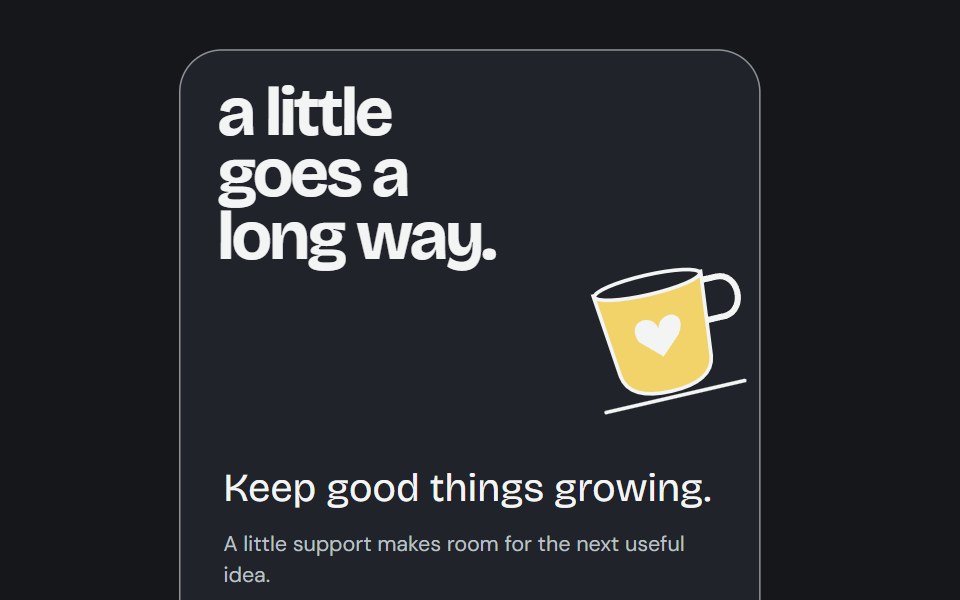 Buy Me CoffeeCojeev UI · ReactA support poster reveals an inviting cup illustration and a real caller destination.
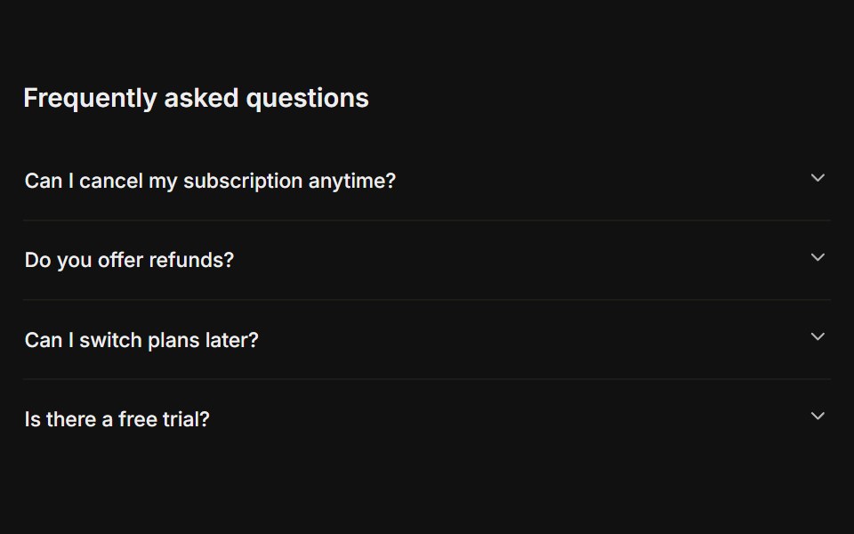 FAQFLX UI · ReactA titled question-and-answer list.
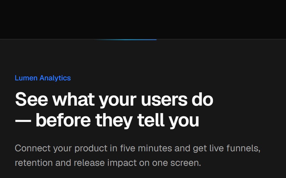 Split CTA with product visualVelora UI · ReactTwo-column CTA card with a benefit list and a dashboard mock-up, traced by an animated border beam.
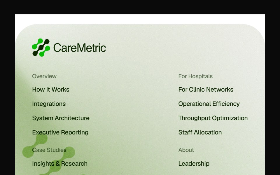 Caremetric FooterPin UI · React
 Interactive Grid HeroSpaceUI · ReactInteractive proximity-reactive square cell grid canvas that softly rounds and insets cells within a focused radius…
 Interactive Grid HeroSkecher UI · ReactA full-page field of square cells that locally soften and round around a fine pointer.
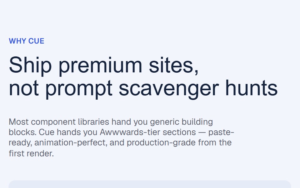 Flex Grow Benefits RevealCue Foundations · React
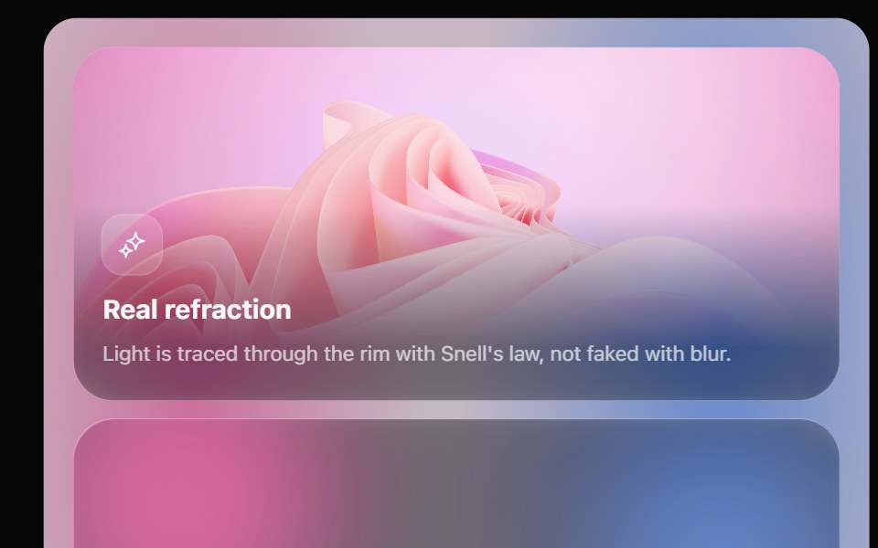 Glass Bento GridOpaline · ReactFeature tiles on glass in a bento layout, with a pointer light and a call to action that slides in.
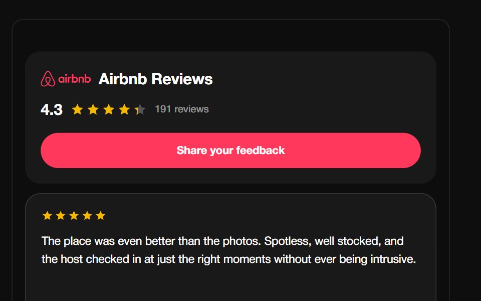 Airbnb ReviewsReactFrame · ReactA guest-review carousel with the Airbnb Bélo mark, aggregate rating header and CTA, above a draggable autoplaying grid…
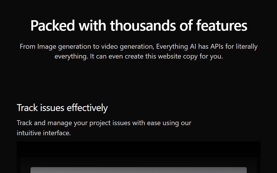 Features Section Demo 3Aceternity UI · React
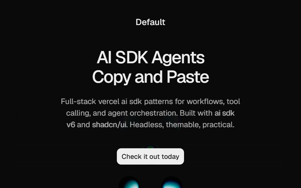 Hero Liquid MetalCult UI · ReactSplit-layout hero section with responsive LiquidMetal shader visuals, CTA, and tech stack badges
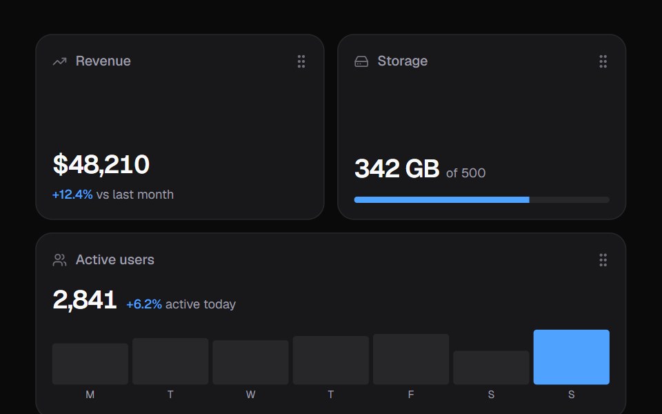 Widget GridKokonut UI · ReactDashboard widgets you lift, drag and resize on a 6-column grid, with spring physics and full keyboard support.
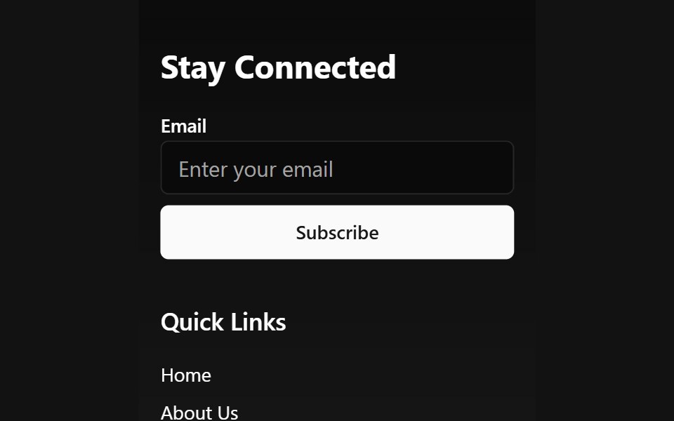 Animated Wave FooterSpectrum UI · Reactcomponent for the Animated Wave Footer
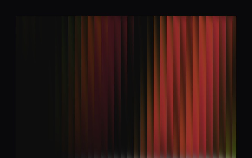 Aurora HeroVengeance UI · ReactFluted glass dynamic hero with interactive switch
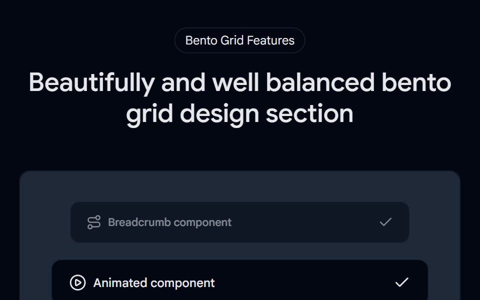 Bento Grid 01 - Bento Grid SectionShadcn Space · ReactA visually rich bento grid that brings the world closer—highlighting stunning locations, cultural moments, and…
 Footer RevealPixel Perfect · ReactA scroll-driven footer reveal — the footer sits pinned in place while the content above slides up to uncover it. Pure…
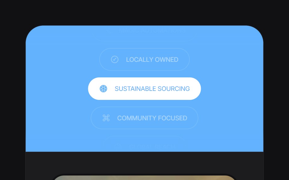 Feature Carouseluselayouts · ReactA smooth carousel for showcasing product features.
 Hero GeometricComponentry · ReactGeometric shapes and patterns for hero sections.
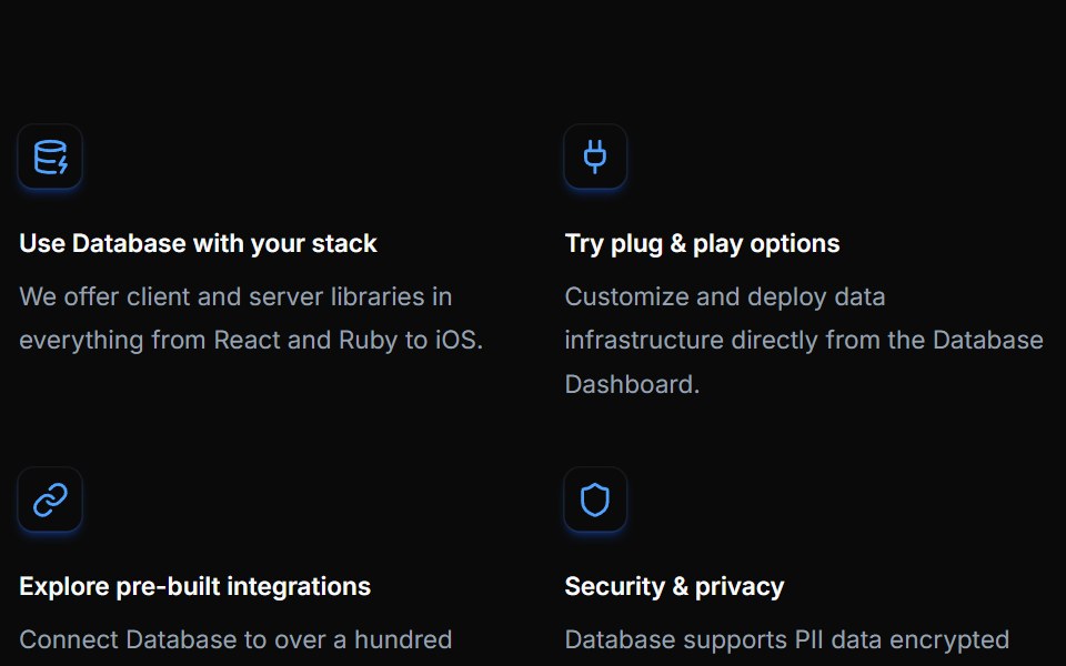 Feature Twelvecnblocks · SvelteFeature grid with gradient backgrounds
 Spell Logo CarouselAnimations (Svelte) · Svelte
 Footer SignatureNexvyn UI · ReactA one row footer with a handwritten signature that draws itself once.
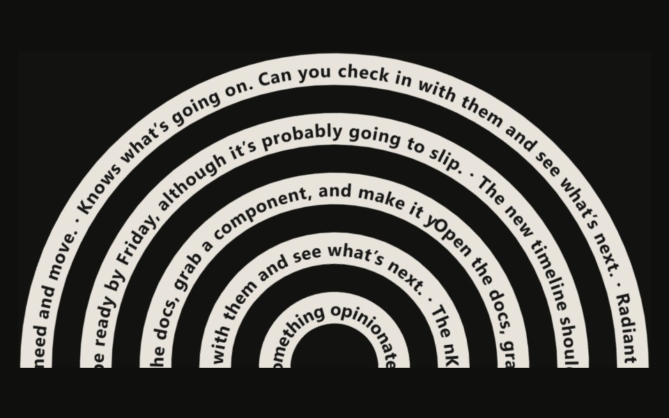 Tangle Footer23rd.dev · ReactA footer of tangled SVG ribbons — thick dark strokes with white text running along each path via textPath.
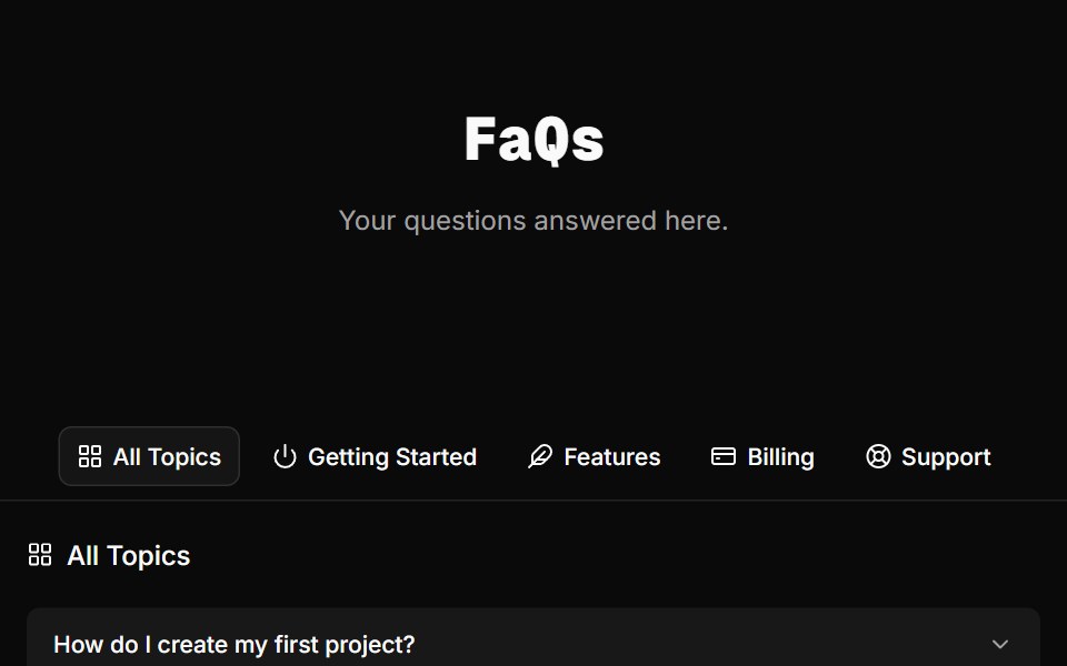 FAQ Foursv-efferd · SvelteA categorized FAQ explorer with topic switching and softly framed accordion rows.
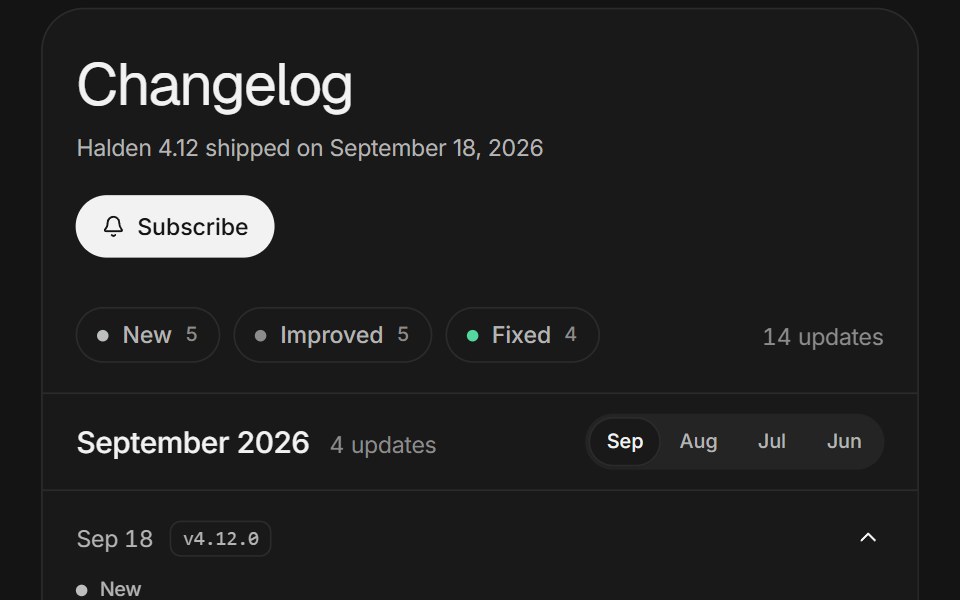 Changelog feedArc Library · ReactRelease notes you can filter, open in place, and scroll through month by month.
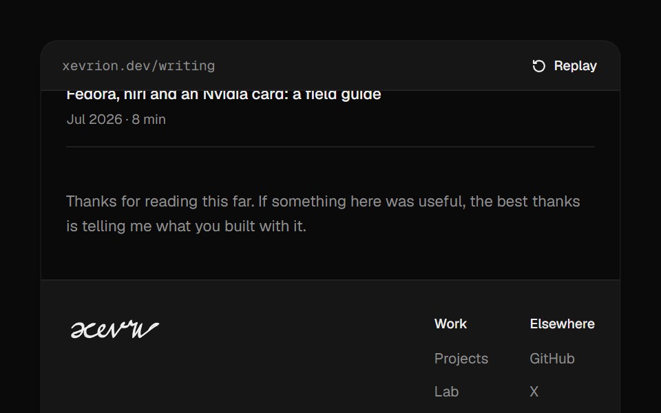 Footer SignatureUI Lab · ReactSigns the footer by hand when it scrolls into view, slowing through every loop.
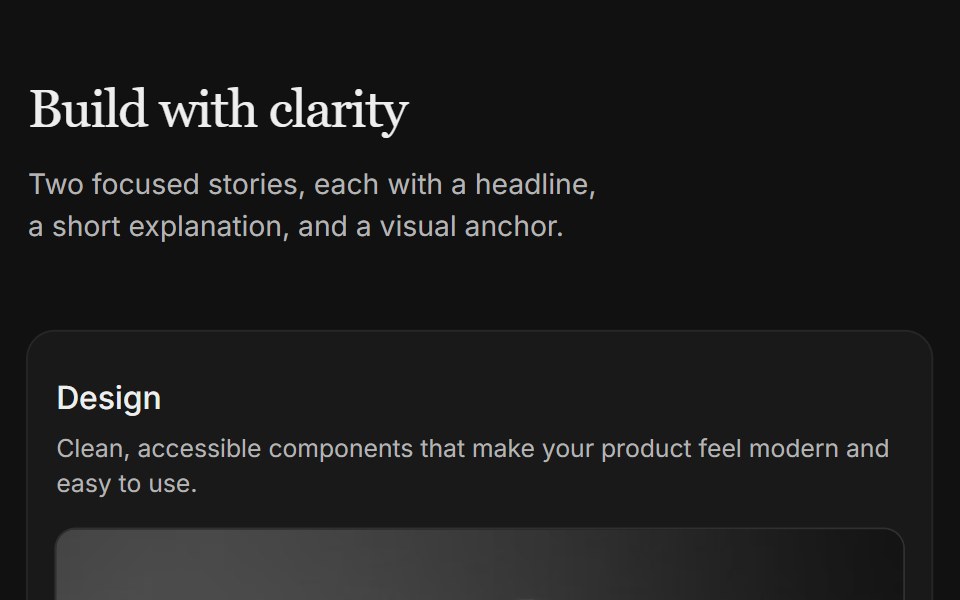 Content 04FLX UI · ReactTwo-column card grid with a serif section header and copy above each image.
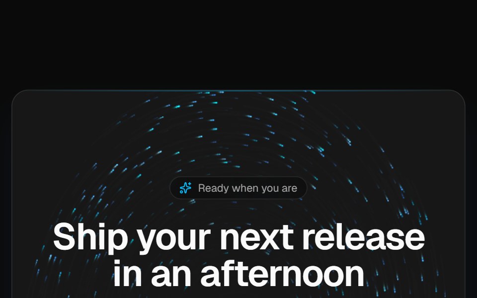 Vortex CTA bandVelora UI · ReactDark rounded call-to-action band over a brand-tinted particle vortex, with two actions and fine print.
 Luna HeroPin UI · React
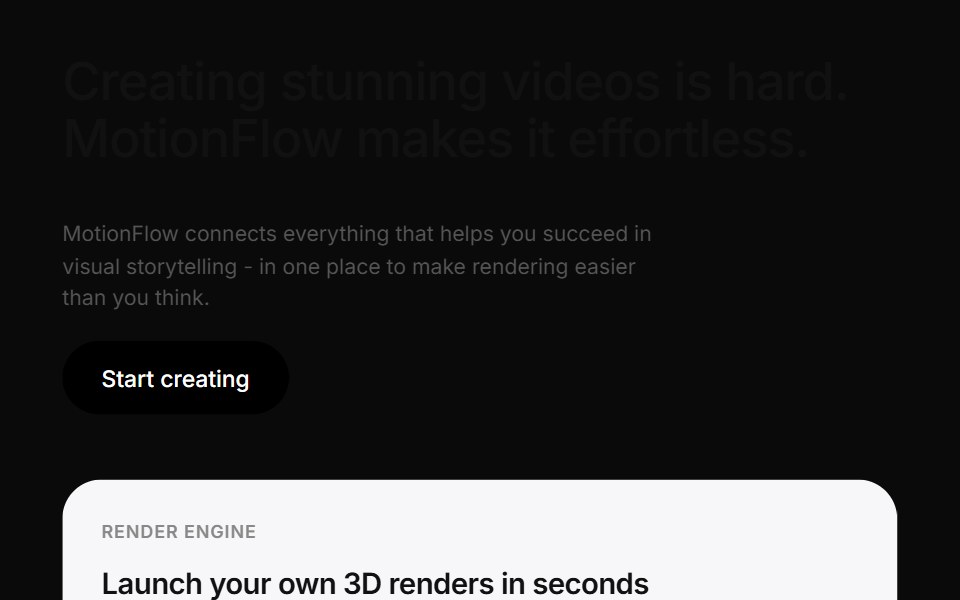 Motionflow Feature Grid ShowcaseCue Foundations · React
 Cinematic Stacked GalleryReactFrame · ReactA fullscreen hero gallery where inactive slides collapse into a stacked deck of thumbnails; clicking one crossfades it…
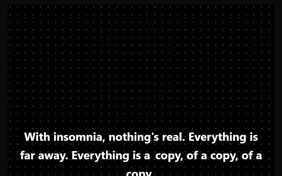 Hero HighlightAceternity UI · React
 Logo CarouselCult UI · ReactAnimated logo carousel with staggered animations and customizable columns
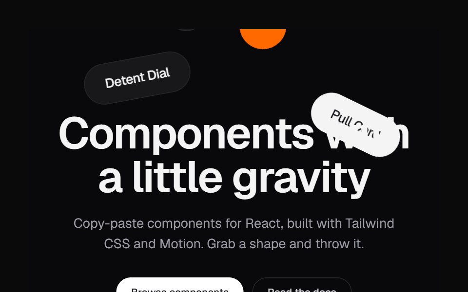 Shape HeroKokonut UI · ReactA landing hero where shapes drop in, pile up under the headline and can be grabbed and thrown.
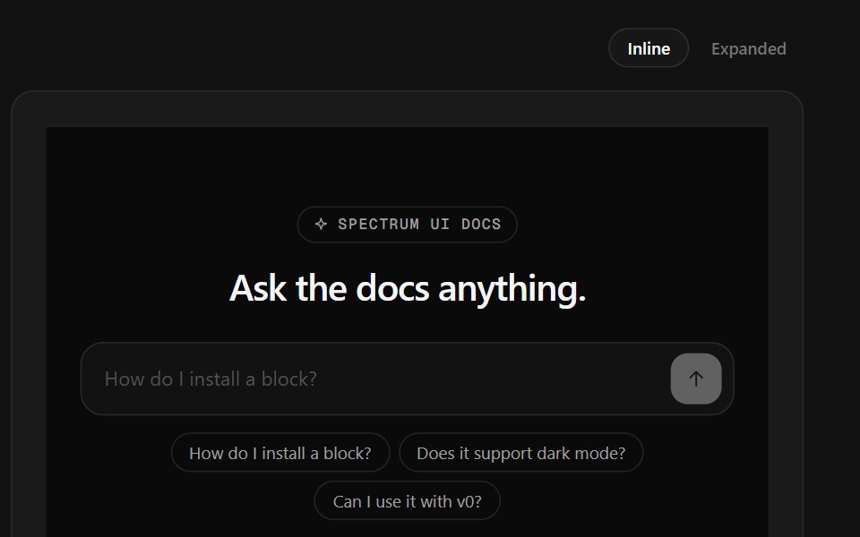 Ask Docs FooterSpectrum UI · ReactA docs question box that streams a cited answer, over link columns.
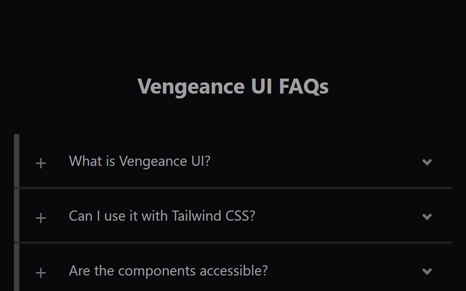 Faq AccordionVengeance UI · ReactAnimated expanding FAQ list
 CTA 02 - Video Background CTAShadcn Space · ReactA high impact call-to-action section with autoplay background video, bold overlay headline, primary button, and…
 Hero Cover RevealPixel Perfect · ReactA scroll-driven hero cover reveal — the hero pins in place while the next section slides up and covers it, scrubbed by…
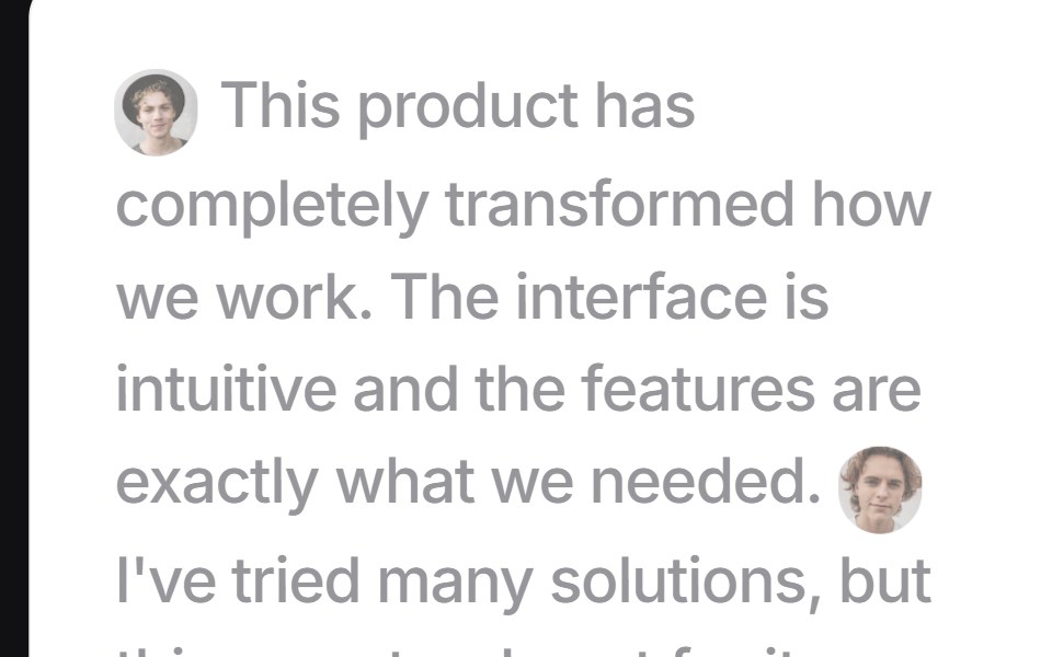 Focus Testimonialsuselayouts · ReactInteractive testimonial section with hover-based focus effects, animated author tooltips, and expandable testimonials.
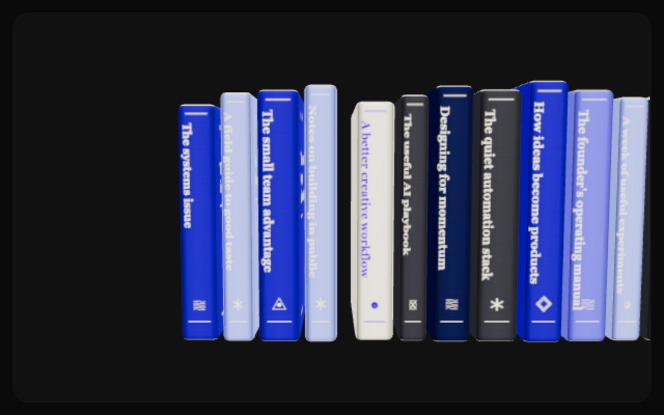 Newsletter BookshelfComponentry · ReactA tactile 3D newsletter archive with hover lift, camera browsing, centered covers, and automatic drag-adjustable…
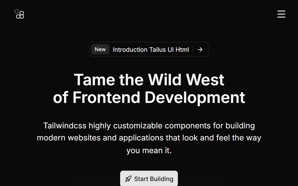 Hero Sevencnblocks · SvelteHero with gradient background and stats
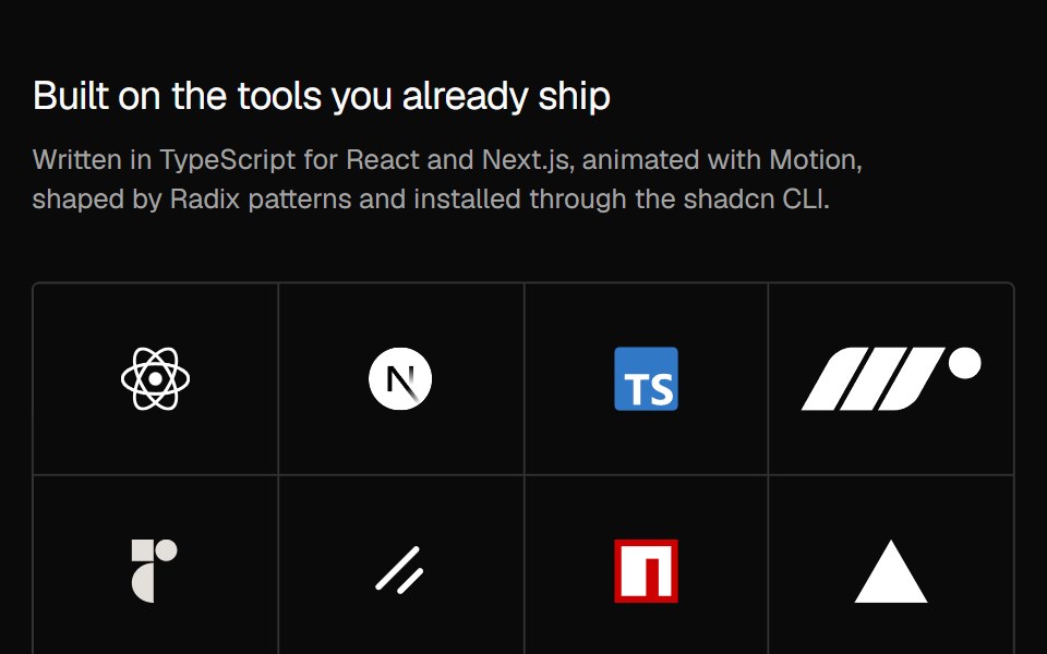 Social Proof Logo hoverNexvyn UI · ReactThe logo grid where the logos step back on hover or focus and a link fades in over them.
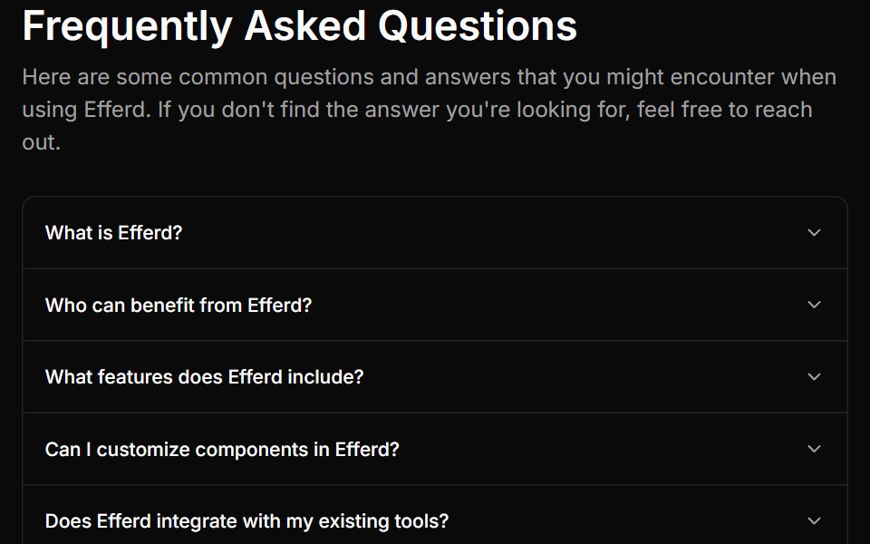 FAQ Onesv-efferd · SvelteA compact FAQ stack with a centered heading and a classic single-column accordion.
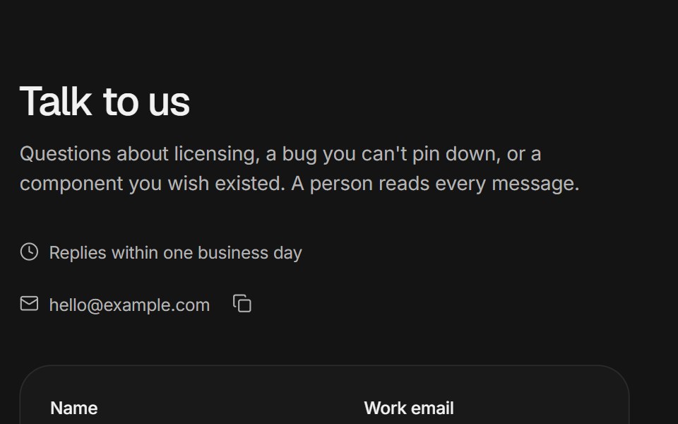 Contact sectionArc Library · ReactA validated contact form that morphs into a confirmation, support channels, and office cards with local times.
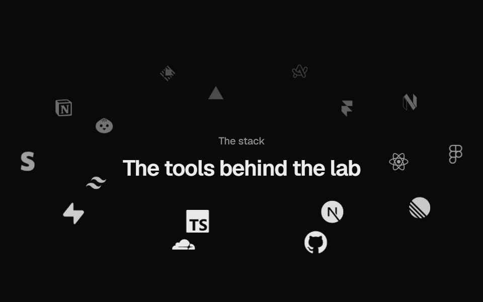 Logo OrbitUI Lab · ReactLogos orbit a heading on tilted rings, passing behind it, and brake to a stop when you point.
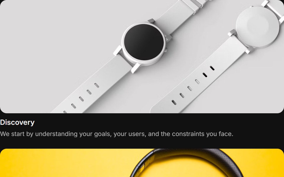 Content 05FLX UI · ReactA focus grid with items that can be focused and dimmed.
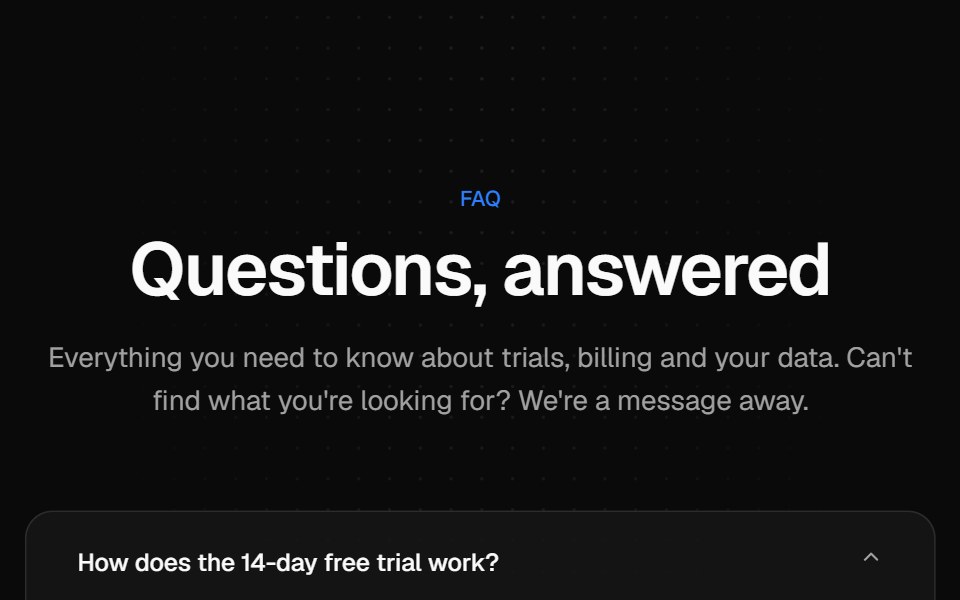 Centered FAQ accordionVelora UI · ReactCentered heading over an accordion of eight questions, closed by a contact row.
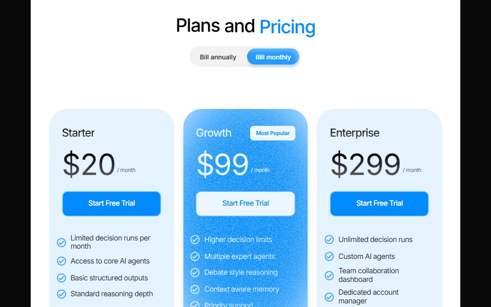 Odometer PricingPin UI · React
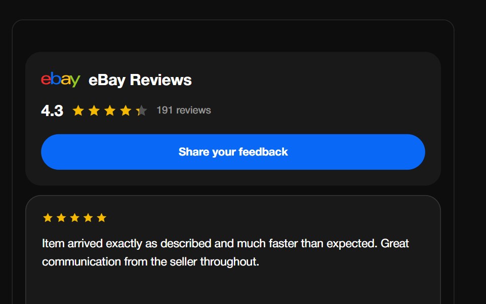 eBay ReviewsReactFrame · ReactA seller-feedback carousel with the eBay wordmark, aggregate rating header and CTA, above a draggable autoplaying grid…
 Hero ParallaxAceternity UI · React
 Careers FooterSpectrum UI · ReactA rolling three-role window with department filters, over link columns.
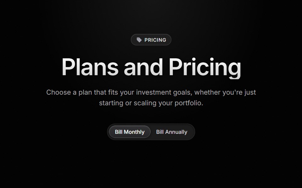 Pricing SectionVengeance UI · ReactThree-tier pricing with a sliding billing switch, rolling prices, and accent-lit cards
 Dialog 07 - Connect IntegrationShadcn Space · ReactDialog with a decorative header connecting two app icons — ideal for third-party integration and calendar connect flows.
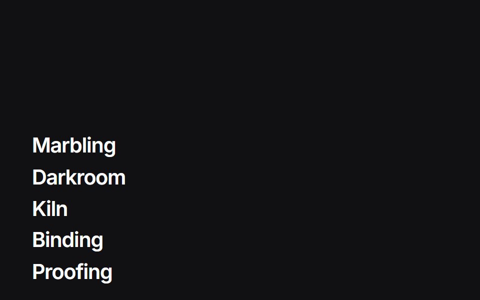 Liquid Indexuselayouts · ReactA feature list whose hover badge is a WebGL liquid gradient that tracks the row.
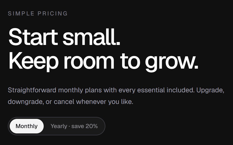 Pricing 02Componentry · ReactA compact pricing table with separated plan summaries, detailed feature lists, and an animated billing-cycle switch.
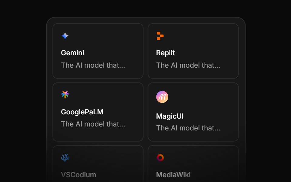 Integration Eightcnblocks · SvelteIntegration grid with animated connections
 Social Proof Logo marqueeNexvyn UI · ReactThe tools a product is built with, drifting in a slow seamless marquee with soft edges.
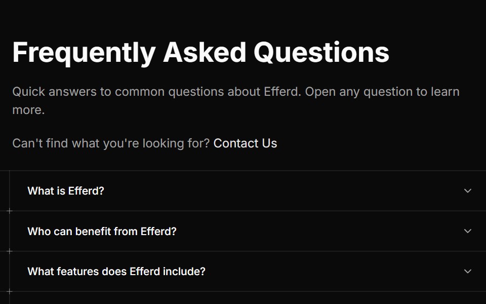 FAQ Threesv-efferd · SvelteA guided editorial FAQ with divider rails and decorative timeline markers.
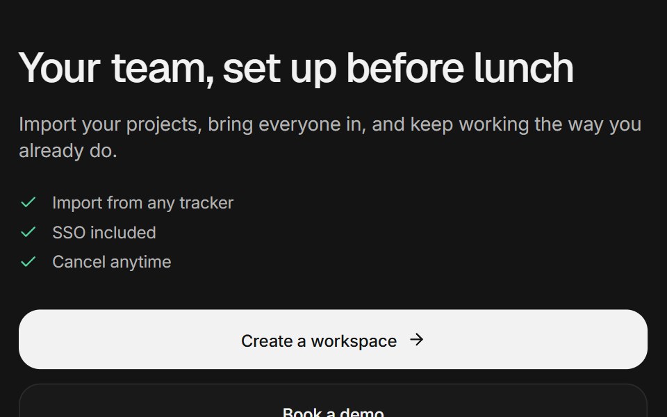 CTA sectionArc Library · ReactA call to action as a centered closing section, a split beside a setup card that completes itself, or a dismissible…
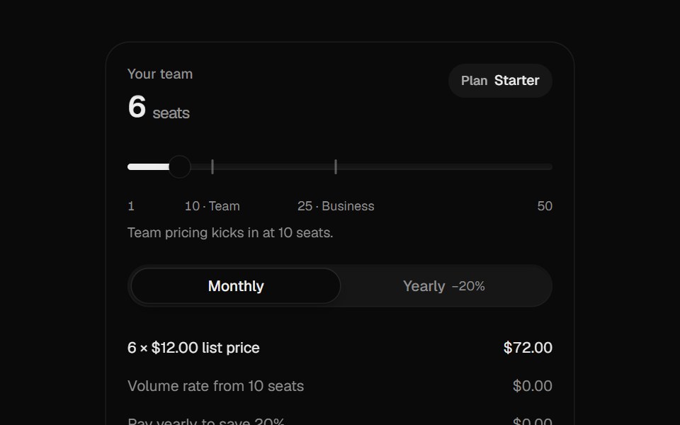 Pricing CalculatorUI Lab · ReactItemizes your bill like an invoice and upgrades the plan the moment your team crosses a seat threshold.
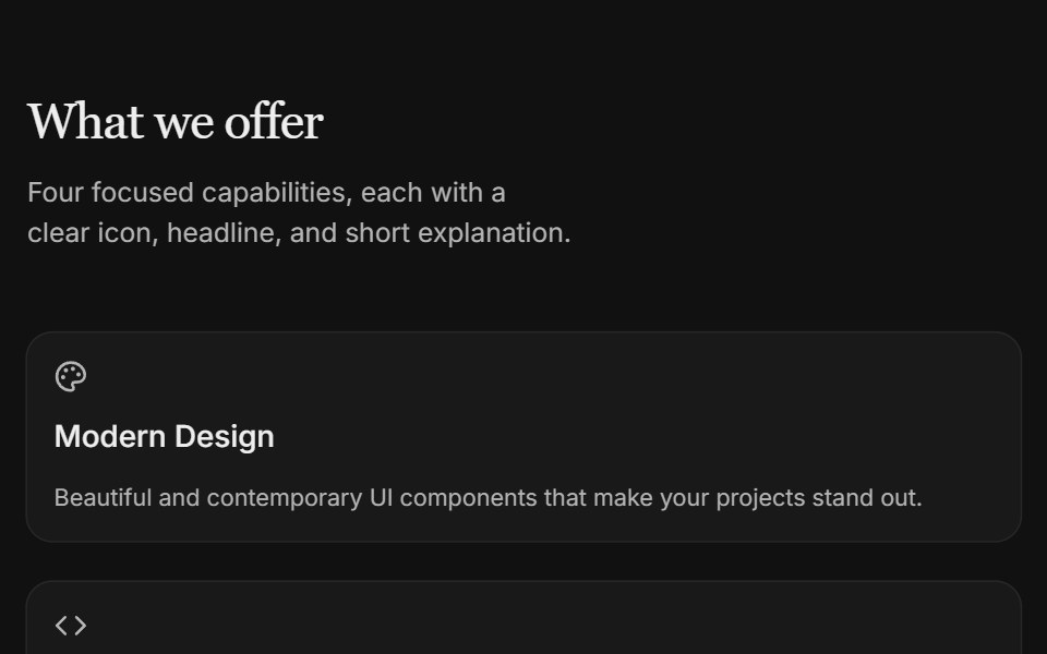 Content 09FLX UI · ReactTwo-column icon card grid with serif section header and subtle entrance motion.
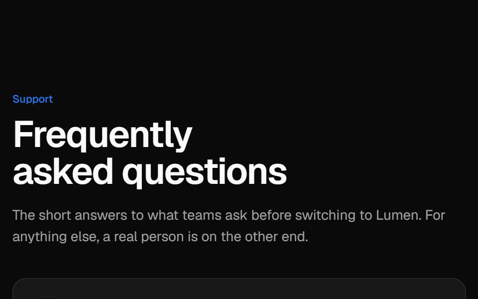 Two-column FAQVelora UI · ReactSticky intro and contact card on the left, an accordion of questions on the right.
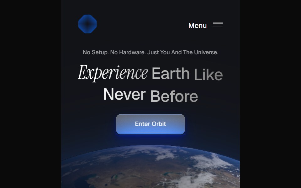 Orbit HeroPin UI · React
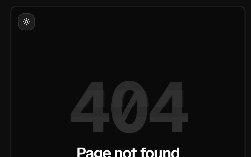 404 Page SectionReactFrame · ReactA centered "page not found" section: a big glitching error code, heading, description and one or two pill buttons…
 Images SliderAceternity UI · React
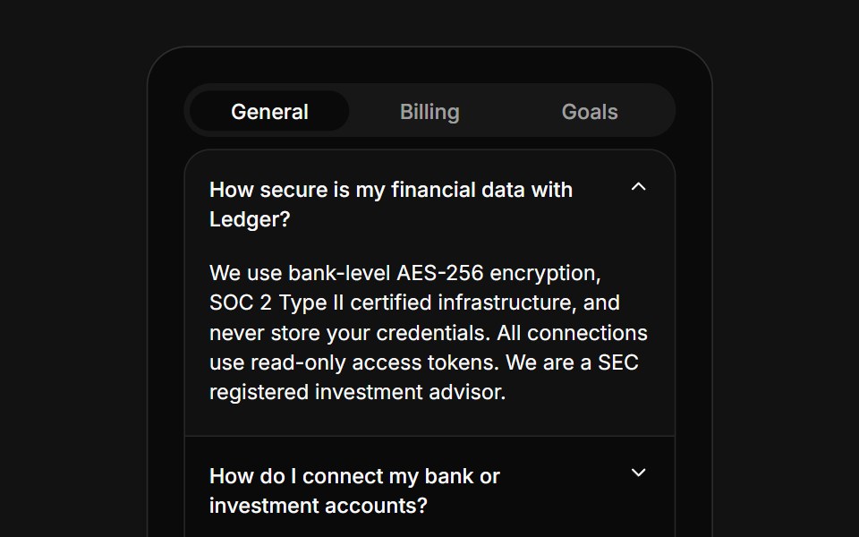 FAQ Tabs CardSpectrum UI · ReactA tabbed FAQ card with animated accordion answers and a support footer.
 Pricing TiersVengeance UI · ReactMonochrome three-tier pricing with a dark featured card, mono labels, and an enterprise row
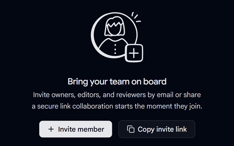 Empty State 02 - Invite Your TeamShadcn Space · ReactA centered empty state with a custom illustration, heading, description, and two calls-to-action for inviting…
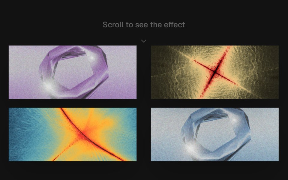 Scroll ChoreographyComponentry · ReactA smooth, scroll-driven image choreography component using Framer Motion.
 Integration Twocnblocks · SvelteTwo-row integration logo marquee
 Social Proof Logo revealNexvyn UI · ReactThe logo grid with a staggered rise and fade that plays once when it first scrolls into view.
 FAQ Twosv-efferd · SvelteA split FAQ layout with a fixed intro column and full-height answer rail.
 FAQ sectionArc Library · ReactFAQs as an accordion, a topic rail, or a searchable list that highlights matches.
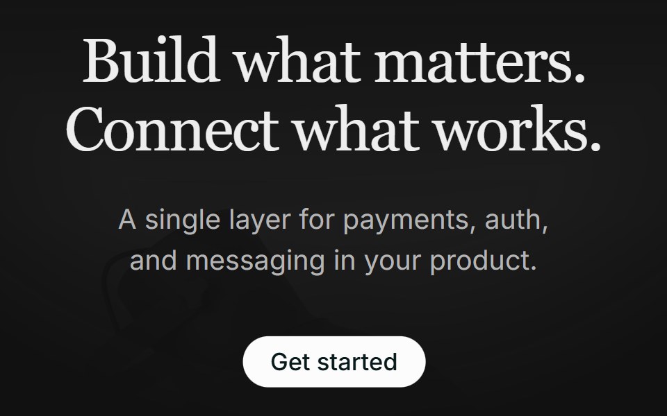 Hero 01FLX UI · ReactA centered serif hero with a soft gradient wash, pill CTA, and a floating integration cloud.
 Bento feature gridVelora UI · ReactFive-card bento grid with live visuals: integration beams, orbiting icons, a chart, a tag marquee and a globe.
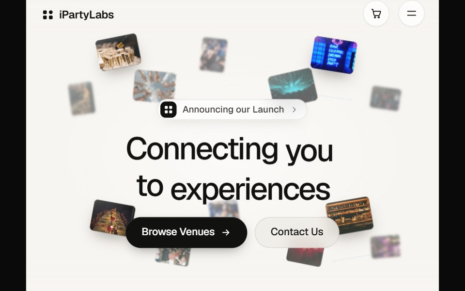 Partylabs HeroPin UI · React
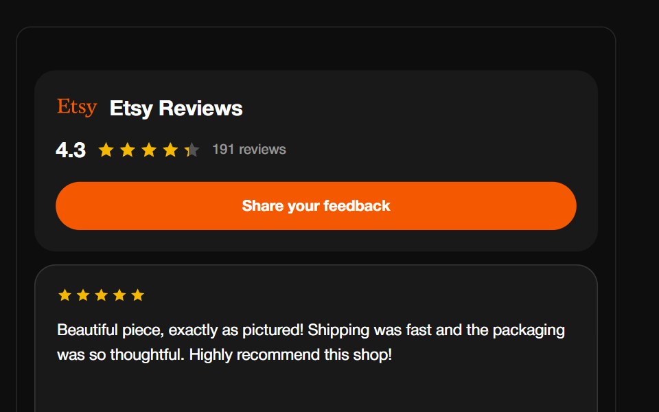 Etsy ReviewsReactFrame · ReactA shop-review carousel with the Etsy wordmark, aggregate rating header and CTA, above a draggable autoplaying grid of…
 LampAceternity UI · React
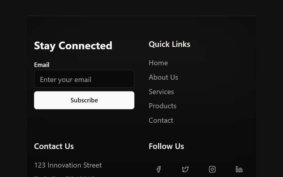 Floating Particle FooterSpectrum UI · Reactcomponent for the Floating Particle Footer
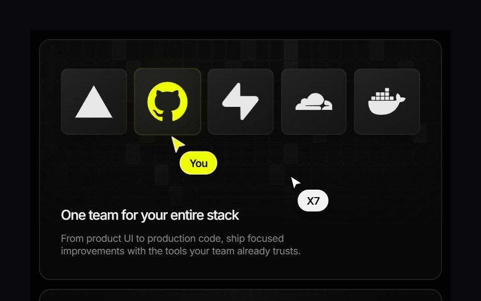 Research Bento GridVengeance UI · ReactAnimated developer-service showcase with interactive pricing and pause states
 Hero 01 - Agency Hero SectionShadcn Space · ReactClean agency hero section designed for SaaS and startup websites, featuring bold headline, gradient background, trust…
 Logocloud Threecnblocks · SvelteScrolling logo cloud marquee with progressive blur edges
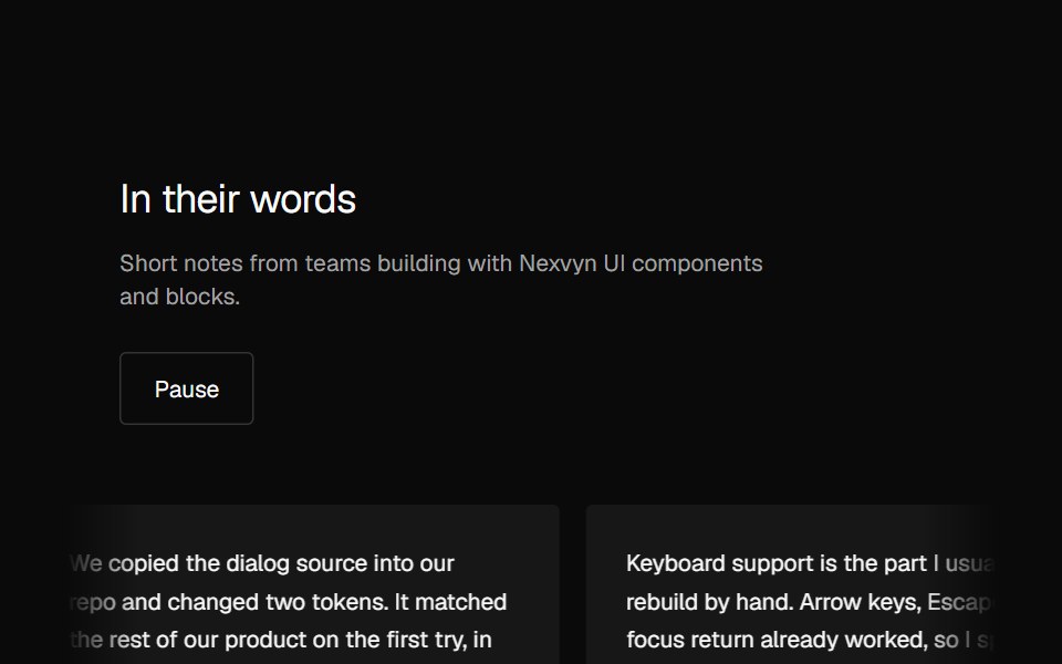 Social Proof Testimonial marqueeNexvyn UI · ReactTwo rows of testimonial cards drifting in opposite directions, pausable.
 Footer Sixsv-efferd · SvelteA cinematic sticky footer with animated columns and a long-form enterprise sitemap.
 Hero sectionArc Library · ReactThree full screen SaaS heroes: a live dashboard rising from the bottom edge over a drifting mesh, a workflow graph…
 Icon feature gridVelora UI · ReactHeading and six icon feature cards in a three-column grid, each border lit by a cursor-following glow.
 Smart PricingPin UI · React
 Logo MarqueeReactFrame · ReactAn infinite scrolling row of client/partner logos with edge fade masks, grayscale-to-color hover reveal…
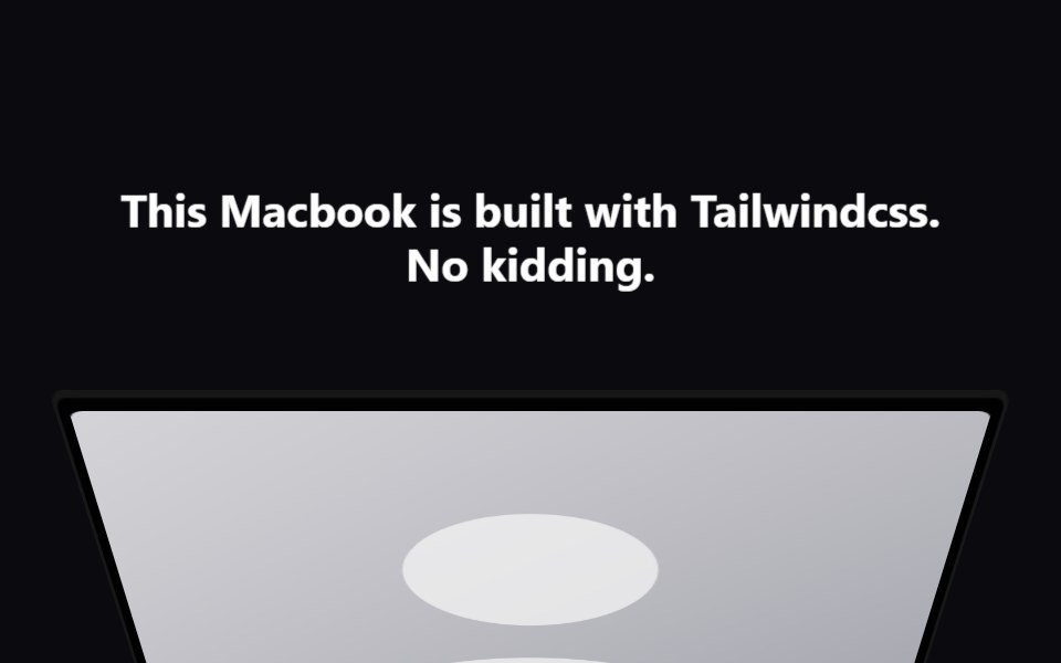 Macbook ScrollAceternity UI · React
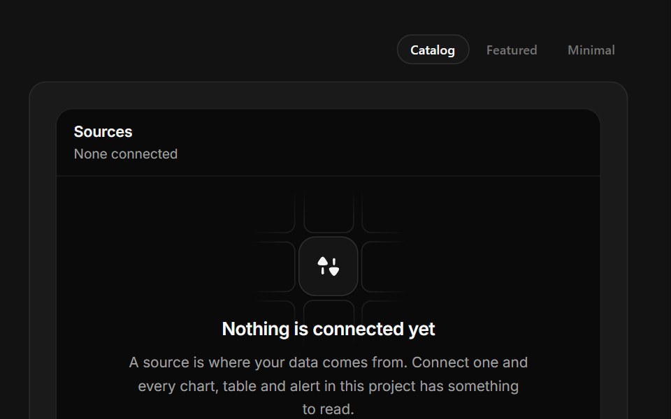 Connect a SourceSpectrum UI · ReactA connector grid where tiles run a real connect sequence and settle into connected.
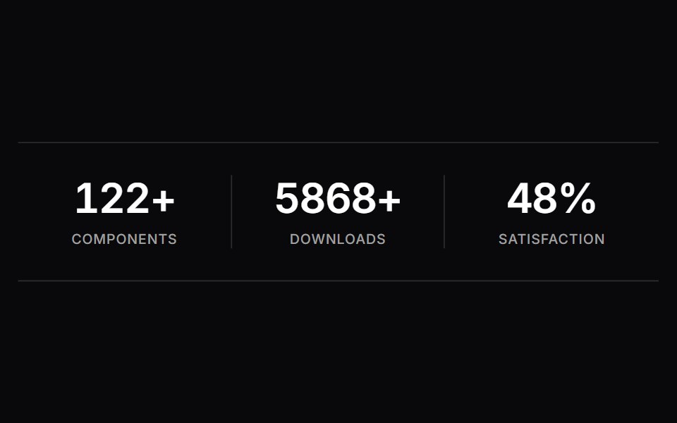 Stats CounterVengeance UI · ReactCount-up number animation triggered on scroll
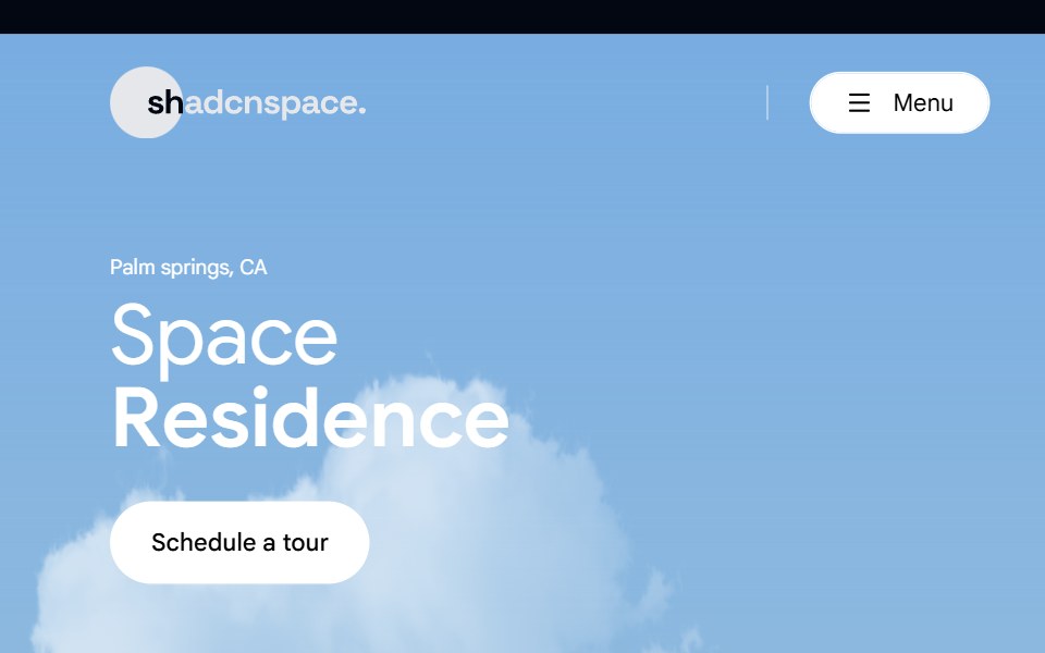 Hero 02 - Real Estate Hero SectionShadcn Space · ReactLuxury real estate hero section crafted for property listings, featuring immersive imagery, location highlight, key…
 Logocloud Twocnblocks · SvelteInteractive logo cloud with hover call-to-action
 Footer Threesv-efferd · SvelteAn animated rounded footer with grouped link columns and softer visual depth.
 Logo marqueeArc Library · ReactA quiet, continuously moving row of brand marks with a pause control.
 Numbered stepsVelora UI · ReactHow-it-works section with four numbered steps on a gradient connector line, each with a small UI visual.
Libraries with Animated section components
Related categories
- Section Components
- React Section Components
- Tailwind CSS Section Components
- Svelte Section Components
- shadcn/ui Section Components
- Animated Hero Components
- Animated Footer Components
- Animated Logo Cloud Components
- Animated Feature Section Components
- Animated FAQ Section Components
- Animated Testimonials Section Components
- Animated CTA Section Components
- Animated Integrations Section Components
- Animated Stats Section Components