 Dev Design Library
Animated Feature Section Components
Dev Design Library indexes 19 Animated feature section components from 9 open-source UI libraries, with the most coming from Velora UI, Vengeance UI, uselayouts, Aceternity UI and Cult UI. Each one links to its page with the source code, a live preview where available, the library license and the install command. These are the feature section components tagged as animated: motion on hover, on scroll or on load, usually built with CSS transitions or Framer Motion. Feature section components belong to the Sections group.
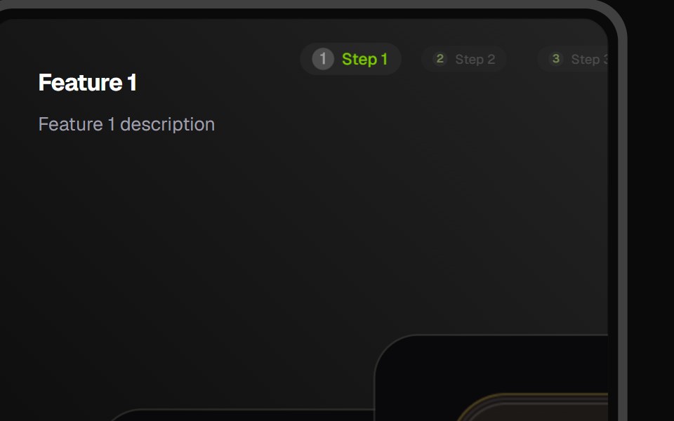 Feature CarouselCult UI · ReactFeature carousel component with smooth transitions and customizable layouts
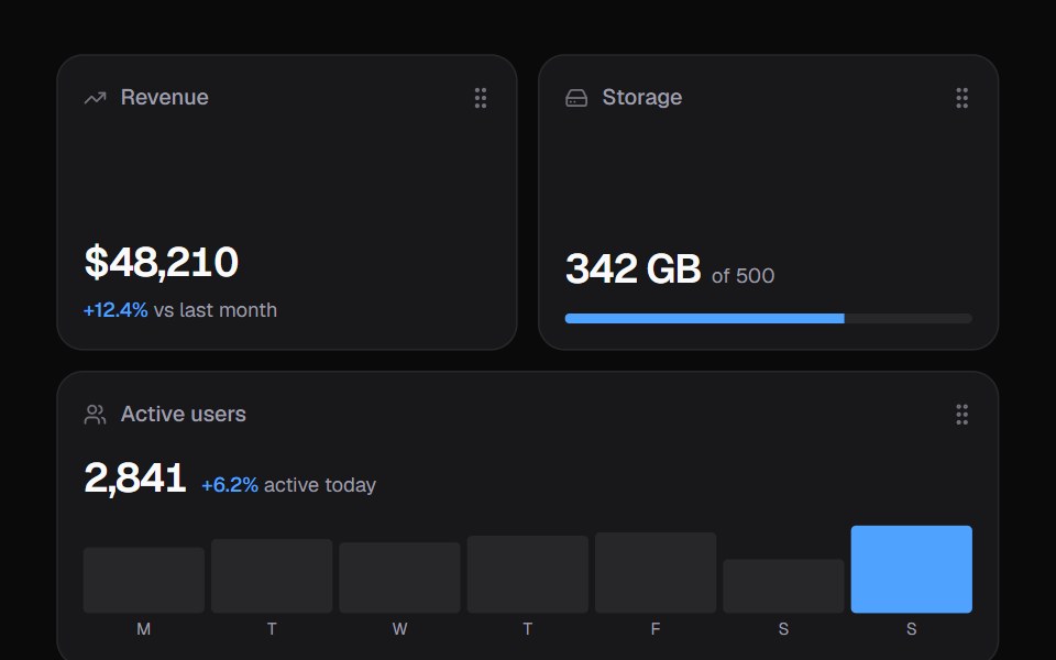 Widget GridKokonut UI · ReactDashboard widgets you lift, drag and resize on a 6-column grid, with spring physics and full keyboard support.
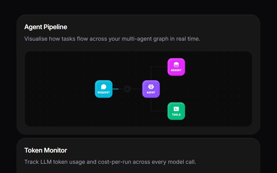 Agent Bento GridVengeance UI · ReactMulti-agent workspace grid layout
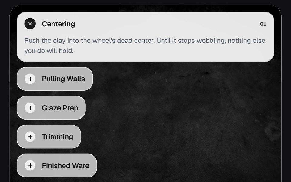 AccordionOSuselayouts · ReactInteractive accordion showcase with animated content, image transitions, hover effects, keyboard navigation, autoplay…
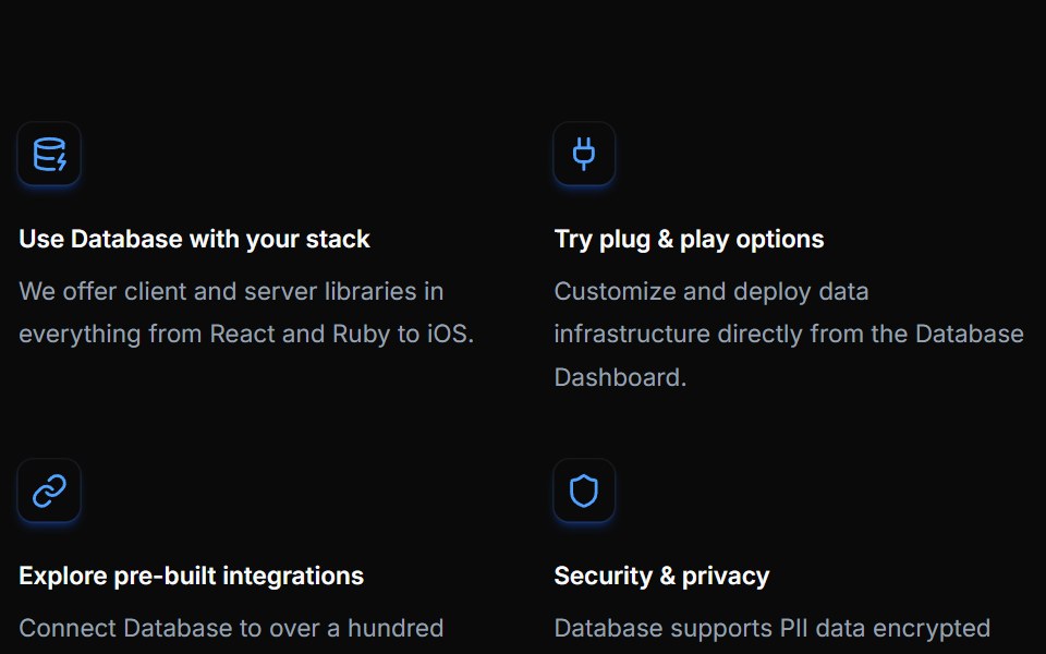 Feature Twelvecnblocks · SvelteFeature grid with gradient backgrounds
 Bento feature gridVelora UI · ReactFive-card bento grid with live visuals: integration beams, orbiting icons, a chart, a tag marquee and a globe.
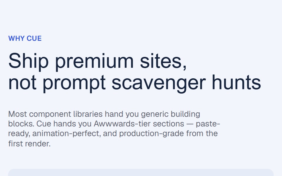 Flex Grow Benefits RevealCue Foundations · React
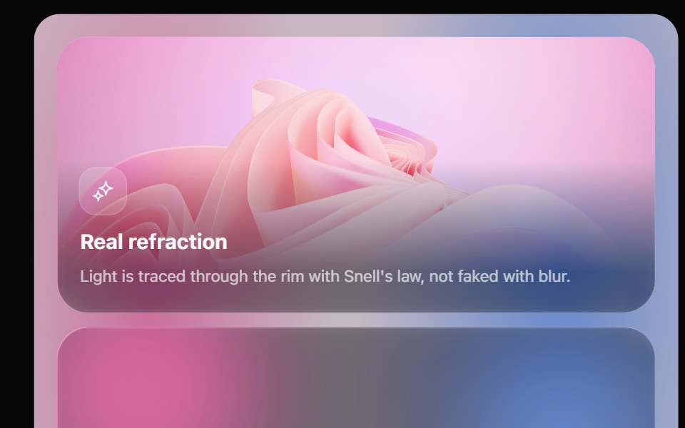 Glass Bento GridOpaline · ReactFeature tiles on glass in a bento layout, with a pointer light and a call to action that slides in.
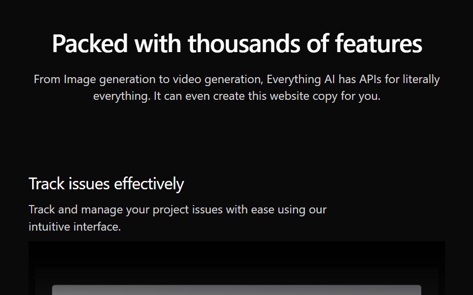 Features Section Demo 3Aceternity UI · React
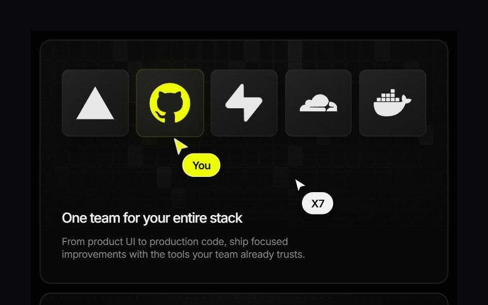 Research Bento GridVengeance UI · ReactAnimated developer-service showcase with interactive pricing and pause states
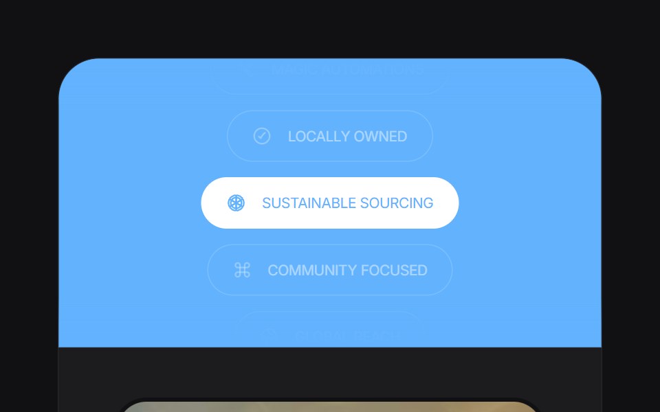 Feature Carouseluselayouts · ReactA smooth carousel for showcasing product features.
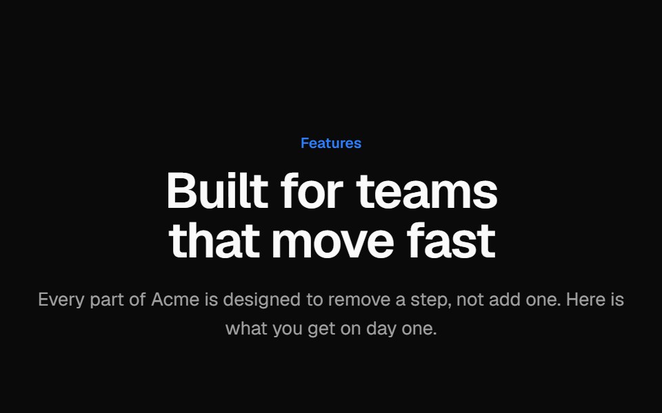 Icon feature gridVelora UI · ReactHeading and six icon feature cards in a three-column grid, each border lit by a cursor-following glow.
 Sticky Scroll RevealAceternity UI · React
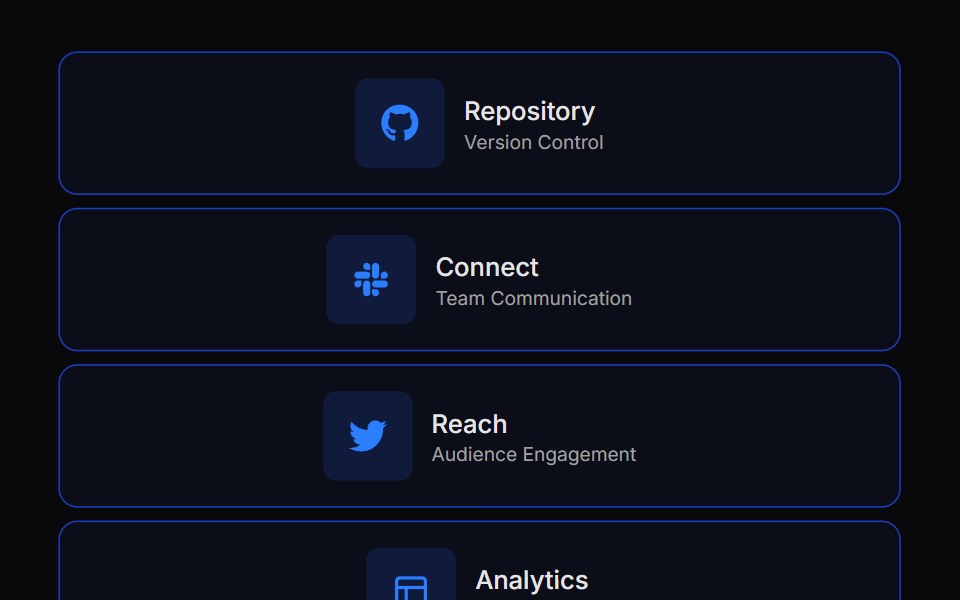 Expandable Bento GridVengeance UI · React
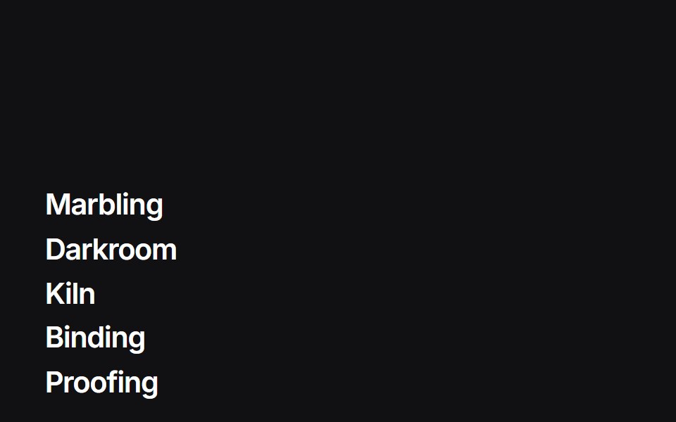 Liquid Indexuselayouts · ReactA feature list whose hover badge is a WebGL liquid gradient that tracks the row.
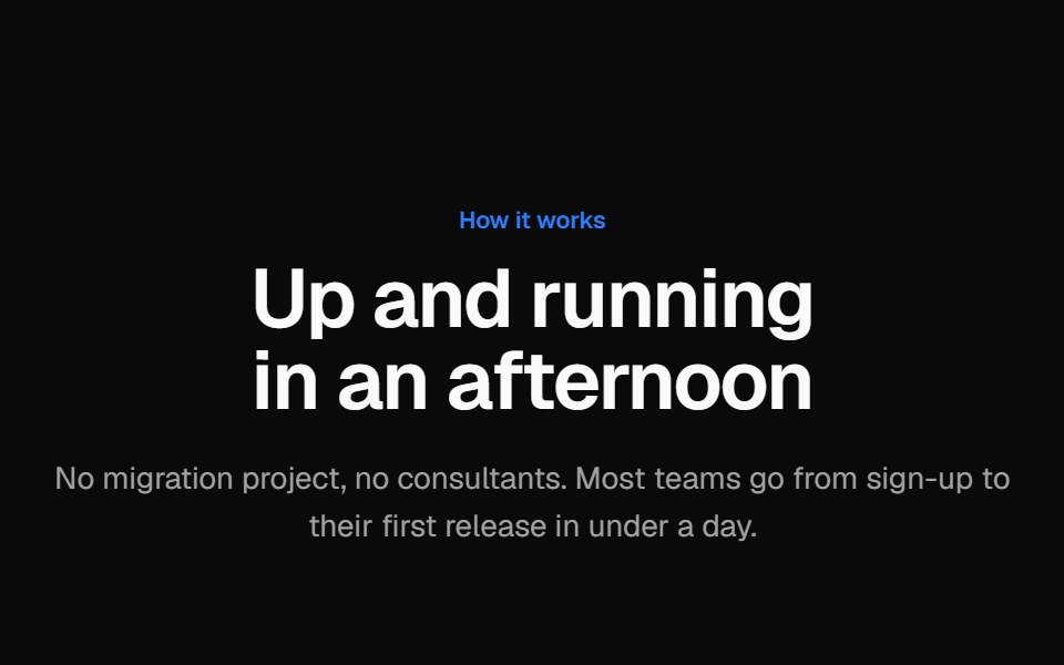 Numbered stepsVelora UI · ReactHow-it-works section with four numbered steps on a gradient connector line, each with a small UI visual.
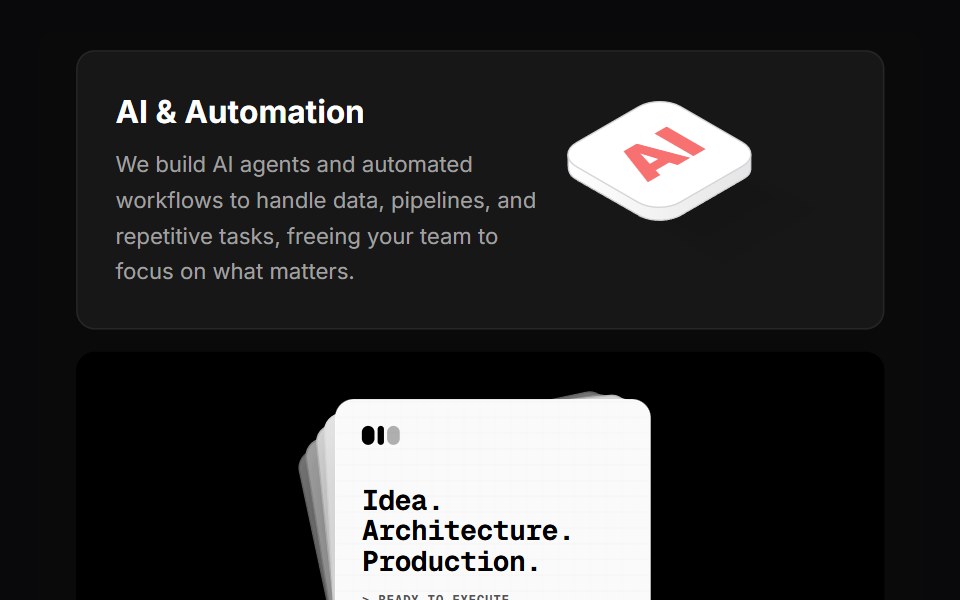 Why Us BentoVengeance UI · React
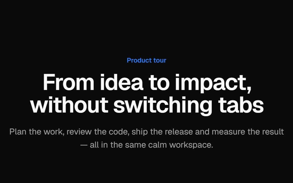 Tabbed product tourVelora UI · ReactProduct tour with animated tabs; each tab pairs short copy and a checklist with a Tailwind-built app mock.
 Sticky ScrollVelora UI · ReactCopy scrolls past a pinned panel that swaps per section.
Libraries with Animated feature section components
Related categories
- Feature Section Components
- React Feature Section Components
- Tailwind CSS Feature Section Components
- Svelte Feature Section Components
- shadcn/ui Feature Section Components
- Animated Section Components
- Animated Hero Components
- Animated Footer Components
- Animated Logo Cloud Components
- Animated FAQ Section Components
- Animated Testimonials Section Components
- Animated CTA Section Components
- Animated Integrations Section Components
- Animated Stats Section Components