 Dev Design Library
Animated Logo Cloud Components
Dev Design Library indexes 28 Animated logo cloud components from 17 open-source UI libraries, with the most coming from cnblocks, Nexvyn UI, sv-efferd, Velora UI and Spectrum UI. Each one links to its page with the source code, a live preview where available, the library license and the install command. These are the logo cloud components tagged as animated: motion on hover, on scroll or on load, usually built with CSS transitions or Framer Motion. Logo cloud components belong to the Sections group.
 Logo LoopReact Bits · ReactContinuously looping marquee of brand or tech logos with seamless repeat and hover pause.
 Logo CarouselCult UI · ReactAnimated logo carousel with staggered animations and customizable columns
 Awesome Logo MarqueeLobe UI · React
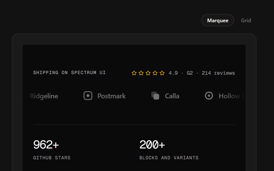 Logo Wall FooterSpectrum UI · ReactA customer logo wall — marquee or plotted grid — over stats and link columns.
 Logos CarouselSpell UI · ReactAnimated carousel component that cycles through sets of logos with staggered animations.
 Logo SliderVengeance UI · React
 Logo Cloud 01Shadcn Space · ReactA simple logo cloud built with Shadcn styling, using a subtle background, underlined heading, and a flexible grid of…
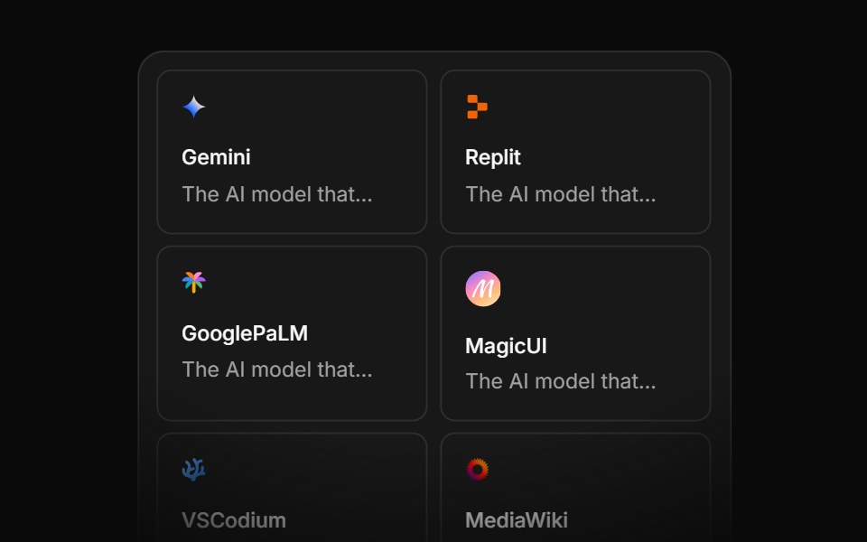 Integration Eightcnblocks · SvelteIntegration grid with animated connections
 Spell Logo CarouselAnimations (Svelte) · Svelte
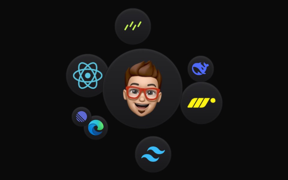 Cloud OrbitBadtz UI · ReactThis component creates a dynamic and interactive experience, where each icon orbits in a fluid motion. Fully…
 Social Proof Logo hoverNexvyn UI · ReactThe logo grid where the logos step back on hover or focus and a link fades in over them.
 Hero Onesv-efferd · SvelteA full hero composition with sticky header, editorial spotlight, and a marquee trust band.
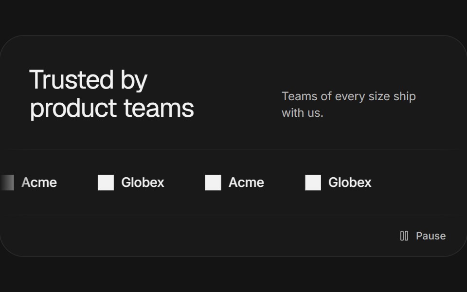 Logo marqueeArc Library · ReactA quiet, continuously moving row of brand marks with a pause control.
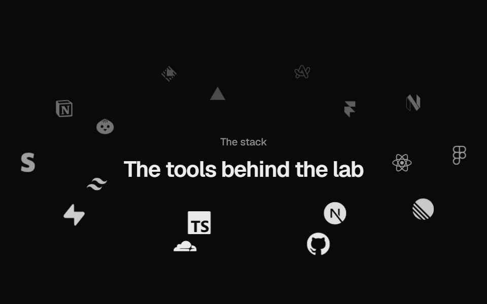 Logo OrbitUI Lab · ReactLogos orbit a heading on tilted rings, passing behind it, and brake to a stop when you point.
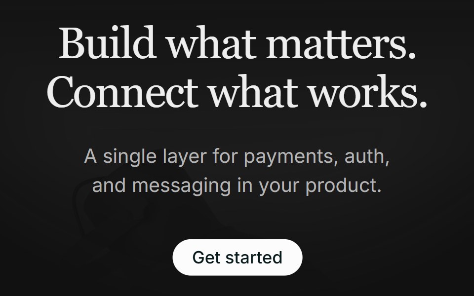 Hero 01FLX UI · ReactA centered serif hero with a soft gradient wash, pill CTA, and a floating integration cloud.
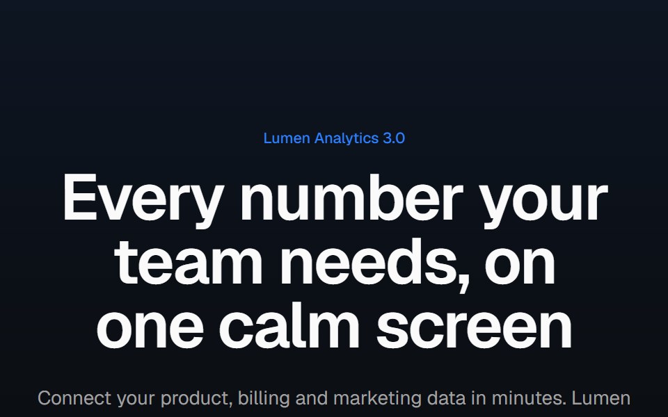 Product screenshot heroVelora UI · ReactCentered headline above a dashboard in a browser frame with a border beam and a logo row.
 Logo MarqueeReactFrame · ReactAn infinite scrolling row of client/partner logos with edge fade masks, grayscale-to-color hover reveal…
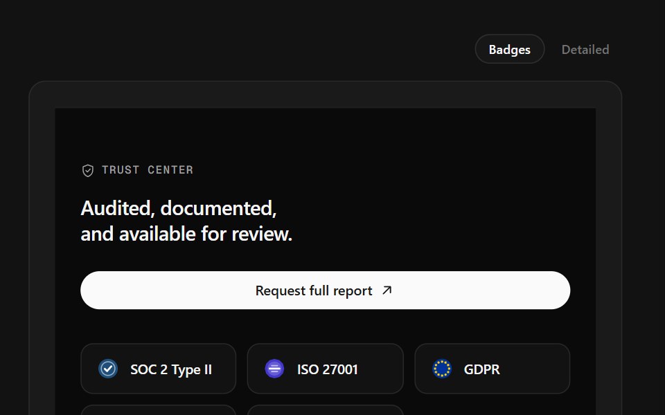 Trust Center FooterSpectrum UI · ReactCompliance marks that expand to scope, over a logo row and link columns.
 Integration Twocnblocks · SvelteTwo-row integration logo marquee
 Social Proof Logo marqueeNexvyn UI · ReactThe tools a product is built with, drifting in a slow seamless marquee with soft edges.
 Logo Cloud Foursv-efferd · SvelteA marquee logo band with progressive edge blur and a layered track surface.
 Logo gridVelora UI · ReactBordered grid of customer logos with a cursor spotlight per cell, beside a heading and stories link.
 Testimonial LogosReactFrame · ReactA compact trust bar, a star rating with a helped-N-teams label above an infinite, edge-masked logo marquee.
 Logocloud Threecnblocks · SvelteScrolling logo cloud marquee with progressive blur edges
 Social Proof Logo revealNexvyn UI · ReactThe logo grid with a staggered rise and fade that plays once when it first scrolls into view.
 Logo Cloud Threesv-efferd · SvelteA scrolling logo marquee with a soft edge mask and editorial rhythm.
 Logo marqueeVelora UI · ReactA “Trusted by” line over a scrolling strip of grayscale logos that take their colour on hover.
 Logocloud Twocnblocks · SvelteInteractive logo cloud with hover call-to-action
Libraries with Animated logo cloud components
Related categories
- Logo Cloud Components
- React Logo Cloud Components
- Tailwind CSS Logo Cloud Components
- Svelte Logo Cloud Components
- Animated Section Components
- Animated Hero Components
- Animated Footer Components
- Animated Feature Section Components
- Animated FAQ Section Components
- Animated Testimonials Section Components
- Animated CTA Section Components
- Animated Integrations Section Components
- Animated Stats Section Components