 Dev Design Library
Section Components
Dev Design Library indexes 754 section components from 48 open-source UI libraries, with the most coming from Watermelon UI, Oxbow UI, cnblocks, sv-efferd and FLX UI. Each one links to its page with the source code, a live preview where available, the library license and the install command.
Showing 120 of 754, a mix from every library. Open a library to see all of its components.
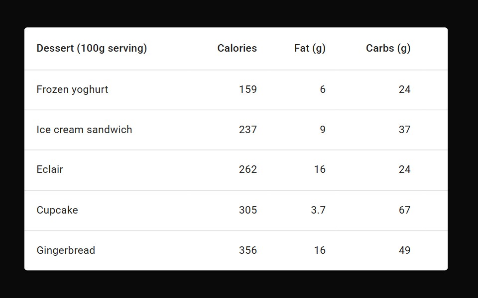 Table FooterMUI / Material UI · React
 Logo LoopReact Bits · ReactContinuously looping marquee of brand or tech logos with seamless repeat and hover pause.
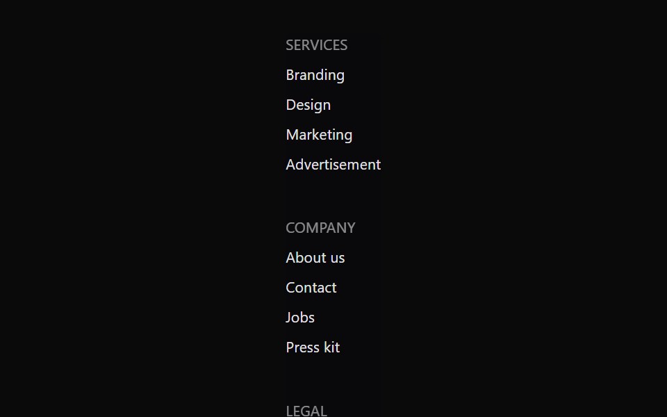 FooterdaisyUI · CSS (Tailwind)
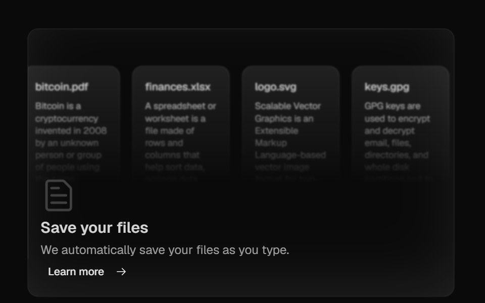 Bento GridMagic UI · ReactBento grid is a layout used to showcase the features of a product in a simple and elegant way.
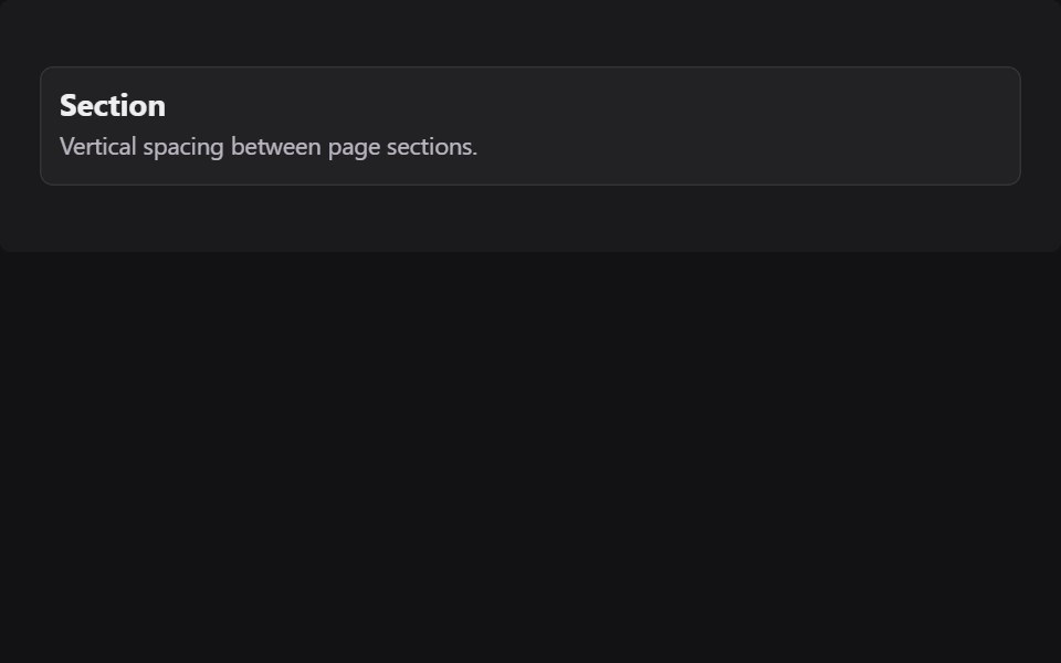 SectionRadix Themes · React
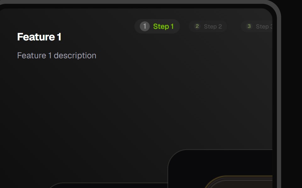 Feature CarouselCult UI · ReactFeature carousel component with smooth transitions and customizable layouts
- Magnetkit WebLibraries.dev · ReactLanding page of a magnetic UI kit: particles and elements pulled toward the cursor.
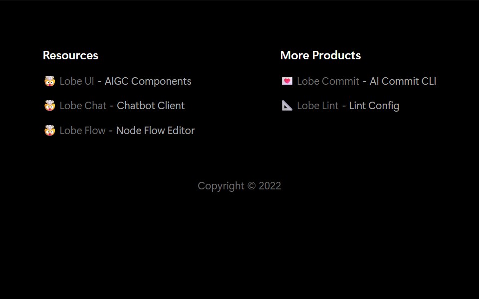 FooterLobe UI · ReactThe Footer component is used to display a website footer. It supports various customization options like column…
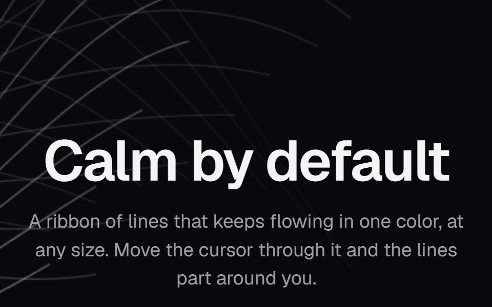 Background PathsKokonut UI · ReactA ribbon of lines in one color that keeps flowing at any size and parts around the cursor.
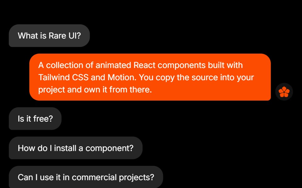 FAQRare UI · ReactAn FAQ styled as a message thread, with each answer sent as a reply bubble.
 Animated TestimonialsSpectrum UI · Reactcomponent for the Animated Testimonials
 Logos CarouselSpell UI · ReactAnimated carousel component that cycles through sets of logos with staggered animations.
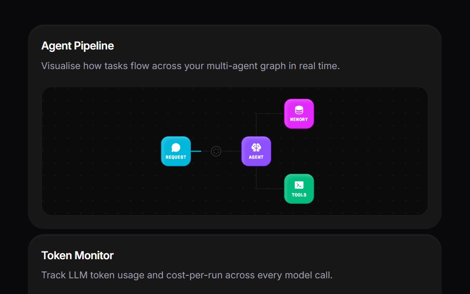 Agent Bento GridVengeance UI · ReactMulti-agent workspace grid layout
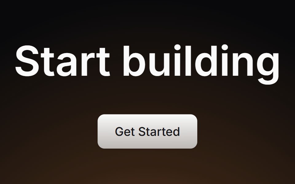 Cta SectionLaunch UI · React
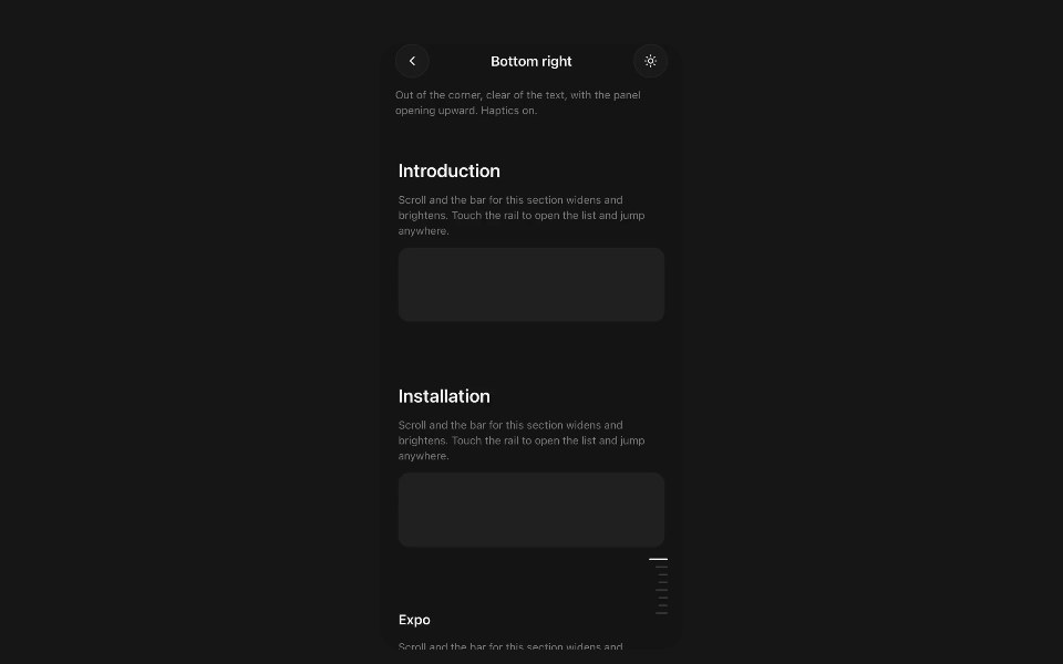 Section RailPanel UI · React NativeFloating section navigator for a long screen.
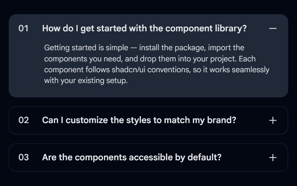 Accordion-03 - Numbered FAQShadcn Space · ReactFAQ accordion with numbered items, background fill on open, and +/- toggle
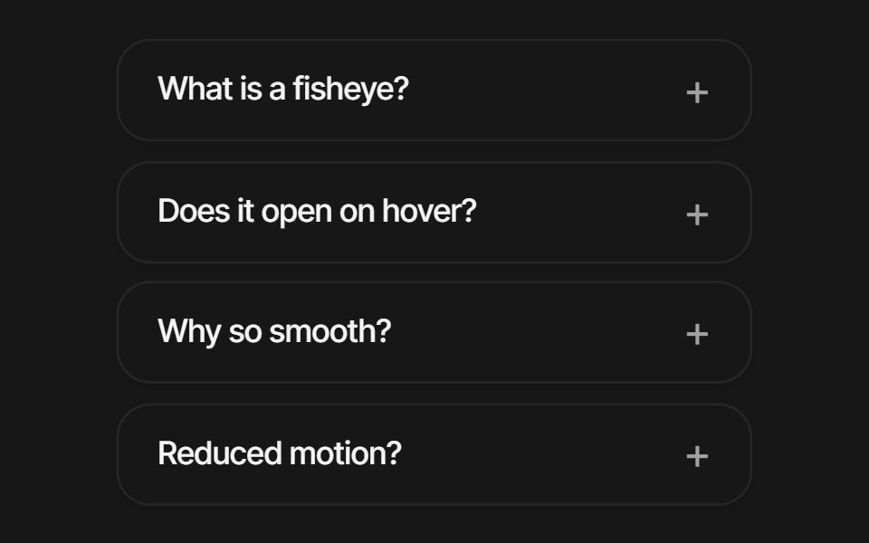 Fisheye FaqPixel Perfect · ReactA vertical FAQ list with macOS-Dock fisheye magnification — rows scale by their distance from the cursor and the…
 BrandsOpenSourceUI · React
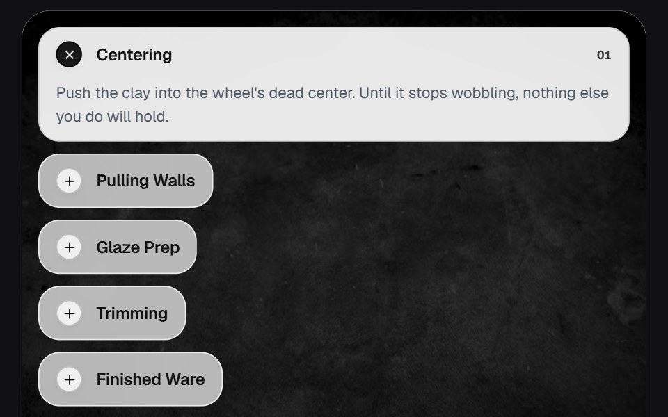 AccordionOSuselayouts · ReactInteractive accordion showcase with animated content, image transitions, hover effects, keyboard navigation, autoplay…
 LandingBoardUI · React
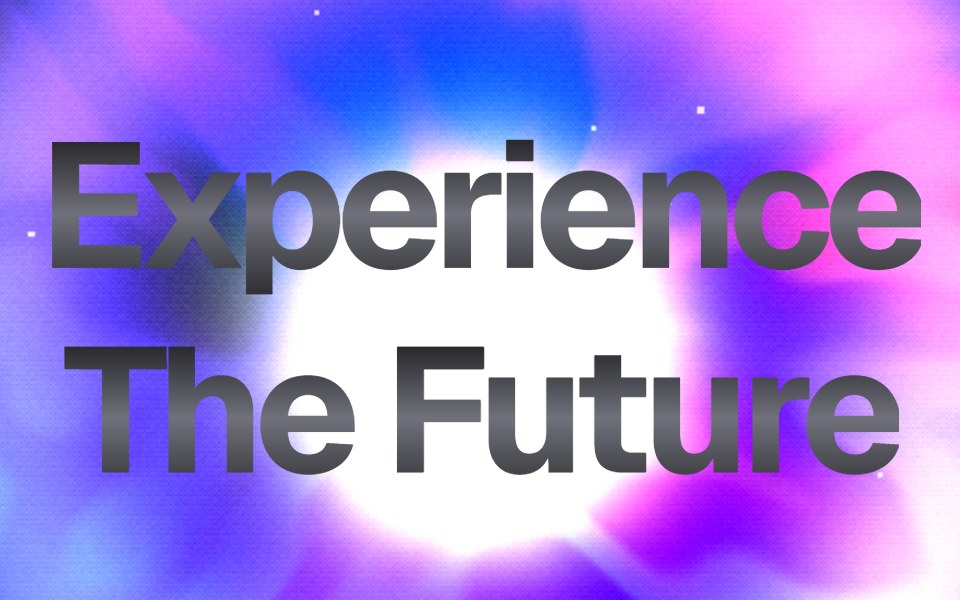 Dither Prism HeroComponentry · ReactStunning WebGL hero with advanced dithering, prismatic refraction, holographic iridescence, and center-focused energy.
 Feature Section 01Tremor Blocks · React
 Comparator Onecnblocks · SvelteBefore/after image comparison slider block
 Bento GridAnimations (Svelte) · SvelteA flexible grid layout with interchangeable BentoCard items for showcasing content in a responsive masonry style.
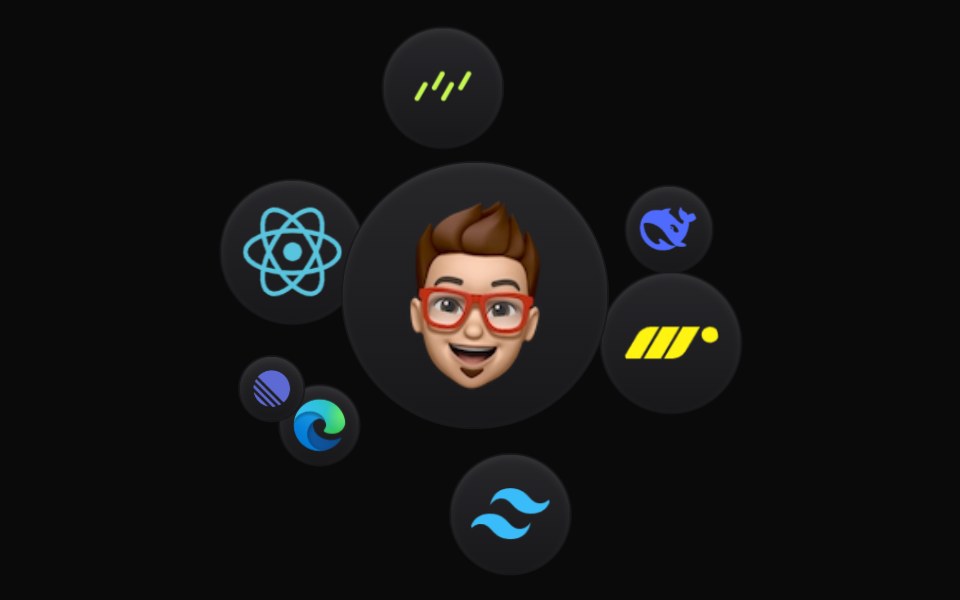 Cloud OrbitBadtz UI · ReactThis component creates a dynamic and interactive experience, where each icon orbits in a fluid motion. Fully…
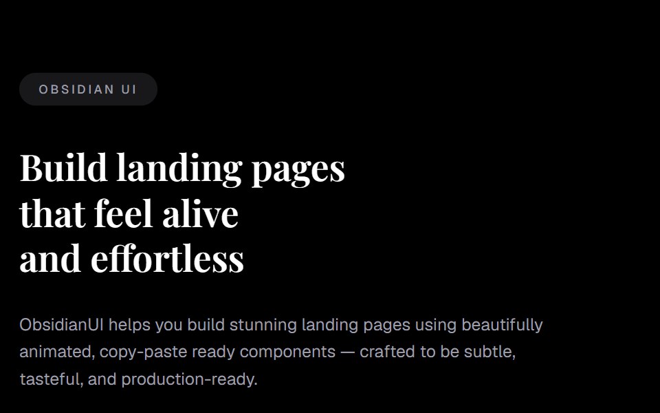 FooterObsidianUI · React
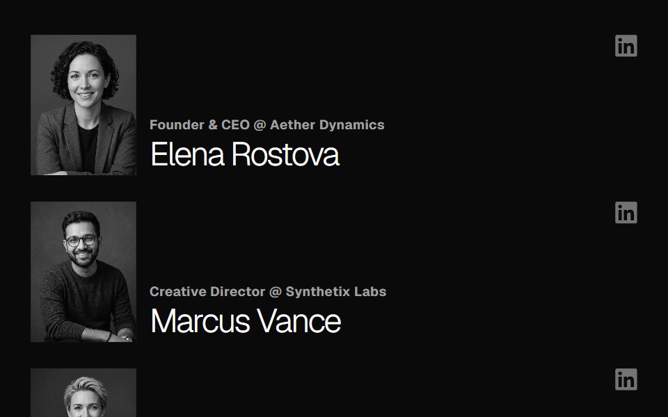 Team SectionGreatUI · React
 Cta 01Oxbow UI · AstroCentered CTA with logo, image and text
 CTANexvyn UI · ReactCall to action primitives: Cta section, CtaAction links and the sliding CtaActionIcon.
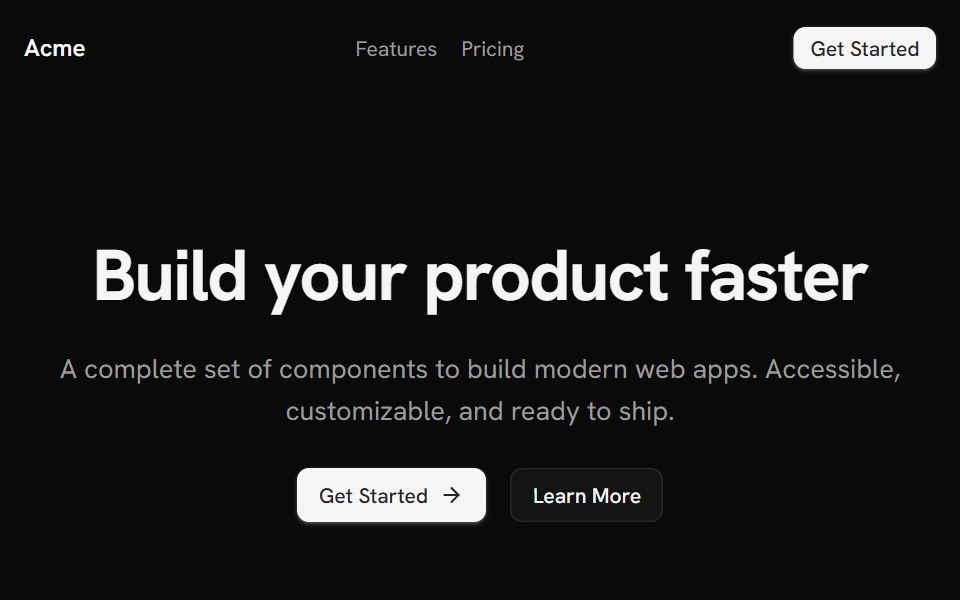 Template LandingShark UI · React
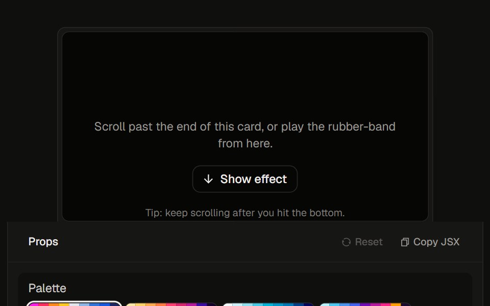 Stretchy Footer23rd.dev · ReactDia-style rubber overscroll: rainbow aurora stretches up past the bottom, then snaps back.
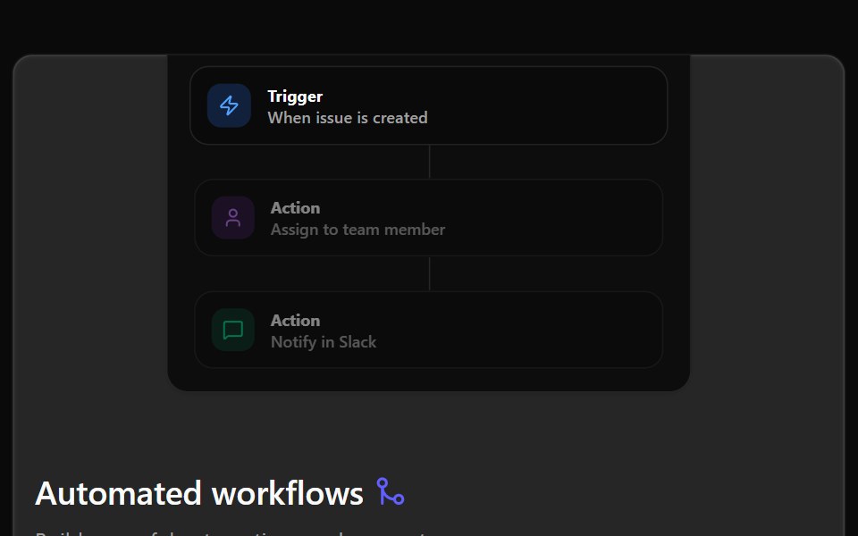 Bento 01Watermelon UI · React
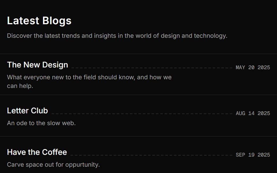 Blog Onesv-efferd · SvelteA vertical editorial list with full-width dividers and compact summaries.
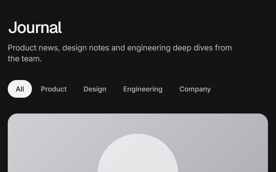 Blog gridArc Library · ReactA blog index with a featured post, category filter, post cards, pagination and an in-place reader.
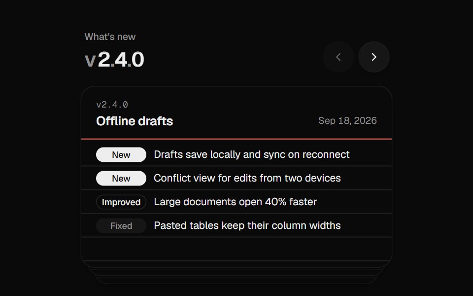 Changelog StackUI Lab · ReactFiles each release card behind the stack like a hand riffling index cards.
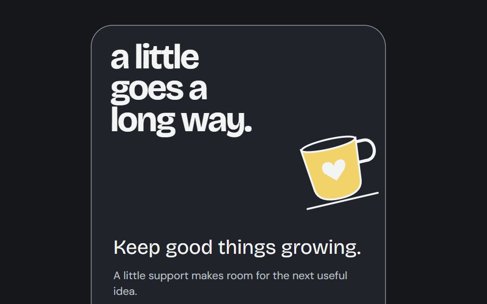 Buy Me CoffeeCojeev UI · ReactA support poster reveals an inviting cup illustration and a real caller destination.
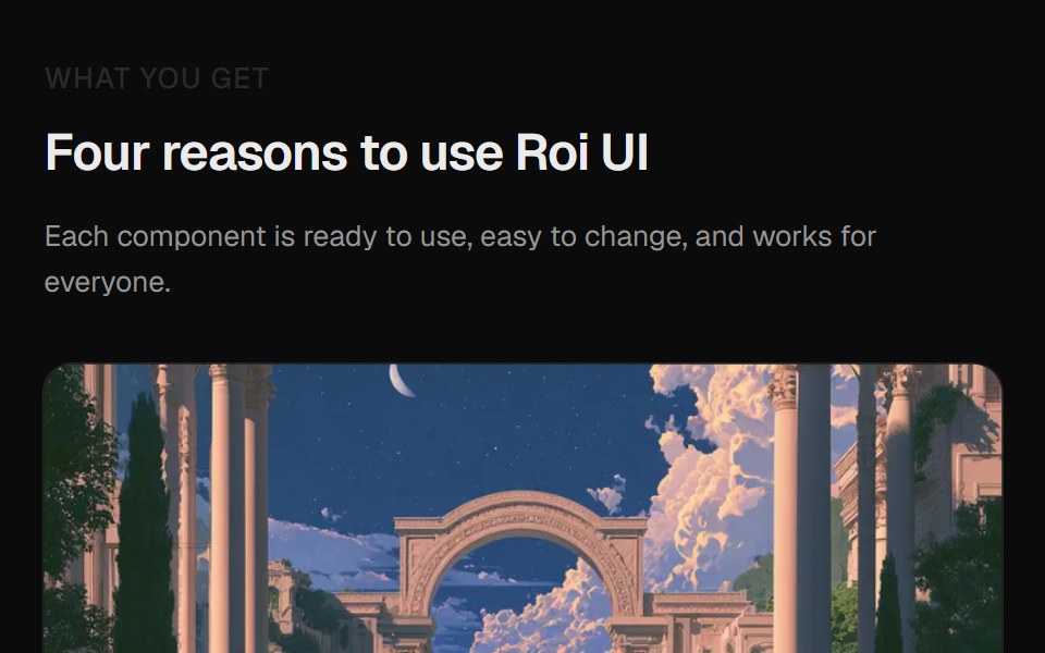 Card Image SectionROI UI · ReactA section with 4 image cards in a masonry layout.
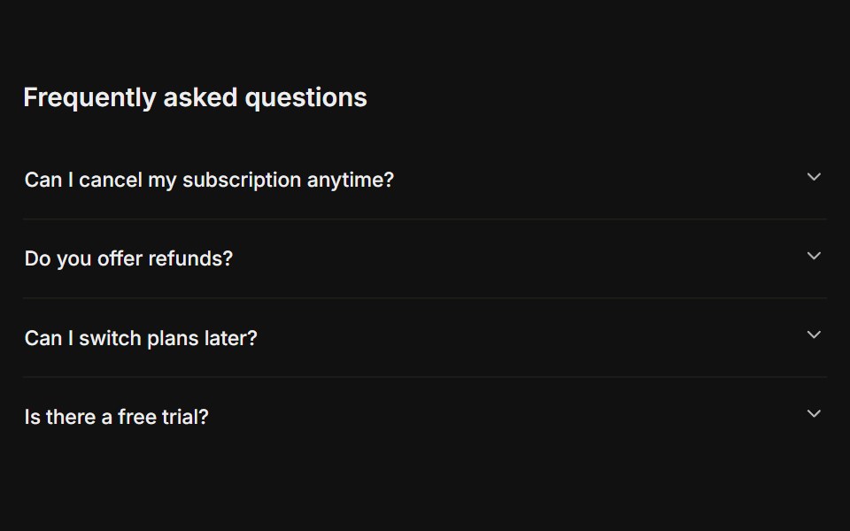 FAQFLX UI · ReactA titled question-and-answer list.
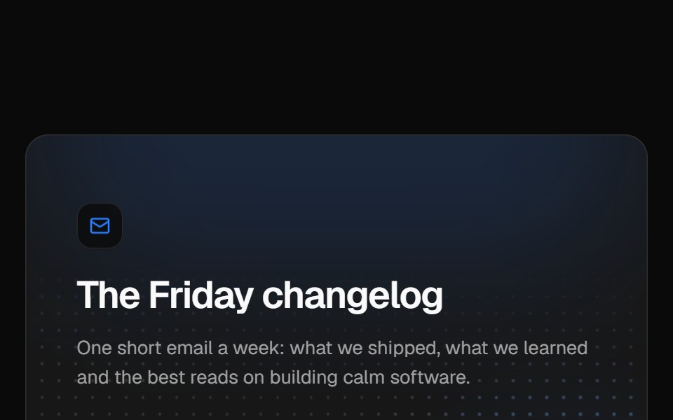 Newsletter sign-upVelora UI · ReactNewsletter card over a glowing dot grid with a labelled email field, subscriber avatars and a privacy note.
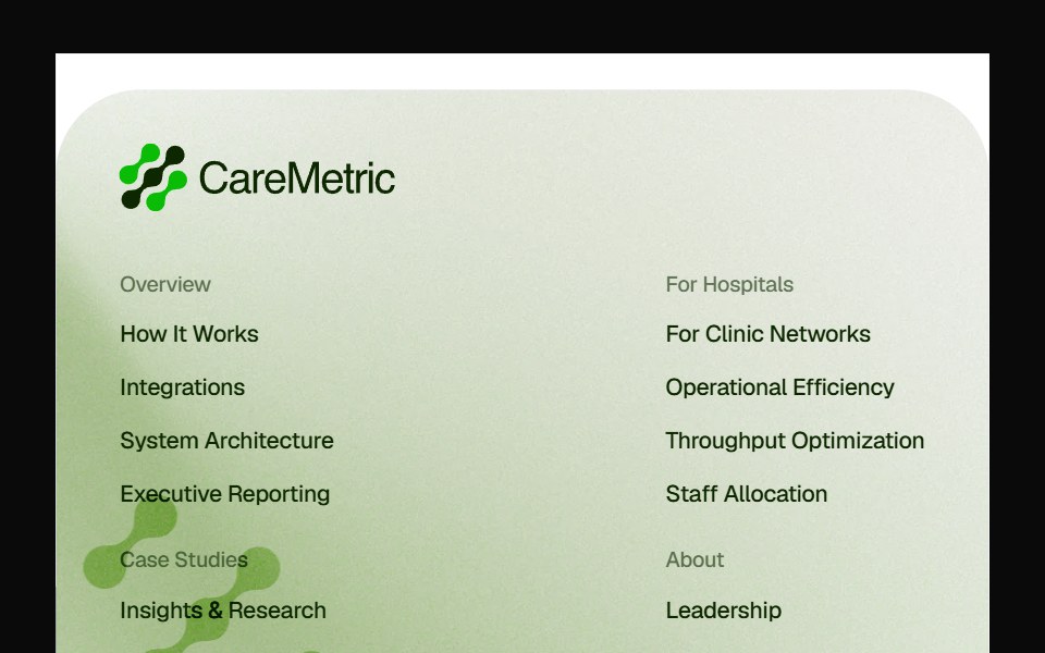 Caremetric FooterPin UI · React
 Interactive Grid HeroSpaceUI · ReactInteractive proximity-reactive square cell grid canvas that softly rounds and insets cells within a focused radius…
 Interactive Grid HeroSkecher UI · ReactA full-page field of square cells that locally soften and round around a fine pointer.
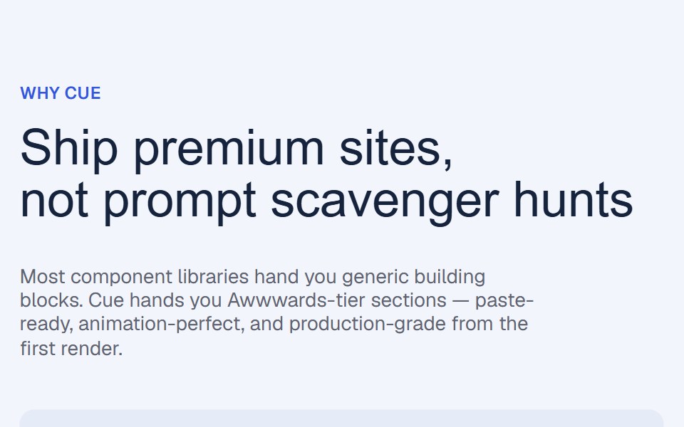 Flex Grow Benefits RevealCue Foundations · React
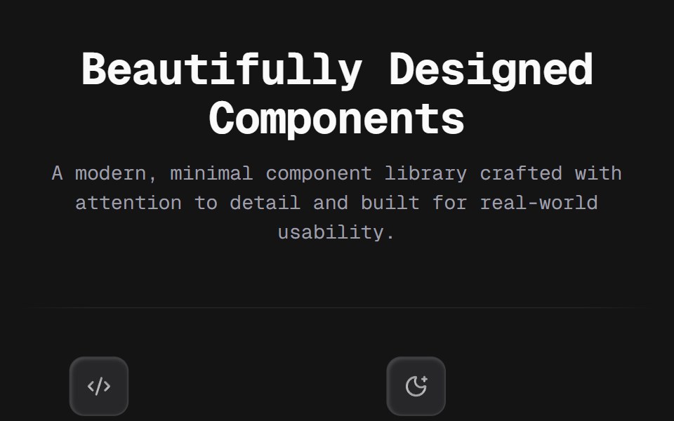 Bento 03D2Studio UI · ReactA flat 3×2 feature grid on thin edge-masked rules — no cards, no fills. Each cell pairs a recessed keycap icon tile…
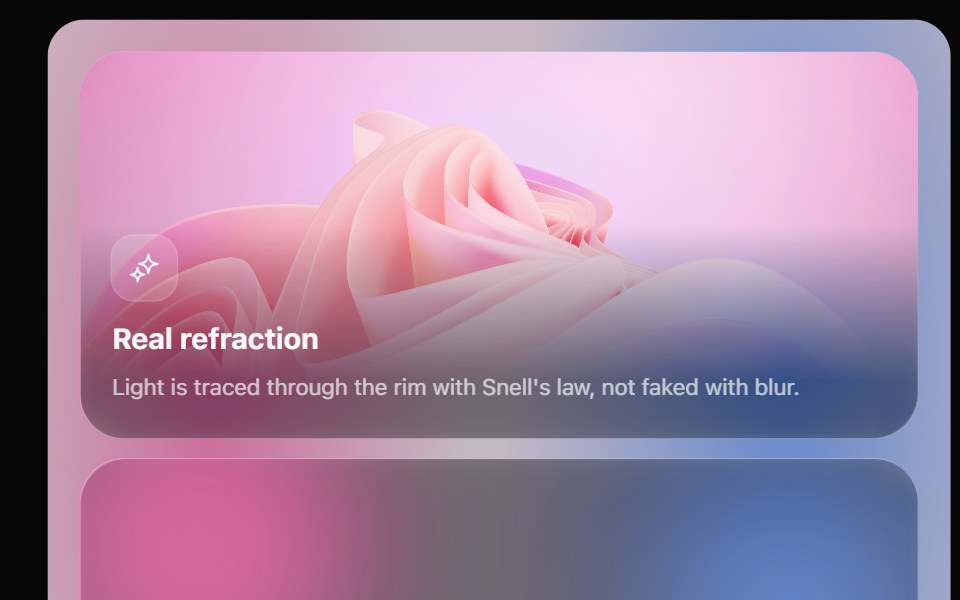 Glass Bento GridOpaline · ReactFeature tiles on glass in a bento layout, with a pointer light and a call to action that slides in.
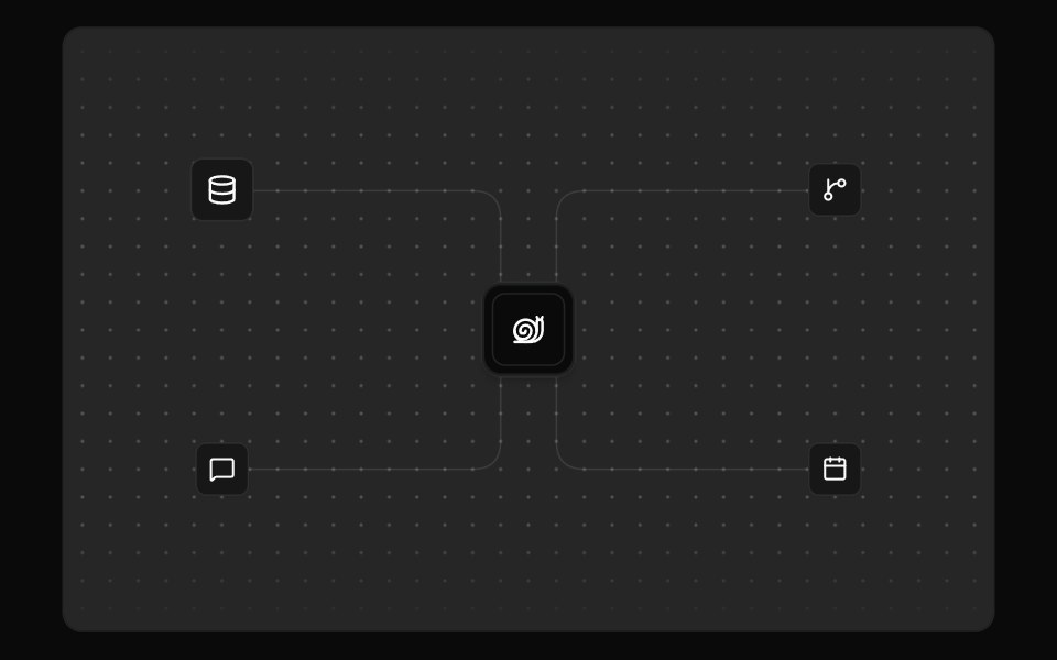 Integration VisualFibo · ReactA hub and the tools wired into it, with pulses along the routes.
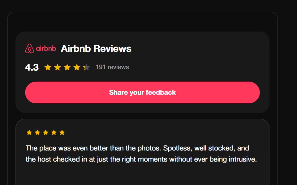 Airbnb ReviewsReactFrame · ReactA guest-review carousel with the Airbnb Bélo mark, aggregate rating header and CTA, above a draggable autoplaying grid…
 Features Section Demo 1Aceternity UI · ReactSimple with card gradient
 HerodaisyUI · CSS (Tailwind)
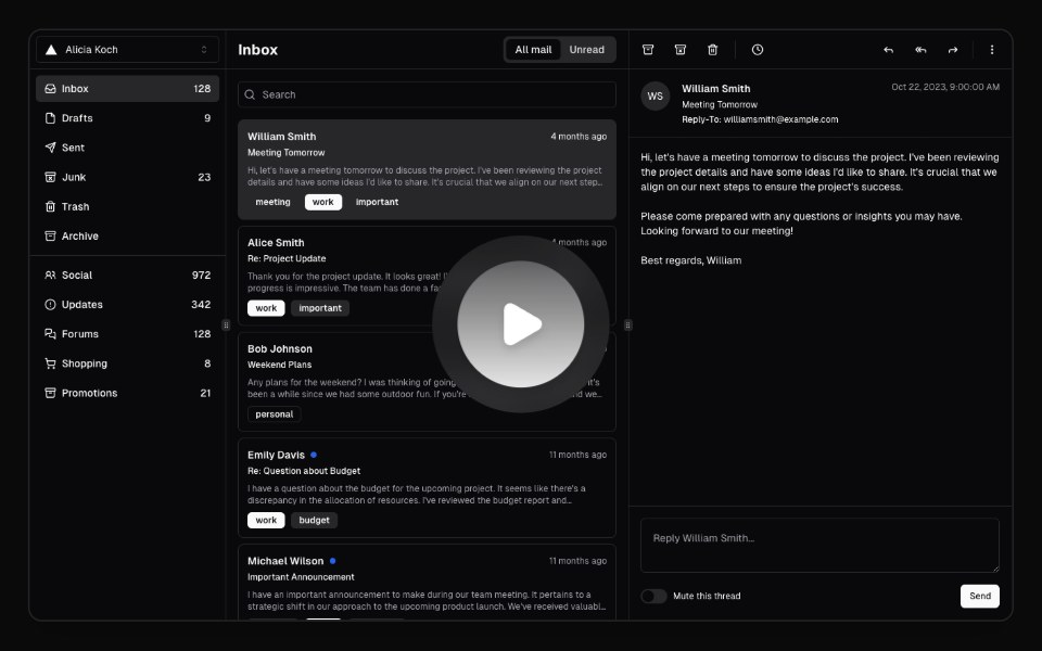 Hero Video DialogMagic UI · ReactA hero video dialog component.
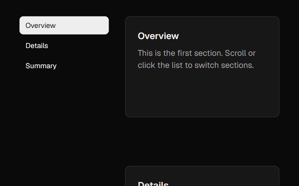 Feature Sticky SectionCult UI · ReactSticky section with controllable panels and scroll behavior
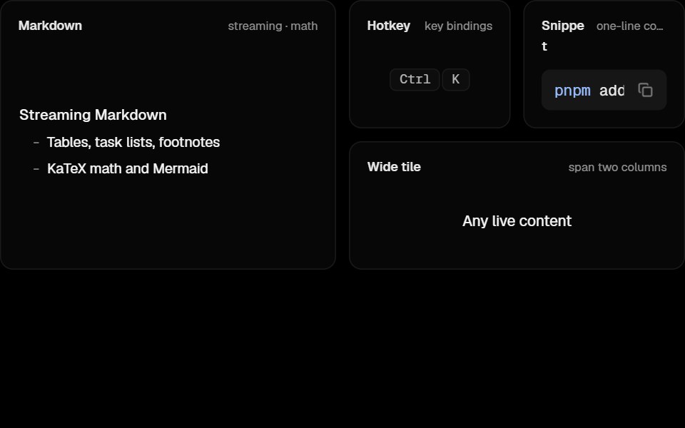 Awesome Bento GridLobe UI · React
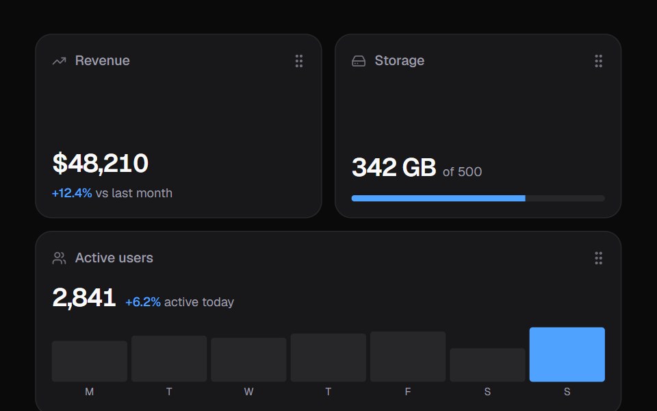 Widget GridKokonut UI · ReactDashboard widgets you lift, drag and resize on a 6-column grid, with spring physics and full keyboard support.
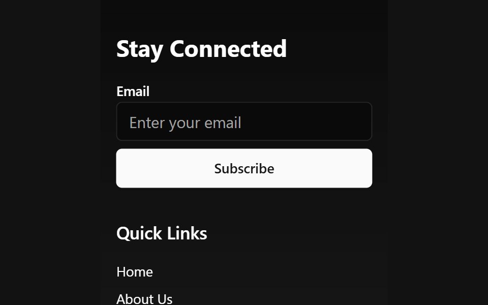 Animated Wave FooterSpectrum UI · Reactcomponent for the Animated Wave Footer
 Animated FooterVengeance UI · ReactReveal-on-scroll footer with cursor-lit ASCII art and parallax
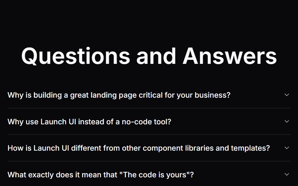 Faq SectionLaunch UI · React
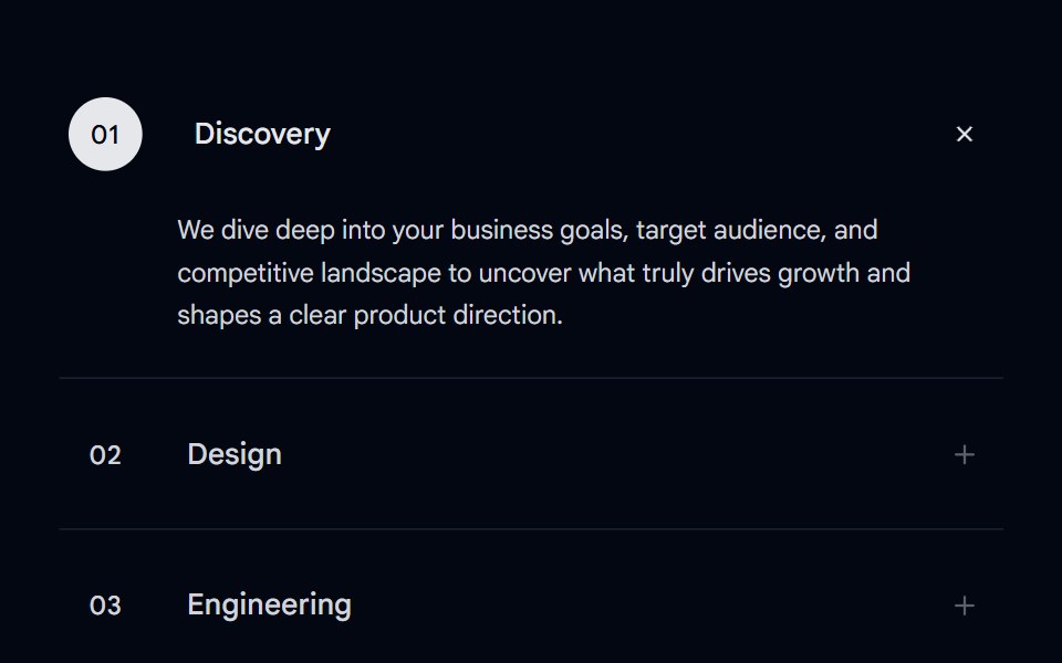 Accordion-07 - Motion ServicesShadcn Space · ReactAnimated accordion with a number bubble, sliding title shift, and an expanding bottom line on hover and active states…
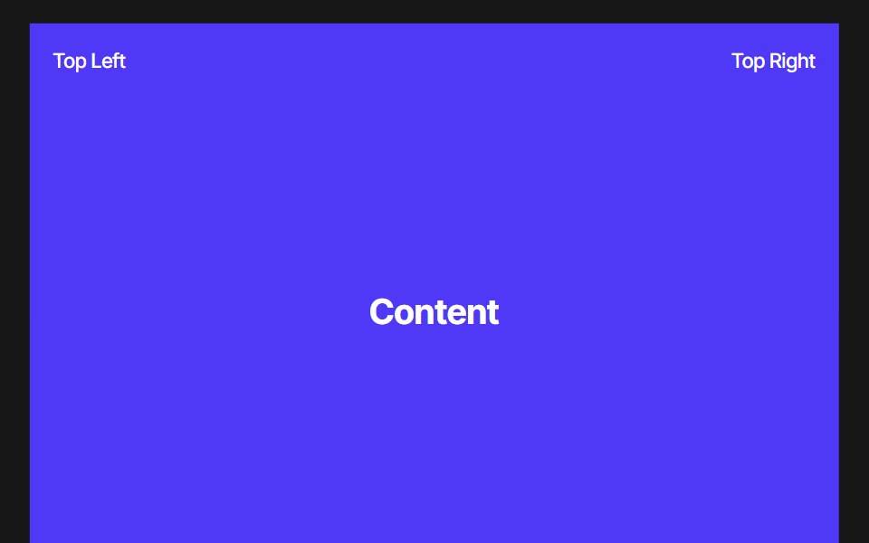 Footer RevealPixel Perfect · ReactA scroll-driven footer reveal — the footer sits pinned in place while the content above slides up to uncover it. Pure…
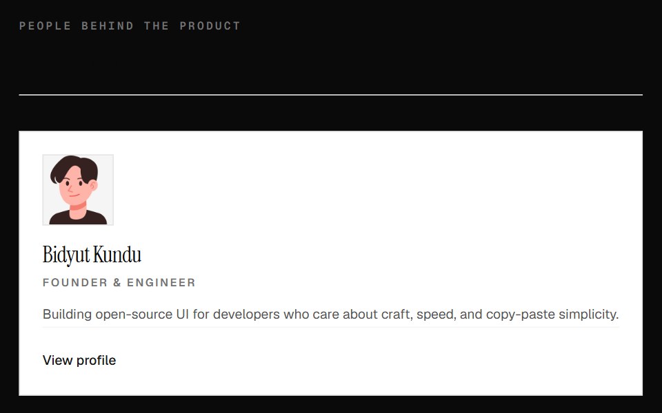 Team Member Profile GridOpenSourceUI · React
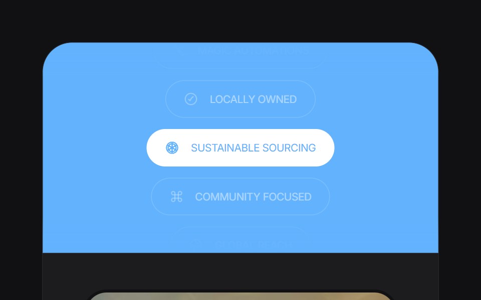 Feature Carouseluselayouts · ReactA smooth carousel for showcasing product features.
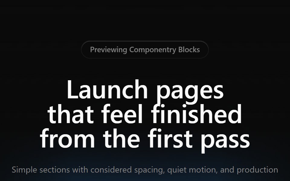 Gradient Hero 01Componentry · ReactA simple centered hero with a warm cinematic gradient, compact badge, short copy, and two actions.
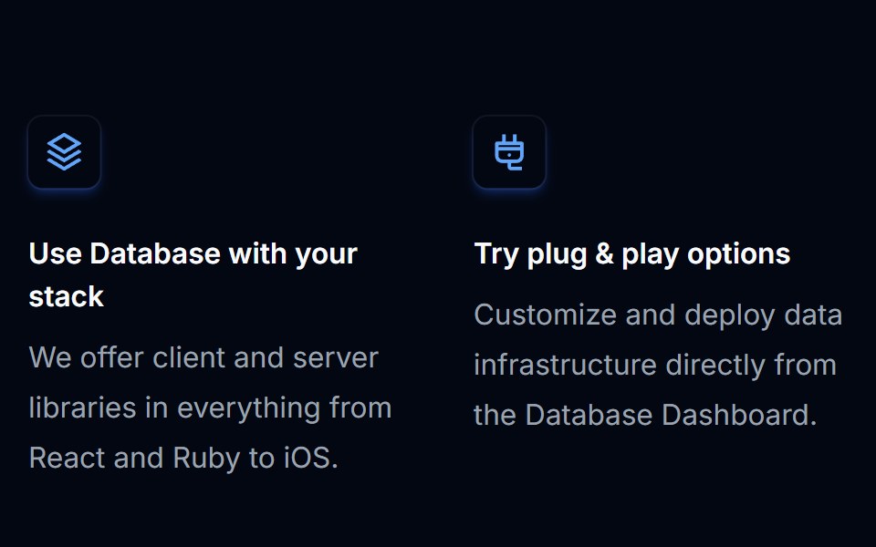 Feature Section 02Tremor Blocks · React
 Contact Onecnblocks · SvelteContact form with input fields and submit button
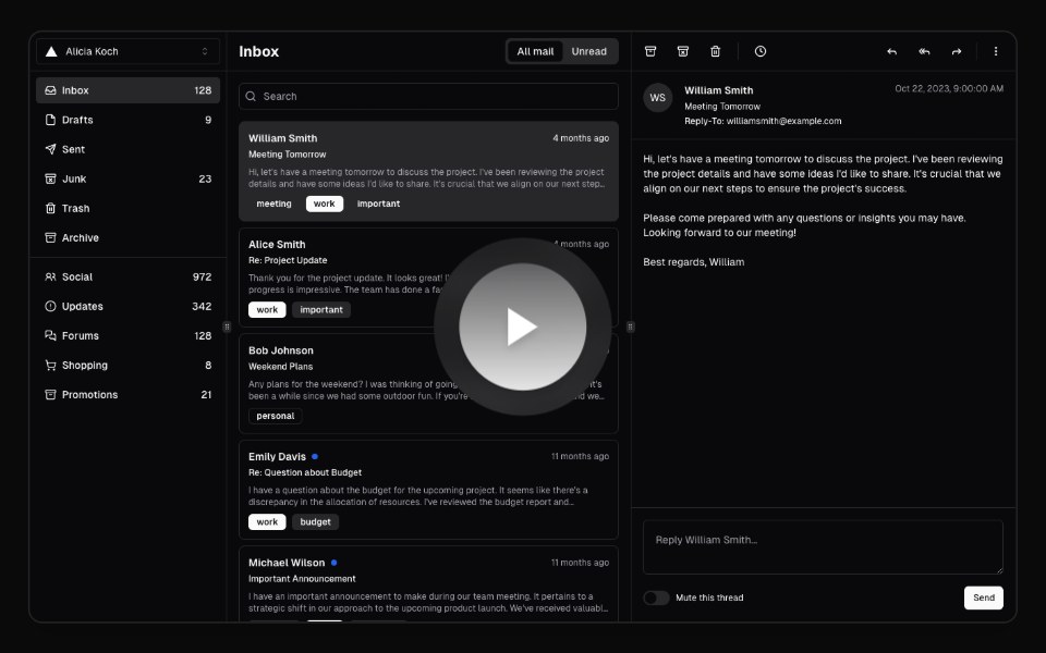 Hero Video DialogAnimations (Svelte) · SvelteA video dialog component with animated entrance effects, thumbnail support, and customizable animation styles.
 Split ShowcaseObsidianUI · React
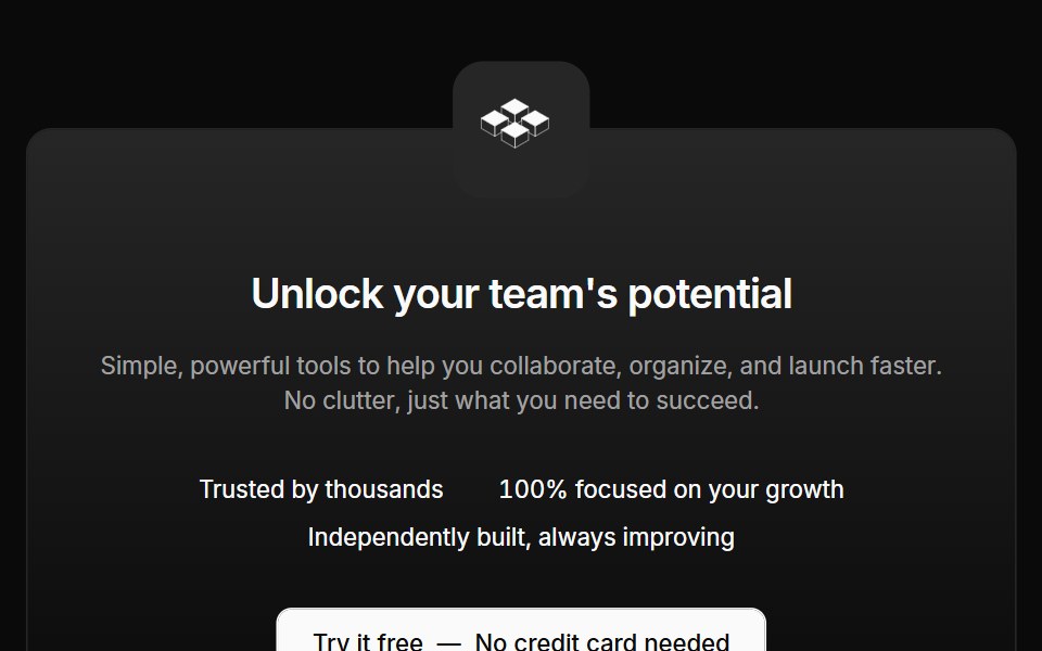 Cta 02Oxbow UI · AstroCentered CTA with logo and text
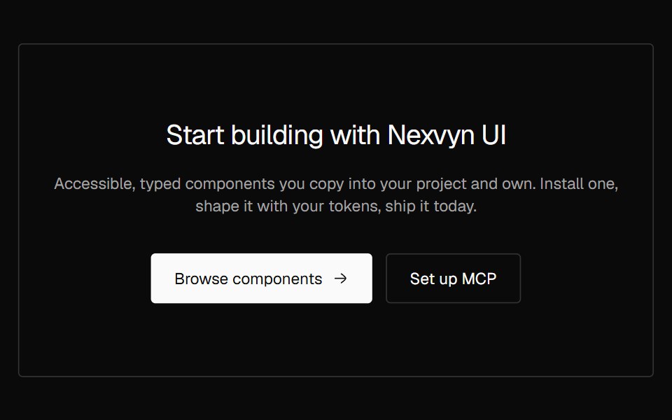 CTA CenteredNexvyn UI · ReactA centered call to action with eyebrow, heading, supporting text and two actions.
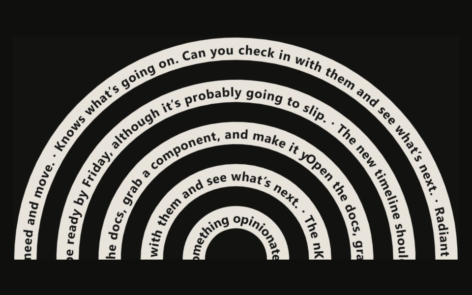 Tangle Footer23rd.dev · ReactA footer of tangled SVG ribbons — thick dark strokes with white text running along each path via textPath.
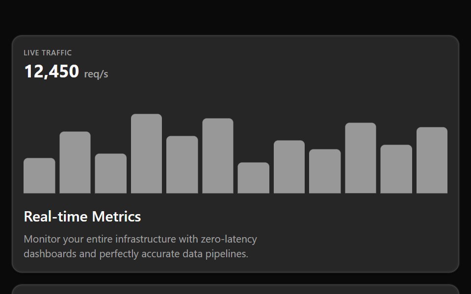 Bento 02Watermelon UI · React
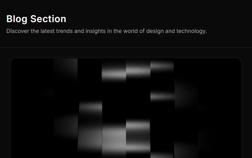 Blog Threesv-efferd · SvelteA card-based blog grid with media thumbnails and richer reading metadata.
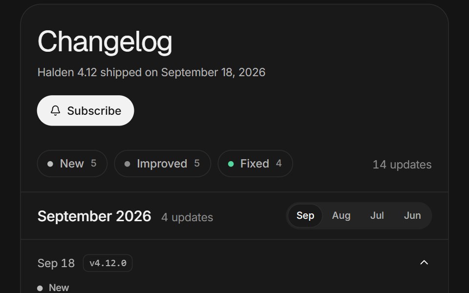 Changelog feedArc Library · ReactRelease notes you can filter, open in place, and scroll through month by month.
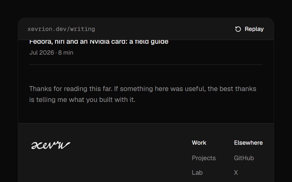 Footer SignatureUI Lab · ReactSigns the footer by hand when it scrolls into view, slowing through every loop.
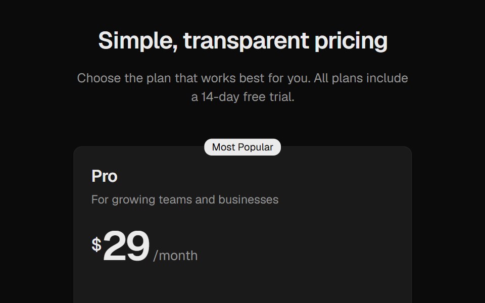 Pricing SectionROI UI · ReactA pricing section with three plan cards.
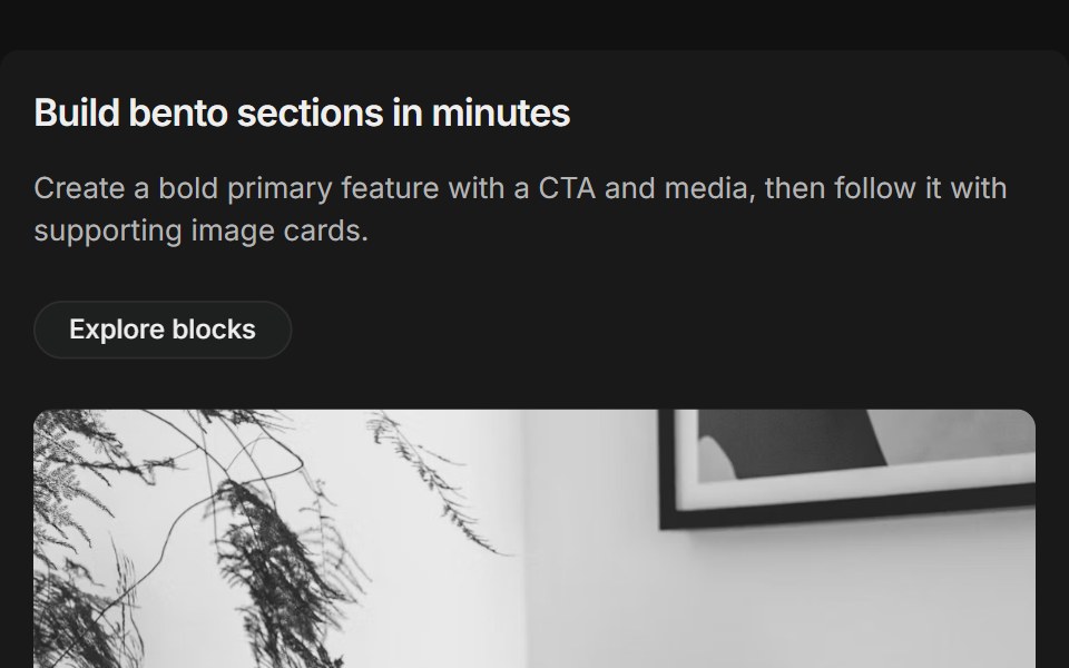 Bento grids 01FLX UI · ReactThree-column bento: primary tile (two-thirds) with title, description, CTA and media, plus supporting image cards.
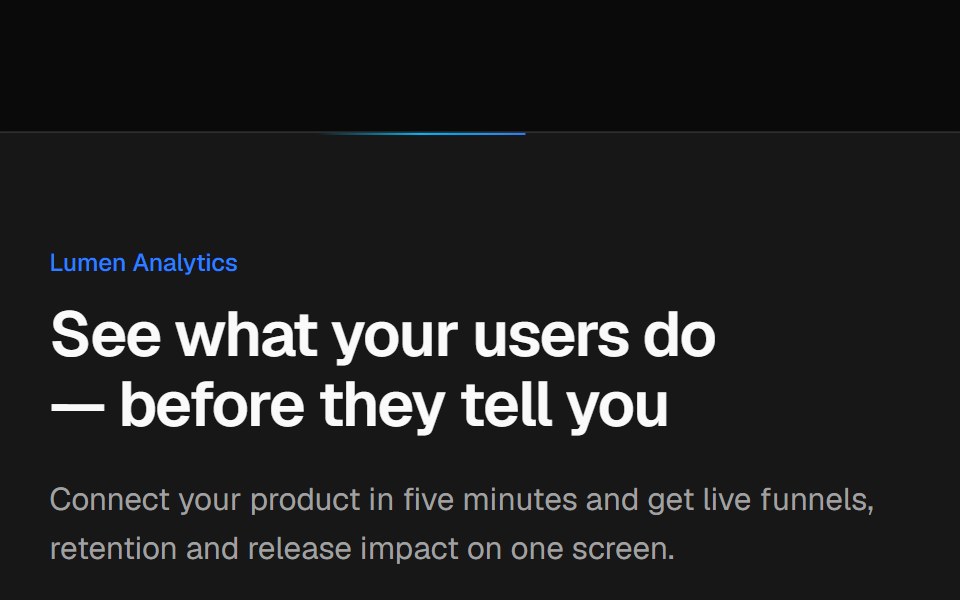 Split CTA with product visualVelora UI · ReactTwo-column CTA card with a benefit list and a dashboard mock-up, traced by an animated border beam.
 Luna HeroPin UI · React
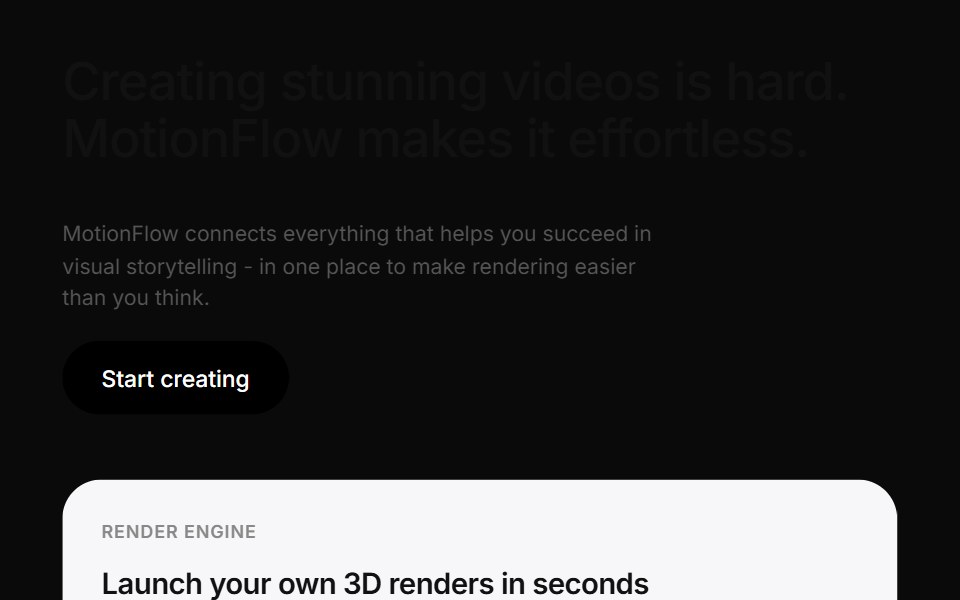 Motionflow Feature Grid ShowcaseCue Foundations · React
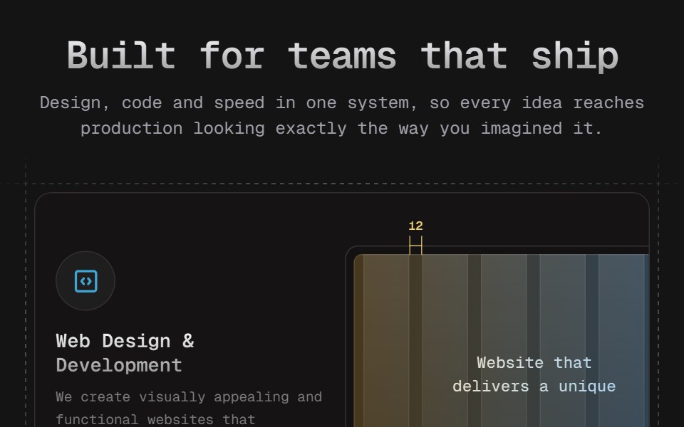 Bento 04D2Studio UI · ReactA four-card services bento on marching dashed blueprint frames. Hover blooms each card's icon from blue to the D2…
 Cinematic Stacked GalleryReactFrame · ReactA fullscreen hero gallery where inactive slides collapse into a stacked deck of thumbnails; clicking one crossfades it…
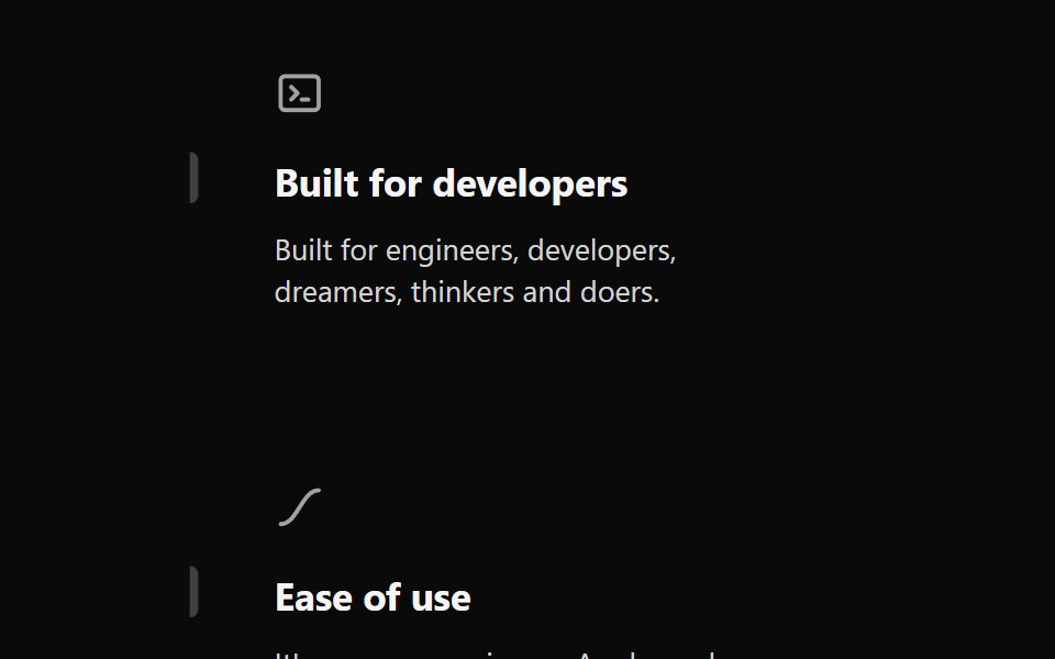 Features Section Demo 2Aceternity UI · ReactSimple with hover effects
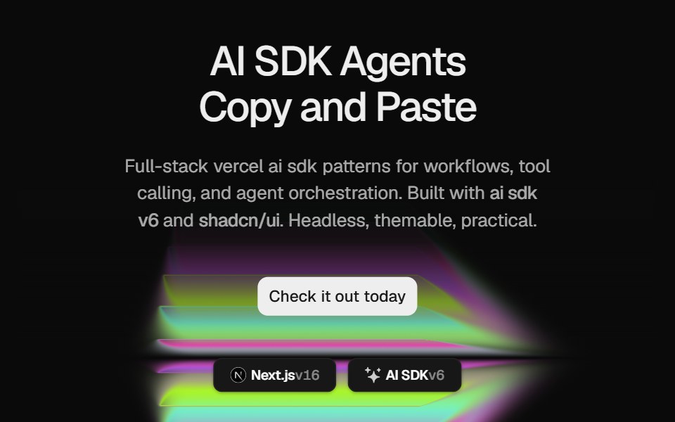 Hero Color PanelCult UI · ReactSplit-layout hero section with responsive ColorPanels shader visuals, CTA, and tech stack badges
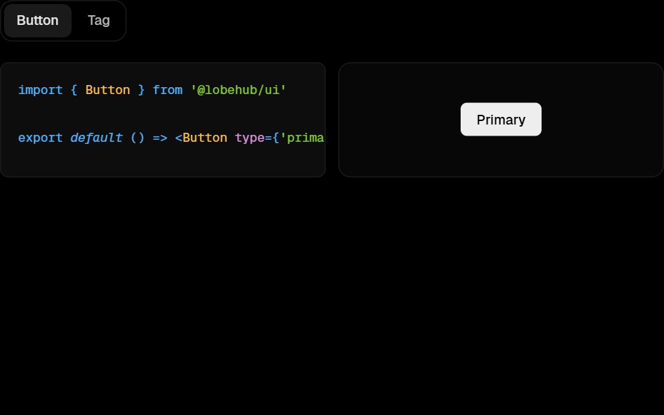 Awesome Code ShowcaseLobe UI · React
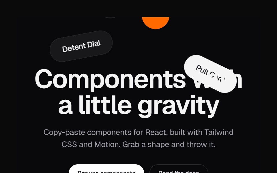 Shape HeroKokonut UI · ReactA landing hero where shapes drop in, pile up under the headline and can be grabbed and thrown.
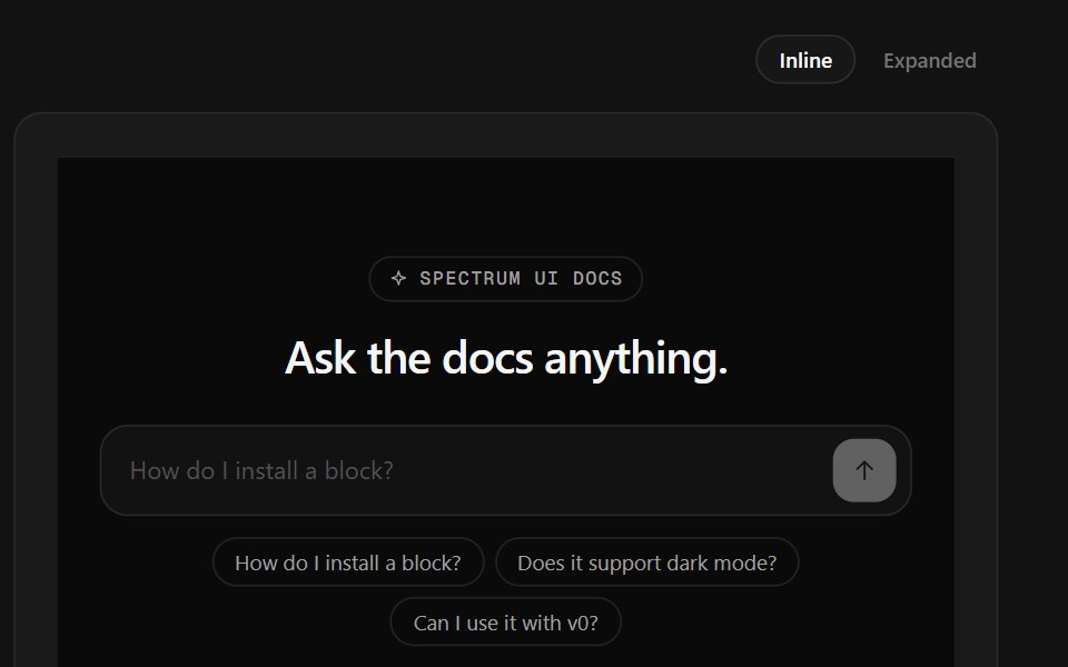 Ask Docs FooterSpectrum UI · ReactA docs question box that streams a cited answer, over link columns.
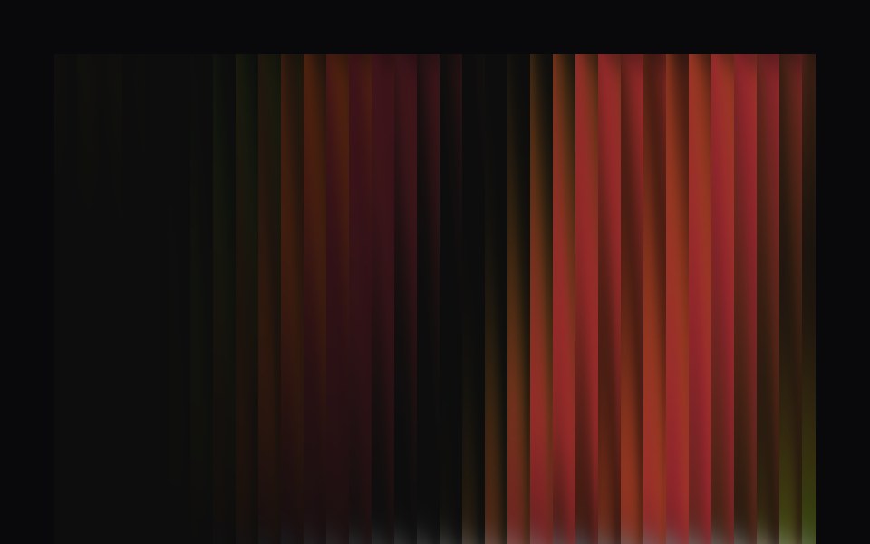 Aurora HeroVengeance UI · ReactFluted glass dynamic hero with interactive switch
 FooterLaunch UI · React
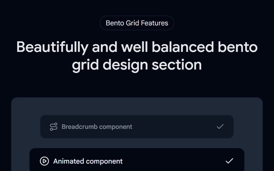 Bento Grid 01 - Bento Grid SectionShadcn Space · ReactA visually rich bento grid that brings the world closer—highlighting stunning locations, cultural moments, and…
 Hero Cover RevealPixel Perfect · ReactA scroll-driven hero cover reveal — the hero pins in place while the next section slides up and covers it, scrubbed by…
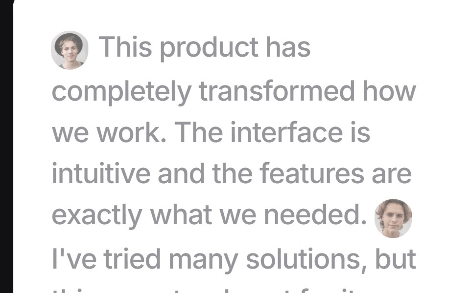 Focus Testimonialsuselayouts · ReactInteractive testimonial section with hover-based focus effects, animated author tooltips, and expandable testimonials.
 Hero GeometricComponentry · ReactGeometric shapes and patterns for hero sections.
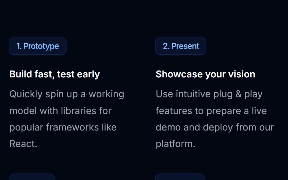 Feature Section 03Tremor Blocks · React
 Contact Twocnblocks · SvelteTwo-column contact section with form and info
 Spell Logo CarouselAnimations (Svelte) · Svelte
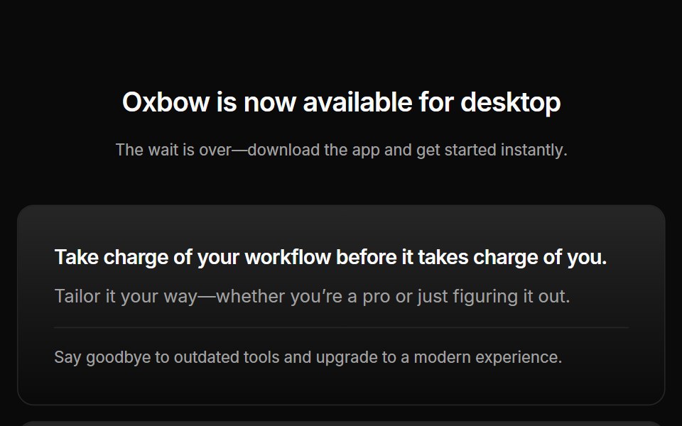 Cta 03Oxbow UI · AstroCentered CTA with download buttons
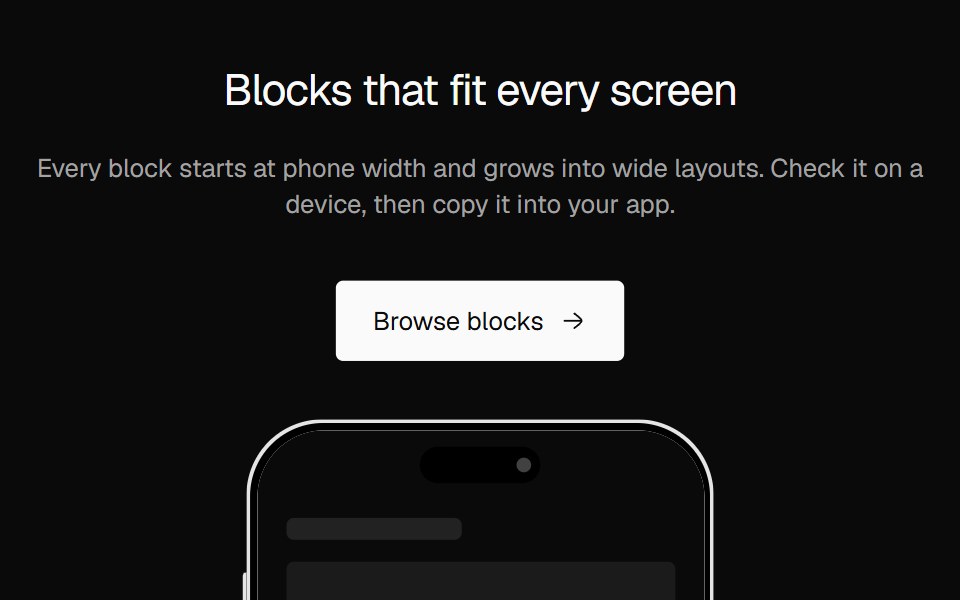 CTA SplitNexvyn UI · ReactA two column call to action with a phone showing your app screen.
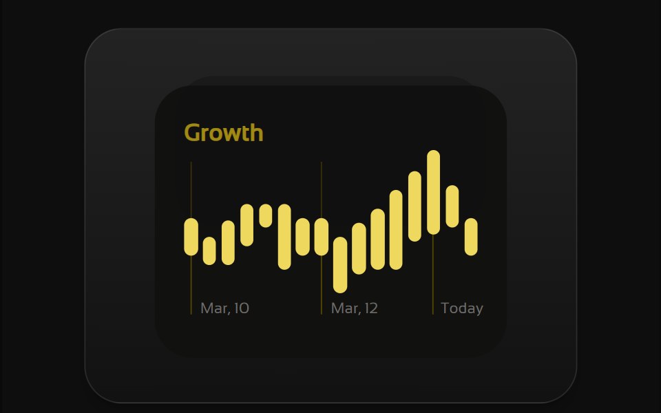 Bento 1Watermelon UI · React
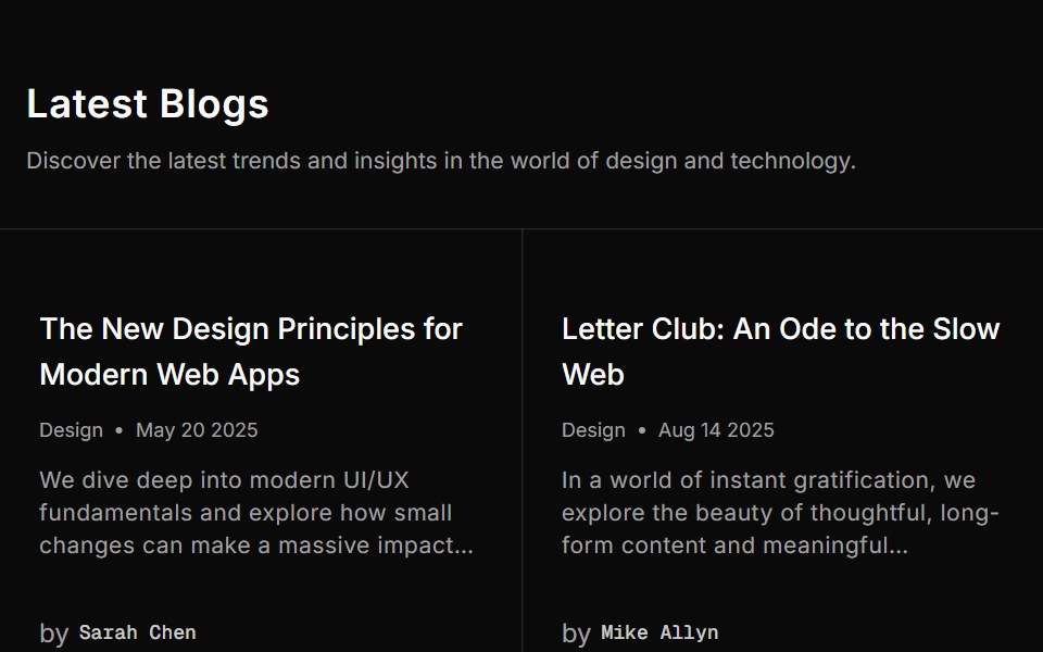 Blog Twosv-efferd · SvelteA structured blog grid with metadata rows and filler cells for balance.
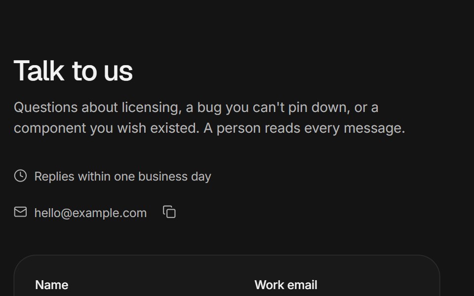 Contact sectionArc Library · ReactA validated contact form that morphs into a confirmation, support channels, and office cards with local times.
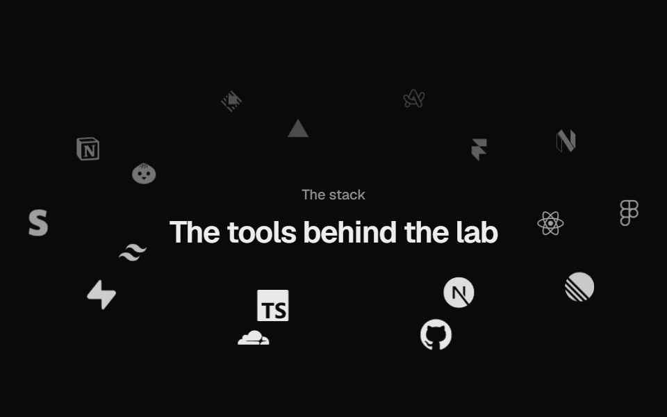 Logo OrbitUI Lab · ReactLogos orbit a heading on tilted rings, passing behind it, and brake to a stop when you point.
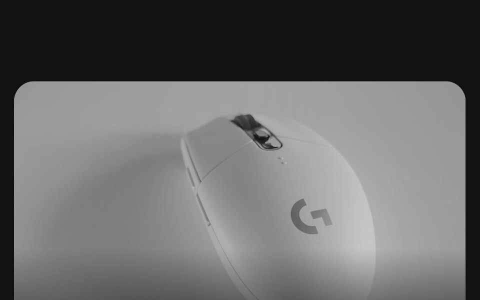 Bento grids 02FLX UI · ReactA row of collection cards, one twice as wide, each with a product photo bleeding off the top, a title, a short…
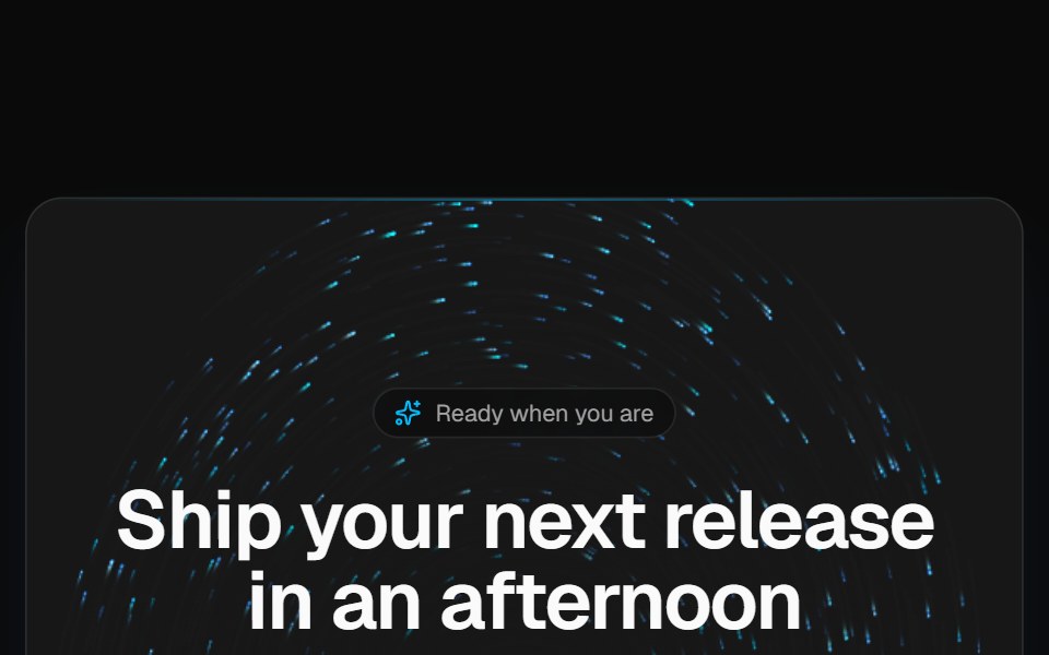 Vortex CTA bandVelora UI · ReactDark rounded call-to-action band over a brand-tinted particle vortex, with two actions and fine print.
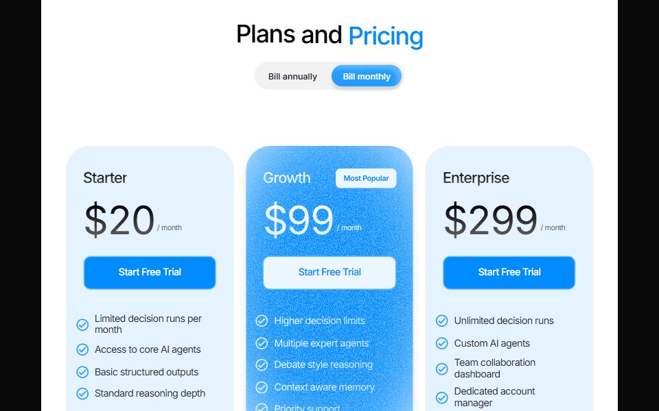 Odometer PricingPin UI · React
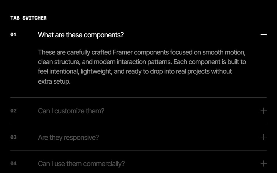 Split Panel Image Synced Faq FeaturesCue Foundations · React
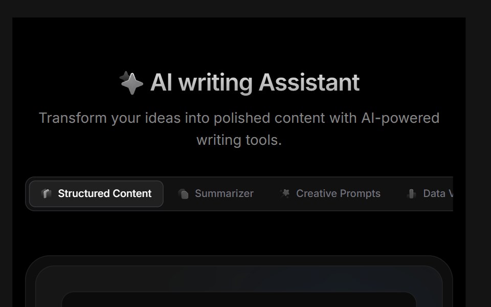 Block 01D2Studio UI · ReactAI feature showcase with smart summarizer, creative prompts, document analysis and engagement metrics cards.
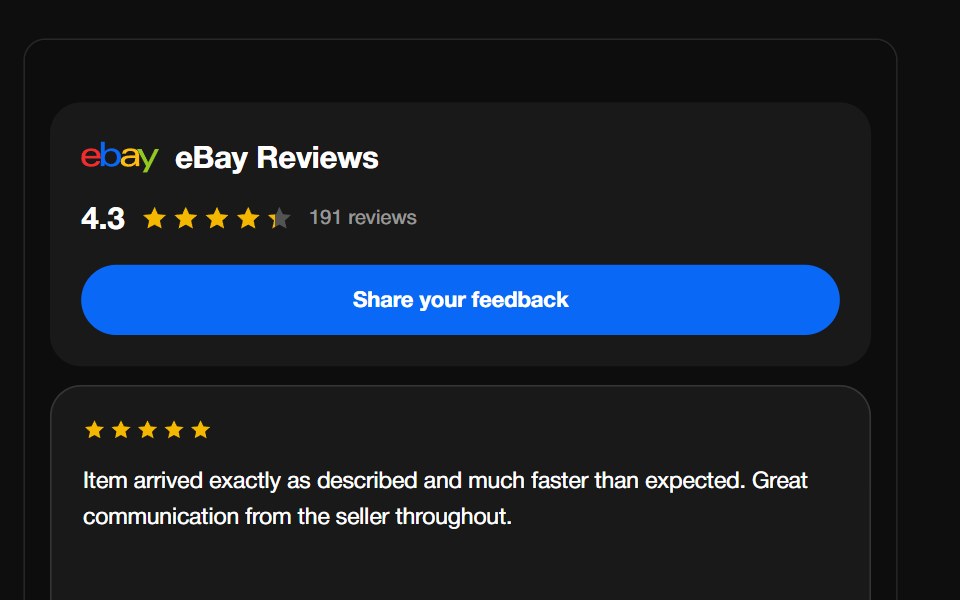 eBay ReviewsReactFrame · ReactA seller-feedback carousel with the eBay wordmark, aggregate rating header and CTA, above a draggable autoplaying grid…
 Features Section Demo 3Aceternity UI · React
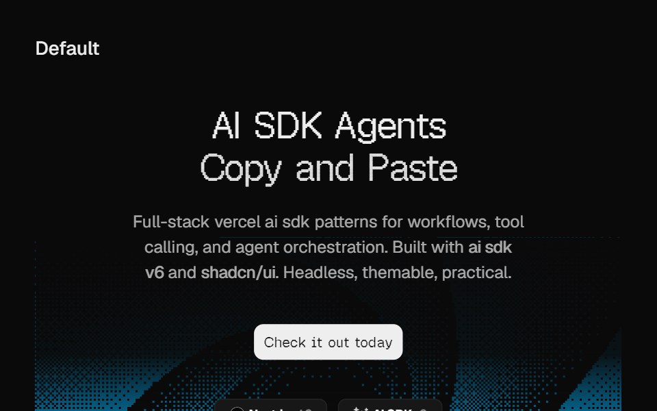 Hero DitheringCult UI · ReactSplit-layout hero section with responsive dithering shader visuals, CTA, and tech stack badges
 Awesome Feature GridLobe UI · React
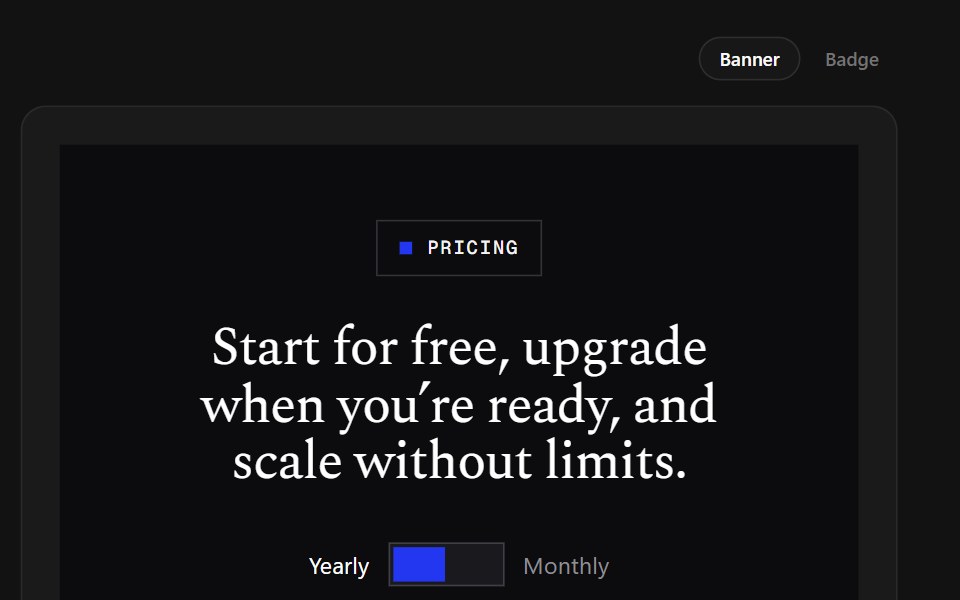 Banner TiersSpectrum UI · ReactA brutalist plan table whose featured column wears a blue banner on top.
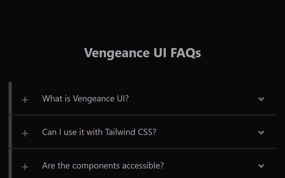 Faq AccordionVengeance UI · ReactAnimated expanding FAQ list
 Footer SectionLaunch UI · React
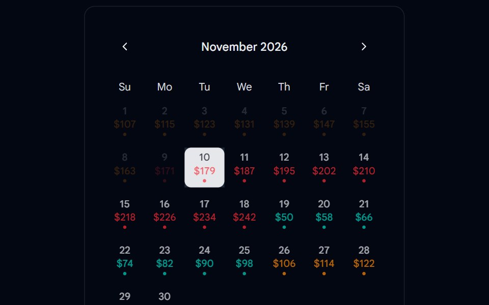 Calendar 15 - With PricingShadcn Space · ReactCalendar component
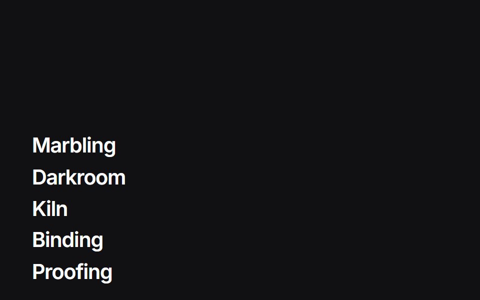 Liquid Indexuselayouts · ReactA feature list whose hover badge is a WebGL liquid gradient that tracks the row.
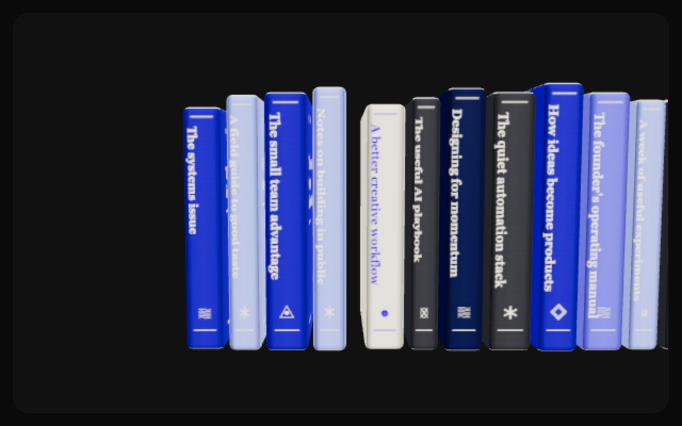 Newsletter BookshelfComponentry · ReactA tactile 3D newsletter archive with hover lift, camera browsing, centered covers, and automatic drag-adjustable…
 Feature Section 04Tremor Blocks · React
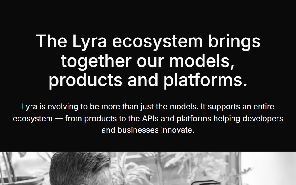 Content Fivecnblocks · SvelteContent block with image and text in grid layout
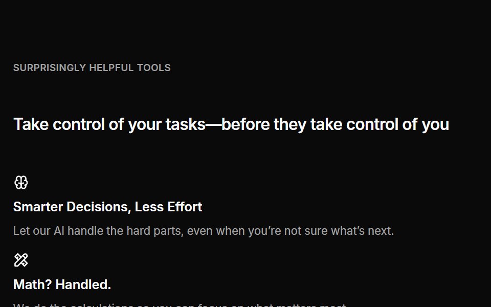 Cta 04Oxbow UI · AstroCentered CTA with grid banner
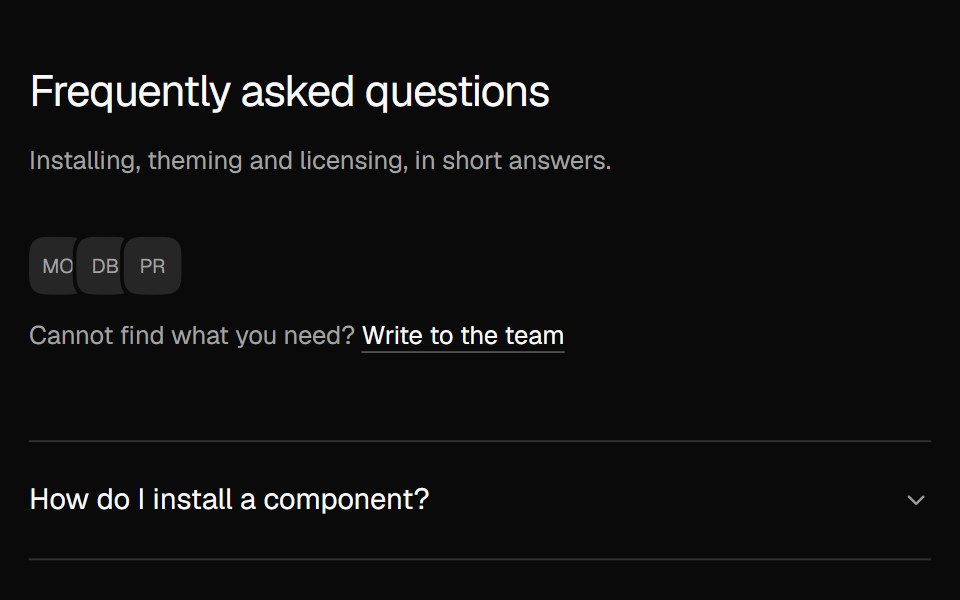 FAQ AccordionNexvyn UI · ReactA two column FAQ accordion with a contact line.
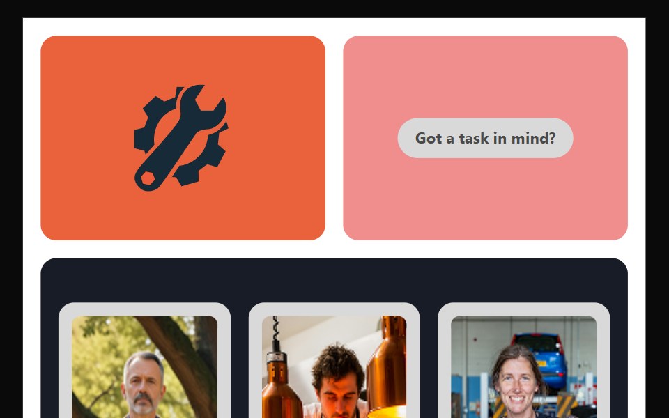 Bento 10Watermelon UI · React
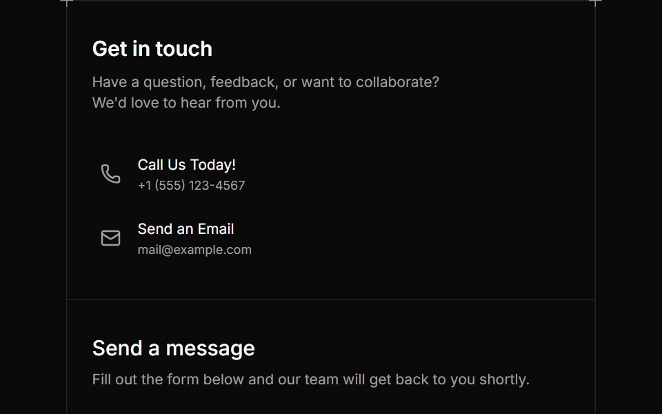 Contact Fivesv-efferd · SvelteA bordered contact card pairing essential details with a reusable message form.
Libraries with section components
Related categories
- React Section Components
- Tailwind CSS Section Components
- Svelte Section Components
- Animated Section Components
- shadcn/ui Section Components
- Hero Components
- Feature Section Components
- Footer Components
- Logo Cloud Components
- CTA Section Components
- FAQ Section Components
- Testimonials Section Components
- Gallery Section Components
- Integrations Section Components
- Stats Section Components
- Contact Section Components
- Team Section Components
- Blog Section Components
- Newsletter Section Components