 Dev Design Library
Svelte Hero Components
Dev Design Library indexes 13 Svelte hero components from 3 open-source UI libraries, with the most coming from cnblocks, sv-efferd and Animations (Svelte). Each one links to its page with the source code, a live preview where available, the library license and the install command. Every library in this list targets Svelte. Hero components belong to the Sections group.
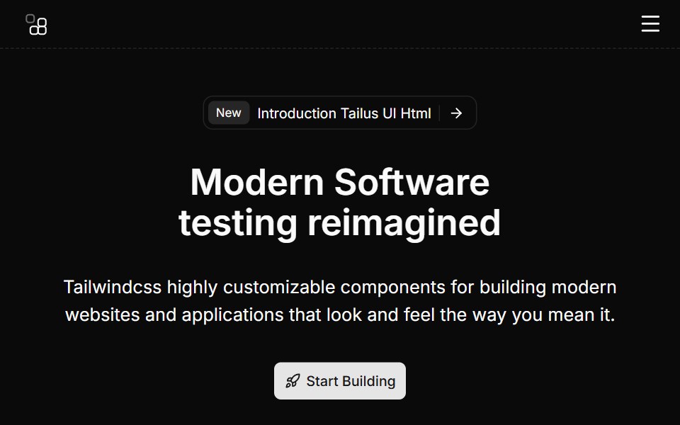 Hero Eightcnblocks · SvelteHero with video background and overlay
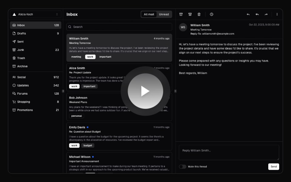 Hero Video DialogAnimations (Svelte) · SvelteA video dialog component with animated entrance effects, thumbnail support, and customizable animation styles.
 Hero Onesv-efferd · SvelteA full hero composition with sticky header, editorial spotlight, and a marquee trust band.
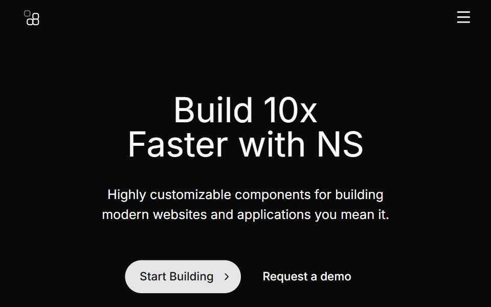 Hero Fivecnblocks · SvelteHero section with app mockup image
 Hero Threesv-efferd · SvelteA modern hero layout with mega-nav header, device mockup spotlight, and compact logo grid.
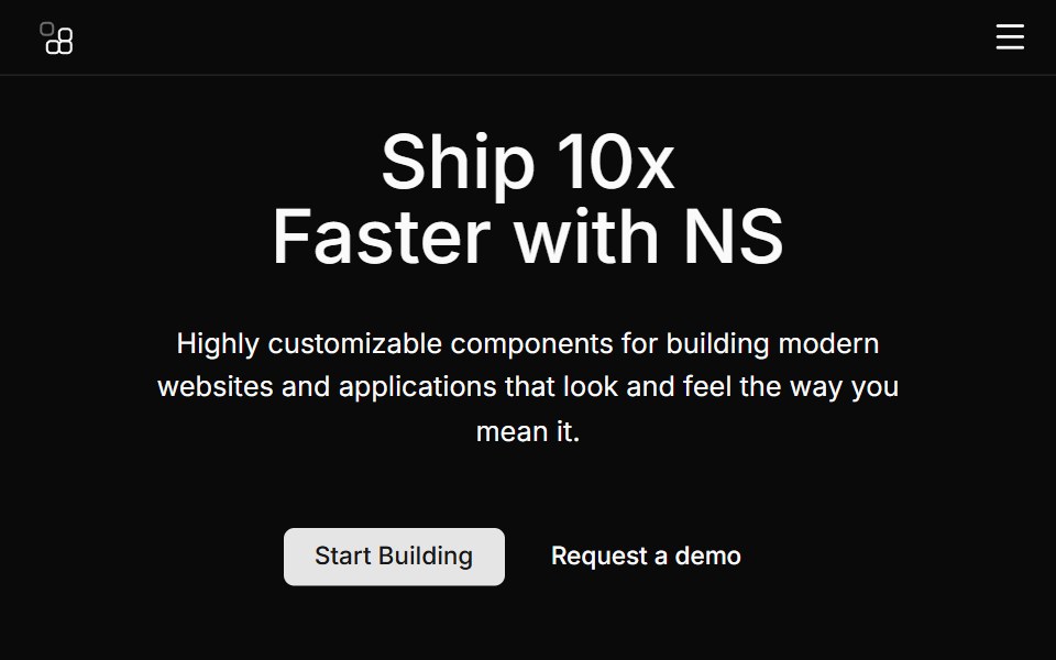 Hero Fourcnblocks · SvelteSplit hero with image on right side
 Hero Twosv-efferd · SvelteA framed product hero with a floating screen, structured header, and bordered logo section.
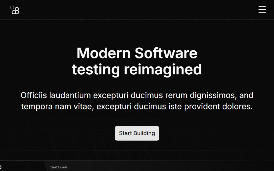 Hero Ninecnblocks · SvelteHero with animated background elements
 Hero Onecnblocks · SvelteClassic centered hero with headline and CTA
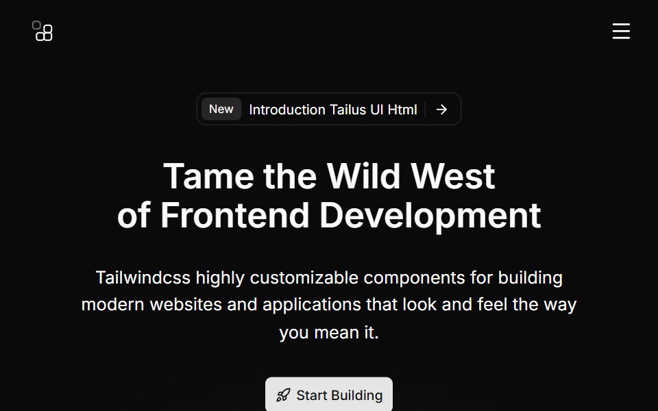 Hero Sevencnblocks · SvelteHero with gradient background and stats
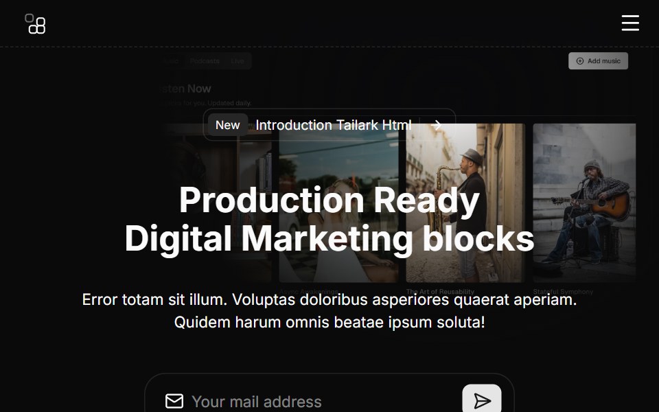 Hero Sixcnblocks · SvelteHero section with logo cloud below
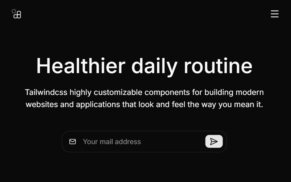 Hero Threecnblocks · SvelteHero with background image and overlay
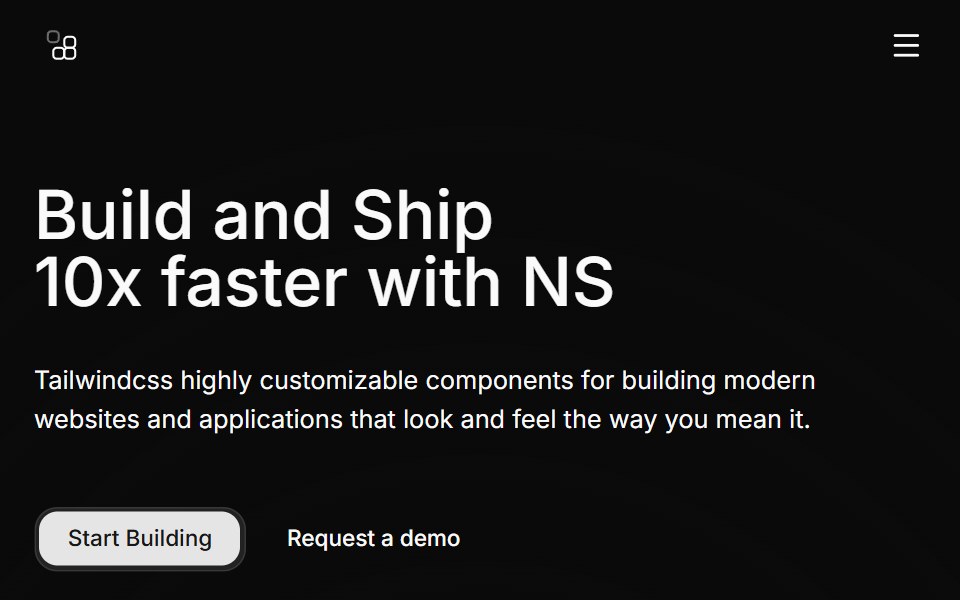 Hero Twocnblocks · SvelteTwo-column hero with image carousel
Libraries with Svelte hero components
Related categories
- Hero Components
- React Hero Components
- Tailwind CSS Hero Components
- Animated Hero Components
- shadcn/ui Hero Components
- Svelte Section Components
- Svelte Logo Cloud Components
- Svelte Feature Section Components
- Svelte Integrations Section Components
- Svelte Footer Components
- Svelte Testimonials Section Components
- Svelte FAQ Section Components
- Svelte CTA Section Components
- Svelte Contact Section Components