 Dev Design Library
React Filter Bar Components
Dev Design Library indexes 54 React filter bar components from 16 open-source UI libraries, with the most coming from Tremor Blocks, ReUI, Origin UI, Arc Library and FLX UI. Each one links to its page with the source code, a live preview where available, the library license and the install command. Every library in this list targets React. Filter bar components belong to the Data display group.
 Comp 381Origin UI · React
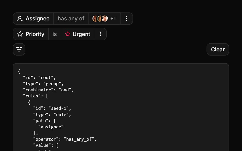 Everything in one filter barReUI · ReactMulti-select, nested fields, async options and stacked values.
 Dashboard Filter SidebarLobe UI · React
 Careers FooterSpectrum UI · ReactA rolling three-role window with department filters, over link columns.
 Drawer 03 - Filters PanelShadcn Space · ReactLeft side filter drawer with category checkboxes, a price range slider, an in stock switch, a live result count, and…
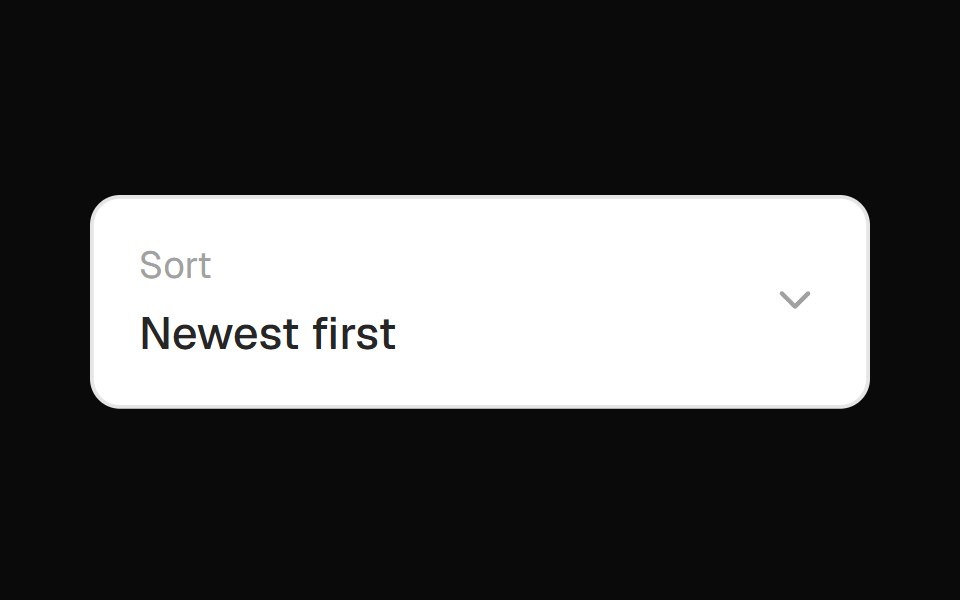 Filter Sort DropdownOpenSourceUI · React
 Filter Interactionuselayouts · ReactInteractive list items with hover and focus effects.
 Filterbar 01Tremor Blocks · React
 Blog gridArc Library · ReactA blog index with a featured post, category filter, post cards, pagination and an in-place reader.
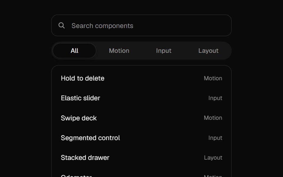 Filter ListUI Lab · ReactRows fade out of the way while the rest slide up to close the gap.
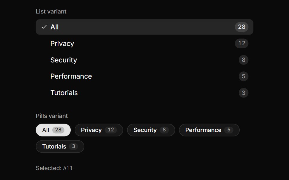 Category Facet ListLocalMode · ReactA domain-decoupled, filterable category facet (vertical list or horizontal pills) with per-category count badges…
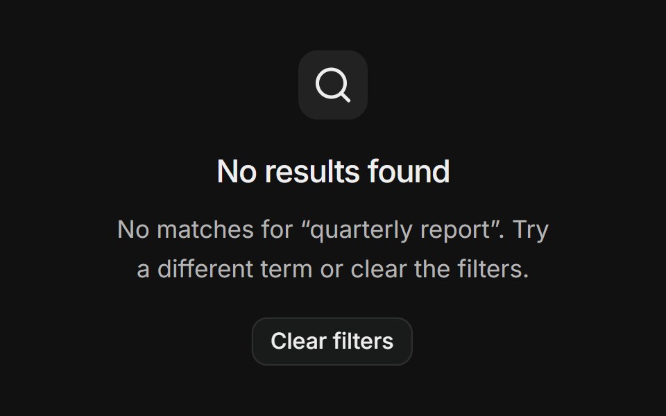 No resultsFLX UI · ReactSearch empty state with a clear-filters action.
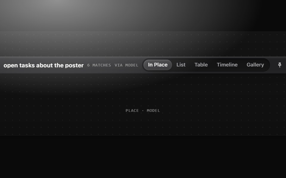 Filter barMetal UI · React + SwiftUINames the question a filter asks and switches how the answer is shown: Surface(frost) with a Glyph, the query in…
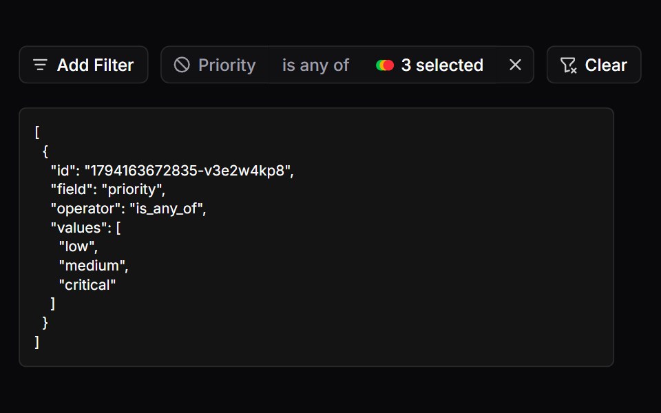 FiltersSpaceUI · ReactProvides a filter bar with badges and active tags, allowing users to narrow down search results by multiple criteria…
 Filter MenuFibo · ReactA filter menu of fields and values that turns into a search as you type.
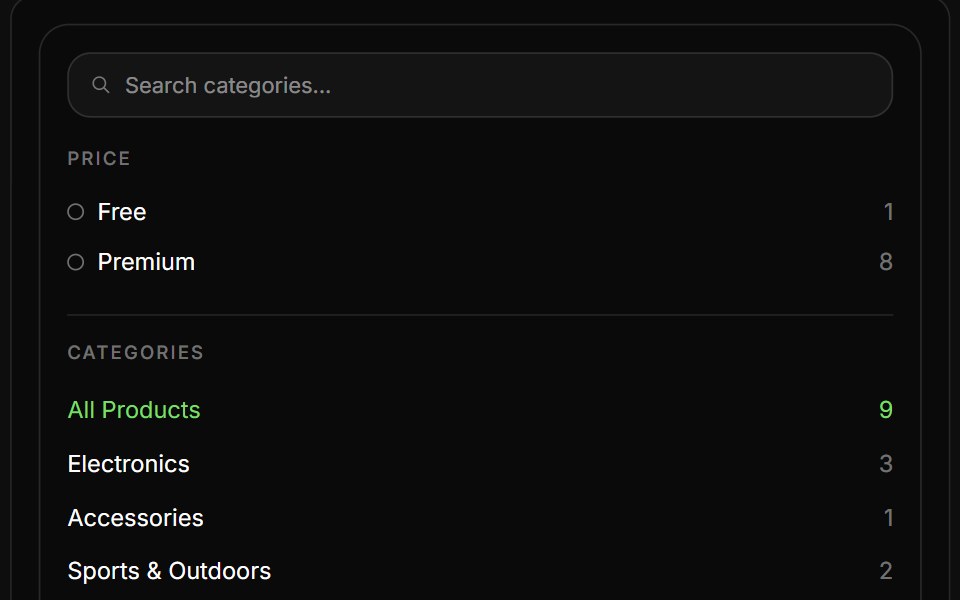 Product ListReactFrame · ReactAn eCommerce product listing block with a filter sidebar (live search, Free/Premium tiers, categories) and a…
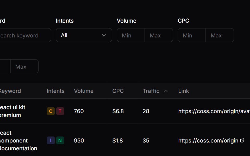 Comp 478Origin UI · React
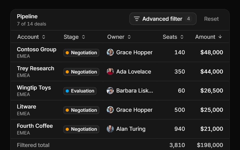 Nested groups in a popoverReUI · ReactA data grid paged, sorted and totalled under a popover builder.
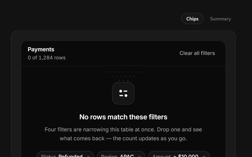 No Matching FiltersSpectrum UI · ReactFilter chips you can drop one at a time, with the match count coming back as you do.
 Dropdown Menu 06 - FiltersShadcn Space · ReactA filter dropdown that expands in place with a price range slider, category checkboxes, rating chips, availability…
 Filterbar 02Tremor Blocks · React
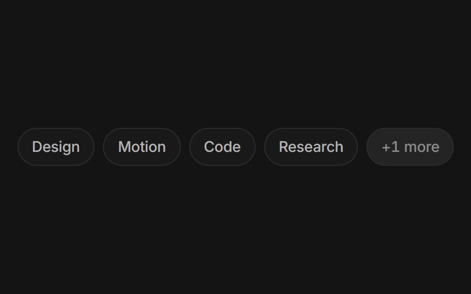 Chip groupArc Library · ReactFilter by a few facets with chips that morph as you pick them.
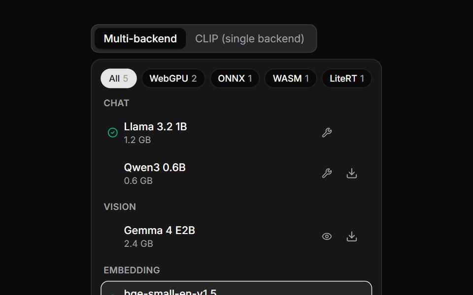 Model SelectorLocalMode · ReactA device-aware model picker: a list grouped by category, backend filter chips (WebGPU/ONNX/WASM/LiteRT) with live…
 FiltersFLX UI · ReactGrouped toggle button filters for status and priority, with reset and apply actions.
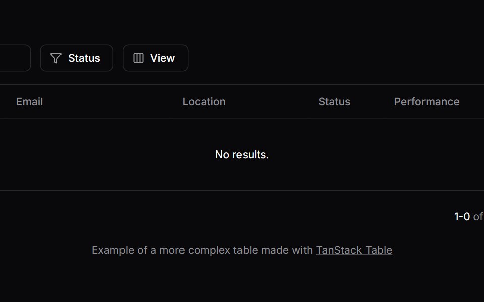 Comp 485Origin UI · React
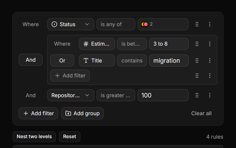 Nested groups inline, walked back outReUI · ReactThe builder inline, beside its own tree read back as an expression.
 Filterbar 03Tremor Blocks · React
 Filter toolbarArc Library · ReactKeep collection filters close and easy to reset.
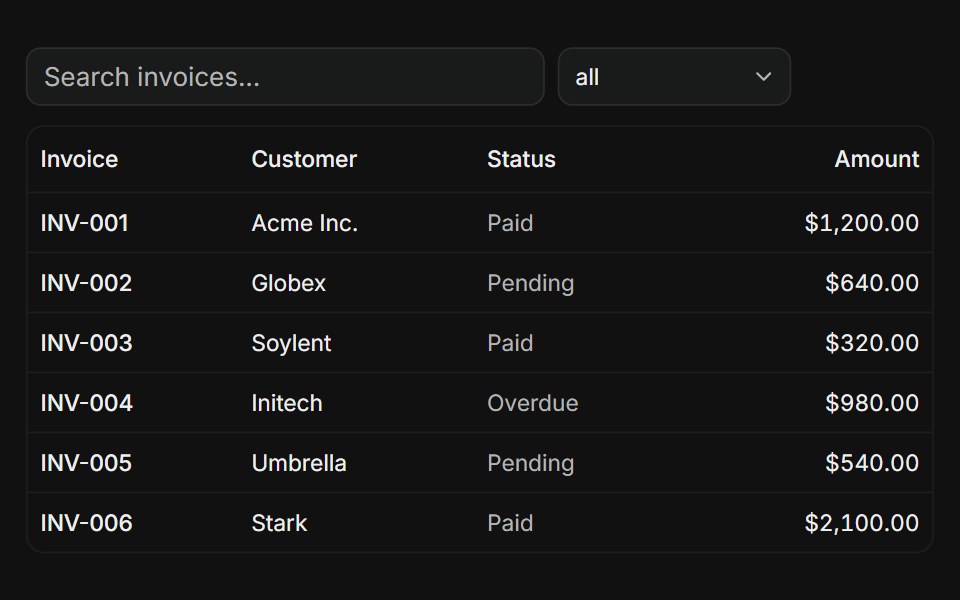 With filtersFLX UI · ReactTanStack Table, global search input plus a status column filter dropdown.
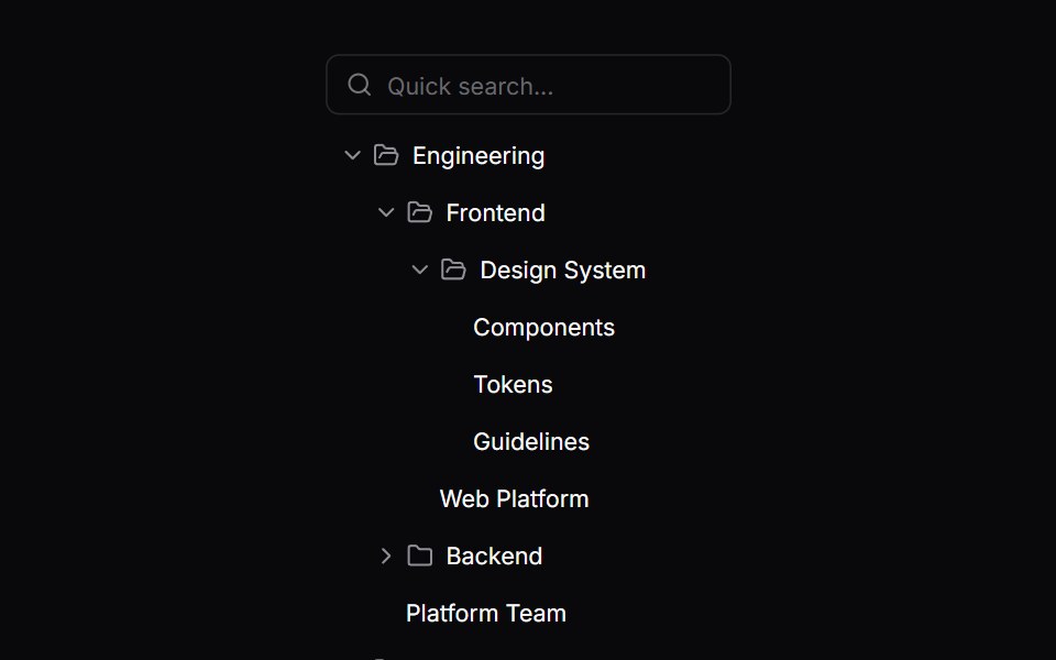 Comp 571Origin UI · React
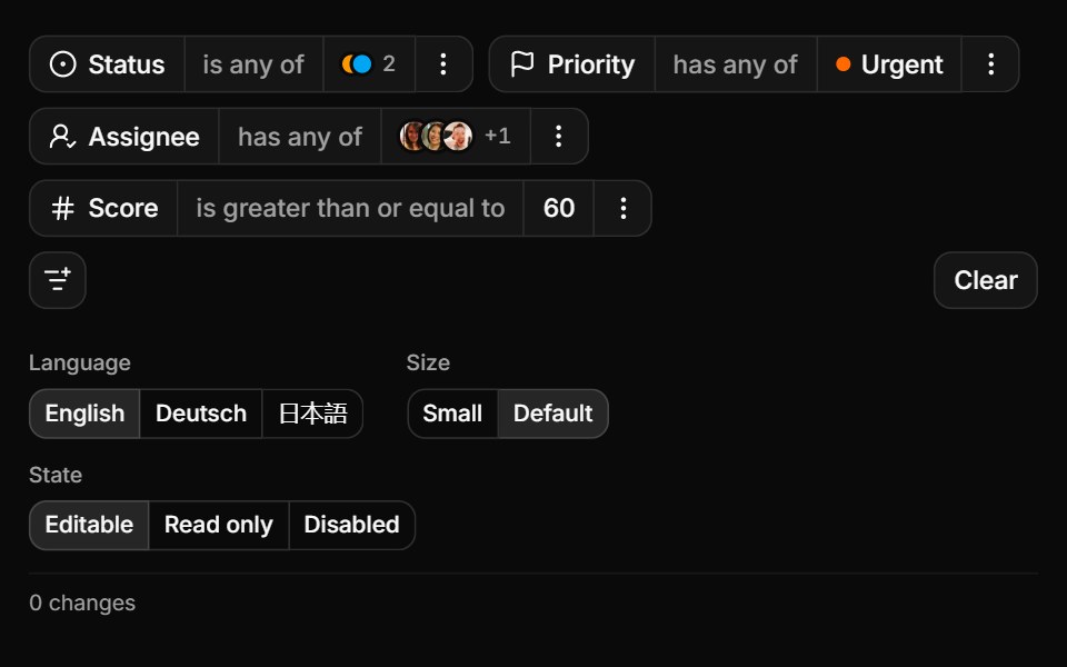 Controlled, sized and translatedReUI · ReactOne controlled query, three locales and every change reported.
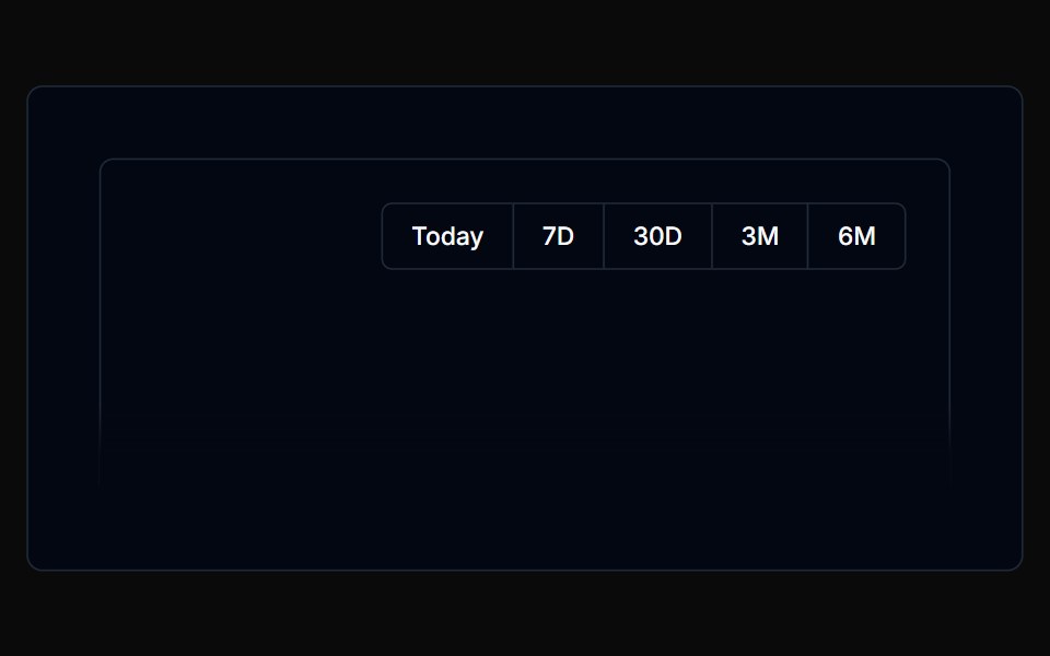 Filterbar 04Tremor Blocks · React
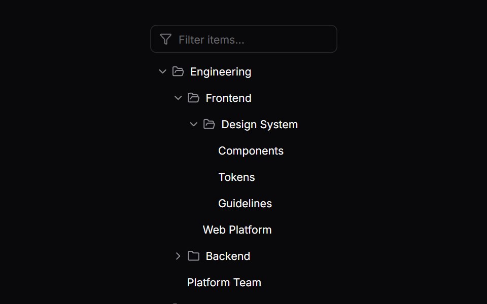 Comp 572Origin UI · React
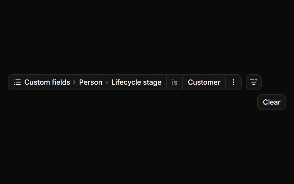 Nested attributes at workspace scaleReUI · ReactDrill-down groups, a filterable branch and deep search.
 Filterbar 05Tremor Blocks · React
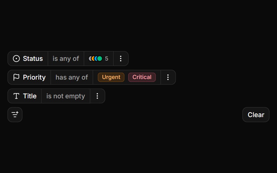 Status and priority colour badgesReUI · ReactColour-coded options and badges in the chip.
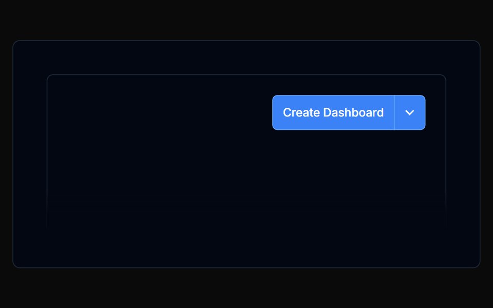 Filterbar 06Tremor Blocks · React
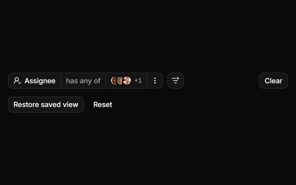 Avatars, paging and a restored viewReUI · ReactAvatar options, results paged over the wire and a saved view.
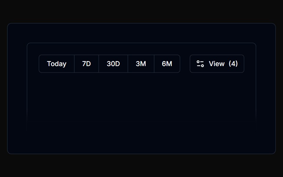 Filterbar 07Tremor Blocks · React
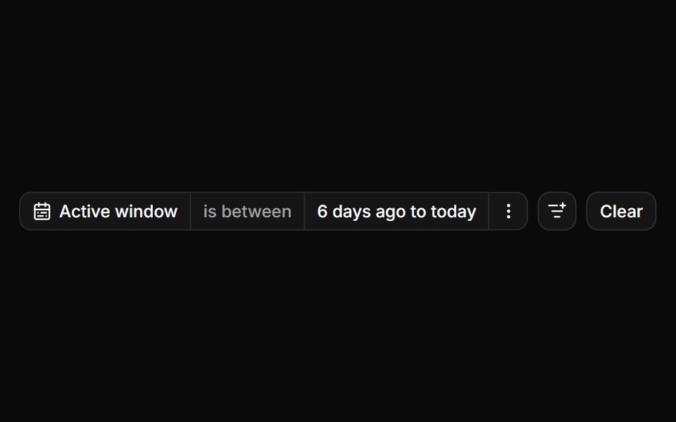 A date and a date range editorReUI · ReactConsumer-owned date and date range controls.
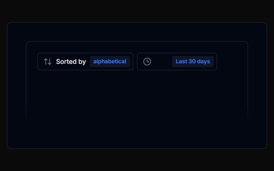 Filterbar 08Tremor Blocks · React
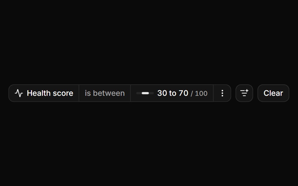 Sliders as the value editorReUI · ReactOne slider editor for range and single-value operators.
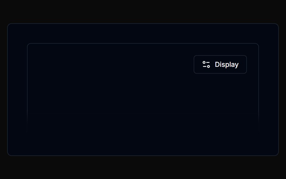 Filterbar 09Tremor Blocks · React
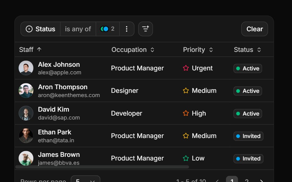 Filtering a tableReUI · ReactThe query tree compiled to a row predicate.
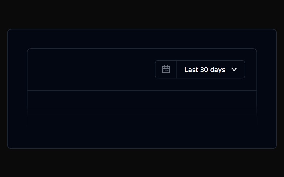 Filterbar 10Tremor Blocks · React
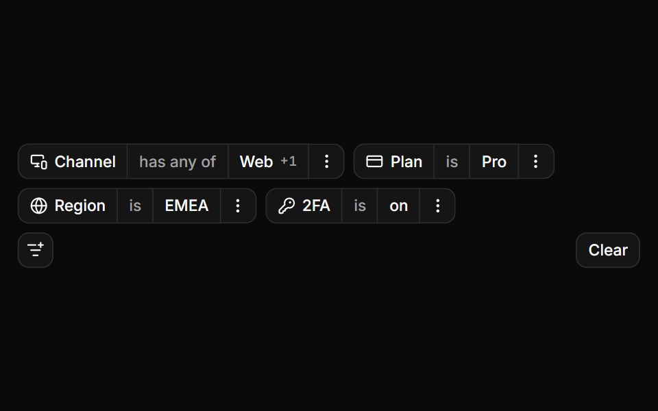 Choice controls as editorsReUI · ReactToggle group, radios, checkboxes, select and switch.
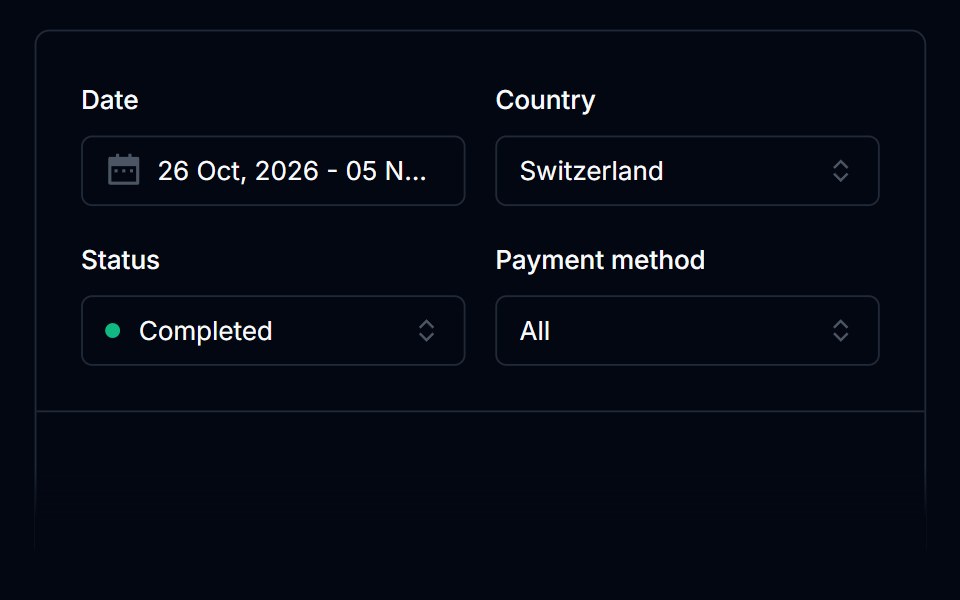 Filterbar 11Tremor Blocks · React
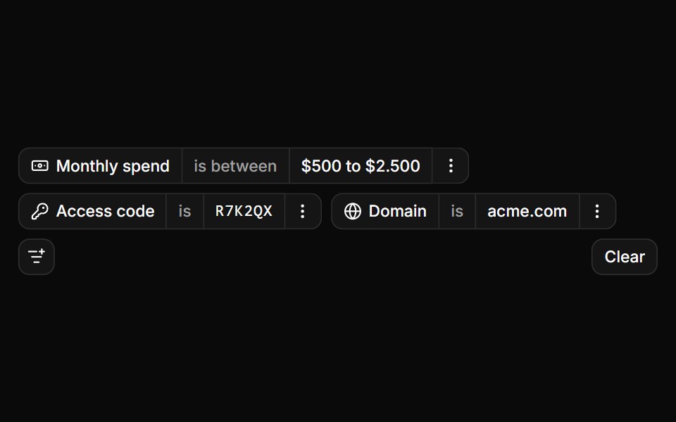 Typed values in shadcn inputsReUI · ReactAn input group, a term list, code slots and a validated domain.
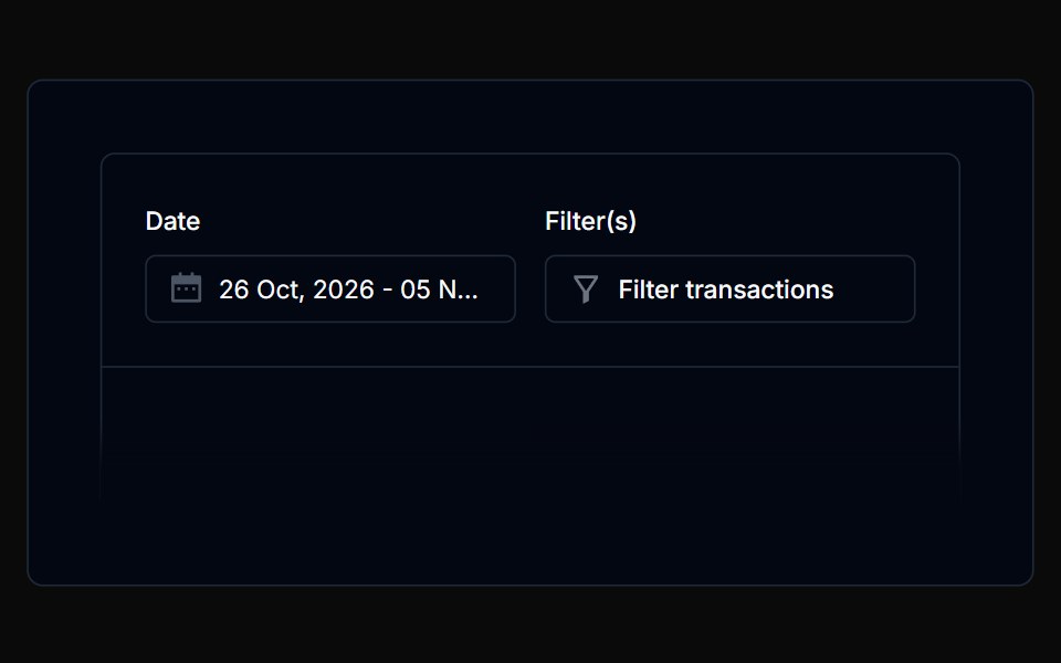 Filterbar 12Tremor Blocks · React
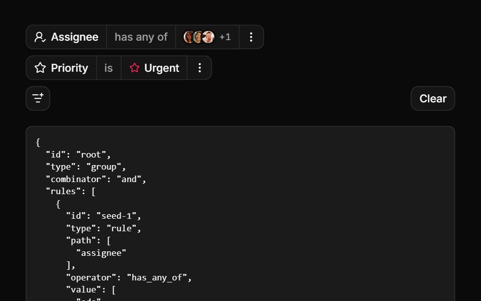 FiltersReUI · ReactA stepped filter builder with nested attributes, popover value editors and a boolean query tree.
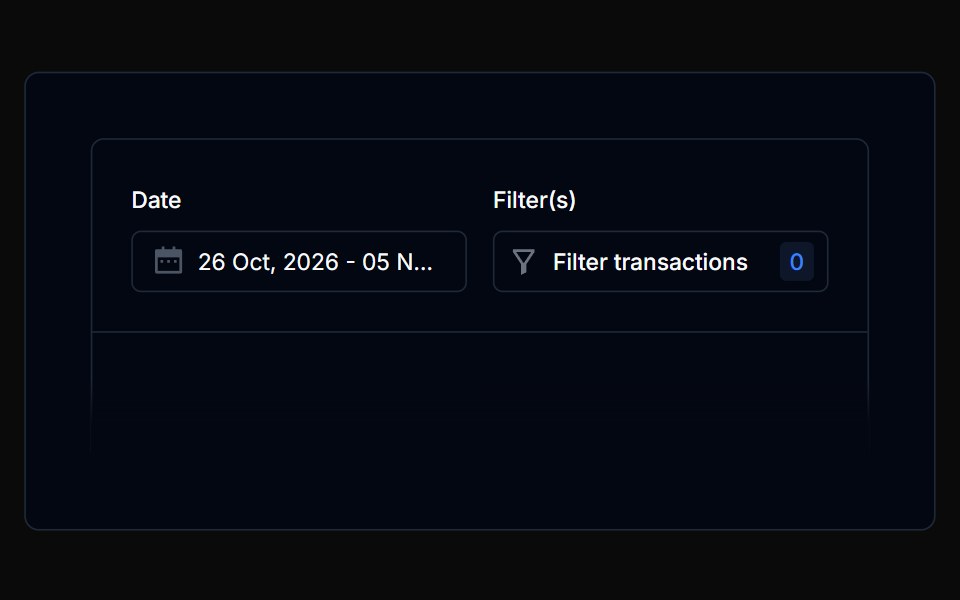 Filterbar 13Tremor Blocks · React
 Filterbar 14Tremor Blocks · React
 Filterbar 15Tremor Blocks · React
 Filterbar 16Tremor Blocks · React
Libraries with React filter bar components
Related categories
- Filter Bar Components
- Tailwind CSS Filter Bar Components
- Svelte Filter Bar Components
- Animated Filter Bar Components
- shadcn/ui Filter Bar Components
- React Data Display Components
- React Card Components
- React Chart Components
- React Table Components
- React Avatar Components
- React List Components
- React Stat Components
- React Calendar Components
- React Accordion Components
- React Carousel Components
- React Collapsible Components
- React Data Table Components
- React Avatar Group Components
- React Tree View Components
- React Card Stack Components
- React Line Chart Components