 Dev Design Library
Tailwind CSS Filter Bar Components
Dev Design Library indexes 56 Tailwind CSS filter bar components from 16 open-source UI libraries, with the most coming from Tremor Blocks, ReUI, sv-table, Origin UI and FLX UI. Each one links to its page with the source code, a live preview where available, the library license and the install command. Every library in this list styles its components with Tailwind CSS utility classes. Filter bar components belong to the Data display group.
 Comp 381Origin UI · React
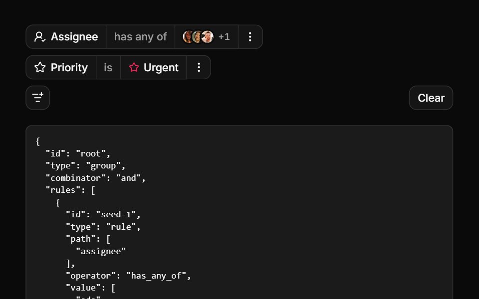 Everything in one filter barReUI · ReactMulti-select, nested fields, async options and stacked values.
 Careers FooterSpectrum UI · ReactA rolling three-role window with department filters, over link columns.
 Drawer 03 - Filters PanelShadcn Space · ReactLeft side filter drawer with category checkboxes, a price range slider, an in stock switch, a live result count, and…
 Filter Sort DropdownOpenSourceUI · React
 Filter Interactionuselayouts · ReactInteractive list items with hover and focus effects.
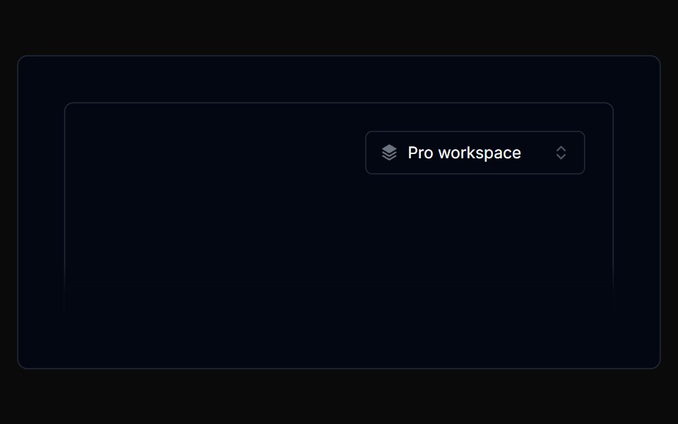 Filterbar 01Tremor Blocks · React
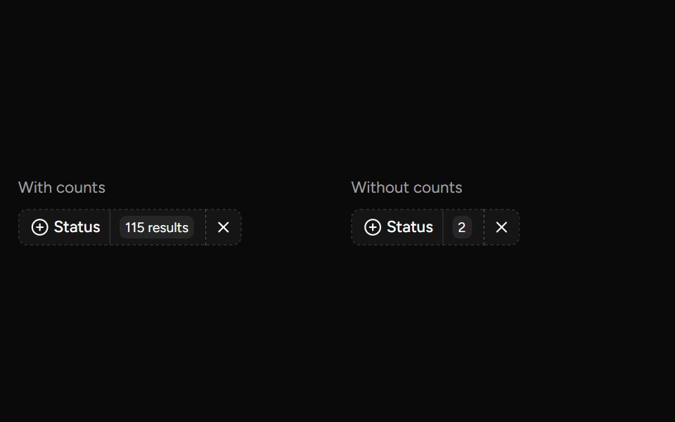 Data Table Faceted Filtersv-table · SvelteA searchable multi-select filter with live counts for categorical table columns.
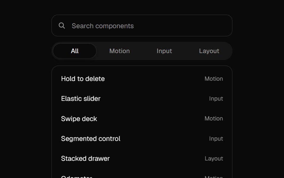 Filter ListUI Lab · ReactRows fade out of the way while the rest slide up to close the gap.
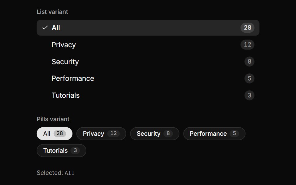 Category Facet ListLocalMode · ReactA domain-decoupled, filterable category facet (vertical list or horizontal pills) with per-category count badges…
 No resultsFLX UI · ReactSearch empty state with a clear-filters action.
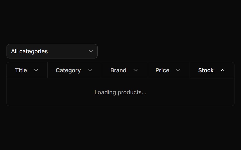 Filter Tablesv-particles · Svelte
 Filter barMetal UI · React + SwiftUINames the question a filter asks and switches how the answer is shown: Surface(frost) with a Glyph, the query in…
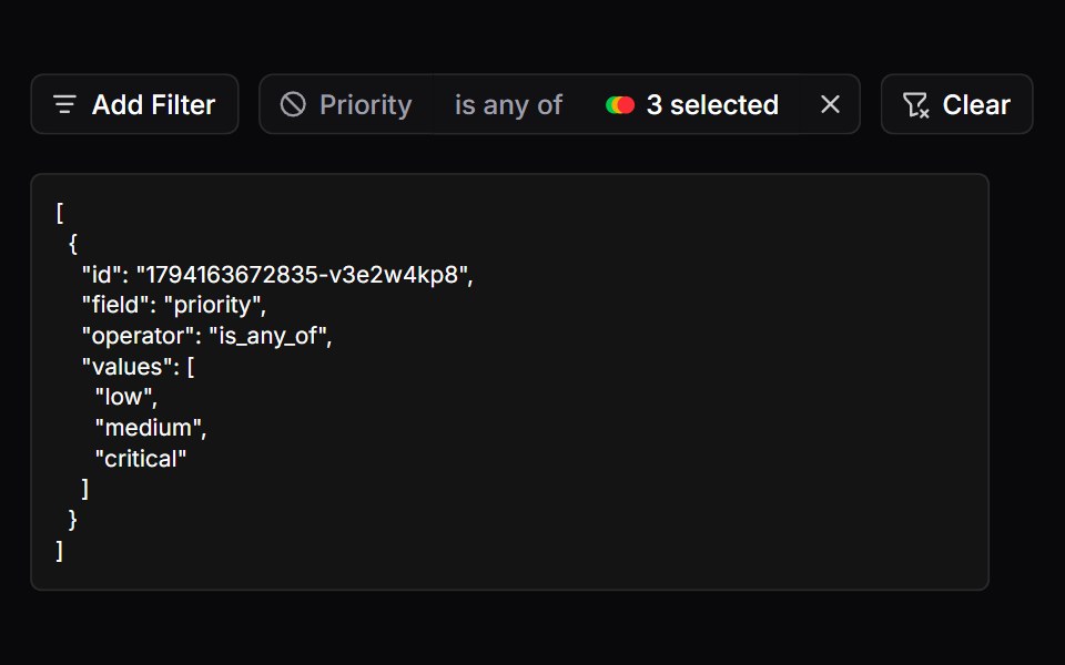 FiltersSpaceUI · ReactProvides a filter bar with badges and active tags, allowing users to narrow down search results by multiple criteria…
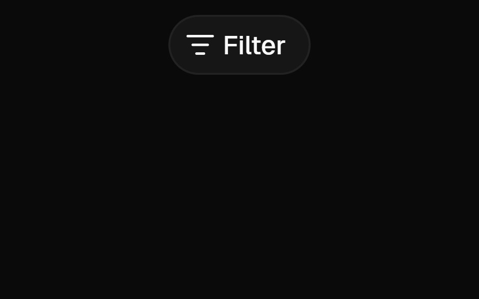 Filter MenuFibo · ReactA filter menu of fields and values that turns into a search as you type.
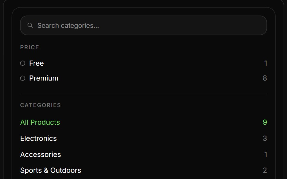 Product ListReactFrame · ReactAn eCommerce product listing block with a filter sidebar (live search, Free/Premium tiers, categories) and a…
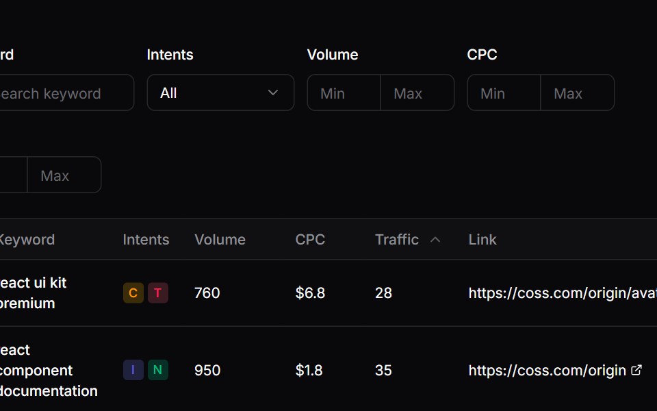 Comp 478Origin UI · React
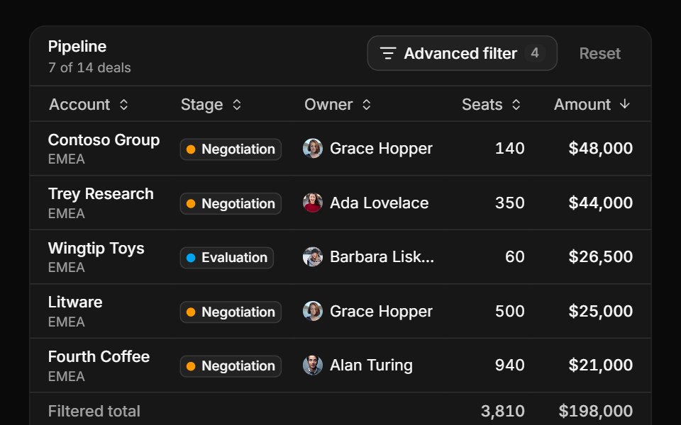 Nested groups in a popoverReUI · ReactA data grid paged, sorted and totalled under a popover builder.
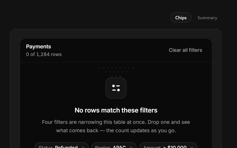 No Matching FiltersSpectrum UI · ReactFilter chips you can drop one at a time, with the match count coming back as you do.
 Dropdown Menu 06 - FiltersShadcn Space · ReactA filter dropdown that expands in place with a price range slider, category checkboxes, rating chips, availability…
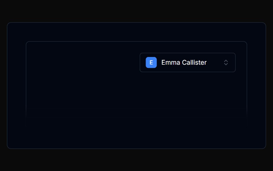 Filterbar 02Tremor Blocks · React
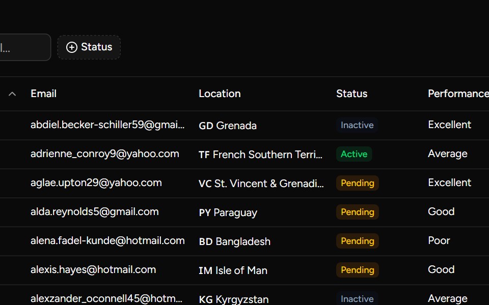 Complex Examplesv-table · Svelte
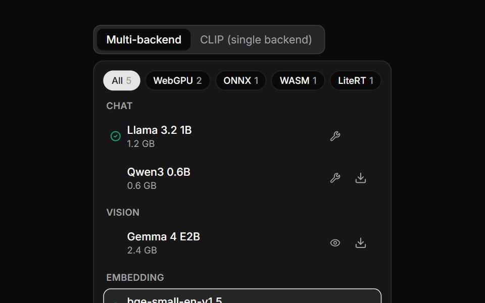 Model SelectorLocalMode · ReactA device-aware model picker: a list grouped by category, backend filter chips (WebGPU/ONNX/WASM/LiteRT) with live…
 FiltersFLX UI · ReactGrouped toggle button filters for status and priority, with reset and apply actions.
 Comp 485Origin UI · React
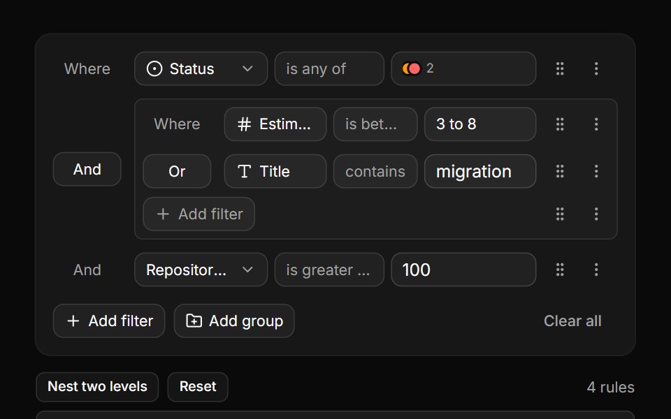 Nested groups inline, walked back outReUI · ReactThe builder inline, beside its own tree read back as an expression.
 Filterbar 03Tremor Blocks · React
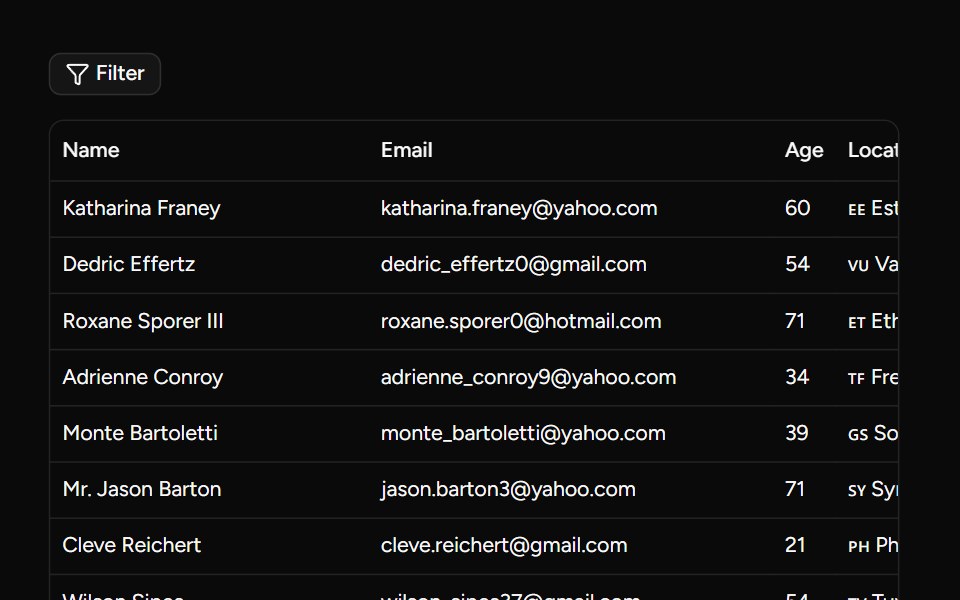 Custom Filters Examplesv-table · Svelte
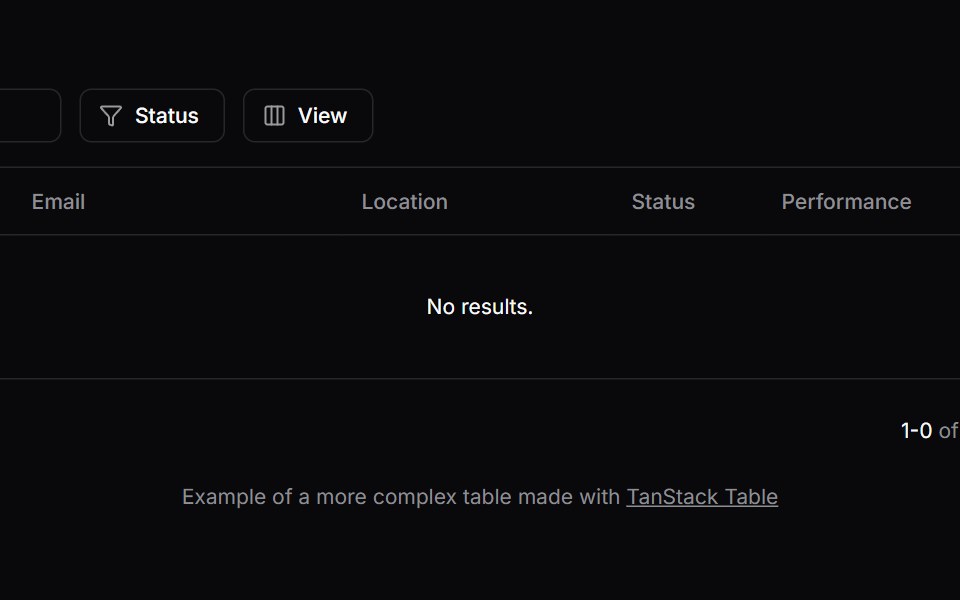
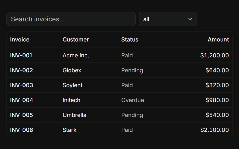 With filtersFLX UI · ReactTanStack Table, global search input plus a status column filter dropdown.
 Comp 571Origin UI · React
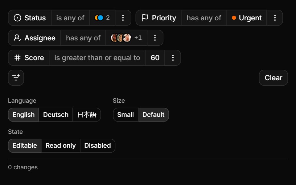 Controlled, sized and translatedReUI · ReactOne controlled query, three locales and every change reported.
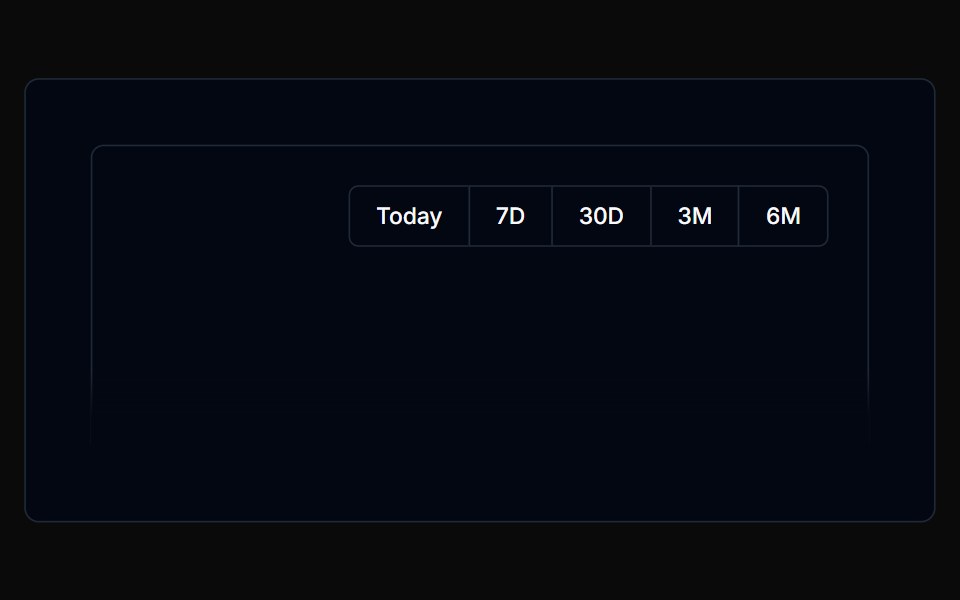 Filterbar 04Tremor Blocks · React
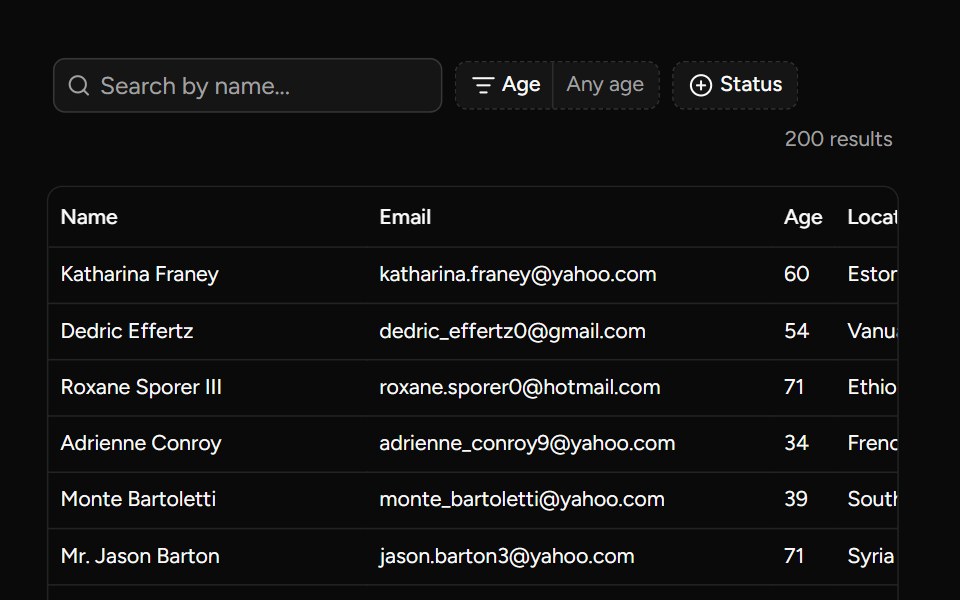 Data Table Filters Examplesv-table · Svelte
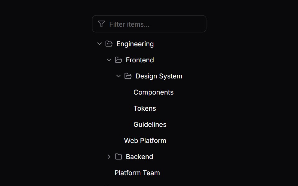 Comp 572Origin UI · React
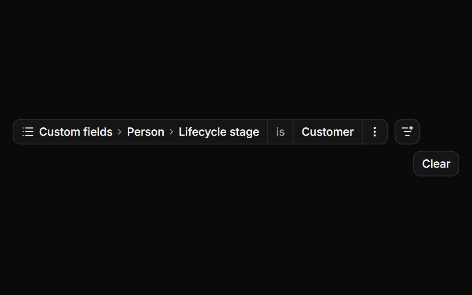 Nested attributes at workspace scaleReUI · ReactDrill-down groups, a filterable branch and deep search.
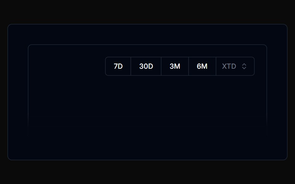 Filterbar 05Tremor Blocks · React
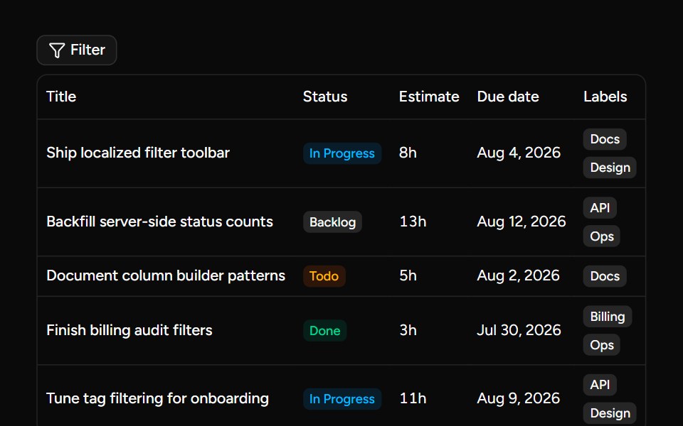 Data Table Filterssv-table · Svelte
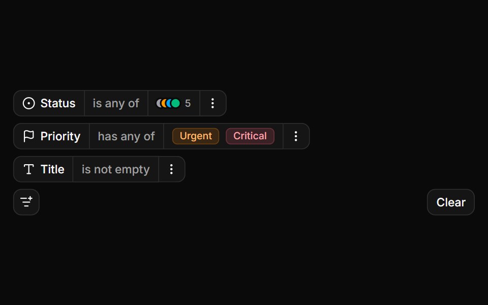 Status and priority colour badgesReUI · ReactColour-coded options and badges in the chip.
 Filterbar 06Tremor Blocks · React
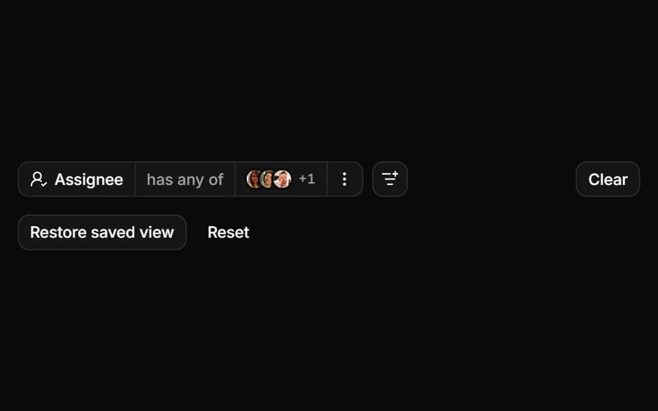 Avatars, paging and a restored viewReUI · ReactAvatar options, results paged over the wire and a saved view.
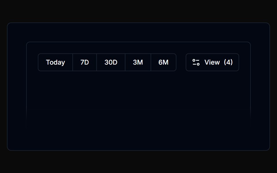 Filterbar 07Tremor Blocks · React
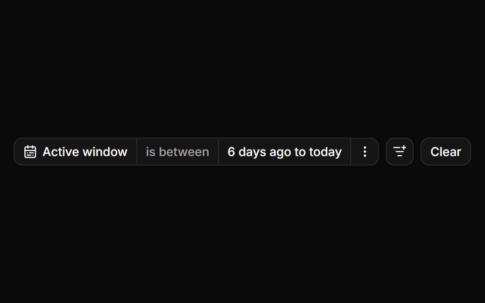 A date and a date range editorReUI · ReactConsumer-owned date and date range controls.
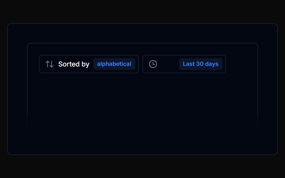 Filterbar 08Tremor Blocks · React
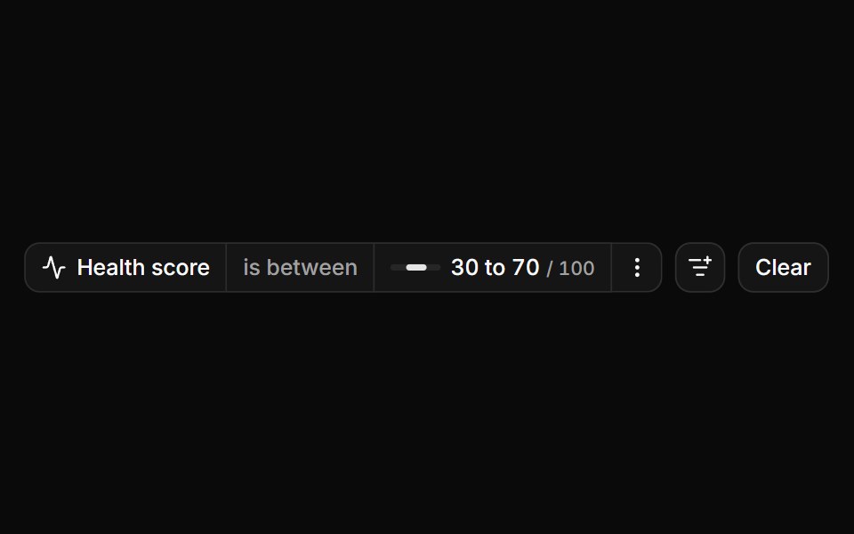 Sliders as the value editorReUI · ReactOne slider editor for range and single-value operators.
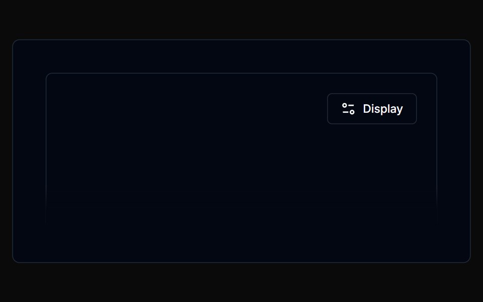 Filterbar 09Tremor Blocks · React
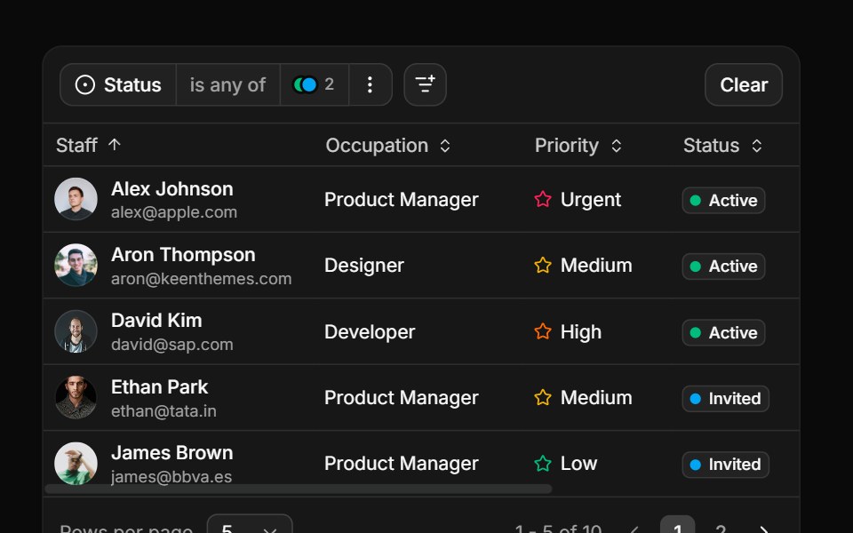 Filtering a tableReUI · ReactThe query tree compiled to a row predicate.
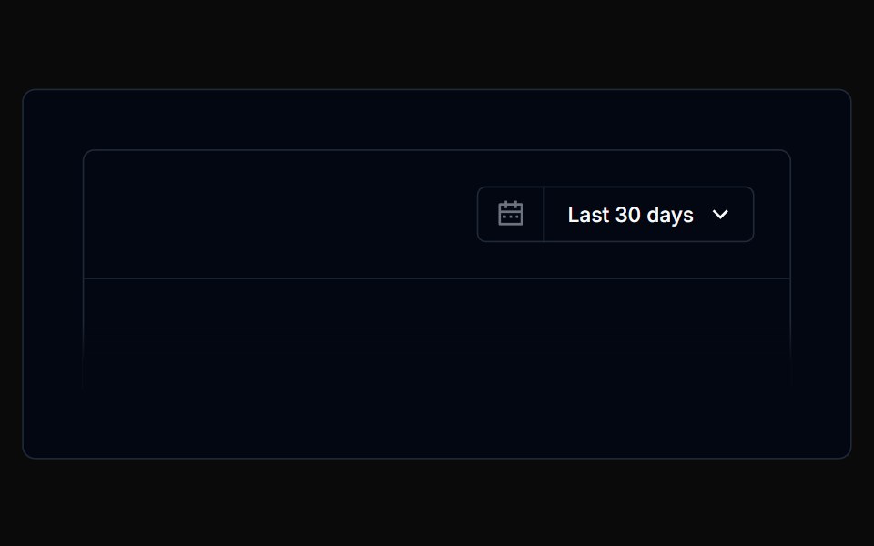 Filterbar 10Tremor Blocks · React
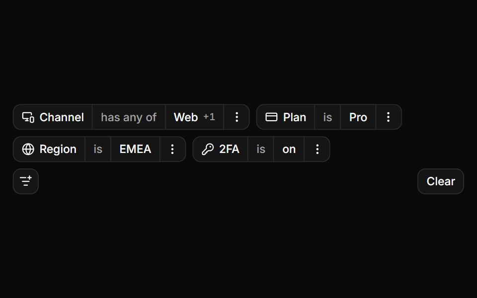 Choice controls as editorsReUI · ReactToggle group, radios, checkboxes, select and switch.
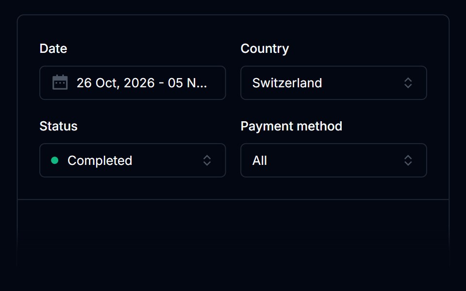 Filterbar 11Tremor Blocks · React
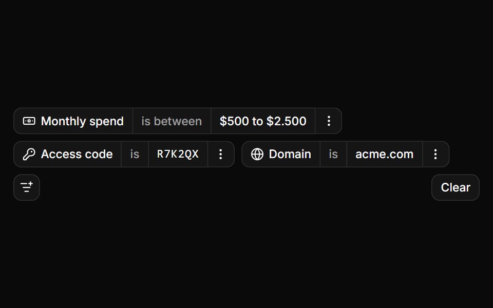 Typed values in shadcn inputsReUI · ReactAn input group, a term list, code slots and a validated domain.
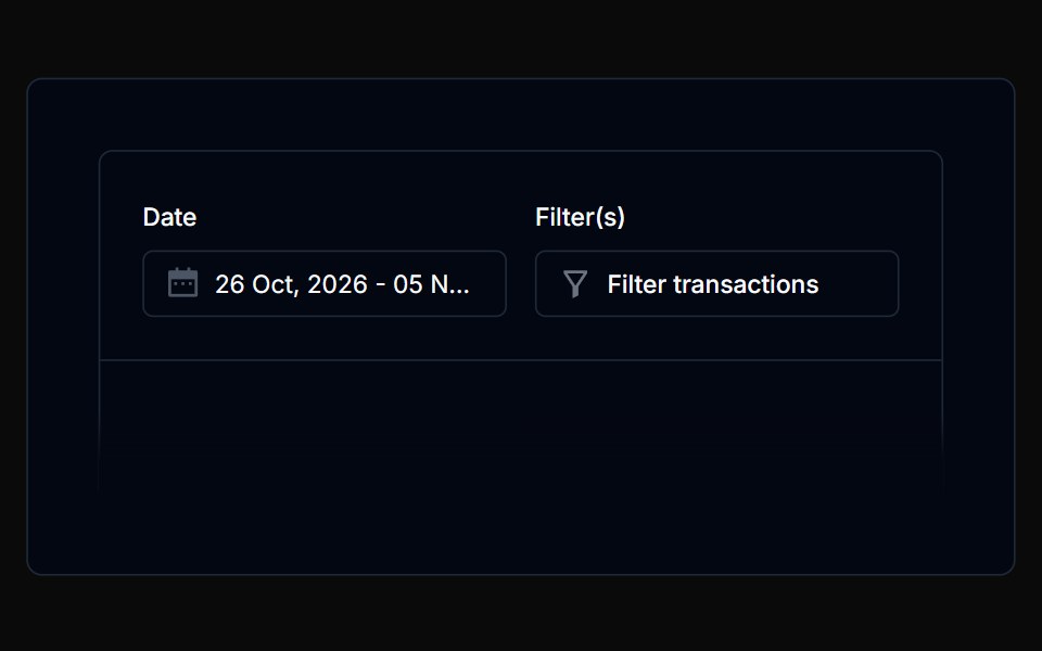 Filterbar 12Tremor Blocks · React
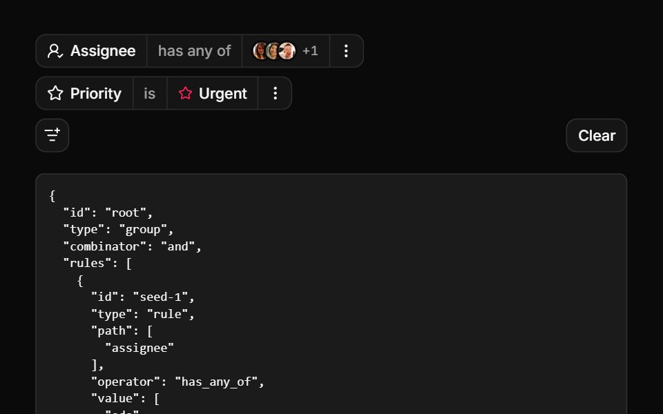 FiltersReUI · ReactA stepped filter builder with nested attributes, popover value editors and a boolean query tree.
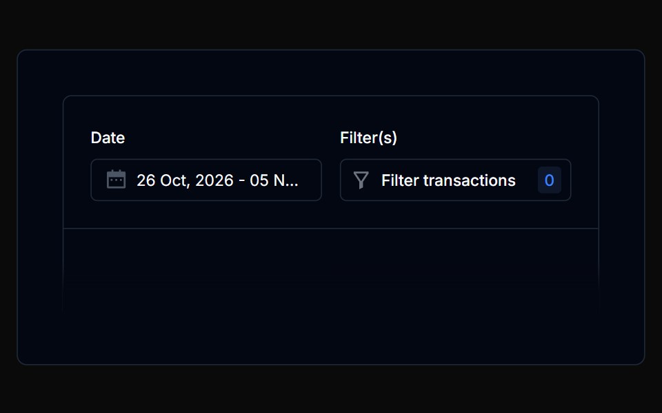 Filterbar 13Tremor Blocks · React
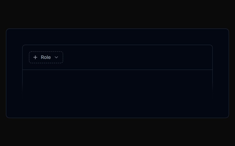 Filterbar 14Tremor Blocks · React
 Filterbar 15Tremor Blocks · React
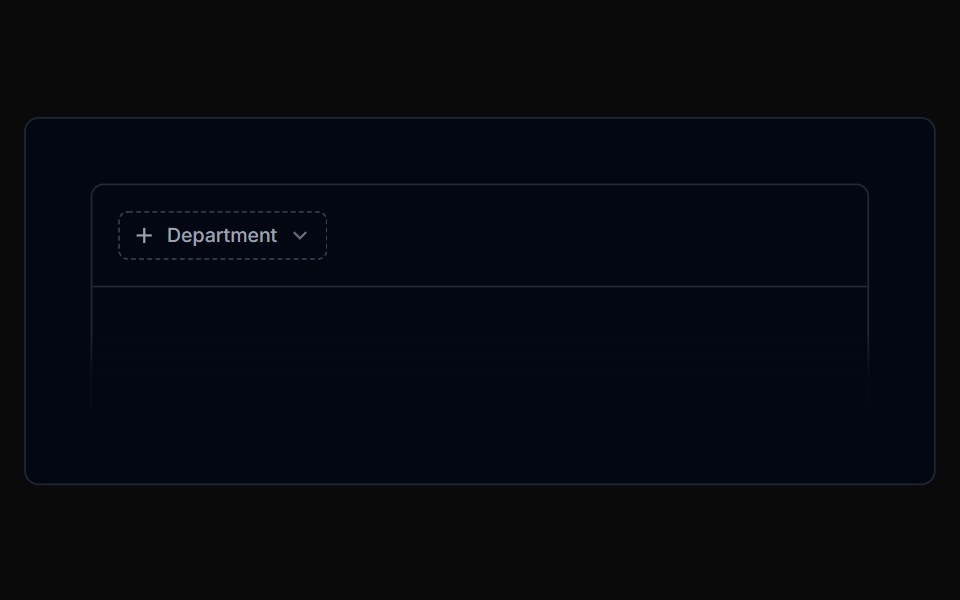 Filterbar 16Tremor Blocks · React
Libraries with Tailwind CSS filter bar components
Related categories
- Filter Bar Components
- React Filter Bar Components
- Svelte Filter Bar Components
- Animated Filter Bar Components
- shadcn/ui Filter Bar Components
- Tailwind CSS Data Display Components
- Tailwind CSS Card Components
- Tailwind CSS Chart Components
- Tailwind CSS Table Components
- Tailwind CSS Avatar Components
- Tailwind CSS Stat Components
- Tailwind CSS List Components
- Tailwind CSS Calendar Components
- Tailwind CSS Accordion Components
- Tailwind CSS Data Table Components
- Tailwind CSS Carousel Components
- Tailwind CSS Collapsible Components
- Tailwind CSS Avatar Group Components
- Tailwind CSS Stat Card Components
- Tailwind CSS Bar Chart Components
- Tailwind CSS Tree View Components