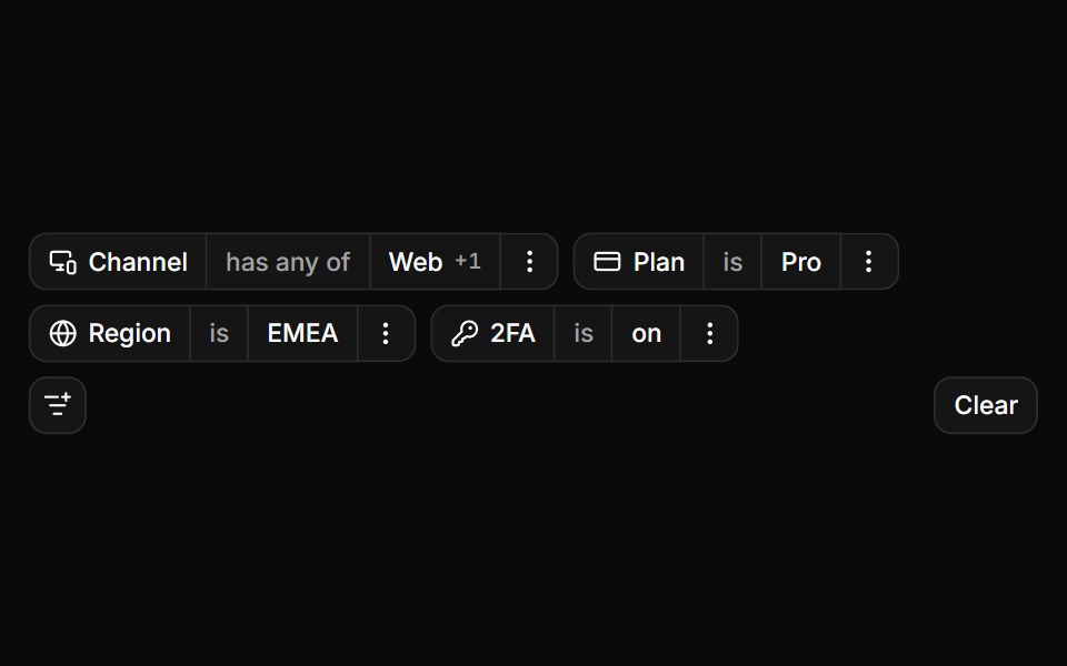
Choice controls as editors
Toggle group, radios, checkboxes, select and switch.
- Library
- ReUI
- Framework
- React
- Type
- block
- License
- MIT
- Dependencies
- cn
- Install
npx shadcn@latest add @reui/c-filters-8- Files
registry-reui/bases/radix/components/filters/c-filters-8.tsxregistry-reui/bases/radix/reui/filters/filters.tsxregistry-reui/bases/radix/reui/filters/filters-query.tsxregistry-reui/bases/radix/reui/filters/filters-types.tsxregistry/bases/radix/ui/button.tsxregistry/bases/radix/ui/checkbox.tsxregistry/bases/radix/ui/label.tsxregistry/bases/radix/ui/native-select.tsx
- Source
- https://github.com/keenthemes/reui
Categories
- Data Display Components
- React Data Display Components
- Tailwind CSS Data Display Components
- Filter Bar Components
- React Filter Bar Components
- Tailwind CSS Filter Bar Components
More from ReUI
- Everything in one filter bar
- Nested groups in a popover
- Nested groups inline, walked back out
- Controlled, sized and translated
- Nested attributes at workspace scale
- Status and priority colour badges
- Avatars, paging and a restored view
- A date and a date range editor
- Sliders as the value editor
- Filtering a table
- Typed values in shadcn inputs
- Filters