 Dev Design Library
Ticket Card Components
Dev Design Library indexes 10 ticket card components from 7 open-source UI libraries, with the most coming from OpenSourceUI, Spectrum UI, Kokonut UI, React Bits and Evil Buttons. Each one links to its page with the source code, a live preview where available, the library license and the install command. Ticket card components belong to the Data display group.
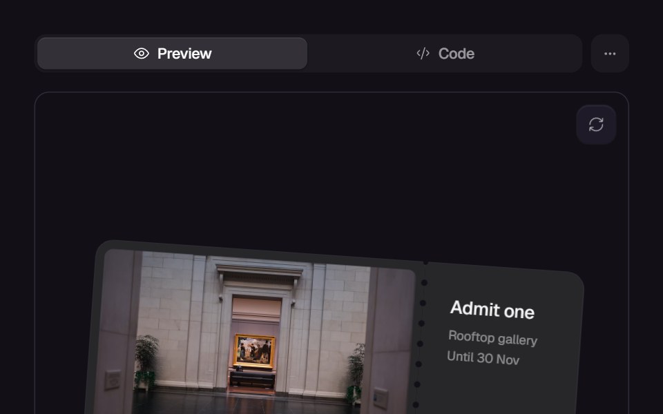 Tear TicketReact Bits · ReactTicket whose perforated stub tears off by hand: paper bridges stretch into fibres and snap one by one from the far…
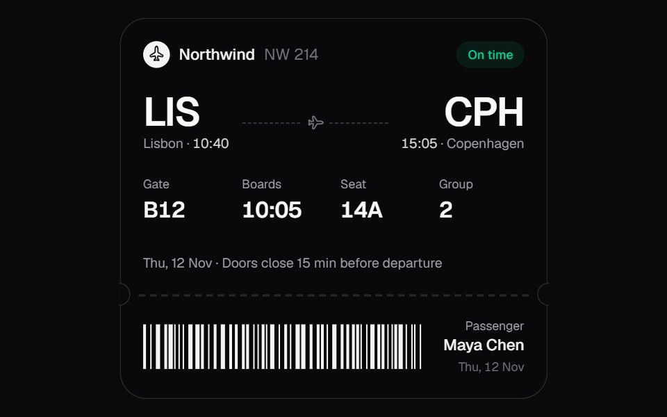 Boarding PassKokonut UI · ReactA boarding pass that keeps itself current. When the gate or times change, only the changed characters roll over, the…
 Event Badge 3DSpectrum UI · Reactcomponent for the Event Badge 3D
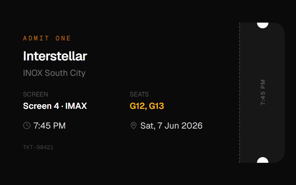 Cinema Ticket CardOpenSourceUI · React
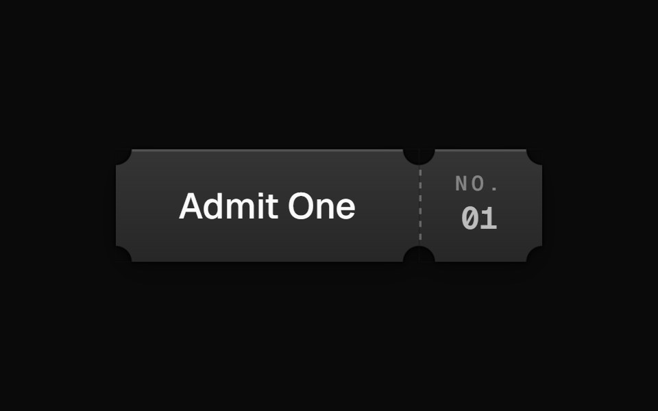 MoviePassButtonEvil Buttons · ReactA cinema ticket button that tears along its perforation on click, hinging open or snapping apart.
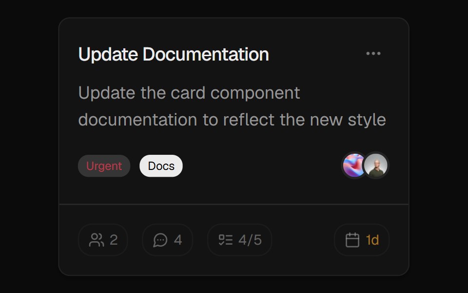 Task CardROI UI · ReactA task card component with badges, avatars, and action menu.
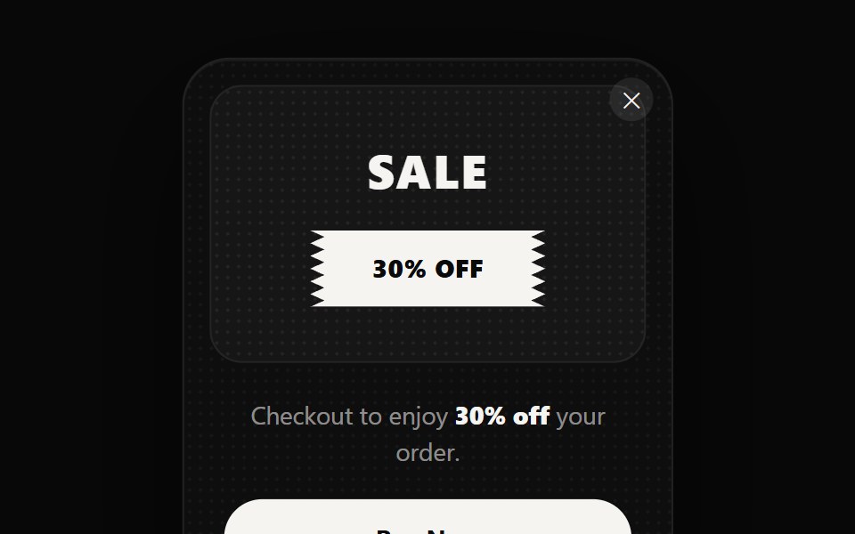 Sales Ticket PopupReactFrame · ReactA corner-anchored promo popup shaped like a torn event ticket, with 5 themes, a zigzag badge stub…
 Event Ticket CardOpenSourceUI · React
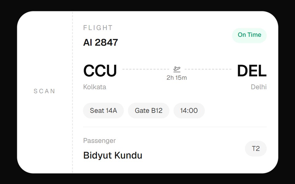 Flight Boarding CardOpenSourceUI · React
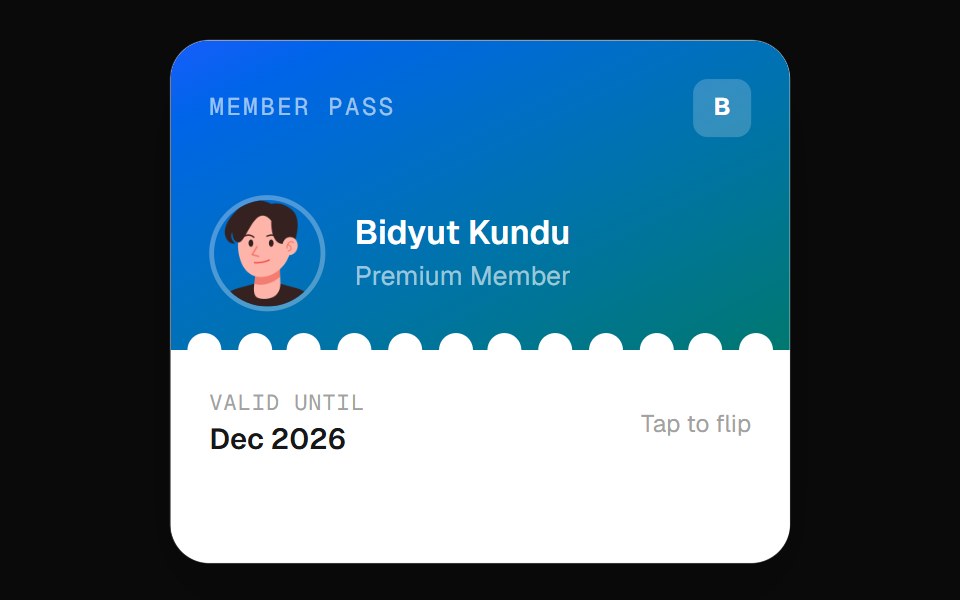 Wallet Pass CardOpenSourceUI · React
Libraries with ticket card components
Related categories
- Tailwind CSS Ticket Card Components
- Data Display Components
- Card Components
- Chart Components
- Table Components
- Avatar Components
- List Components
- Stat Components
- Calendar Components
- Accordion Components
- Data Table Components
- Carousel Components
- Collapsible Components
- Avatar Group Components
- Stat Card Components
- Bar Chart Components
- Tree View Components