 Dev Design Library
Animated Sparkline Components
Dev Design Library indexes 7 Animated sparkline components from 5 open-source UI libraries, with the most coming from Spectrum UI, Amicro Micro Transitions, beUI, Arc Library and UI Lab. Each one links to its page with the source code, a live preview where available, the library license and the install command. These are the sparkline components tagged as animated: motion on hover, on scroll or on load, usually built with CSS transitions or Framer Motion. Sparkline components belong to the Data display group.
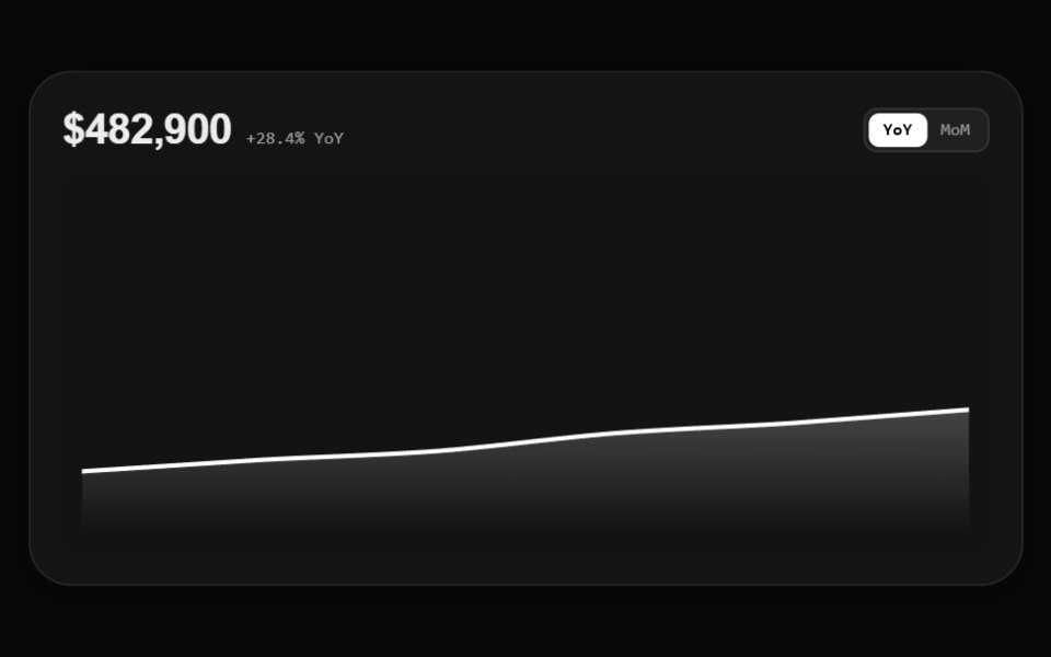 Mono Rounded Kpi Card ChartAmicro Micro Transitions · React
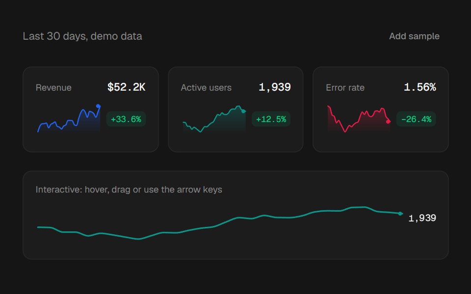 SparklinebeUI · ReactA compact inline trend for stat cards and tables, with a change badge and optional readout.
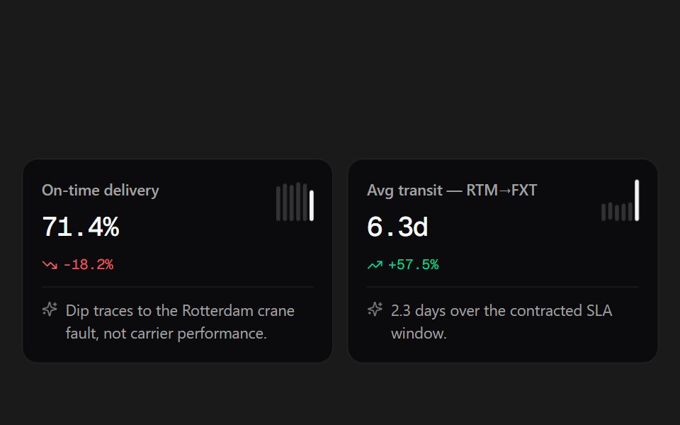 Insight CardsSpectrum UI · ReactMetric cards with spark bars, trend deltas, and an AI note.
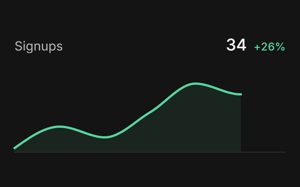 SparklineArc Library · ReactShow a compact trend beside a value.
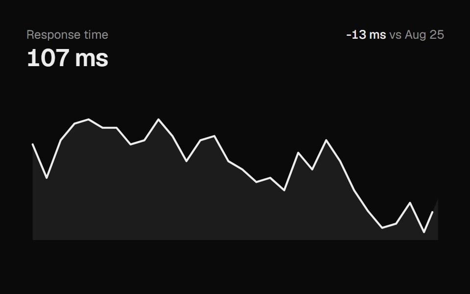 SparklineUI Lab · ReactDraws itself in, then scrubs to the nearest point under your cursor.
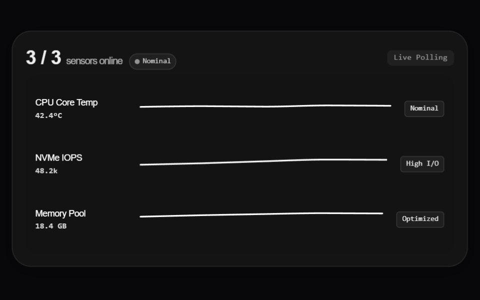 Mono Rounded Sparkline ChartAmicro Micro Transitions · React
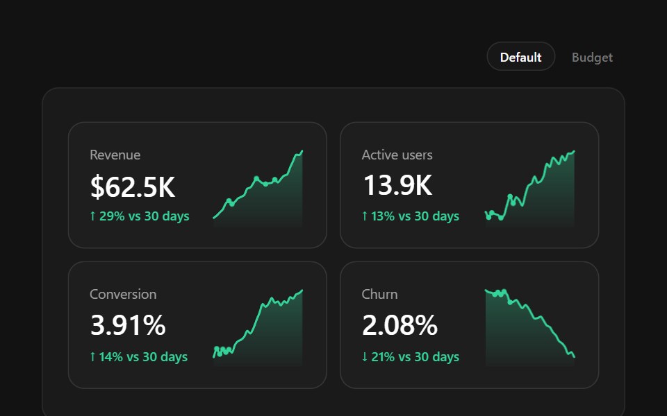 Stat CardsSpectrum UI · ReactKPI cards with a big value, the delta written as a sentence, and a scrubbable sparkline or progress bar beside it…
Libraries with Animated sparkline components
Related categories
- Sparkline Components
- Tailwind CSS Sparkline Components
- Animated Data Display Components
- Animated Card Components
- Animated Chart Components
- Animated Carousel Components
- Animated Accordion Components
- Animated Stat Components
- Animated Collapsible Components
- Animated Card Stack Components
- Animated Counter Components
- Animated List Components
- Animated Avatar Components
- Animated Table Components
- Animated Tree View Components
- Animated Avatar Group Components
- Animated Line Chart Components
- Animated Timeline Components