 Dev Design Library
Feature Card Components
Dev Design Library indexes 16 feature card components from 10 open-source UI libraries, with the most coming from Kokonut UI, Badtz UI, D2Studio UI, GreatUI and Lobe UI. Each one links to its page with the source code, a live preview where available, the library license and the install command. Feature card components belong to the Data display group.
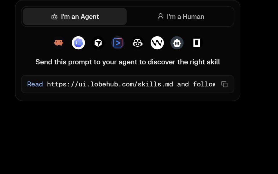 Awesome Agent Skill CardLobe UI · React
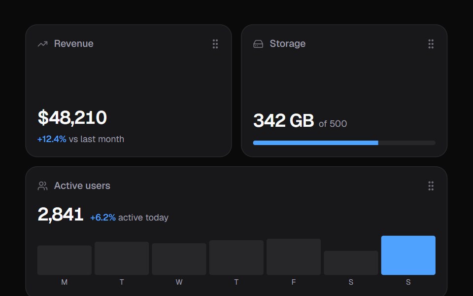 Widget GridKokonut UI · ReactDashboard widgets you lift, drag and resize on a 6-column grid, with spring physics and full keyboard support.
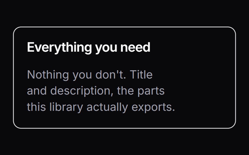 ItemLaunch UI · React
 Shine Border-03 - Feature CardShadcn Space · ReactAn interactive mouse-tracking spotlight shine border that reveals a gradient glow on hover, wrapping a feature…
 Feature Cardcnblocks · SvelteReusable feature card with icon and text
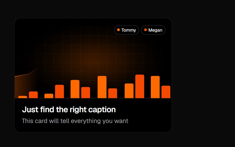 Animated Card 1Badtz UI · React
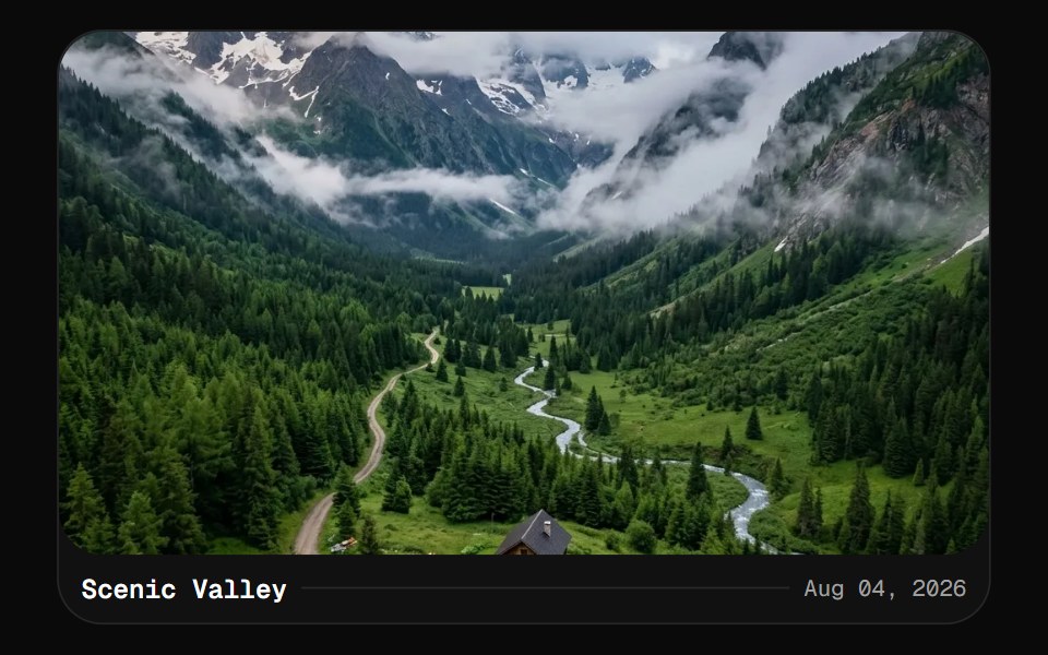 CardGreatUI · React
 Icon feature gridVelora UI · ReactHeading and six icon feature cards in a three-column grid, each border lit by a cursor-following glow.
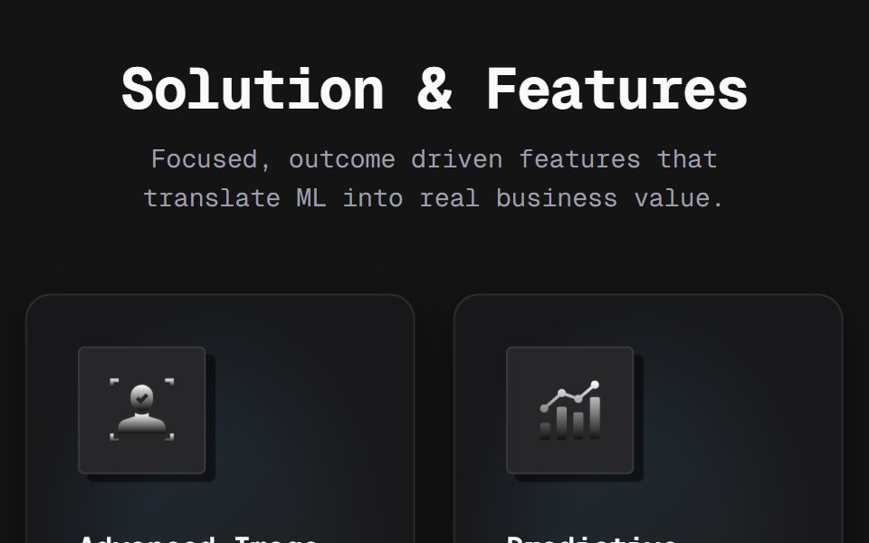 Bento 02D2Studio UI · ReactA five-card feature bento with metallic-gradient glyphs on lifting icon tiles, a dot-matrix texture and color-dodged…
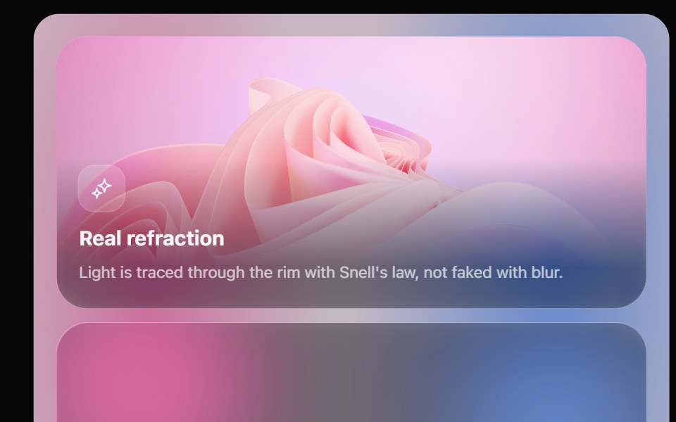 Glass Bento GridOpaline · ReactFeature tiles on glass in a bento layout, with a pointer light and a call to action that slides in.
 Flick CardKokonut UI · ReactA two-sided card you spin with a drag or a flick, with thickness, light and a floor shadow that follow the angle.
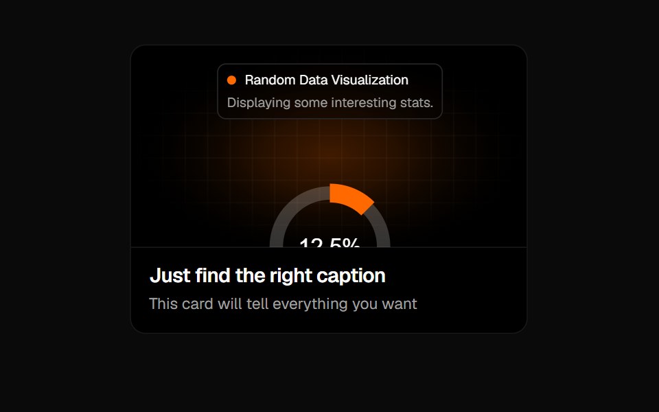 Animated Card 2Badtz UI · React
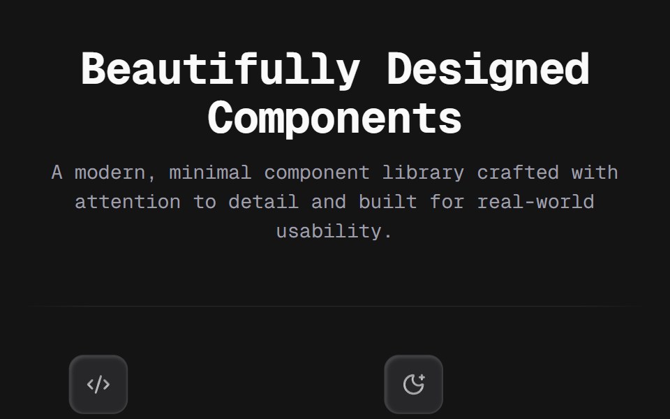 Bento 03D2Studio UI · ReactA flat 3×2 feature grid on thin edge-masked rules — no cards, no fills. Each cell pairs a recessed keycap icon tile…
 Spotlight CardsKokonut UI · ReactFeature card grid with ambient aurora glow, magnetic 3D tilt and focus dimming on hover, built with React, Tailwind…
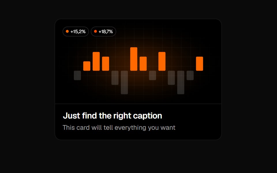 Animated Card 3Badtz UI · React
 Bento 05D2Studio UI · ReactA four-card studio bento on a masked dot field. Each card is a Figma gradient export carrying its own glass fill and…
Libraries with feature card components
Related categories
- React Feature Card Components
- Tailwind CSS Feature Card Components
- Animated Feature Card Components
- Data Display Components
- Card Components
- Chart Components
- Table Components
- Avatar Components
- List Components
- Stat Components
- Calendar Components
- Accordion Components
- Data Table Components
- Carousel Components
- Collapsible Components
- Avatar Group Components
- Stat Card Components
- Bar Chart Components
- Tree View Components