 Dev Design Library
Animated Feature Card Components
Dev Design Library indexes 9 Animated feature card components from 5 open-source UI libraries, with the most coming from Kokonut UI, Badtz UI, GreatUI, Velora UI and Opaline. Each one links to its page with the source code, a live preview where available, the library license and the install command. These are the feature card components tagged as animated: motion on hover, on scroll or on load, usually built with CSS transitions or Framer Motion. Feature card components belong to the Data display group.
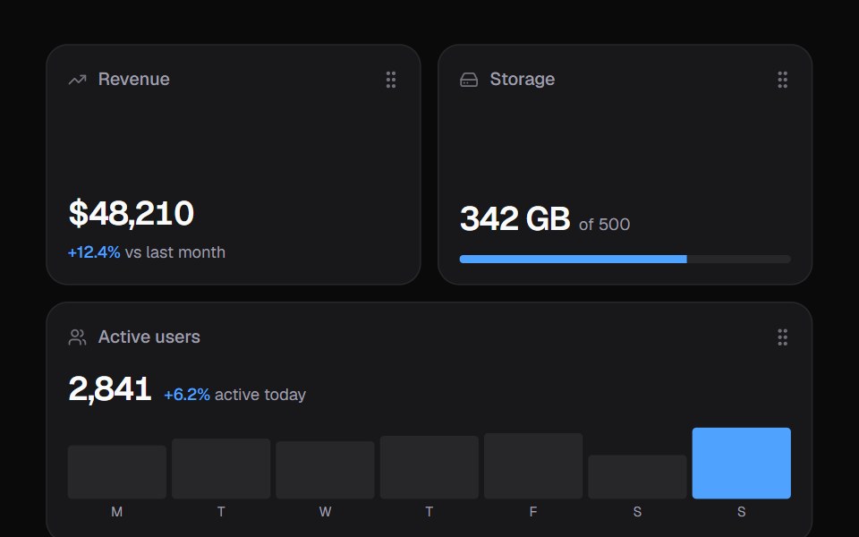 Widget GridKokonut UI · ReactDashboard widgets you lift, drag and resize on a 6-column grid, with spring physics and full keyboard support.
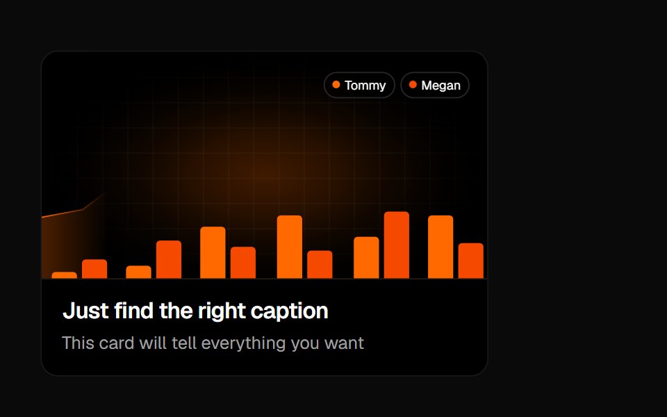 Animated Card 1Badtz UI · React
 CardGreatUI · React
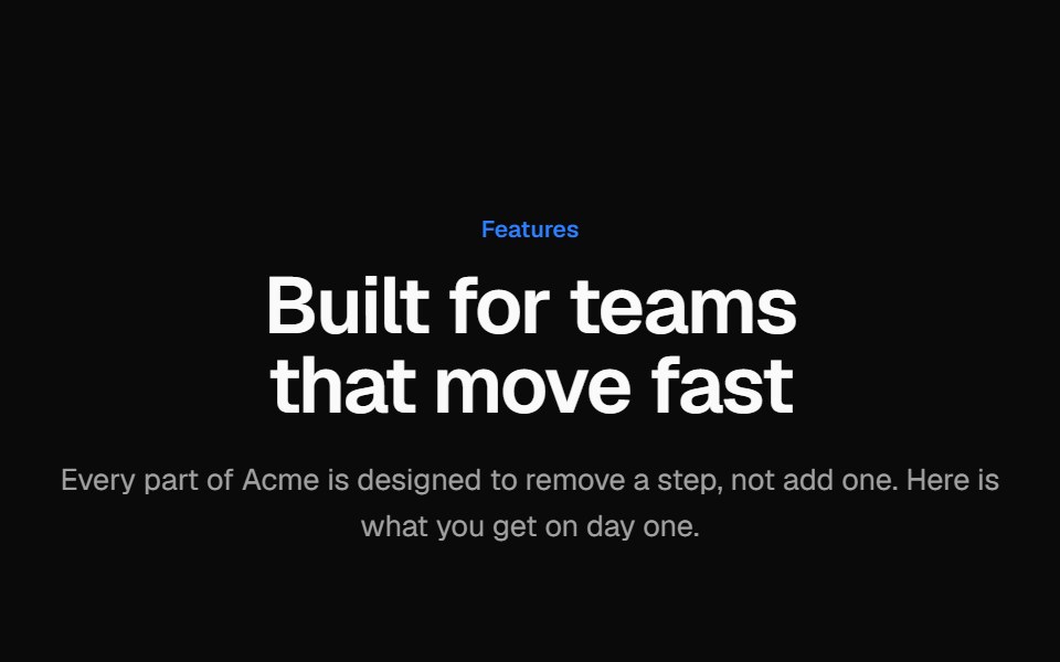 Icon feature gridVelora UI · ReactHeading and six icon feature cards in a three-column grid, each border lit by a cursor-following glow.
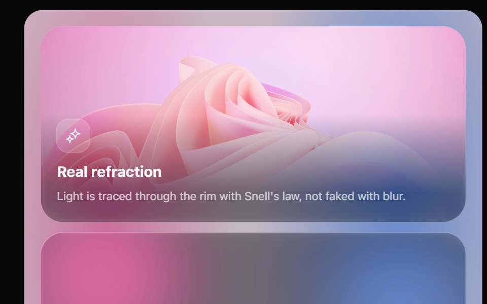 Glass Bento GridOpaline · ReactFeature tiles on glass in a bento layout, with a pointer light and a call to action that slides in.
 Flick CardKokonut UI · ReactA two-sided card you spin with a drag or a flick, with thickness, light and a floor shadow that follow the angle.
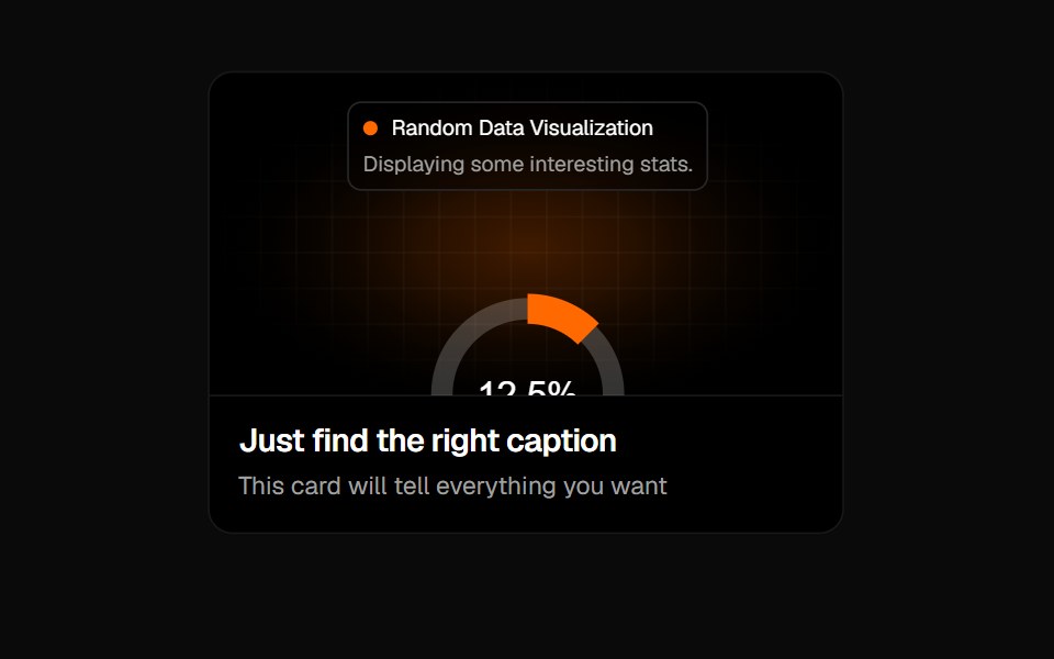 Animated Card 2Badtz UI · React
 Spotlight CardsKokonut UI · ReactFeature card grid with ambient aurora glow, magnetic 3D tilt and focus dimming on hover, built with React, Tailwind…
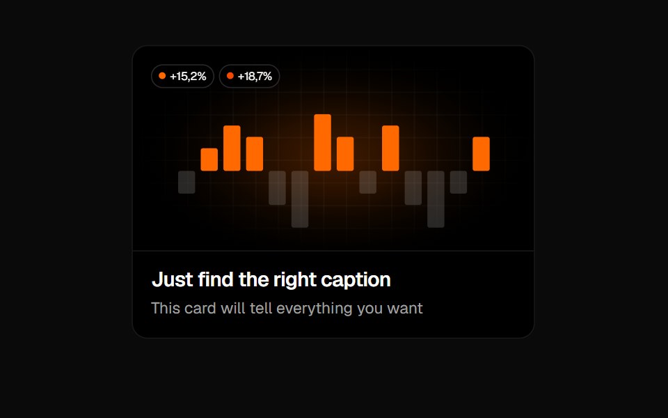 Animated Card 3Badtz UI · React
Libraries with Animated feature card components
Related categories
- Feature Card Components
- React Feature Card Components
- Tailwind CSS Feature Card Components
- Animated Data Display Components
- Animated Card Components
- Animated Chart Components
- Animated Carousel Components
- Animated Accordion Components
- Animated Stat Components
- Animated Collapsible Components
- Animated Card Stack Components
- Animated Counter Components
- Animated List Components
- Animated Avatar Components
- Animated Table Components
- Animated Tree View Components
- Animated Avatar Group Components
- Animated Line Chart Components
- Animated Timeline Components