 Dev Design Library
shadcn/ui Multi Select Components
Dev Design Library indexes 6 shadcn/ui multi select components from 5 open-source UI libraries, with the most coming from Fluid Functionalism, Spectrum UI, sv-table, FLX UI and Shadcn Space. Each one links to its page with the source code, a live preview where available, the library license and the install command. They follow the shadcn/ui conventions, so most install with the shadcn CLI and drop into a Tailwind project. Multi select components belong to the Inputs group.
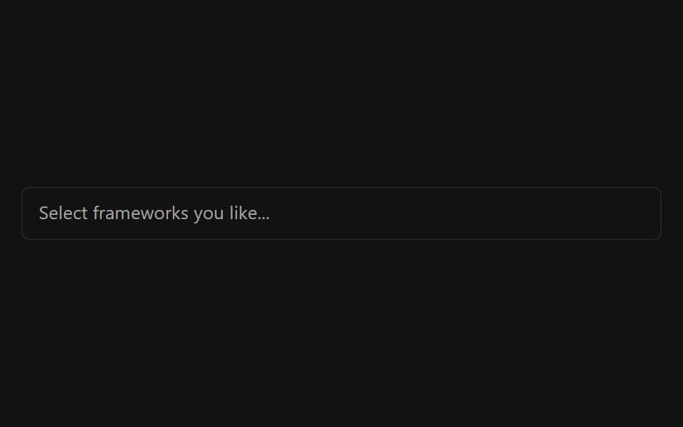 Multiple SelectorSpectrum UI · ReactA multi-select input with async search, grouping, and creatable options.
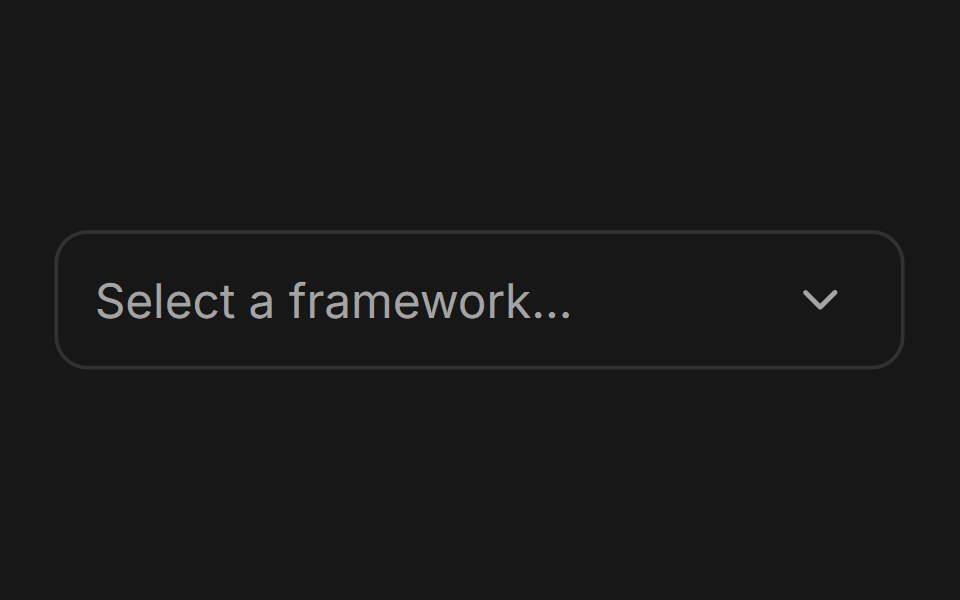 ComboboxFluid Functionalism · ReactType-to-filter combobox with single or multiple (chips, merged selection backgrounds) selection: a text field that…
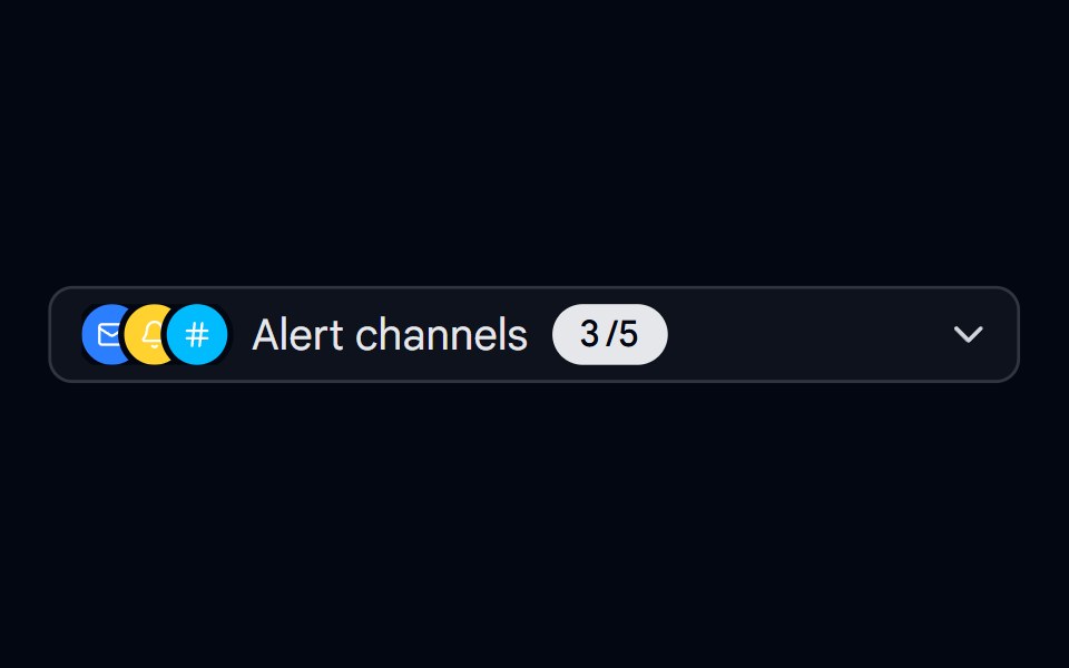 Select 11 - Alert Channels Multi-SelectShadcn Space · ReactMulti-select trigger that summarizes chosen alert channels as an animated overlapping icon stack with a spring-counted…
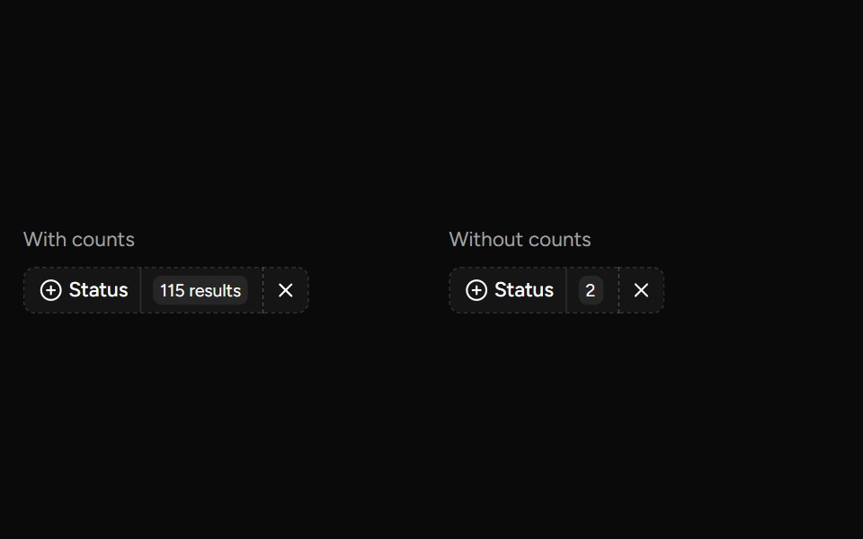 Data Table Faceted Filtersv-table · SvelteA searchable multi-select filter with live counts for categorical table columns.
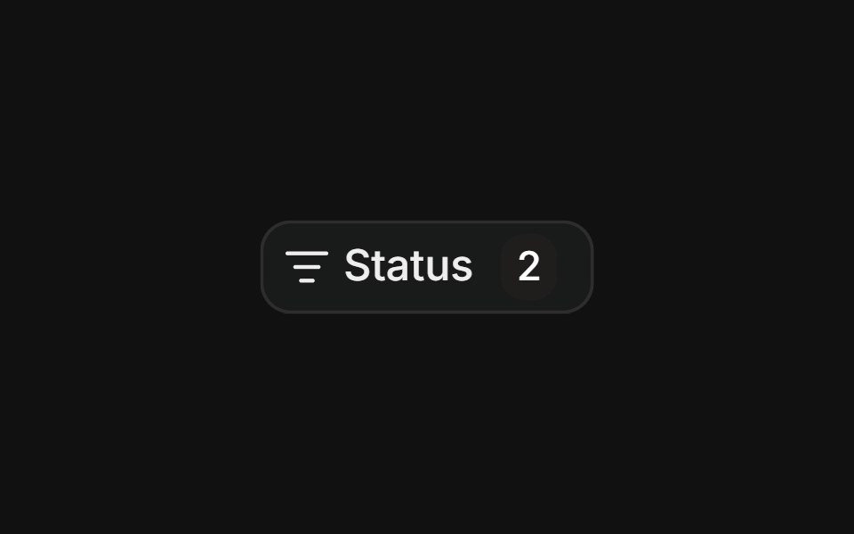 Multi-select filterFLX UI · ReactCheckbox items with a count badge and a clear action.
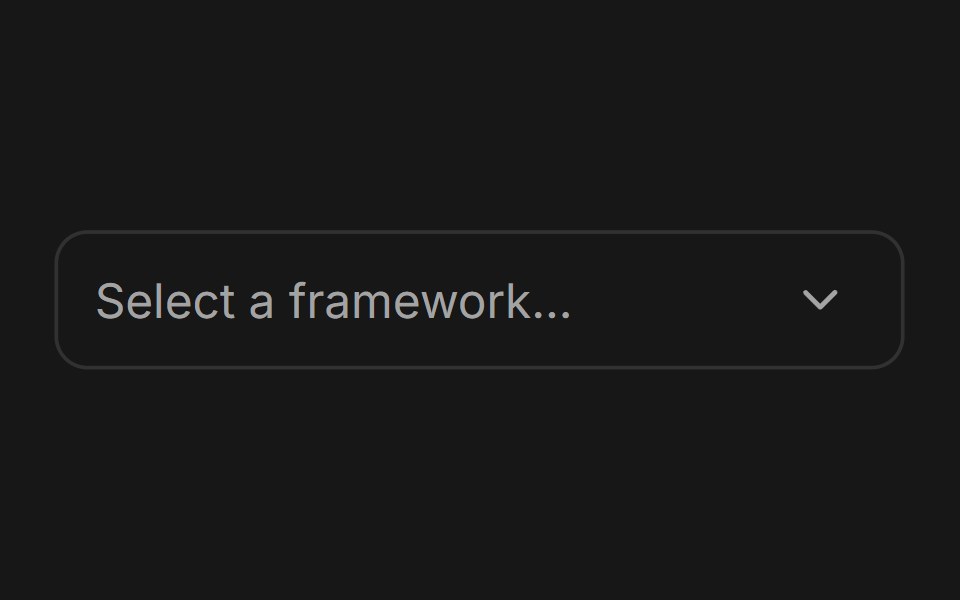 ComboboxFluid Functionalism · ReactType-to-filter combobox with single or multiple (chips, merged selection backgrounds) selection: a text field that…
Libraries with shadcn/ui multi select components
Related categories
- Multi Select Components
- React Multi Select Components
- Tailwind CSS Multi Select Components
- Animated Multi Select Components
- shadcn/ui Input Components
- shadcn/ui Form Components
- shadcn/ui Select Components
- shadcn/ui Text Input Components
- shadcn/ui Form Field Components
- shadcn/ui Switch Components
- shadcn/ui Textarea Components
- shadcn/ui Checkbox Components
- shadcn/ui OTP Input Components
- shadcn/ui Combobox Components
- shadcn/ui Date Picker Components
- shadcn/ui Radio Components
- shadcn/ui Login Form Components
- shadcn/ui Search Input Components
- shadcn/ui File Upload Components
- shadcn/ui Slider Components