 Dev Design Library
shadcn/ui Toggle Group Components
Dev Design Library indexes 11 shadcn/ui toggle group components from 7 open-source UI libraries, with the most coming from Shadcn Space, ObsidianUI, sv-particles, ark-cn and glasscn. Each one links to its page with the source code, a live preview where available, the library license and the install command. They follow the shadcn/ui conventions, so most install with the shadcn CLI and drop into a Tailwind project. Toggle group components belong to the Inputs group.
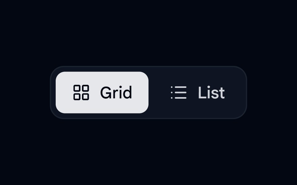 Toggle Group 01 - Animated Formatting ToolbarShadcn Space · ReactA premium animated view switcher and styling toolbar utilizing Radix UI Toggle Group and Framer Motion spring sliding…
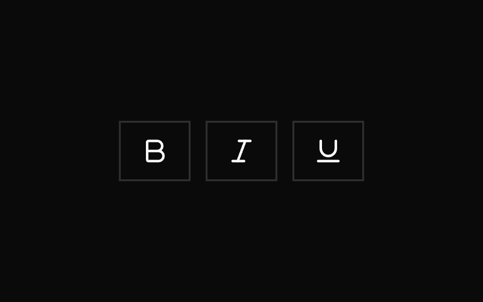 Toggle GroupShadcn Dashboard · React
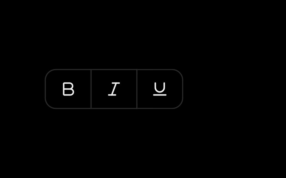 Toggle GroupObsidianUI · React
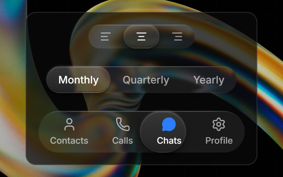 Glass Toggle Groupglasscn · ReactA segmented control with a sliding glass puck indicator supporting icons, text, or any React content.
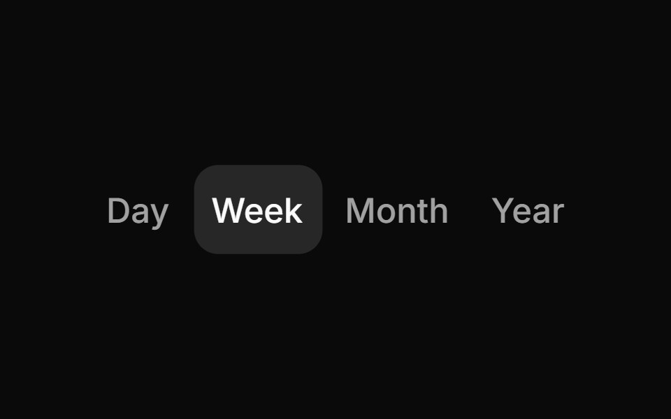 Toggle groupHextaUI · ReactA row of toggles for one choice or many, with a fill that slides to the picked item, joined or spaced items and…
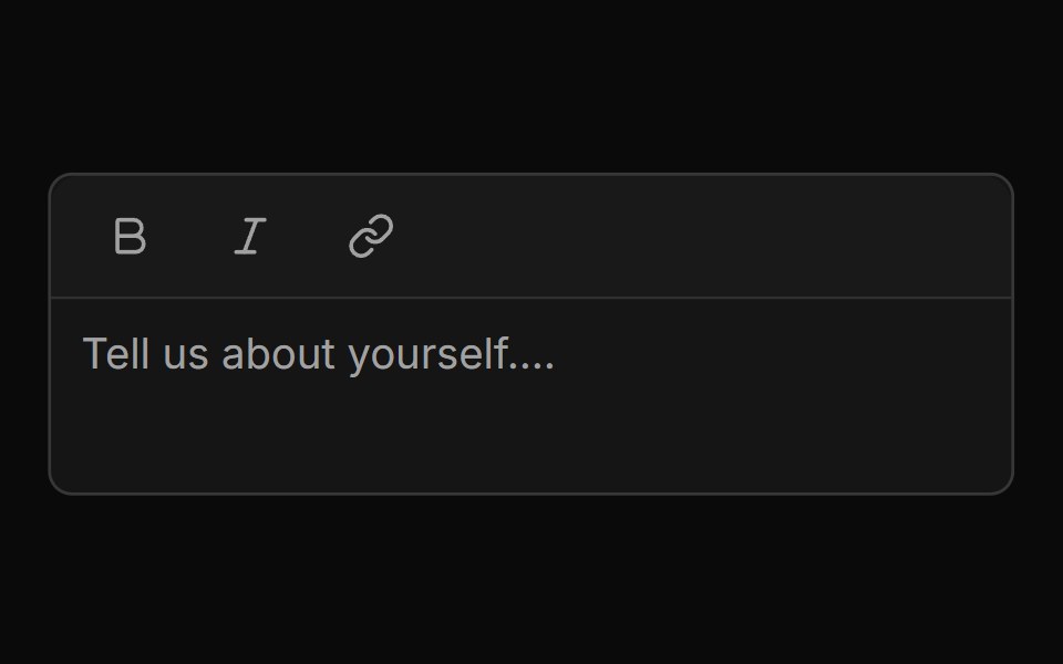 Mini Editor Group Togglesv-particles · Svelte
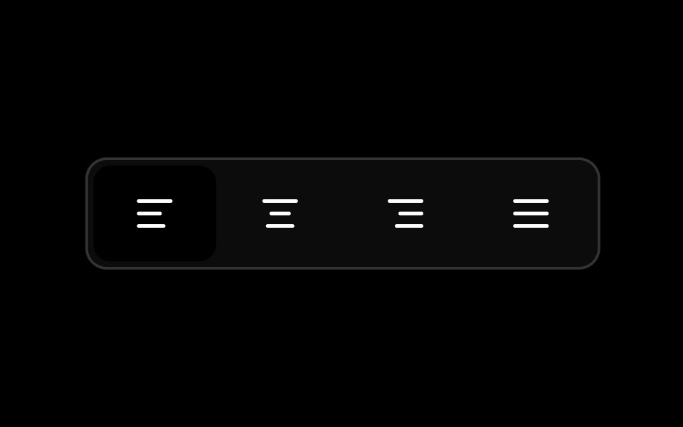 Toggle Groupark-cn · ReactA shadcn-style toggle group component built with Ark UI primitives.
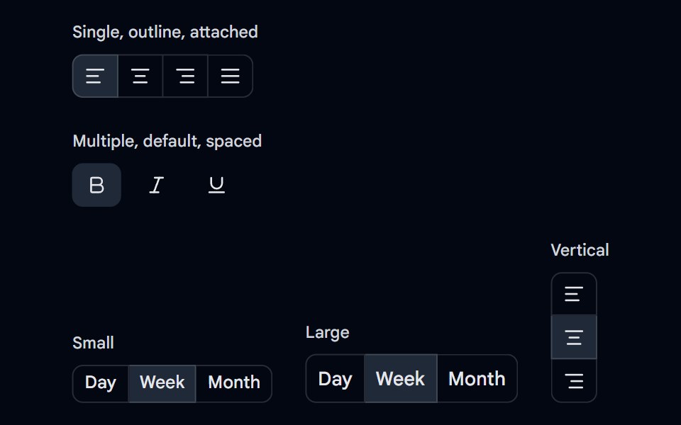 Toggle Group 03 - Variants & SizesShadcn Space · ReactSingle and multiple selection toggle groups in default and outline variants, attached and spaced, small and large, and…
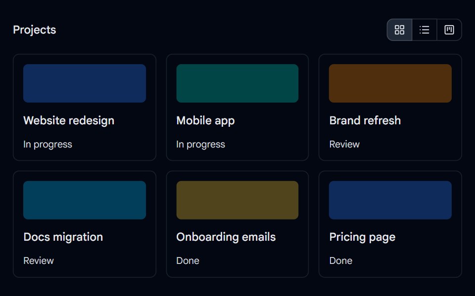 Toggle Group 04 - View SwitcherShadcn Space · ReactGrid, list, and board view switcher that always keeps one view selected and re-lays out a project list.
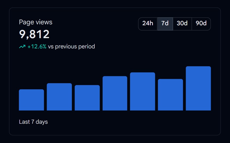 Toggle Group 06 - Chart Time RangeShadcn Space · ReactAnalytics card with a 24h, 7d, 30d, and 90d time range toggle that updates the total, trend, and bar chart.
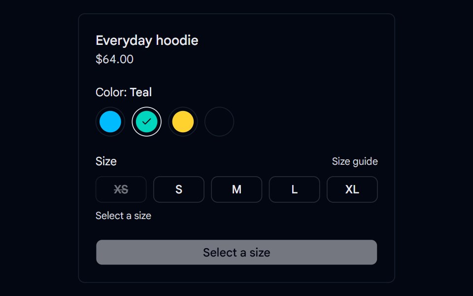 Toggle Group 07 - Product OptionsShadcn Space · ReactProduct variant picker with color swatch and size toggle groups, sold out sizes, low stock messages, and an add to…
Libraries with shadcn/ui toggle group components
Related categories
- Toggle Group Components
- React Toggle Group Components
- Tailwind CSS Toggle Group Components
- Animated Toggle Group Components
- shadcn/ui Input Components
- shadcn/ui Form Components
- shadcn/ui Select Components
- shadcn/ui Text Input Components
- shadcn/ui Form Field Components
- shadcn/ui Switch Components
- shadcn/ui Textarea Components
- shadcn/ui Checkbox Components
- shadcn/ui OTP Input Components
- shadcn/ui Combobox Components
- shadcn/ui Date Picker Components
- shadcn/ui Radio Components
- shadcn/ui Login Form Components
- shadcn/ui Search Input Components
- shadcn/ui File Upload Components
- shadcn/ui Slider Components