 Dev Design Library
shadcn/ui Counter Components
Dev Design Library indexes 7 shadcn/ui counter components from 3 open-source UI libraries, with the most coming from sv-particles, Shadcn Space and Cojeev UI. Each one links to its page with the source code, a live preview where available, the library license and the install command. They follow the shadcn/ui conventions, so most install with the shadcn CLI and drop into a Tailwind project. Counter components belong to the Data display group.
 Avatar-05 - CounterShadcn Space · ReactCounter avatar component
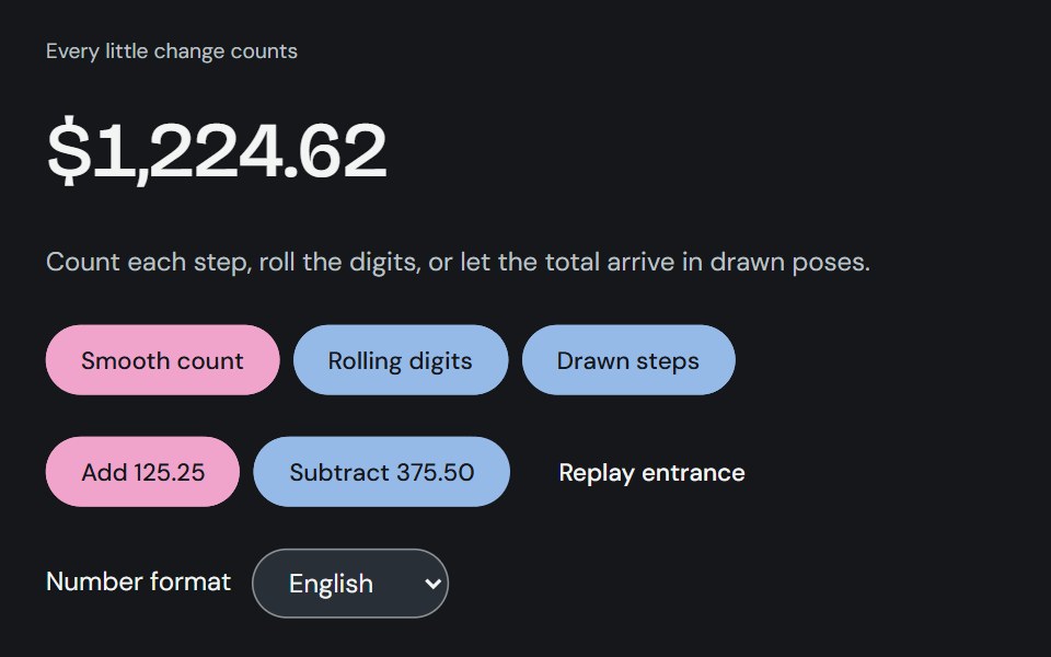 Animated numberCojeev UI · ReactA smooth, interruptible number transition for totals, metrics and small moments of progress.
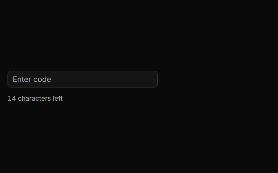 Characters Remaining Countsv-particles · SvelteText input that shows how many characters are still left before the limit.
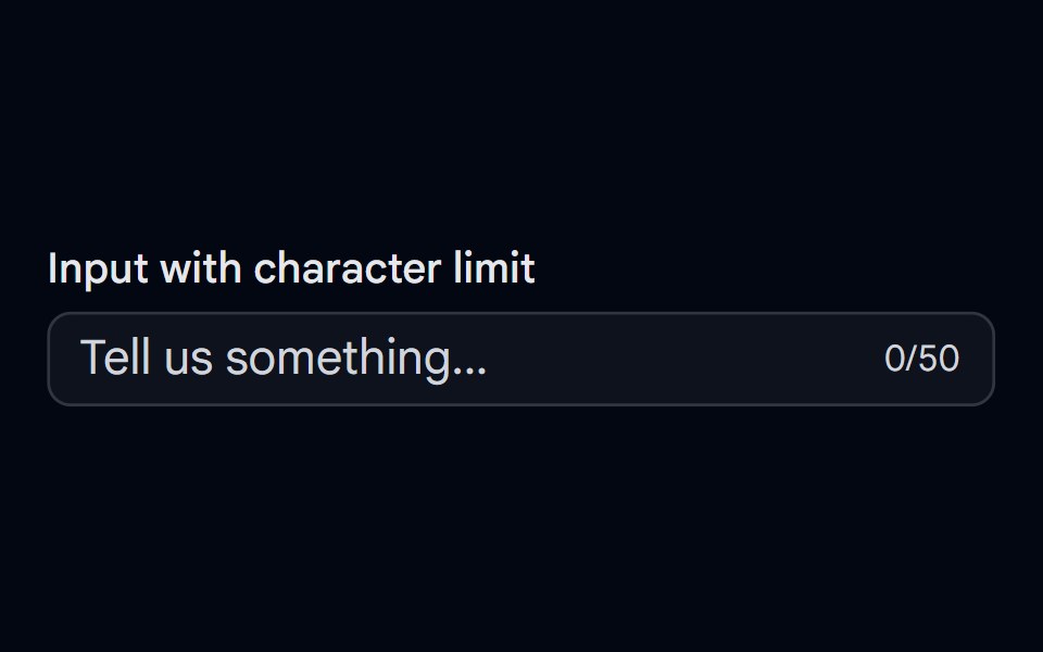 Input-06 - Input with character counterShadcn Space · ReactInput component
 Outline Like With Countsv-particles · SvelteOutlined like button with a heart and the number of likes next to it.
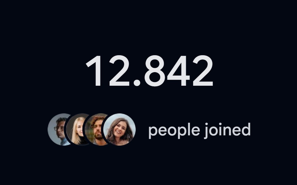 Number Ticker 06 - Social ProofShadcn Space · ReactA social proof counter with a counting member number and a stacked avatar cluster, perfect for signup counts…
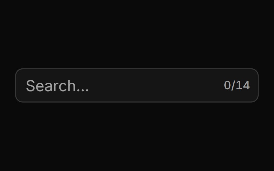 With Character Countsv-particles · SvelteForm field that shows the number of characters typed out of the maximum.
Libraries with shadcn/ui counter components
Related categories
- Counter Components
- React Counter Components
- Tailwind CSS Counter Components
- Animated Counter Components
- shadcn/ui Data Display Components
- shadcn/ui Card Components
- shadcn/ui Table Components
- shadcn/ui Avatar Components
- shadcn/ui Data Table Components
- shadcn/ui Accordion Components
- shadcn/ui Stat Components
- shadcn/ui List Components
- shadcn/ui Chart Components
- shadcn/ui Calendar Components
- shadcn/ui Collapsible Components
- shadcn/ui Stat Card Components
- shadcn/ui Avatar Group Components
- shadcn/ui Tree View Components
- shadcn/ui Carousel Components
- shadcn/ui Testimonial Components