 Dev Design Library
shadcn/ui Profile Card Components
Dev Design Library indexes 8 shadcn/ui profile card components from 4 open-source UI libraries, with the most coming from Watermelon UI, FLX UI, Shadcn Space and Spectrum UI. Each one links to its page with the source code, a live preview where available, the library license and the install command. They follow the shadcn/ui conventions, so most install with the shadcn CLI and drop into a Tailwind project. Profile card components belong to the Data display group.
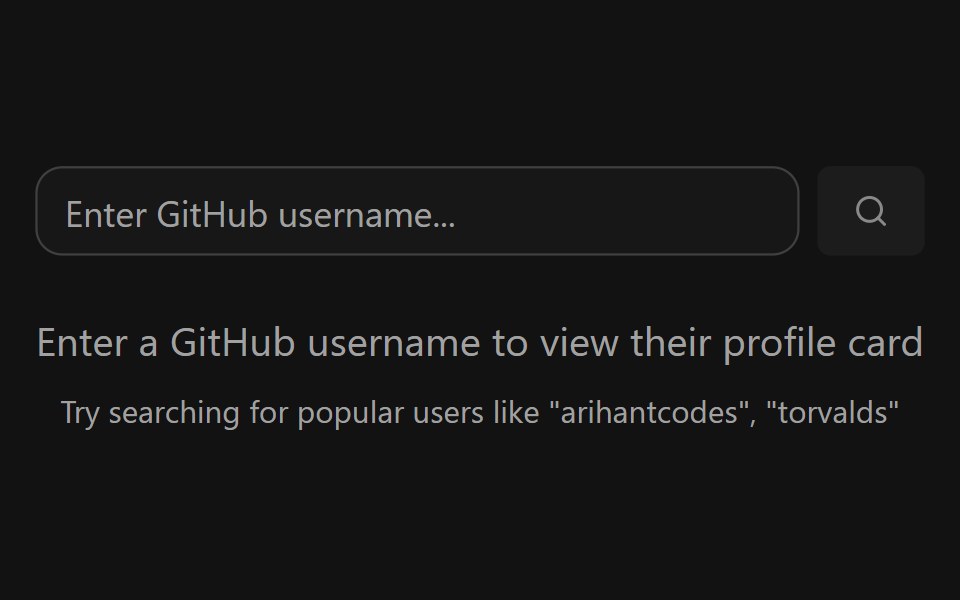 GitHub Profile CardSpectrum UI · ReactA GitHub profile card with account stats, a contribution graph, and social links.
 Card-09 - Invite Member CardShadcn Space · ReactCard component
 Team 2Watermelon UI · React
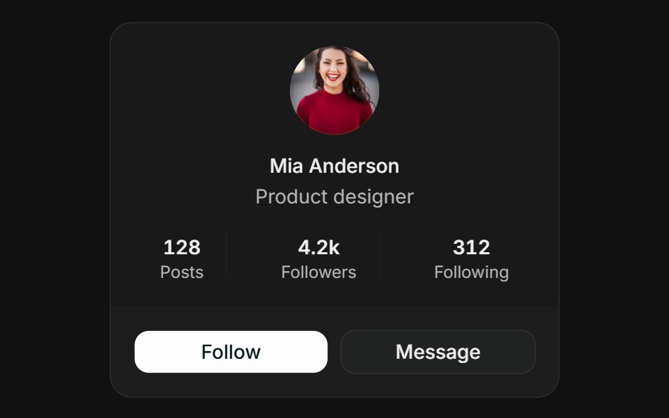 ProfileFLX UI · ReactCentered avatar, stats row, and follow / message actions.
 Popover 02 - User Profile CardShadcn Space · ReactProfile card popover triggered by an avatar - shows user stats and follow/message actions.
 Team 4Watermelon UI · React
 Edit profileFLX UI · ReactFieldGroup form with Save and Cancel footer.
 Team 5Watermelon UI · React
Libraries with shadcn/ui profile card components
Related categories
- Profile Card Components
- React Profile Card Components
- Tailwind CSS Profile Card Components
- Animated Profile Card Components
- shadcn/ui Data Display Components
- shadcn/ui Card Components
- shadcn/ui Table Components
- shadcn/ui Avatar Components
- shadcn/ui Data Table Components
- shadcn/ui Accordion Components
- shadcn/ui Stat Components
- shadcn/ui List Components
- shadcn/ui Chart Components
- shadcn/ui Calendar Components
- shadcn/ui Collapsible Components
- shadcn/ui Stat Card Components
- shadcn/ui Avatar Group Components
- shadcn/ui Tree View Components
- shadcn/ui Carousel Components
- shadcn/ui Testimonial Components